 Marius Masalar
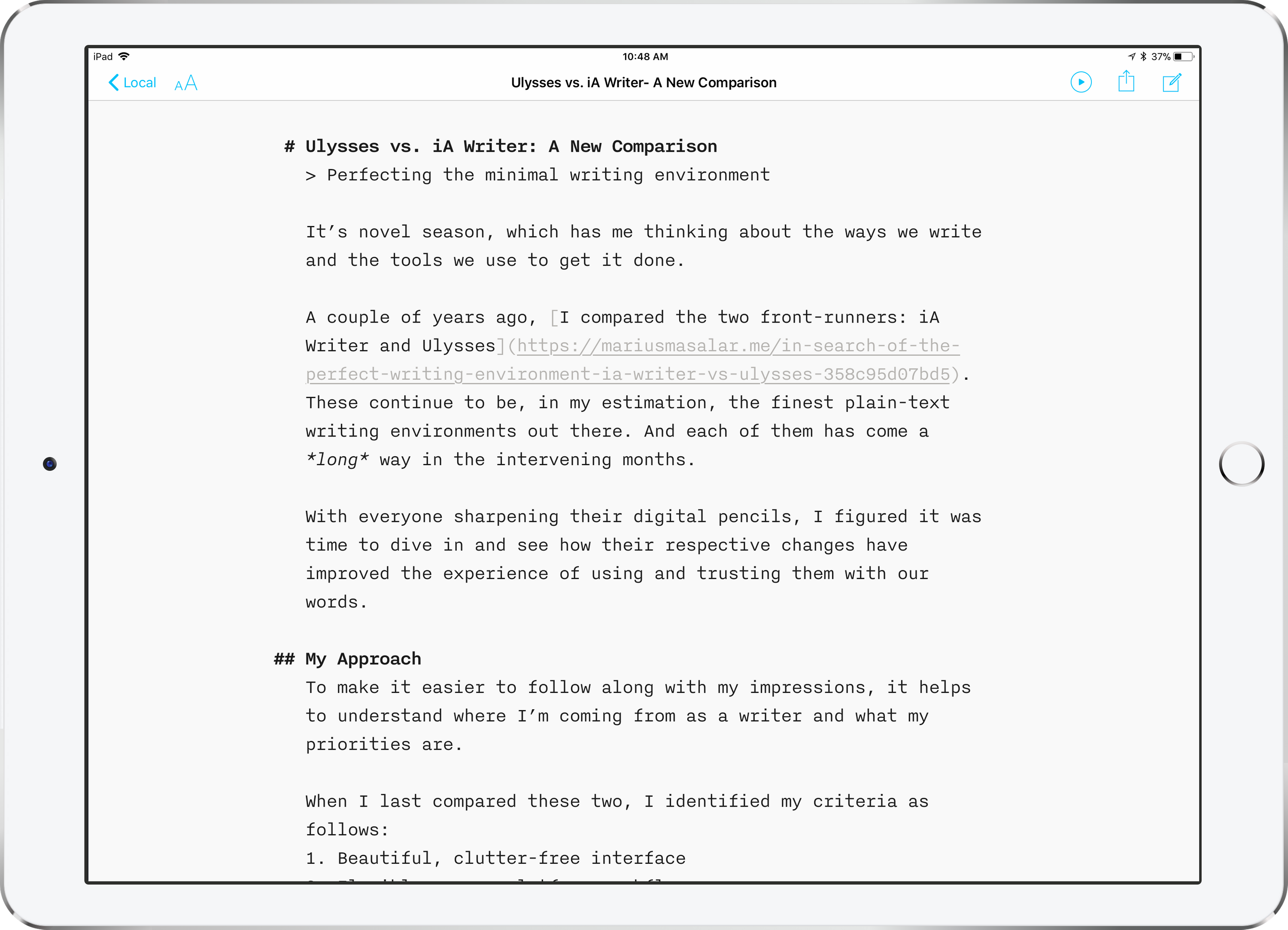
Ulysses vs. iA Writer: A New Comparison
Perfecting the minimal writing environment

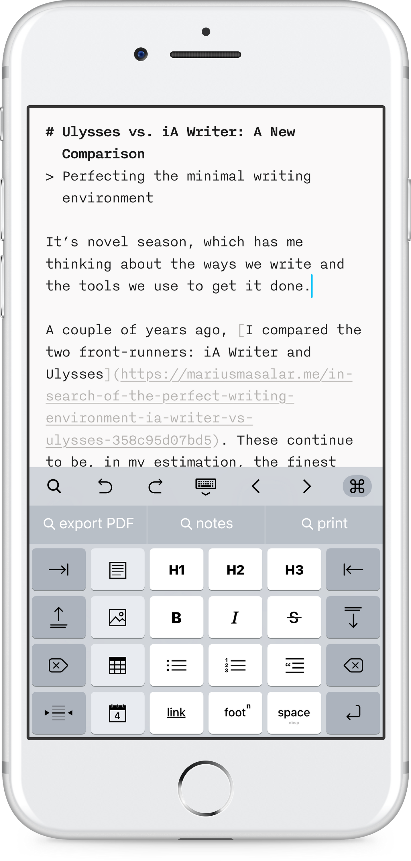
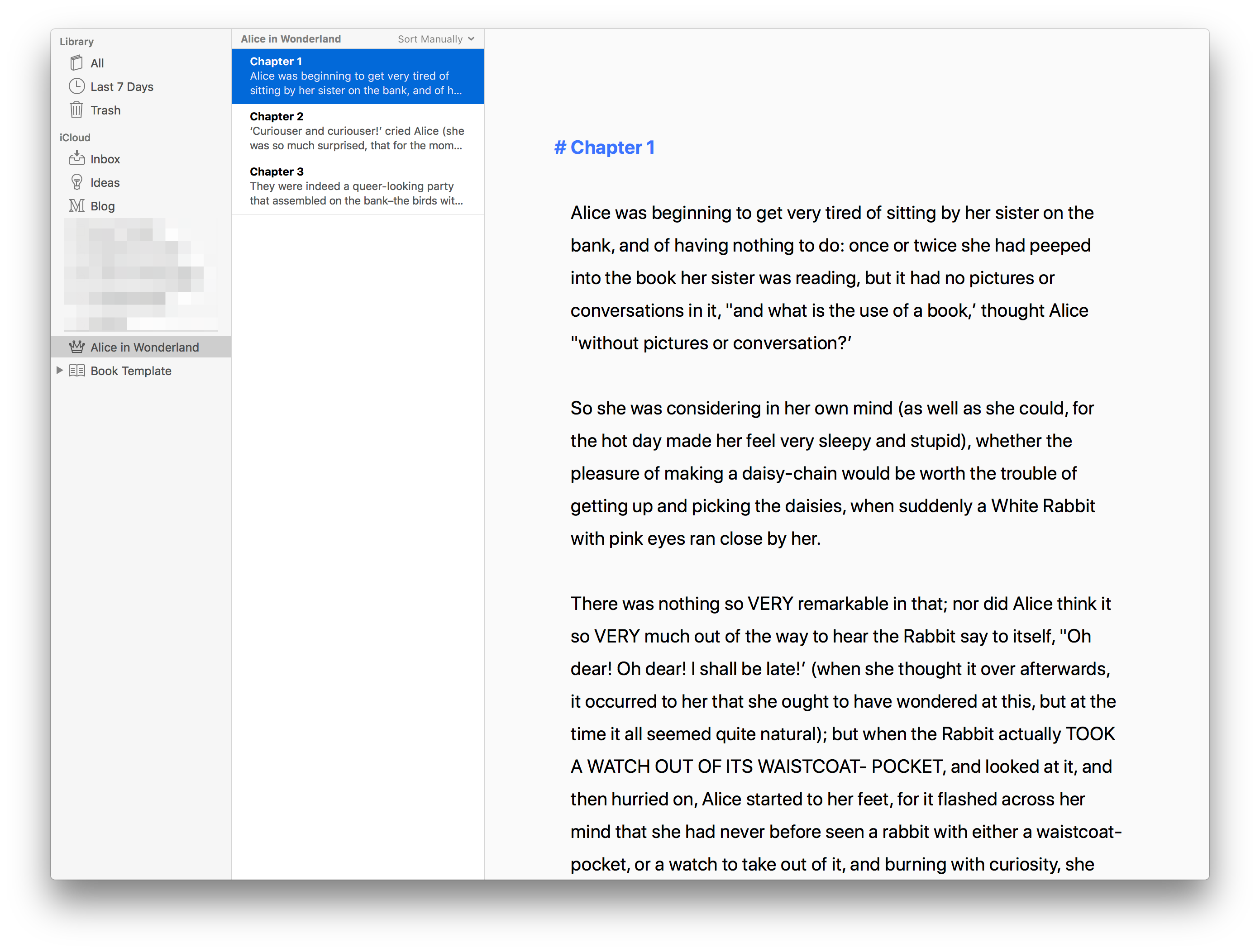
It’s novel season, which has me thinking about the ways we write and the tools we use to get it done.
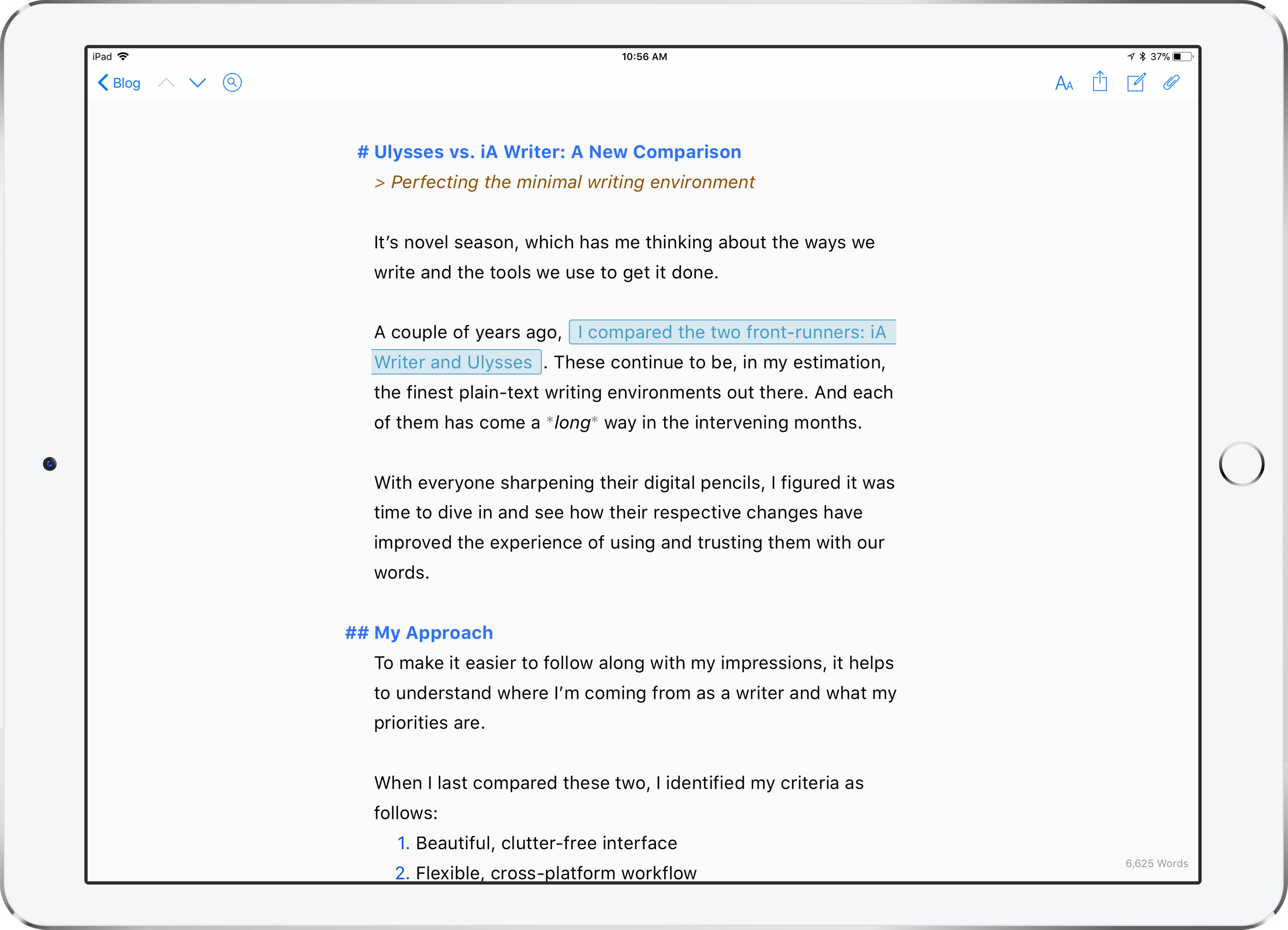
A few years ago, I compared the two front-runners: iA Writer and Ulysses. These continue to be, in my estimation, the finest plain-text writing environments out there. And each of them has come a long way in the intervening years.
With everyone sharpening their digital pencils, I figured it was time to dive in and see how their respective changes have improved the experience of using and trusting them with our words.
My Approach
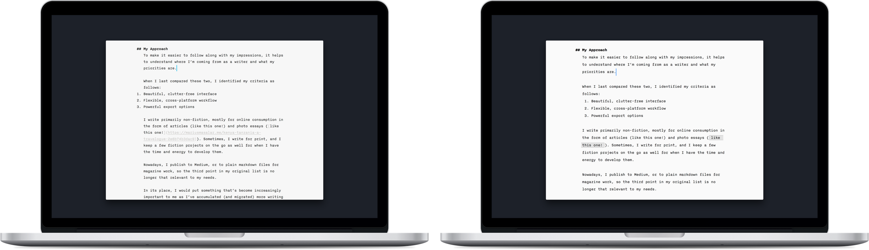
To make it easier to follow along with my impressions, it helps to understand where I’m coming from as a writer and what my priorities are.
When I last compared these two, I identified my criteria as follows:
- Beautiful, clutter-free interface
- Flexible, cross-platform workflow
- Powerful export options
I write primarily non-fiction, mostly for online consumption in the form of articles (like this one!) and photo essays (like this one!). Sometimes, I write for print, and I keep a few fiction projects on the go as well for when I have the time and energy to develop them.
Nowadays, I publish this site via Blot, or to plain markdown files for magazine work, so the third point in my original list is no longer that relevant to my needs.
In its place, I would put something that’s become increasingly important to me as I’ve accumulated (and migrated) more writing work over time:
A powerful, easy way to manage and manipulate text items, whether they be articles, snippets, notes, sections, or any other arbitrary text unit.
With that out of the way, let’s see what’s new in each of the two apps.

What’s New in iA Writer?
Writer has had a strange history.
It started as a single app, became two apps, and then merged back into one app that brought together the best aspects of the former Classic and Pro variants. They’ve also made their way to Android, and are currently contemplating a web version too.
Writer’s modern incarnation is somehow both very similar and very different from the app’s original vision.
Polish
I was in Tanzania recently, and while there I watched the process of carving a beautiful sculpture at a local soapstone workshop. After the basic form has been fashioned, every item goes through half a dozen phases of sanding—by hand—each with a progressively softer paper grain.
By the end, one might wonder how much of a difference it makes.
But anyone who’s experienced the end result will know that in stone carving and software design alike: there’s a difference between smooth and polished.
iA Writer has broken out the fine grained sandpaper this year.
Where previous years saw them whittling rough edges off to reveal the underlying shape, the past few months have been about bridging that gap between smoothness and polish.
Aesthetics and Style
Aesthetically, the app has returned to a more conventional layout with version 5, particularly in the case of its iOS app, which—after a brief diversion featuring an actual File menu and other oddities—now has a normal sidebar library view and familiar tools. Across all platforms, the library supports multiple storage locations, and the writing environment itself remains as spartan as can be: a page, a keyboard, and a blinking blue cursor.
This feels more natural, more intuitive, and less busy.
You still can’t choose your own font, but iA have (reluctantly) relaxed their standards a bit to allow for a choice of three typeface variants, a night mode colour scheme, three different text size options, and the ability to customize the tools you get in their new keyboard extension. In their own words:
With a growing customer base, we constantly needed to add features to satisfy the ever-branching needs. App store ratings pushed us into adding modes, templates, and settings. And these big feature comparison charts people go to before making buying decisions? They make you look bad if you don’t have night mode, WordPress export, 555 templates and an Indonesian name generator. We don’t like this trajectory; step by step it pushes us into the opposite of where we came from. We handled it alright. iA Writer still has only one font for writing, but now offers night mode, WordPress, Templates and a bunch of settings. Features as such are not evil, the devil is in making sure that they stay a detail.
Writer’s attitude has always been a bit aloof—to a fault, sometimes—but I’m glad to see them allowing writers to make a few quality of life adjustments. Nothing that breaks the aesthetic continuity or pushes you down the slippery slope of customizing everything, just enough to settle in, get comfortable, and write.
The Library, and File Management
Under the hood, Writer remains resolutely dedicated to working with actual files. It’s very much a traditional text editor in this sense—always just files on a disk.
This is both good and bad.
Good because they’re true to the spirit of plain text, giving you control over where your files are at all times, and keeping everything in timeless, non-proprietary plain text formats. No lock-in.
But for me, one of the greatest advances in modern computing is the slow departure of “file management”. I don’t want to manage my files any more than I want to manage my tasks. I want to complete tasks and work with files.
I want files to manage themselves, to be ready when and where I need them, and to stay safe and backed up.
While it seems like the experience would be equivalent—iA Writer and Ulysses both use iCloud as the default storage location, after all—the difference between storing things as loose files in a directory versus Ulysses’ sheets-in-a-library monolith has deep functional implications.
Sheets can have keywords attached to add a different dimension for organization, and Ulysses offers a robust system for creating smart folders (called Filters) to view content based on criteria including keywords, text inclusion/exclusion, and creation date.
Thankfully, version 5 of iA Writer brings smart folders (and favourite folders), but there’s still no equivalent to keywords.
That doesn’t bother me much though, because keywords represent more metawork than I typically want to do. They’re helpful for long-form content where I can use them to keep track of editing progress, but I can do without for most of my writing.
My chief concern with Writer’s flat file approach is the relative lack of flexibility compared to Ulysses’ sheets. I don’t mean broadly (can’t get more flexible than plain text files) but within the app itself, where it matters.
Content Blocks
Unlike plain text files, Ulysses’ sheets can contain file attachments (embedded or not) without adding clutter, and can be effortlessly merged and manipulated in ways that iA Writer’s files simply cannot.
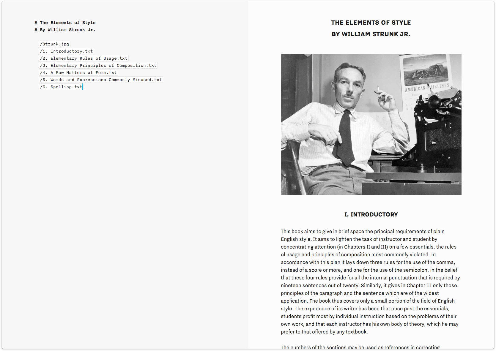
iA have attempted to address this limitation with one of the highlight features of the previous (version 4) update: Content Blocks. These are essentially a file referencing system, and while they don’t provide the same functionality as sheet manipulation or attachments, they are still quite useful.
The way it works is that you can include a file in your current document by adding a reference to it using a simple slash syntax, like so:
/chapter-2.txt
This results in your document preview (and exported product) showing the contents of the referenced file where you’ve placed it in the original document. Along with text files, you can reference images, CSV tables, and code.
This extends the inter-document workflow potential of Writer, but it does so in a way that’s only useful for export and publishing, not during the editing process. Let me give you a practical example to illustrate why this limitation frustrates me:
Let’s say I’m working on a piece of fiction, and I’m writing it out scene by scene, with each scene in its own document so I can easily re-organize them. At some point, I’m going to want to assemble those scenes into chapters and edit the resulting chapter as one item to make sure it flows.
In Ulysses, each scene would be a sheet that I could put into folders by chapter. Within the folder, I could manually re-order the scenes to experiment with structure, then merge them effortlessly into a single sheet containing my entire chapter, ready for editing.
In Writer, each scene can be its own document, and I can organize them into folders, but there’s no elegant way for me to merge the scenes into a single file for editing. The best I can do is use the new Content Blocks to append each scene’s file to the end of the first, in order, and then export that as a new document and edit that file.
This problem applies backwards too, by the way: in Ulysses you can very easily split a sheet if you realize you need to work on a section separately. There’s no way to do this in iA Writer except the old-fashioned way of cutting out the relevant portion and pasting it into a new document.
There’s an argument to be made in favour of keeping the scenes separated though, and some might prefer to work that way. However, this workflow is also possible in Ulysses, and is easier too. If I’m not yet ready to merge sheets, I can simply “glue” them together so they’re editable as a single unit yet remain independent sheets in the library.
There are other limitations to Content Blocks too.
Referenced files must exist in the same folder as the document, or a subfolder thereof. This quickly escalates into a lot of file clutter, as you can imagine. I write articles that often include many photos, so with Writer I’m faced with a few choices:
- Keep documents and images in the same directory, resulting in a folder full of loose, mostly unrelated files
- Make a subfolder for each document’s attachments, resulting in both a file and a folder for each thing I write (and thus two entries for each piece in the library)
- Make the subfolder for each document, but also move the document itself into the subfolder, in which case the directory only has one item of each name…but then the process of navigating between documents in the library view is a mess of hopping in and out of folders, and the main view will be showing all folder names instead of files, which means you can’t see content previews
- Make a single attachments subfolder and either have every document’s attachments loosely contained therein, or create another subfolder level for each document’s attachments within the master attachments folder, resulting in longer and longer reference links in the document On the bright side, you can reference web links to images and avoid local copies in Writer’s directly entirely if you like.
Still, I haven’t been able to find an option that doesn’t feel unnecessarily clunky, which has kept me from using Content Blocks very much. Others with different workflows may find them more beneficial, but for my work I consider them to be a poor substitute for what Ulysses’ sheets offer.
Keyboard Extension
The keyboard merits mention, as version 5 of the iOS app has a new customizable keyboard extension, accessible via a ⌘ icon that’s now visible above your software keyboard.
This extension can house a tremendous variety of features, from formatting shortcuts (like a button for adding markdown footnotes), to text manipulation (all sorts of selection options, line moving, tabs, etc.), to quick actions (like adding a markdown table, or the current date, or a content block).
This takes a lot of the pain out of using Markdown syntax (which tends to use a lot of special characters) while touch typing. It saves time and keeps you in the flow, which is crucial for any writing app.
Ulysses has a similar keyboard extension, but it isn’t customizable, so you’re stuck using the layout the developers have created for you—an ironic point in iA’s favour since they’re typically the ones restricting customization!
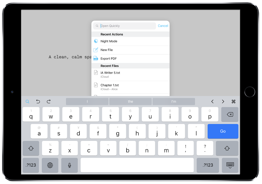
Keyboard interaction is also enhanced through the presence of a feature iA calls Open Quickly. Using the ⇧⌘O shortcut, you can summon a modal window that allows you to search for and open files from your library.
This would be neat on its own, but version 5 brings a whole new aspect to this by including quick actions. Now, from the same dialog, you can type something like “night mode” and activate it with a single tap. Or “export pdf” to accomplish that task in a single step too. In fact, you only really need to type the first few letters of a query before auto-complete presents you with the full command.
This is a tremendous time saver, and works with just about everything you can imagine: focus mode, syntax highlighting, preview, etc.
Ulysses has a Quick Open feature that works more or less the same way as far as finding and opening files (including shortcuts for specifying the search area) but there are no quick actions. Instead, Ulysses relies on a robust set of keyboard shortcuts that serve the same purpose.
It’s hard to say which approach is preferable.
On the one hand, learning a bunch of shortcuts is time consuming and potentially difficult compared to just typing what you want into a box. On the other hand, once you do learn the shortcuts, it’s faster to invoke a quick key combination than to have to do that and then also type in the beginning of your command.
Horses for courses.
Focus Mode & Syntax Control
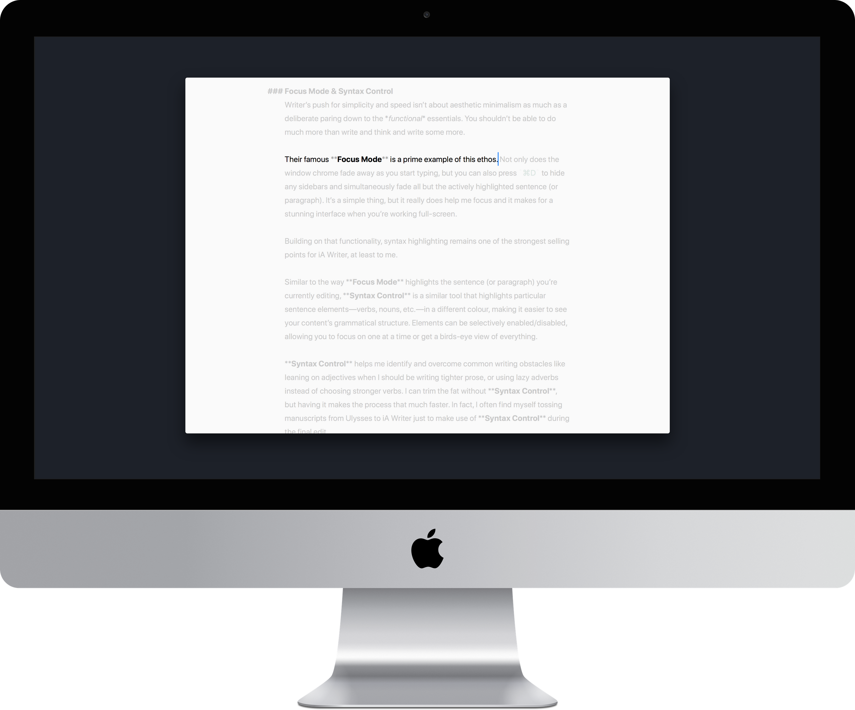
Writer’s push for simplicity and speed isn’t about aesthetic minimalism as much as a deliberate paring down to the functional essentials. You shouldn’t be able to do much more than write and think and write some more.
Their famous Focus Mode is a prime example of this ethos. Not only does the window chrome fade away as you start typing, but you can also press ⌘D to hide any sidebars and simultaneously fade all but the actively highlighted sentence (or paragraph). It’s a simple thing, but it really does help me focus and it makes for a stunning interface when you’re working full-screen.
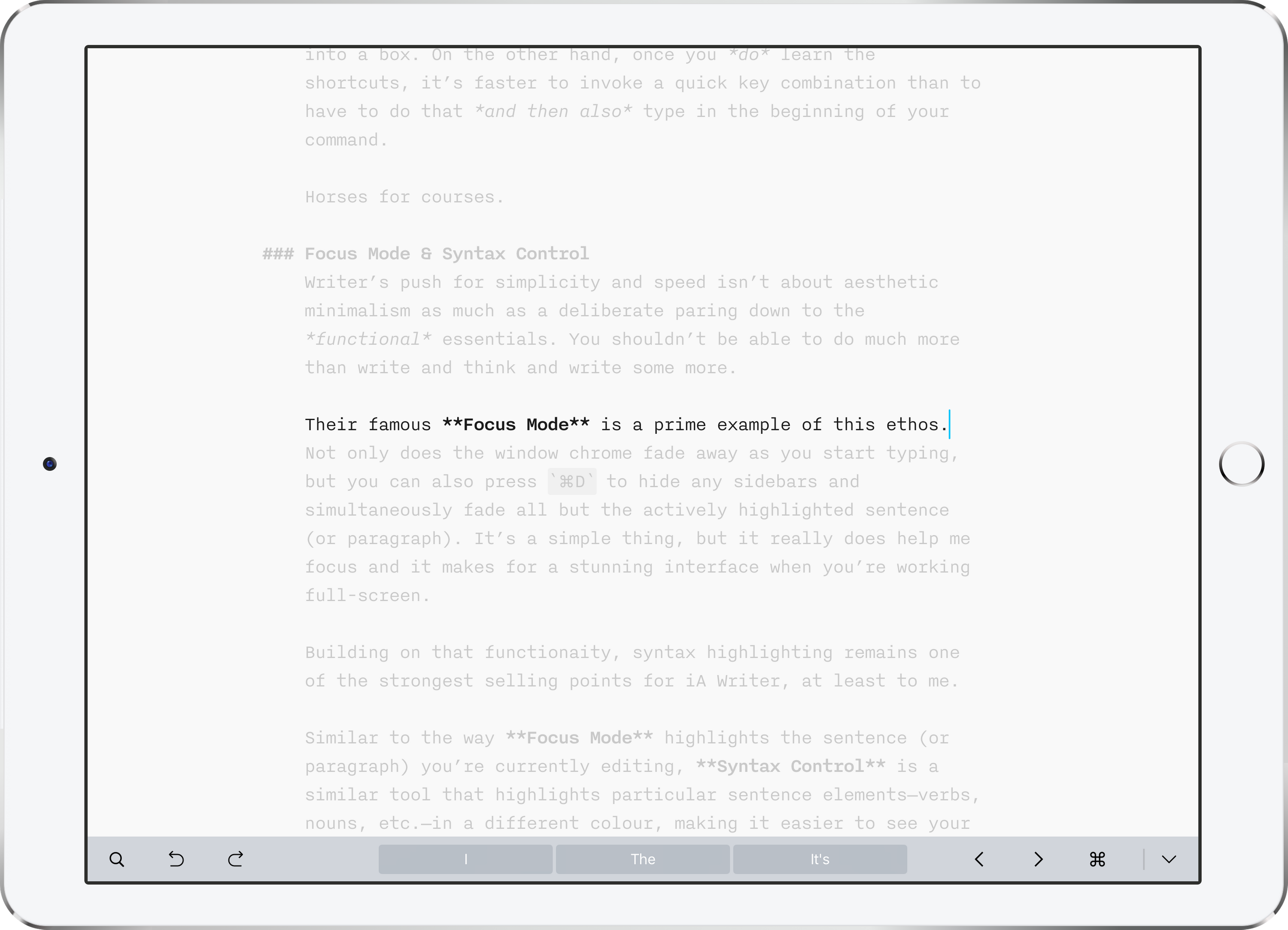
Building on that functionality, syntax highlighting remains one of the strongest selling points for iA Writer, at least to me.
Similar to the way Focus Mode highlights the sentence (or paragraph) you’re currently editing, Syntax Control is a similar tool that highlights particular sentence elements—verbs, nouns, etc.—in a different colour, making it easier to see your content’s grammatical structure. Elements can be selectively enabled/disabled, allowing you to focus on one at a time or get a birds-eye view of everything.
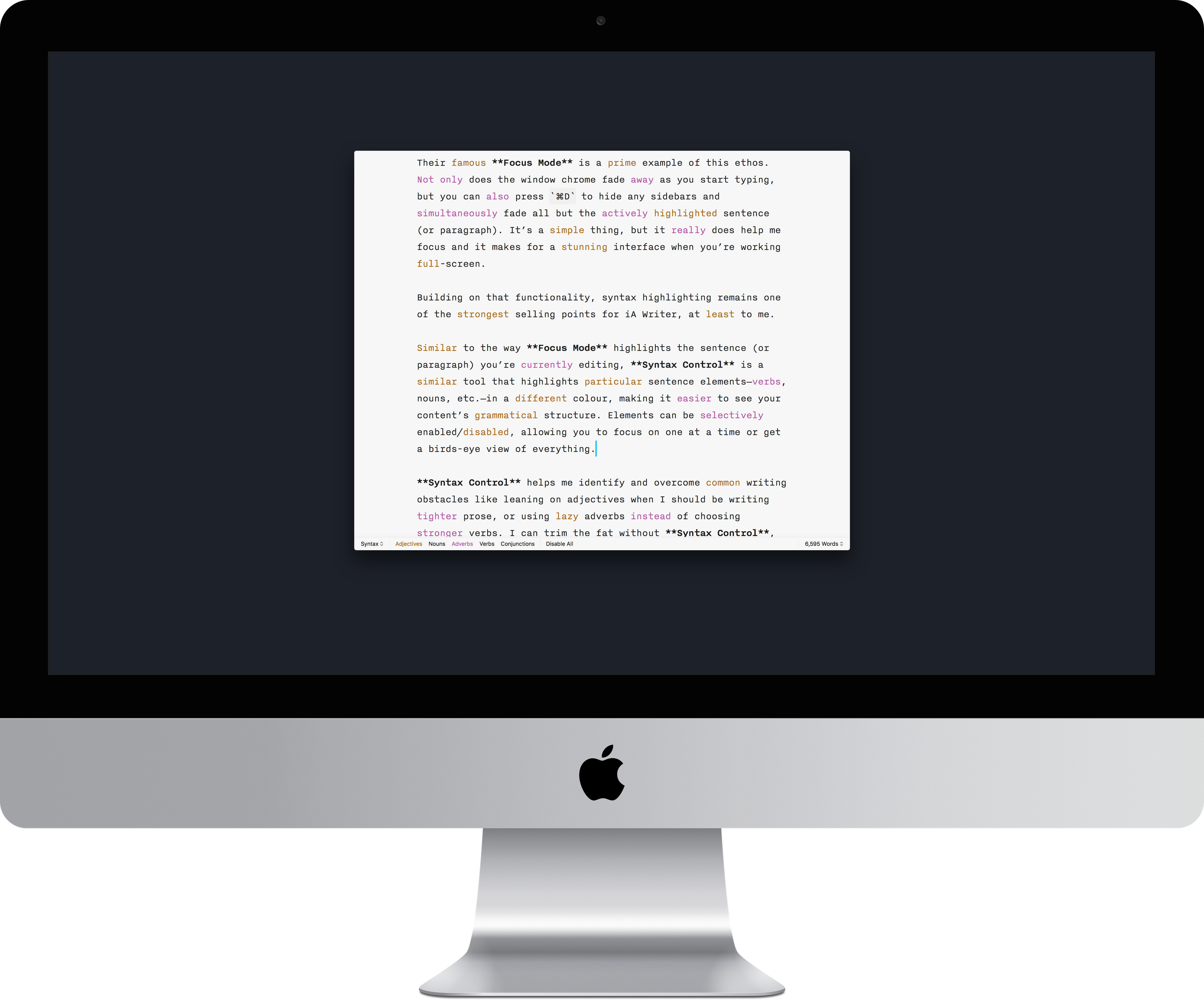
Syntax Control helps me identify and overcome common writing obstacles like leaning on adjectives when I should be writing tighter prose, or using lazy adverbs instead of choosing stronger verbs. I can trim the fat without Syntax Control, but having it makes the process that much faster. In fact, I often find myself tossing manuscripts from Ulysses to iA Writer just to make use of Syntax Control during the final edit.
iA Writer Take-Aways
With version 5, iA Writer has matured into a competent, streamlined writing app that maintains a lot of the austerity that made it distinctive, while adding key functionality to help accommodate more writing styles, content types, and author preferences.
It remains a lean and focused way to write, and doesn’t require a subscription to use—an elephant whose presence in the room we’ll examine shortly.

What’s New in Ulysses
The team behind Ulysses has been developing creative writing software for 14 years.
I have a deep appreciation for software that comes together after years of research and iteration, so it’s not surprising that I chose Ulysses as my writing environment of choice two years ago when I first compared it against iA Writer. Yet I find myself switching back and forth between the two even today.
With version 12, Ulysses has taken another meaningful step forward—its first since the switch to a subscription pricing model—adopting new iOS 11 technologies and streamlining the library.
A Personal Writing Environment
Earlier this year, I replaced the old desk I’d been using since high school with a new one.
I wanted something less cramped, with better organizational options. The new desk is expansive, more than twice as wide as its predecessor, with only a few decorative items and my Grovemade Desk Collection. It’s less cluttered, less distracting, and fits my needs perfectly.
But I had to make it myself.
If you’re willing to put thought and effort into to optimizing your work environment for calm and productivity (as you should be, as far as I’m concerned), then you’ll appreciate Ulysses.
I liken it to the difference between people who prefer to learn on their own versus people who prefer the structure of a curriculum or teacher to keep themselves on track. Ulysses is less opinionated software than iA Writer.
Ulysses asks “How do you want to do this?” Then says, “Great! Let’s go.”
iA Writer says “This is how it’s done. Now let’s get to it!”
Out of the box, Ulysses is just as inviting a writing environment as iA Writer is, but Ulysses is a clean slate that adapts to suit your needs. You can choose your own typeface, and control the colours and styling of everything from headings to comments.
The risk of having these options is that you’ll spend more time fiddling than writing. Nothing is more easily distracted than a procrastinating writer, and if even your writing environment distracts you then you’re off to a bad start. But it’s not the software’s job to manage your self-discipline, and in choosing to trust their users with that task, Ulysses can focus on optimizing for when its writers are in the zone.
After the initial honeymoon period, I wasn’t tempted to fiddle with the settings much. Spend a day experimenting, set things up, tear them down, change colours, explore the Style Gallery…and you’ll eventually settle on something that suits you perfectly. You made it, after all.
Then you can focus on writing.
Its flexibility allows Ulysses to be many things to many people. If you’re used to writing in a serif font with rich text previews, you can style the editor to look that way. If you love iA Writer’s look, you can replicate it exactly within Ulysses, giving you access to the same aesthetic without sacrificing any of the additional functionality.
In fact, here’s a fun experiment: can you tell which app is which in the screenshots below?
Of course, we’re often reminded that design is how it works too, not just how it looks, so making Ulysses look like iA Writer is only part of the equation.
There are things we can do to make the experience of writing match as well. Ulysses now has the option to fade the toolbars when you write, like iA Writer does, so that you’re left with nothing but the words and cursor. Similarly, while it doesn’t have a dedicated Focus Mode, you can roll your own by enabling Typewriter Mode and setting the highlight option to sentence.
So if the entire experience of iA Writer can be replicated in Ulysses, why do I find myself using Writer at all anymore?
There used to be several answers, but as Ulysses has continued to iterate, they’ve whittled it down to a single reason: Syntax Control. Ulysses has no equivalent, and I find it helpful when editing long pieces, so despite the ability to re-create the look and feel of writing in iA Writer within Ulysses, I still can’t replicate its editing experience.
Ulysses’ Library
Looking at the library view of these apps side by side, the differences in approach aren’t immediately obvious; in both cases, it looks like a list of documents.
One immediate (and perhaps trivial) aesthetic difference is that Ulysses’ folders (called Groups) appear in their own sidebar and can have customizable icons assigned to them. Conversely, iA Writer’s folders appear in the one library sidebar and look like plain folders. While I find Ulysses’ approach more pleasing to look at, there’s also a semantic difference in that having a dedicated Groups sidebar is clearer than having both files and folders showing up in the same sidebar view.
 I find that there’s a lack of context with iA Writer, since all you can see is the current folder you’re in. There’s no sense of where you are in the greater library of texts.
 Ulysses can optionally focus in on a single Group, but by default you can see everything.
And there are more important advantages to a library monolith instead of loose files in a directory. In the developer’s own words:
Everything, literally everything, is in this one place, right there in the app. There is no need to go outside the app to search for a note or that one snippet you created last night. If it happens in Ulysses, it stays in Ulysses. Then there’s the topic of file names. Or rather, the absence of file names. This may seem minor, but it allows Ulysses to scale from note pad to novel writing power horse, and even to combine both and everything in-between. You can probably compare it to the photo library on your phone. Imagine you would have to name every single photo, probably before you’ve even shot it. Then imagine the photos were listed in alphabetical order, and you could only search by name. This would be crazy, right? But that’s how most apps still present your content, and that’s what we wanted to get rid of in Ulysses.
Beyond that, the sheets within Ulysses’ library are more capable than plain text files, not only in terms of what you can do with them, but also in terms of what you can do within them.
Sheets vs. Files
In addition to all the features afforded by Ulysses’ native MultiMarkdown syntax support, sheets allow Ulysses to offer functionality that goes beyond what plain text is capable of.
For example, you can add in-text comments like you’d expect, but also annotations that function almost like comments on a PDF: affected text is marked to show the presence of an annotation, but the annotation text isn’t visible while writing unless you explicitly open it. Comments and annotations are omitted from the preview and exported files.
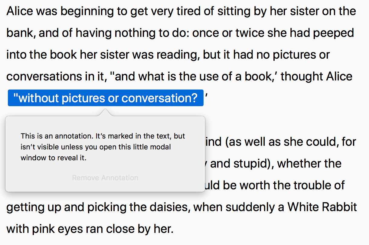 Annotations in Ulysses
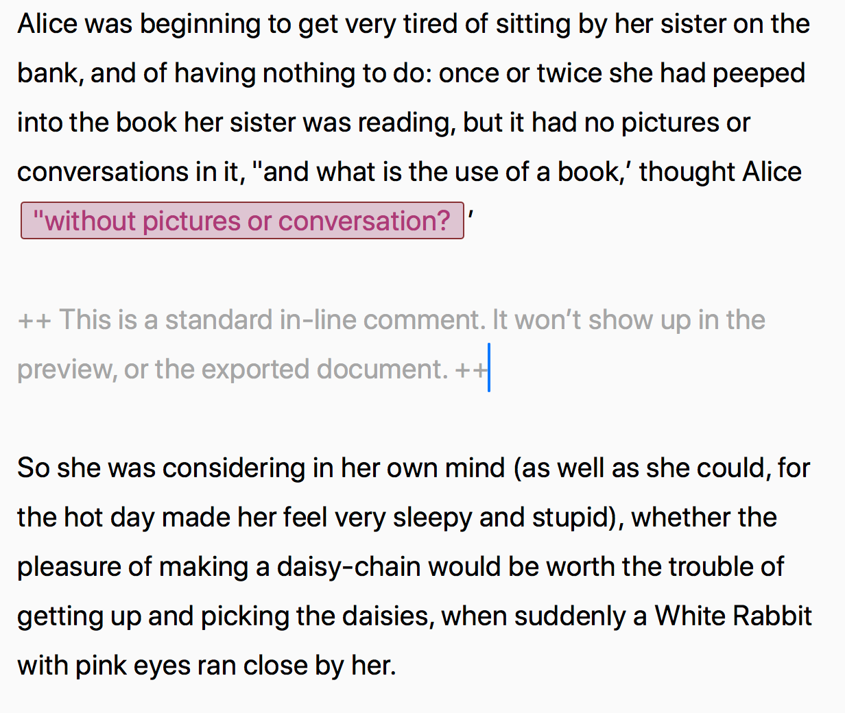 Comments in Ulysses
Writer, bizarrely, doesn’t even support in-text comments, let alone annotations.
Each sheet in Ulysses also has its own notepad attached that allows you to make notes that pertain to the sheet as a whole, without being embedded in the content in any way. For fiction writers, this is a great place to keep over-arching goals for the chapter for quick reference, for example. Ulysses is, of course, smart enough to ignore comment and annotation text when it calculates your word count and other statistics.
These statistics also work across multiple sheets, allowing you to calculate reading time and view word counts for entire groups.
Attachments & Images
Sheets can also have keywords and files attached to them. Keywords work the way you’d expect, like tags do in Evernote or Bear, and can be used to help filter sheets in the library. One way I’ve used them is to mark sheets that need editing, and then create a Filter (Ulysses’ smart folder equivalent) to gather all sheets that require more work, regardless of where they are in the library.
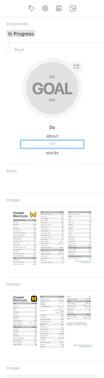 Ulysses’ sidebar can include sections for Keywords, Notes, Goals, and Attachments.
File attachments are more interesting. You can drag any file you like into a sheet’s sidebar on macOS to attach it (or pull them in through native Files app integration on iOS). These files are attached, not embedded, and can be placed into the document or left in the sidebar as a reference.
Images work very similarly. You can have images attached to the sheet in the sidebar without them showing up in the text, but you can also drag & drop (on macOS and iOS alike—thanks, iOS 11!) to insert them into the text. Best of all, as of Ulysses version 12, you’ll now see a small thumbnail preview of the image as you write.
For folks like me working on articles and photo essays that contain a lot of imagery, it’s much easier to structure and lay things out now that I can actually see the images (instead of a plain text image tag or, in the case of iA Writer, a Content Block). Of course, in iA Writer you can keep the preview panel open while you write and see images that way, but then you have two panes open, which I find distracting.
One downside of this functionality is that attachments aren’t currently a criteria for filters in the library. This means you can’t create a Filter to show only sheets with attachments, or one that excludes image attachments and shows only PDFs, or anything like that. I’d like to see the team build out the filters with file and attachment related options in the future.
Drag & Drop
Drag & drop has come to iOS, and Ulysses’ implementation is very elaborate. Text and images from other apps can be pulled into the sheet, or into the sidebar to attach them.
You can also drag sheets (and groups of sheets) around in the library to re-organize them, a task made simpler by the multi-pane view on iPad Pros. You needn’t grab the entire sheet though: content from within sheets can be dragged and dropped them into other ones—or even out into other apps!
It’s one of the more robust implementations of drag & drop that I’ve seen on iOS and it’s very satisfying to use.
Ulysses’ library has also gained some great dragging & swiping related features since I last wrote about it. Most notably, you can now perform swipe actions on sheets, making it easier to mark sheets as favourites, set keywords from the library view, and other similar functionality depending on whether the sheet is in Ulysses’ library or stored in an external storage option like Dropbox.
Swiping also works on the library’s groups, enabling a library focus feature. If you’re like me and store all your writing in Ulysses, you can quickly end up with a lot of groups and a ton of sheets. When you’re working on a particular project though, all that extra stuff is distracting, so now you can hide it away by swiping a group to the right.
There’s currently no way to do this in the macOS version of the app, but it’s one of very few examples of features that aren’t shared across platforms. One such feature in macOS’ favour is the ability to open sheets in tabs if you’re running macOS Sierra or newer, which I prefer to having a bunch of windows open (unless I’m actively copying/referencing content back and forth).
Advanced Features
It’s a little unfair to compare Ulysses to iA Writer in terms of features, because the former counts deep functionality as part of its strategy, whereas the latter is focused on simplicity.
Still, it’s worth at least noting the gaps so that those choosing iA Writer are aware of what’s being offered on the other side of the fence.
I won’t dwell on them, but here are some of the unique features I find valuable in Ulysses (in no particular order):
- The ability to lock your library behind a passcode and/or Touch ID (on supported iOS and Mac hardware) for privacy
- Robust automation potential via x-callback-url support. This is a deep rabbit hole that allows for sophisticated workflows—generally beyond the scope of what I do, but it unlocks some amazing potential. Go see Federico at MacStories for more on this
- Support for the textbundle and textpack formats
- Export styles (for customizable HTML, PDF, Word, and even ePub) That’s not even a fraction of the full list, but you get the idea. Ulysses has a lot of features.
That doesn’t make it a better app, but it might make it a more suitable app for your needs if those features happen to align with your requirements.
Subscription and Lock-in
Okay, time to talk about the elephant of subscription pricing.
Earlier this year, Ulysses announced the switch from per-app pricing to a unified subscription. Then they explained it in more detail.
The internet was angry. The internet is always angry.
Rather than re-hash what those articles and the resulting comment storm discuss, let’s keep things high-level and positive. The benefits are the usual:
- One price unlocks all apps across all platforms, so no more purchasing separate licenses for each
- Free downloads of the apps means they can finally offer a proper trial to give people an opportunity to try before they buy
- Steady income for the developers means steady work on the app, without the need to artificially bundle features into major paid point updates
- Subscriptions shift the balance of effort from acquiring new users (after all, that’s where the money comes from in the pay-once model) to supporting existing ones
And some of the common concerns:
- Subscription = lock-in!
- What happens when every app goes subscription?
- I don’t want to pay for platforms I don’t use it on
- I don’t want to rent my software, I want to own it
Each side has more points, but life is short and it’s not my job to sway you toward or against subscriptions. Instead, I want to focus on my stance and why I am happy to pay for both of these apps—once or continuously, as required.
First of all, on lock-in: storing files in a library monolith means you need to use the apps to access them, it’s true, but it’s a weak argument for common users.
You need an app to open anything—even your email needs an app to be accessed, whether it’s native or a web client. The advantage of iA Writer is that you get to choose whether you access it from iA Writer or another app, and you can do it from any platform you use.
That is an advantage—no doubt about it—but in how many real-world scenarios does it apply? This is choice without benefit, or optimizing for the unlikely.
In the real world, people who know they need to access files across multiple platforms in difficult scenarios aren’t going to be considering Ulysses at all—because it’s macOS and iOS only. It’s not even in the running.
And if you use those platforms but want to keep a normal file copy of everything as well (separate from the excellent native backup functionality) then you can do so. Export your library as plain text and put it wherever you want. Voilà. Job done.
I spend about equal amounts of time writing on my iOS devices and iMac. I’m never looking to write without access to at least one of those devices, so for my usage the “lock-in” of not being able to access my files in any app from any device just doesn’t apply. I recognize that this isn’t true of every writer, but before you storm away from Ulysses in an angry huff, consider where and how you actually write and make sure that you’re not throwing the baby out with the bath water.
The other side of the lock-in debate centres around a misconception about what happens when you stop paying your subscription fee. The reality is that you don’t lose access to anything, and in fact Ulysses even encourages subscribing only as needed.
When you stop paying, the only thing that’s disabled is writing. They don’t disable opening, or reading, or even exporting. You can’t put new things in, but everything you’ve already got in Ulysses stays accessible, stays safely backed up, and can be infinitely exported with the full feature set so you can take it with you wherever you need it.
As far as cost is concerned, I’m as worried as anyone about the future where everything is subscription. I can’t afford them all. But I can afford to selectively pay for the tools that enable me to do my job. Figuring out which is which is my problem, not theirs.
Ulysses costs $50 CAD per year ($40 USD). Or it would, but the company offered a lifetime 50% discount for existing users of the standalone apps to ease the transition, so I’m actually paying less than that. But let’s say it’s $50. In fact, let’s say it’s double that to account for future price hikes—$100 per year.
A typical freelance writing assignment will cover that cost and then some. So in terms of value, that would be one of the cheapest software investments I make, even if it did cost $100/year.
What if you’re not a professional though?
This is where a lot of upset people are, because they’re not making money from their writing, but they want the best tools to be available to them and had previously paid money for that. Of course, their copy doesn’t stop working, but they’re no longer keeping up to date, which sucks.
Unfortunately, a lot of this upset is built on an entitled fallacy that we own the software we pay for. But the pay-once model was never about vendors selling software, it was vendors selling a license to use the software—it just happened to be a license that never expired, so you could use it until it stopped working.
With a subscription model, the vendor is still just selling you a usage license, but now it’s done in a way that reflects the reality of software development, which is that nothing is ever done and that simply keeping something working requires ongoing effort.
Even though iA Writer isn’t currently planning a subscription model, they too acknowledge this struggle:
Trust is earned in drops and lost in buckets. Yes, we need to live. But that’s our problem. Explaining that dev costs and comparing software to coffee, sandwiches or cars is not convincing. The only ones that will feel you are friends, family and other indie devs. Friends don’t count money. Customers do. To own, we pay more. To rent, we pay less. Strangers don’t genuinely care about our wellbeing—they compare prices and pick the best value. Subscriptions are tough. They are not bad or impossible, but they need to meet real life expectations…Currently, at our price point, we can’t get much cheaper. Our prices can only go up if we up our value. And if we offer a subscription, it won’t be a forced price hike to milk poor poets and students but a cheaper alternative for organisations.
Ulysses Take-Aways
Version 12 was an important update for the Ulysses team. It signals the sort of progress we’re meant to expect as a result of the subscription pricing, both in terms of content and speed of execution.
Support for the latest iOS and macOS technologies appeared almost immediately, and in thoughtful ways. Ulysses remains user-focused, allowing near infinite customization of the writing environment, along with a robust set of tools to support working with and exporting plain text, without the limitations of storing it in literal .txt files.
Balancing that power with the simplicity required to keep writers on task and productive is a delicate struggle, and one that I think the team is doing an admirable job of managing.
TL;DR: Making a Choice
That’s a lot to take in, so let’s break this down:
Ulysses Pros
- Robust, customizable writing environment that can scale from a complex three-pane view to a minimal editor that can be styled according to your preferences
- Unified library system provides a number of meaningful advantages over file wrangling, including speed, flexibility, infinite versioning, and the beauty of never wondering where or whether a document is saved
- Sheets allow for file attachments, keywords, notes, more sophisticated merging and manipulation, all on top of the syntax-based formatting of MultiMarkdown
- Powerful document statistics with word goals
- It trusts its users to manage themselves; the app lets me focus or not focus on writing as I see fit—it’s a tool, not a taskmaster
Ulysses Cons
- No cross-platform support: just iOS and macOS
- No equivalent to Syntax Control, for highlighting of sentence components to facilitate editing
- No ability to filter sheets by attachments
- Subscription pricing model is divisive
iA Writer Pros
- Extremely immersive writing experience, aided by the terrific Focus Mode and an aggressively minimal approach to design
- Polished, aesthetically beautiful writing experience
- Syntax Control for a more visual way to edit
- Support for Android and, in the future, web access
- Plain text editing of plain text files, with no frills and no library monolith
- Content Blocks facilitate structuring and working with longer pieces, and make it easier to assemble complex documents for export
- Familiar pay-once pricing model
iA Writer Cons
- Lean design means that it’s lacking in raw features compared to Ulysses
- Reliance on regular files offers limited capabilities in terms of manipulating documents, embedding and organizing attachments, and handling features that go beyond what Markdown syntax allows for
- Limited customization options: it’s their way or the highway
Conclusion
I picked Ulysses two years ago, and it continues to be my writing app of choice today. But I often turn to iA Writer for the final editing pass thanks to Syntax Control.
For writing, Ulysses keeps me productive and organized, and I’ve never had any reason to doubt the integrity or functionality of its library system, nor do I mind supporting its developers with a subscription provided they continue to build and support it as they’ve been doing so far.
For others, the progress made by each app has made choosing one a more complicated decision. Hopefully this overview has helped, but I want to leave you with a thought that occurred to me as I was editing this article.
The impetus for this was the approach of NaNoWriMo, and I realized something: Ulysses has sponsored NaNoWriMo for the past four years running, and offered special trial licenses to help people experience the app in the context it was designed for: intense, distraction-free writing of something important.
This year’s NaNoWriMo extended trial also comes with a free introductory video, custom-made to help get people up to speed quickly, along with an email course that digs deeper. To top it off, users of the NaNoWriMo trial are offered an ongoing 15% discount on their subscription if they choose to purchase at the end.
Similarly, their blog regularly features tips & tricks, writer profiles, and inspiration.
That’s a lot of support for the writing community, and it’s a cultural thing that makes me admire the Ulysses team. When they say they care about writers, they clearly think beyond the confines of their app, and I respect that. They support me, so I feel better about supporting them.
Writing is challenging, and intensely personal. Moreover, trusting an app with your words can be daunting. Having used both Ulysses and iA Writer for years now, I can confidently say that both are trustworthy, dependable, and capable tools for the production and polishing of text.
Which one you favour has more to do with you than with them, frankly, so don’t agonize too much over choosing which is “better”.
They’re both outstanding, and you have more important things to do—like write.