LoupeDeck
A review of the editing console for Adobe Lightroom
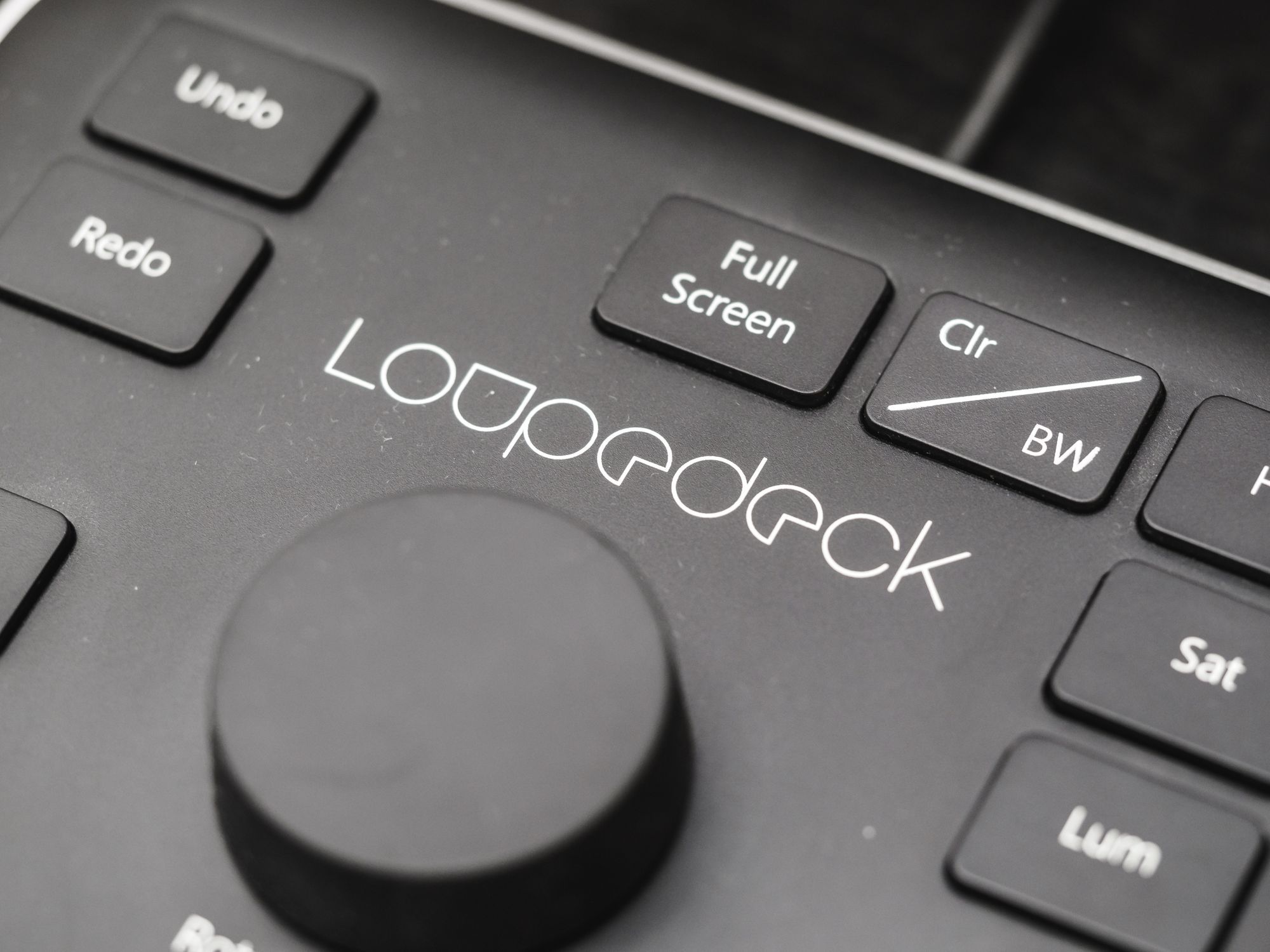
I like dedicated hardware.
Instead of reading on my iPad or iPhone, I use ereaders. Instead of gaming on my computer, I buy consoles. So it’s not surprising that the Kickstarted LoupeDeck editing console for Adobe Lightroom caught my eye when it was first announced.
Having now spent several months with it, I wanted to share some thoughts on how it’s affected my workflow and whether or not it represents good value for money.
The Promise
LoupeDeck’s appeal is that you have dedicated hardware knobs to manipulate controls in Lightroom.
Everything from catalogue-based tasks like picking and rating, to Develop module work involving HSL adjustments, Highlight/Shadow, etc. can be accomplished without mousing around.
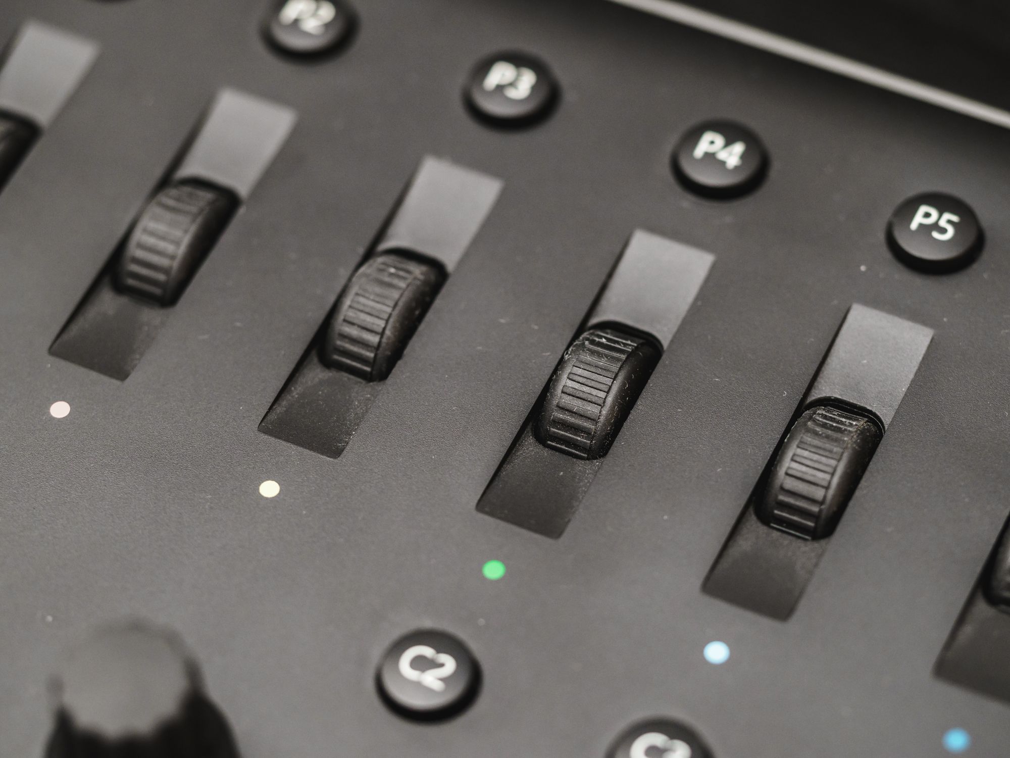
Critics have pointed out that this has been possible for years using cheap MIDI controllers that you map yourself. This is true, but while there’s merit to that approach, there’s also merit to having something that’s designed and laid out specifically for the task at hand. MIDI controllers are designed for use in a musical context, whereas LoupeDeck was clearly built by working photographers, and it shows.
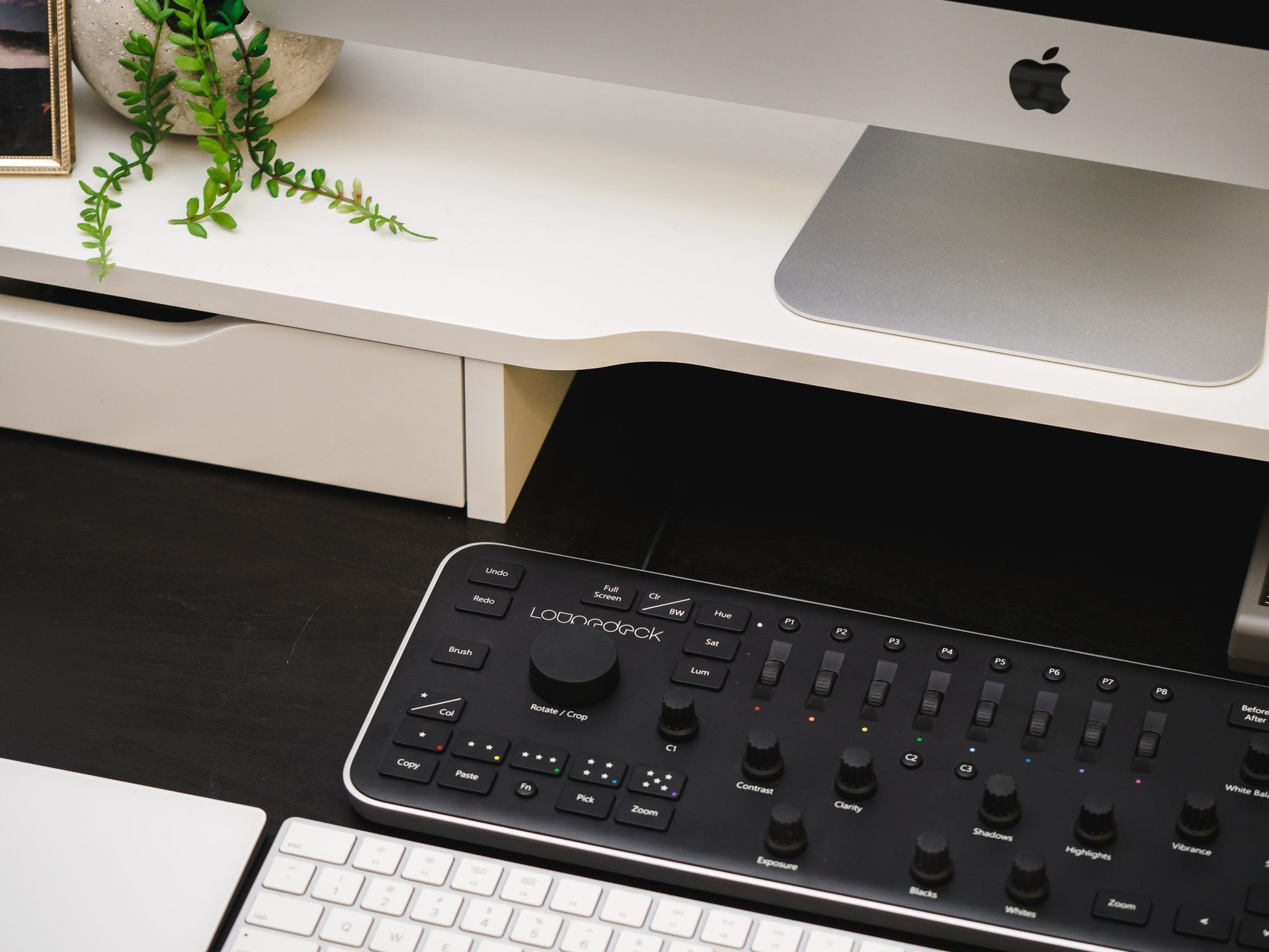
The features are arranged logically, and the type of control makes sense for the task.
In Use
It took me a while to get used to having LoupeDeck as my main point of contact within Lightroom, and even now I’m not convinced that I’m working any faster than I was before.
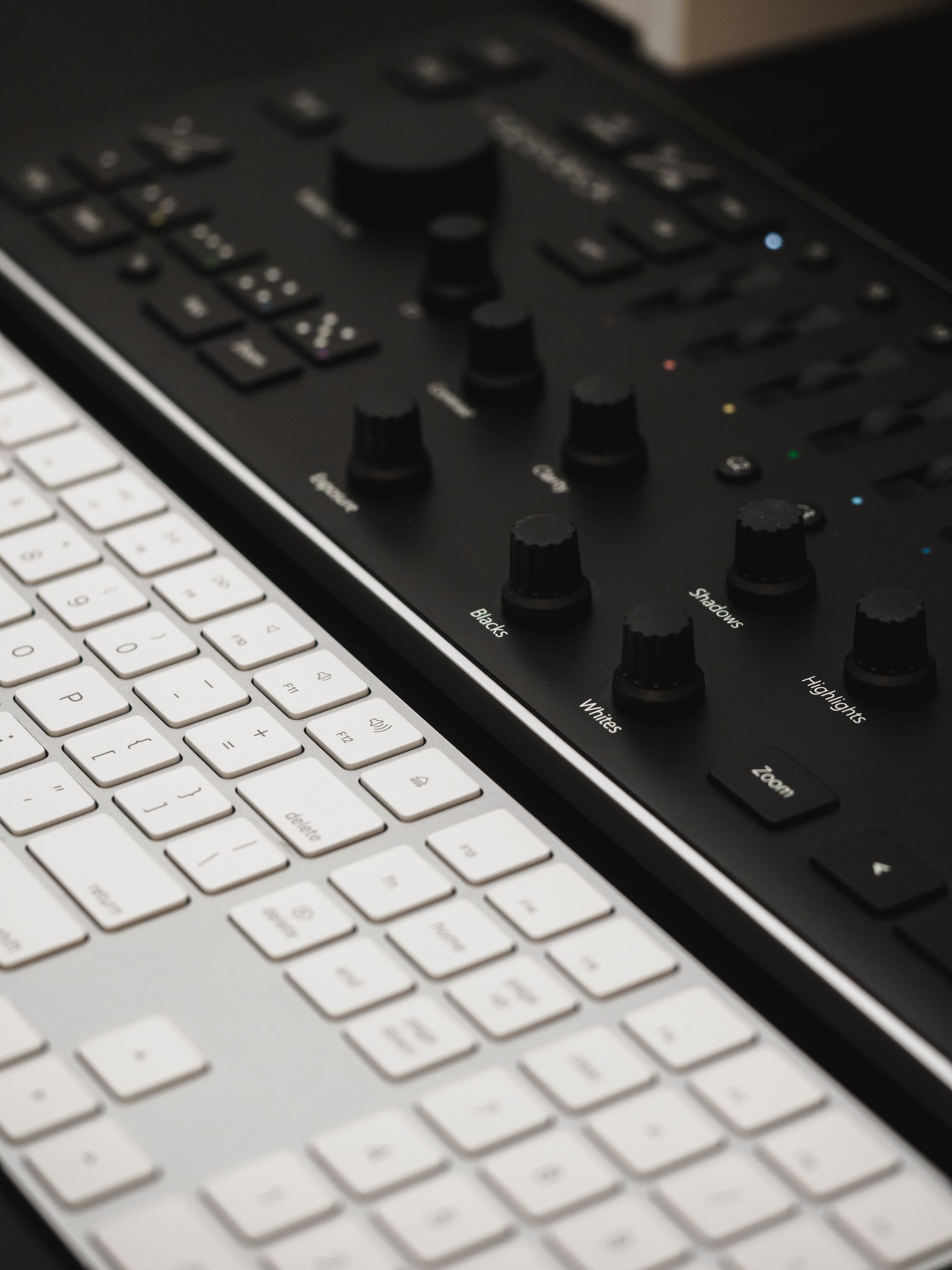
In fact, the main advantage for me has to do with ergonomics, not speed. Manipulating knobs, sliders, and buttons is less tiring for my hands than using a mouse or trackpad. It’s a different sort of movement, and there’s also a satisfying tactility to knobs and sliders that clicking and dragging just doesn’t match.
That being said, there are speed advantages to be had.
The dedicated controls mean you can adjust multiple things simultaneously, which is impossible when using a mouse. For instance, I now adjust control “pairs” simultaneously: White Balance and Tint, Highlights and Shadows, Blacks and Whites—one hand on each knob.
Adjusting the mapping for the customizable controls can also speed things up. You can send a photo to Photoshop for editing, switch from Library to Develop, show clipping, toggle tools, and more with a single button. Or you can invoke one of 16 preferred presets (one for each button from P1-P8 and then 8 more with the Fn button held down). The mapping options are fairly thorough, but I found myself missing a few:
- I wish I could assign one of the buttons to create a virtual copy
- I missed having Grain as an option for the C1 knob These seem like easy fixes, addressable in a software update, but other limitations are more troubling.
Room for Improvement
LoupeDeck is built fairly well and feels sturdy on my desk. It doesn’t wobble or creak in use.
I do have one hardware complaint though: button travel is unstable and slow, particularly for the large buttons. Corners go down more easily than the centre on large buttons, as if they have tiny switches and big key caps.
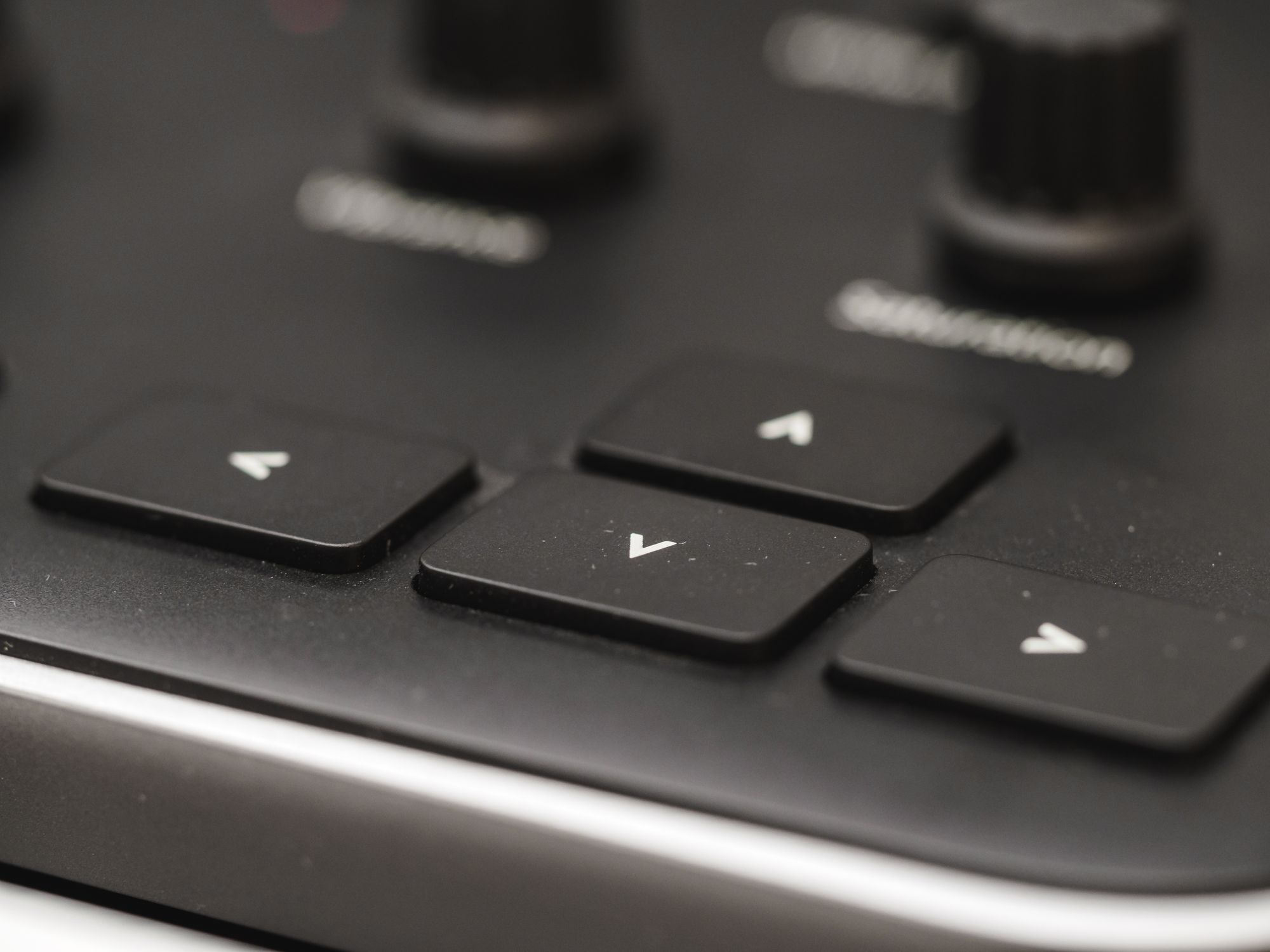
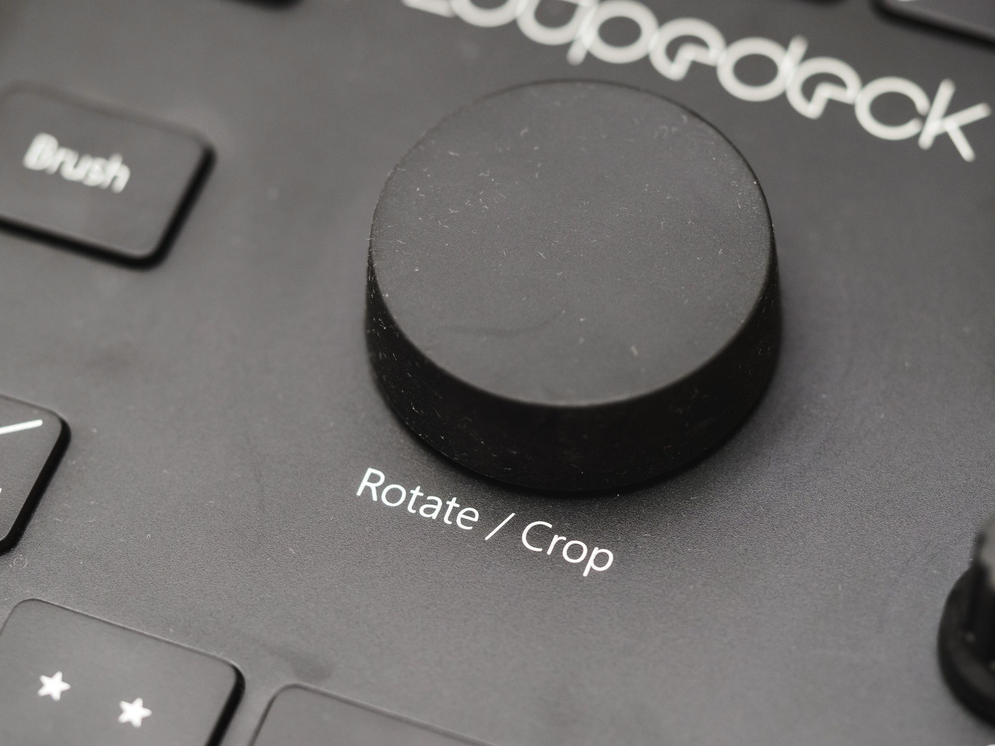
This is problematic because it often means that using the dedicated arrow keys to navigate through a catalogue is slower than using the arrow keys on my normal keyboard. Not only that, but the giant knob on the LoupeDeck does not scroll through photos in the Library view.
I found this baffling until I stopped to think about how all this is working behind the scenes: LoupeDeck is essentially a custom-designed MIDI controller.
MIDI, by the way, is a digital communication protocol developed for use in digital music production. It’s a way for hardware to communicate value changes to software, and it works by having a certain control mapped to a particular MIDI channel. Hardware knobs/sliders/etc. then send signal across that MIDI channel, and the software on the computer interprets it.
In Lightroom’s case, the various edit and navigation controls have been assigned a MIDI channel, and LoupeDeck’s hardware is sending the appropriate messages on the appropriate channel to trigger the effect you’re after.
The problem is that LoupeDeck can therefore only affect controls for which Adobe has provided a MIDI assignment. My guess is that scrolling through the Library isn’t something that can be targeted via MIDI, which means LoupeDeck can’t make its large knob work, despite it seeming like an obvious functionality to have.
Whether or not they can work around this with a custom-coded solution remains to be seen, but as of right now it’s a frustrating limitation.
Similarly, the reliance on MIDI behind the scenes has a few usability/convenience implications. The one that stands out to me is that in the Develop module, the sidebar doesn’t scroll to the control you’re manipulating via the hardware. This means that, if you’re adjusting something in a section that’s out of view, you have to use the mouse to manually scroll the sidebar if you care to see the specific values you’re adjusting to.
It’s hardly a dealbreaker, but it adds to my hesitation, especially in view of the LoupeDeck’s cost.
The Verdict
LoupeDeck costs €249 (about $300USD or nearly $400CAD).
That’s…a lot of money. It’s been the main critique levelled at the product since its release, and with good reason. The fact that you can accomplish this functionality for less than $100 with a generic MIDI controller and some extra setup hassle means that LoupeDeck has to really deliver on the experience.
And, much as I hate to say it, it doesn’t.
All the pieces are there: good hardware, thoughtful layout, easy installation and seamless connection…but LoupeDeck is less than the sum of its parts.
Its MIDI-based approach means it’s not functionally superior to a generic MIDI controller. The button travel is worse than a normal keyboard, and you still need the mouse to scroll, do brush work, and adjust things beyond the scope of the hardware—even common things like Curves, which I use all the time.
In practise, this means that any speed advantage I gain from using LoupeDeck for certain adjustments is defeated by the need to constantly switch back and forth between it and my mouse+keyboard.
If you’re looking for a hardware approach to improve the ergonomics or workflow of photo editing, I think you’d be better served by a drawing tablet like the Wacom Intuous Pro.