iA Writer vs. Ulysses
In search of the perfect writing environment
Note: I’ve since written a follow-up piece that revisits this comparison two years later.

The time has come: Ulysses is now available for iPad, and the Mac app has been given a Yosemite facelift.
For once, I’m experiencing this launch like everyone else. In a strange departure from my normal routine, I did not beta test Ulysses’ update, nor the iPad app.
Though I’ve admitted I tend to oscillate between several writing apps, I’ve become a faithful user of iA Writer of late. Much of that comes down to it being a consistent writing environment across all my devices.
With this revamp, Ulysses levels the playing field, so I knew it was time for me to put the two head to head. For science.
Doing so helped me recognize what I love about iA Writer, and how Ulysses’ latest update allows me to bring almost all of those aspects to a much more functional and self-contained writing environment.
Priorities and Contenders
In the interest of clarity, I want to lay out my criteria for judging these two apps. Your choice of writing environment is a deeply individual thing, so this way you’ll be able to tell if your needs align with mine:
- Beautiful, clutter-free interface
- Flexible, cross-platform workflow
- Powerful export options
To me, an app that manages to tick those boxes will be a contender for my daily driver, at which point the choice would come down to the individual nuances of its design, workflow, and additional functionality.
Examples include iA Writer (and its Pro incarnation, which I’m going to lump into the same name for the sake of convenience), Byword, and now Ulysses.
Byword isn’t included in this comparison because I have fallen out of love with it. Despite being my first plaintext writing app, I gradually came to prefer the way its competitors do certain things, including the basic layout of text, and the way the interface is laid out and interacted with.
That said, it remains a compelling option, and one that handles exporting particularly well, with destinations including live blogs and Evernote in addition to the usual suspects. It’s still the only cross-platform option that provides this natively.
Other strong writing apps are not being considered because they do not offer the cross-platform workflow that’s become increasingly important to me.
What I’m left with is a choice between iA Writer, my current favourite, and the refreshed Ulysses, whose predecessor has always been among my favourite Mac writing apps.
Design & User Experience
In a way, this is an unfair category for comparison because the apps have opposing design philosophies. Still, let’s begin with a look at the most important area: a new document.
The Document View
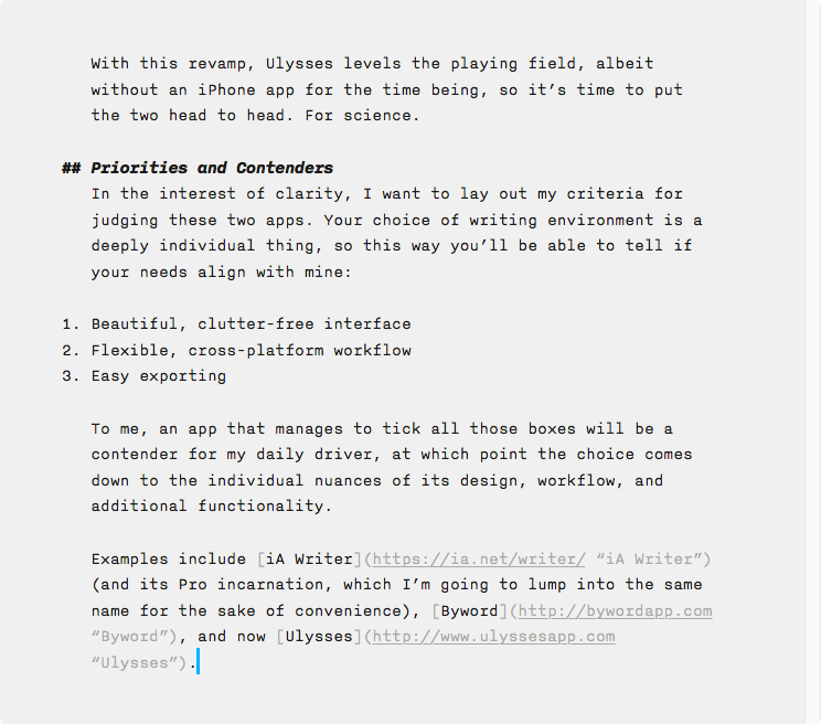
iA Writer is an extremely opinionated app; it chooses your font, it chooses your text size and margins, and it chooses the colours and styles used to display your markup.
All you can do is write.
Writer doesn’t care about your preferences, it cares about getting you to work, and in this respect it is an unparalleled marvel of engineering. As soon as you begin writing, the interface vanishes around you and all you’re left with is a pristine page and the words you fill it with.
Screenshots don’t do justice to the elegance of this interface, but you will feel what I mean the moment you start working in Writer.
Ulysses is wide open, allowing you to customize all these aspects and personalize the app to fit your preferences. This seems great, but any writer knows that the more things you can do instead of writing, the more tempted you will be to do those things instead of putting words on the page.
Functionality is a double-edged sword.
In my case, I made surprisingly few changes to the default settings that Ulysses ships with: I changed the font from Menlo to Source Code Pro, I used the ⌘+3 shortcut to collapse the interface down to just the editor view, I disabled current line highlighting, and I enabled centred typewriter scrolling.
The result is what I consider to be a very pleasing writing environment.
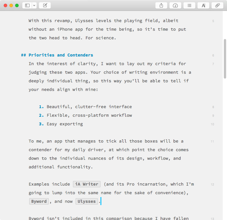
With one exception: I don’t want to see the toolbar while I write. In the standard windowed mode, Ulysses doesn’t provide a way to hide this, nor does it automatically fade like in iA Writer. So I’m stuck with it.
In the fullscreen mode, this is, of course, a non-issue as it’s considered the “distraction-free” mode. I just wish that I could have my clean interface in Ulysses while working in windowed mode like I can in iA Writer.
Another annoyance is the fact that the document’s scrollbar vanishes when you enable typewriter mode to centre the entry point on the page. I’m not quite sure why this is the case, but it means there’s no quick way to scroll through long documents if you’re using the typewriter mode.
These may sound like small details, but it’s nuances like these that weigh on you when you spend hours per day in an app.
Beyond the Page
For iA Writer classic, the design exploration essentially stops here. The document view is the only view. The Pro version expands upon this by attaching a sidebar to the app where its Workflow and Syntax Control features live.
Workflows are a peculiar inclusion that follow the proud iA tradition of being inflexibly opinionated.
The app is built around the notion that all writers work in stages: Note, Write, Edit, and Read. They’re self-explanatory, and Writer Pro gives each of these contexts its own text styling and highlight colour.
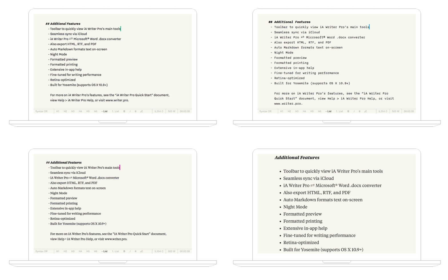
The idea is that you jot down a thought in Note view, then flip to Write view (using a convenient keyboard shortcut) to flesh it out, then on from there to Edit view for polishing, before it lands in the Read bin for final proofreading.
Despite following that path with most of my articles, I never got along with the Workflow aspect of Writer Pro.
The differing contexts are all identical in actual functionality (the excellent Syntax Control features are available regardless of Workflow state, for example) so I never found a reason to use them. I would create, edit, and polish my documents all in the Edit view, since its text styling appealed to me.
In other words, I was using Writer Pro exactly the same way as its basic sibling. Syntax Control is the only feature of Pro that I actually use. As the name suggests, it’s a way of highlighting particular aspects of your writing to help spot repetition, excessive adverb usage, and other bugbears.
It works very well, is tremendously helpful during the editing process, and is available for French, German, Italian, and Spanish too. I just don’t think it justifies the existence of an entirely separate, more expensive app.
A more elegant solution seems obvious: make Syntax Highlighting, Workflows, and the strangely segregated Night Mode[^2] available as an in-app purchase in the basic Writer for those who want those features.
While iA Writer is opinionated about how you write, it’s entirely agnostic as far as where and how you save your files. It follows the familiar paradigm of documents as files, saved either in its iCloud Drive storage folder or some other location of your choosing.
Ulysses is capable of working this way, but it discourages it. Instead, it offers its own library of documents that live within the app itself, not as individual files but as more flexible entities it calls “sheets”.
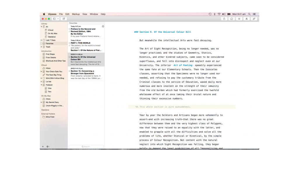
Sheets can be anything from single-sentence thoughts to full novels. They are instantly synced, infinitely version-controlled, automatically saved, and can be re-arranged, combined, and split very easily.
If you’ve used Scrivener, you’ll probably find this concept familiar. But where Scrivener treats each project as its own self-contained library of index cards, pages, attachments, and more, Ulysses provides a unified database for all your projects, and each sheet can contain its own annotations, attachments, and images.
There are several immediate advantages to this:
- Every word from every project is always at your fingertips, immediately accessible via search or the ludicrous Quick Open feature (
⌘+O) that surfaces documents containing your search term so you can resume working in an instant - The flexibility of sheets means you no longer need a separate environment for note taking and writing. Notes can become written pieces, several fragments can combine into one, and longer articles can be split into smaller sections at will
- Sheets are also taggable via Keywords, and you can either keep them in one giant pile or organize them using folders and subfolders (with customizable icons)
- Using sheets instead of standard files allows for additional functionality when writing, including images and attachments
The result is an entirely different way of looking at your writing archive. For those who love managing files independently, it’s unfamiliar territory and can be scary.
It’s a change worth getting used to though, because adopting it is the only way to experience Ulysses at its best.
Since both iA Writer and Ulysses are minimal writing apps, neither is particularly flashy or aesthetically complex—this is a good thing. Both are superbly crafted, with subtle detailing, and intelligent features built by writers.
Chances are you already have a sense of which you prefer from a design aspect, but design—as we’re often reminded—isn’t just how a product looks, but how it works, which brings us to my second criteria.
Workflow
Let’s begin with first impressions.
First Launch
A writing app is for writing, so what it does when you first open it is important. iA Writer (the desktop app) presents you with a file picker dialogue box, which I find tremendously annoying.
When I launch my writing app, it’s usually in a hurried state as I rush to jot down an idea. Having to decide where I want to save that idea, or even having to pause to find and click the “New Document” button before being able to write is jarring.
Just let me write. I can decide where to save the document later.
Being iA Writer, there are of course no options to change this behaviour, but if there were I would set it up to work something like this:
- On first launch, you get a fresh document, ready to write
- If you don’t close the document before exiting, that document is re-opened when you launch the app again
- If you do close it, subsequent app launches provide you with a blank document again
This way, it would launch ready to work.
I suppose the idea behind the file picker appearing is that you can choose between starting a new document or opening an existing one, but since I only ever open existing documents by opening the file itself, the option is just an impediment to my workflow.
As we’ve already discussed, Ulysses and its sheets make for a very different experience overall, but the initial launch is actually very similar.
Opening Ulysses will always leave you exactly where you last left off. Unfortunately, here too I must manually start a new sheet to get writing (this is a common issue—only Typed launches ready to write).
Once you’re up and writing, the workflow begins to diverge between these two apps.
Desktop Writing
Staying with the desktop apps for the time being, it won’t be long before you encounter the functional differences between them.
The most important will become obvious to those who often flip back and forth between multiple documents while working. In iA Writer, because it uses standard files, you’re stuck having to open a new window for each document.
Ulysses already has all your writing in its library, so you can use the Quick Open feature to flip to the exact piece you need and back again.
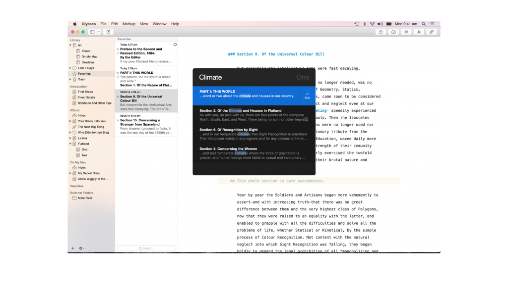
Of course, sometimes it’s preferable to have multiple documents open at once so you can glance at one and write in the other—Ulysses has you covered, as you can right-click any sheet to open it in its own separate window.
Both apps offer the basic Markdown styling options, but Ulysses goes beyond the basics to offer easy footnotes (finally), annotations, comments, and file attachments. Sheets are without a doubt more powerful than standard text files.
There are also some differences in the way similar features are implemented. For example, iA Writer provides the familiar ⌘+K shortcut for placing a link, and it speeds the process up by automatically pasting in URLs if you have one in your clipboard.
Ulysses does the same thing, but in its own way; if you have a URL in your clipboard, you can simply highlight the word/phrase you want to format and paste to create a properly formatted Markdown link.
Another small detail where iA Writer differs is the way styling shortcuts work. Ulysses is actually in the minority here, forcing you to explicitly select the entire word/phrase to style it. With Writer (and most other Markdown writing apps) you need only have the cursor adjacent to a word, and invoking the shortcut will style that word.
The time you save not having to select words for basic styling seems minuscule, but it adds up over hours of writing.
My second criteria included cross-platform workflow, so let’s look at this area next.
iPad, iPhone, and Interoperability
Not long ago, Federico Viticci of MacStories wrote about how the iPad had become his main computer. It’s a scenario that admittedly doesn’t make sense for a lot of professions, but writers are an exception.
And it got me thinking.
Ever since I switched to an iPad Mini from its full-sized sibling, I have been writing less and less on it. Something about the reduced screen size discourages me from doing as much writing on my iPad as I used to, and it’s a large part of why I’m looking forward to picking up a full-sized iPad again.
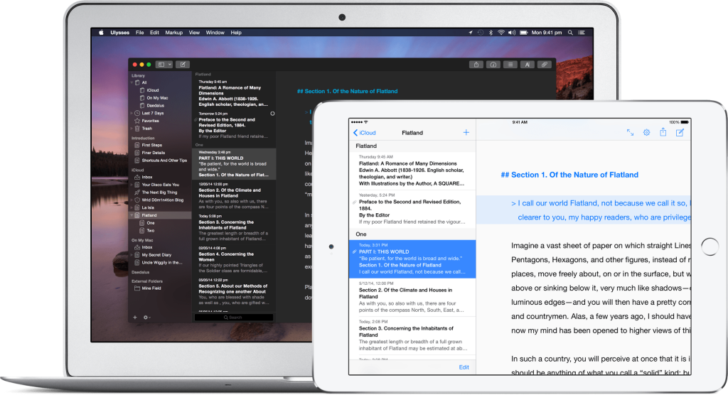
Nevertheless, I do love being able to continue working with nothing but my iPad and a keyboard. And now that Ulysses has a native iPad app, my main problem with adopting the app as my main writing environment has evaporated.
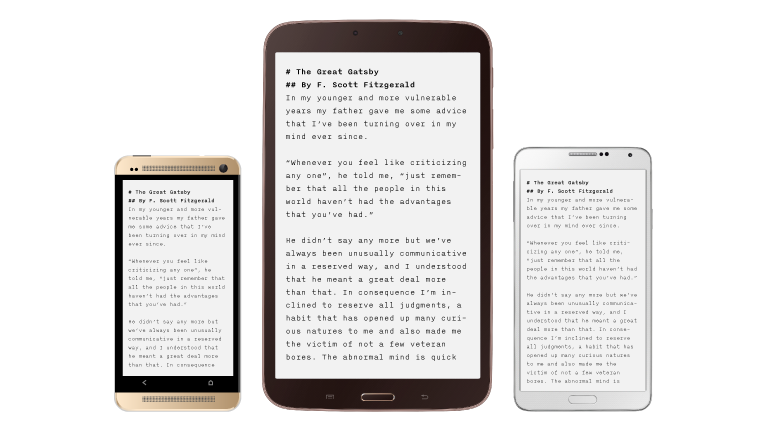
iA Writer has been cross-platform for ages, of course, and one of its greatest strengths is how consistent the experience is from Mac to iPad to iPhone. Recently, the family has even grown to encompass Android.
If you use the native iCloud Drive sync, or store your documents in Dropbox or your cloud storage provider of choice, you can keep your documents in sync no matter what device you’re accessing them from.
Ulysses’ native library makes it even more seamless since the entire prospect of managing files is taken off your plate. It’s all there, always. The problem is that Ulysses hasn’t made its way to iPhone or other ecosystems yet, but as long as you work either on a Mac or an iPad, it’s definitely the better experience.
What’s remarkable is that Ulysses’ iPad app has almost perfect feature parity with its desktop companion. For iA Writer, a functionally basic app, this isn’t as impressive. But for Ulysses and its extensive features, it’s an admirable achievement and probably a large part of why it took so long for the iPad app to emerge.
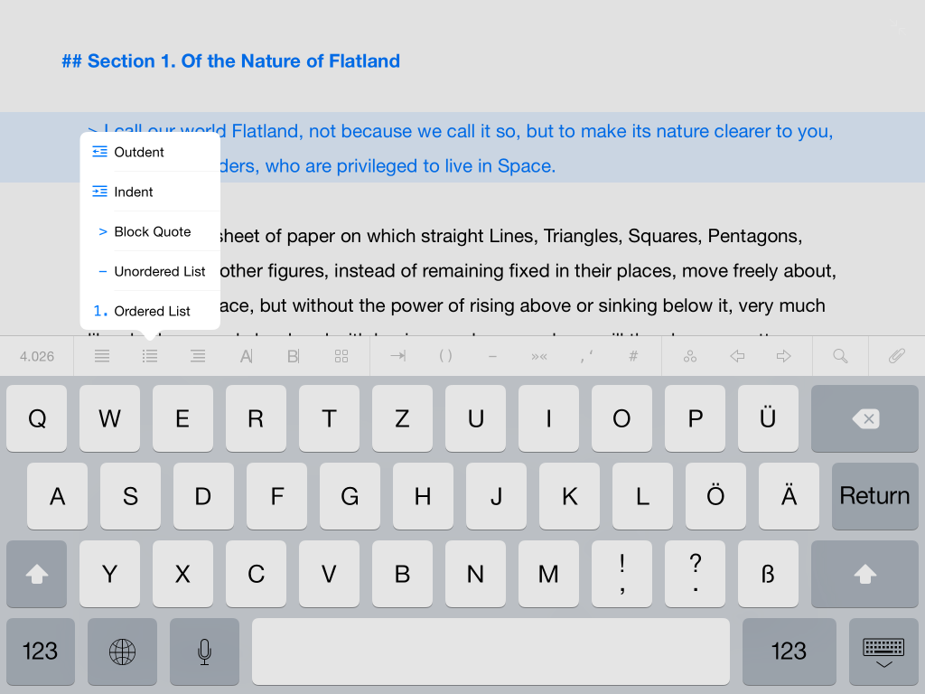
If I was hesitant about the unified library approach on desktop—and I was—it’s the mobile experience that finally sold me on its value. The fact that I don’t have to worry about files anymore is a huge relief, especially on an iPad.
The most magical part of cross-platform work is the new Continuity functionality that Apple has made possible in iOS 8 and OS X Yosemite. If you’re unfamiliar with it, it’s a protocol that app developers can make use of to enable a seamless “handoff” of work between the mobile and desktop versions of their apps.
In the case of iA Writer and Ulysses, it means you can be writing on your iPad and then open your laptop to see the Writer/Ulysses icon in the Handoff area of the dock. Clicking it brings you to exactly the spot you were looking at on your iPad, ready to resume work. The same applies in reverse as well, naturally. It works perfectly and feels obvious, in the way that all great features do.
One important caveat is that Handoff is only available to users of Writer Pro. The classic Writer does not have this functionality, sadly.
To me, Ulysses is clearly establishing a lead in this comparison, so it’s time to address my last criteria.
Exporting
Working in plain text means that the final stage is always preparing your work for its destination. In my case, that’s generally easy since I blog with Ghost and can simply paste the Markdown into the editor directly.
But a good writing app should provide more options, and both of these contenders do.
iA Writer provides plain text, rich text, HTML, PDF, and Microsoft Word output. Regarding the latter, it can also import .docx files and convert them to Markdown. I don’t use this feature so I can’t comment on how well it works, but for those who use Word extensively it’s good to be aware of.
The crucial limitation for iA Writer is that you have no control over the styling of the exported documents. Seemingly obvious things like being able to adjust fonts or text size or even what gets included on the page are impossible in iA Writer.
For example, the basic PDF output includes a date and time stamp beside the title on the header of each page. This is very ugly, but the utter absence of any configuration for iA’s app means you’re stuck with it if you want to use the native output.
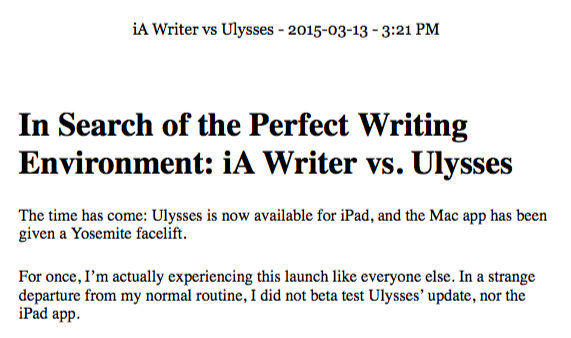
The same lack of configuration stunts every other export option as well, making it almost essential to use a separate app like Brett Terpstra’s popular Marked 2 for your exporting duties.
Marked is great, but…I don’t want to have to resort to a second app to accomplish tasks I expect of the first. To me, a writing app should facilitate the entire process, which includes exporting.
This is iA Writer’s achilles heel.
You see, Ulysses is magnificent at exporting. You can export to plain text, RTF, Word, HTML, PDF, and even ePub!
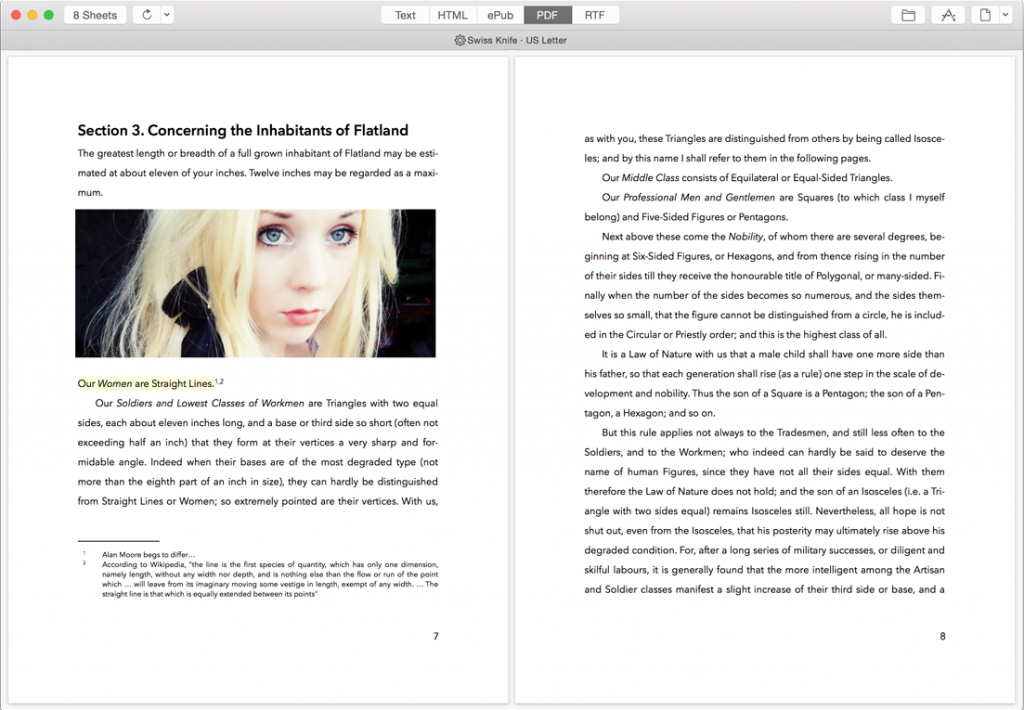
And thanks to the robust sheet system, you’re not limited to exporting documents separately—you can easily combine multiple sheets into a single export. This is handy if you’re working on a book with multiple chapters, as it allows you to keep each chapter on its own sheet while you’re working, and combine them only when you’re ready to publish.
What’s more, each of these export options provides you with a deep styling system that gives you the ability to custom tailor the output to your needs.
If you don’t feel like customizing, you can head over to the Style Exchange to download output styles that others have assembled. Then you can simply pick one when you export. Downloaded styles can be managed in the app’s preferences.
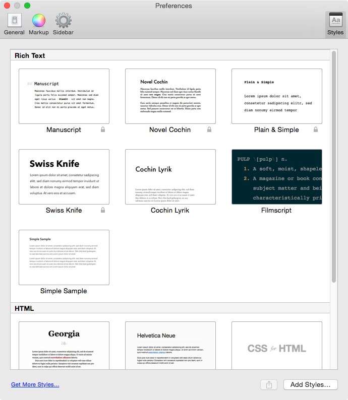
Needless to say, the Style Exchange also includes themes for Ulysses itself, so you can refine your perfect editing environment and share it with others, or try theirs.
Most impressive of all is the fact that the iPad app retains these export options—custom styles included.
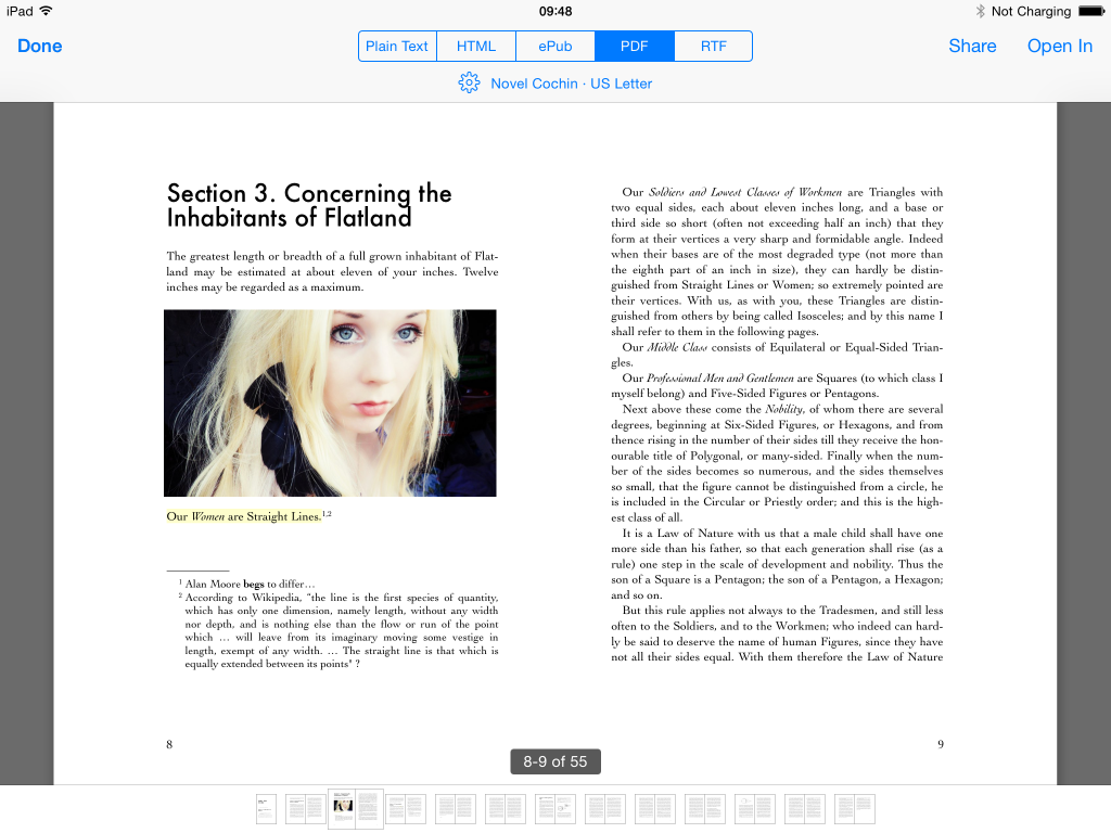
In every other category, you could argue that these two are competitive, but when it comes to exporting, Ulysses is objectively superior—by a large margin.
Having examined how the apps fulfill my criteria, it’s time to wrap up by reflecting on how it all contributed to my decision to switch from iA Writer to Ulysses.
The Ideal Writing Environment
If I’m being honest, I think I always wanted to use Ulysses. From the moment I first tried it, at the recommendation of several colleagues, I knew it was something special.
What bothered me was the general unease that comes with adopting a new workflow—having my documents abstracted away in a unified library that I couldn’t back up was (and in many ways continues to be) strange.
The advantages were undeniable though, and the more time I spent working within this paradigm the more I realized that it really is superior for the kind of work I do.
Unfortunately for previous versions of Ulysses, I enjoy writing on my iPad. I love the focused environment and I love the portability and comfort of being able to work anywhere with better battery life and fewer distractions than my laptop.
That being the case, I fell back to using the next best thing, which was iA Writer. The app is ruthlessly simple, and that simplicity forced me to focus on writing instead of formatting. That’s the whole point of plaintext writing, and I embraced the limitations. With the Pro version, I gained a superb set of editing tools with Syntax Control.
And I could write on my iPad, even my iPhone (I don’t find myself doing this, but it was nice to know I could).
But that was then and this is now. I’m writing in Ulysses, and it feels…perfect.
With the configuration options available, I was able to recreate much of what I loved about the writing experience from iA Writer, and the app lets me focus or not focus on writing as I see fit. It’s a tool, not a taskmaster.
I do miss Writer’s Focus Mode, its elegant sentence-by-sentence view (the current line highlighting in Ulysses is a poor substitute), and I miss Writer Pro’s Syntax Control for editing, but by and large I consider it a significant upgrade.
I retain a comfortable writing environment, but I gain more robust features, statistics, export options, the power to adjust settings, and I can still take the whole experience with me on my iPad.
I’ve distilled my impressions into a brief pro/con arrangement:

iA Writer Pros
- Extremely immersive writing experience, aided by fading toolbars and the terrific Focus Mode
- Lean, dependable cross-platform app that’s available on more platforms than the competition
- Syntax Control in the Pro version is very useful
iA Writer Cons
- Frustratingly stubborn about trusting you with configuration options: what you see is what you get and there are exactly zero things you can adjust
- Functionality is limited compared to the competition, especially when viewed against Ulysses’ elaborate sheet system and its advanced Markdown support
- Writer Pro’s Workflows are functionally irrelevant and do very little to justify their existence. Even if your workflow aligns with the assumed one, the hassle of having to flip between contexts instead of just continuing to write is tiresome and provides no functional benefit.

Ulysses Pros
- Robust, customizable writing environment that can scale from a complex three-pane view to a minimal editor
- Impressive feature parity between desktop and iPad app
- Sheets and unified library system provide a number of meaningful advantages over file wrangling, including speed, flexibility, infinite versioning, and the beauty of never wondering where or whether a document is saved
- Powerful document statistics with word goals
Ulysses Cons
- Small interface quirks like the inability to hide the toolbar in windowed mode, display a scrollbar in typewriter mode, and the less streamlined implementation of styling shortcuts versus iA Writer
- No easy way to export your document database as a monolith for backup purposes, even if it’s in a proprietary file format
- Limited to just Mac and iPad (for now)
- No equivalent to Syntax Control. I would love to see something like Syntax Control and/or Hemmingway integrated into Ulysses
Conclusion
The charitable conclusion here is that both apps are great and which app ends up being the best for your needs will depend on whether you have the same priorities as I do.
But reality isn’t so politically correct.
What remains true regardless of preferences is that Ulysses is an app that puts you in control and is willing to adapt to suit your needs.
iA Writer is a very capable option, but it’s their way or the highway—if your needs align with their philosophy, then you’ll be in heaven, feeling like you’re working in an app built especially for you.
For the rest of us, the app is a frustrating mix of genius and aggravation that gets in the way as often as it helps. When I had no other option that fulfilled all my needs, I made do with iA Writer and life went on. It’s only a text editor, after all.
But now that Ulysses 2.0 has emerged from its chrysalis and spread its gorgeous wings (quite literally—the new logo is a butterfly), there’s no longer any question in my mind about which writing environment is the best.
It’s Ulysses, and you owe it to yourself to try it out if you love writing as much as its creators do.
review digital lifestyle productivity