Kindle vs. Kobo: The Future of Reading
The future of reading
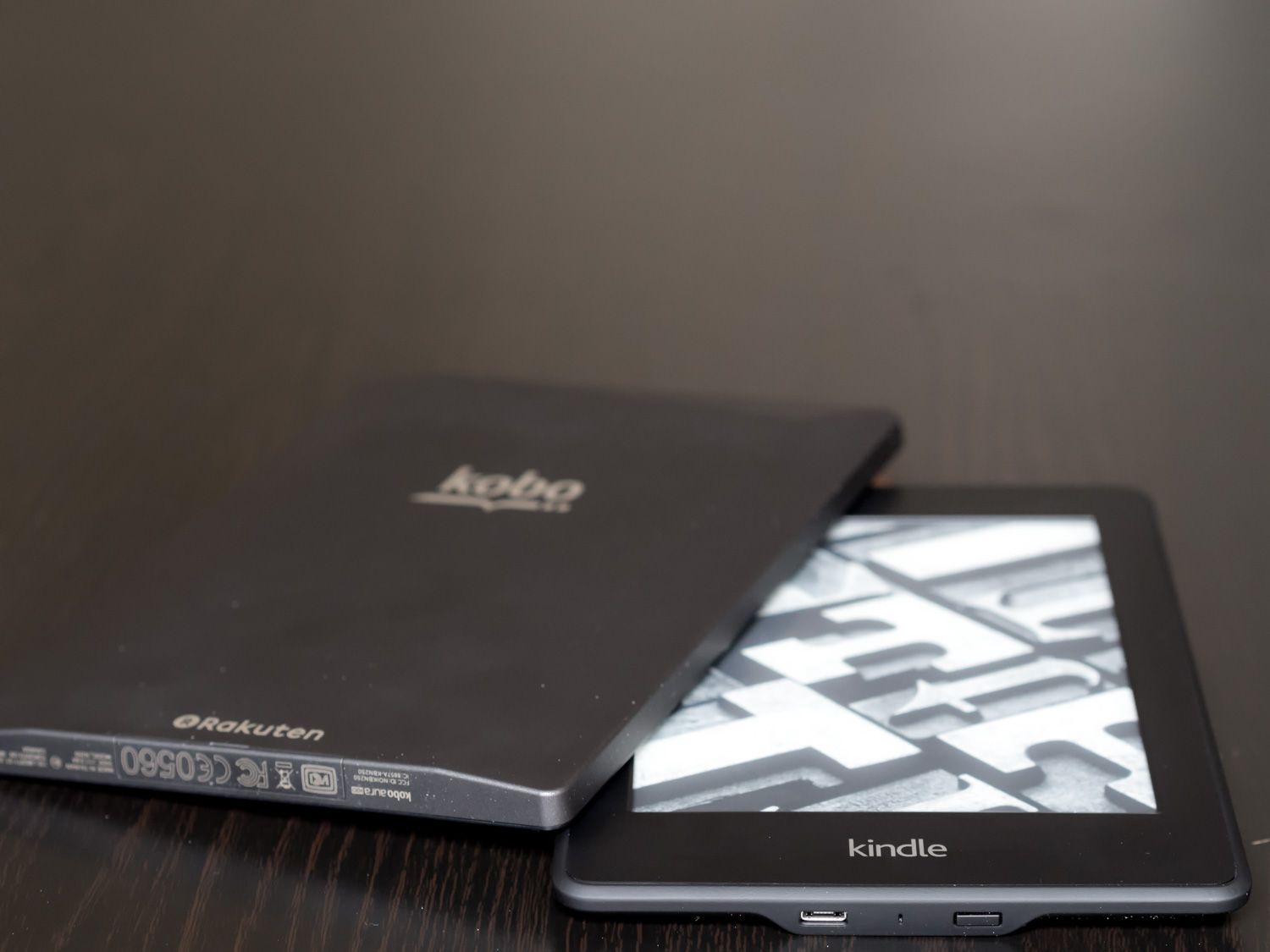
Remember reading?
Before technology became a prism splitting our mind’s eye into competing beams of attention, we used to feed our imagination with words on a page.
It required our full attention, this mind meal, and was tremendously nourishing. It has since become something of an acquired taste. It was called reading.
Not scanning, not skimming…reading.
Where Reading Went
As someone who grew up reading, I’m left with a deep-seated curiosity about where this past-time, obsession—whatever it is to you—is going.
One possibility is that it’s headed for extinction, but I’m more optimistic than that. Another possibility is that it’s simply headed to a more connected place, like most other things in our culture. But I fear the internet may be a hostile environment for reading as we used to know it.
For example, you’re still here. Still reading. That puts you in the shrinking percentage of people who have gone past the headline and devoted additional minutes of your time to engaging with this article. I’m grateful.
And I understand the difficulty. Your struggles are my struggles. Reading on our own terms—unassailed by notifications and ads and pop-ups and pings—is difficult on the internet, and on the many devices that connect us to it.
That’s why e-readers exist. And that’s where true reading has found refuge.
E-Reading
How many people do you know who bought an e-reader and boasted about the many more books they’re reading now than they used to? Or perhaps you are that person; I know I was.
E-readers are unusually limited by today’s standards, but they’re less confusing than people make them out to be. We’re used to judging devices by how many things they can do; compare an e-reader to a tablet, and you will find it wanting. Chris Ziegler called it the duck-billed platypus of the gadget world.
But this kind of thinking is missing the point. E-readers don’t have to justify their existence compared to tablets because all they’re designed to do is replace paper books.
How We Got Here
Earlier this year, I wrote about my switch from Pocket to Instapaper.
Besides being one of the more popular entries on the site, it sparked a fair bit of feedback about reading in general and what my stance was on the major e-reading options on the market. It’s a subject that’s dear to me, and I wanted to do it justice, which is why this article has been months in the making.
My history with e-readers is a colourful one. It began with me supporting the underdog. When the Kindle was still establishing its leadership, Barnes & Noble had its fascinating first Nook on the market.
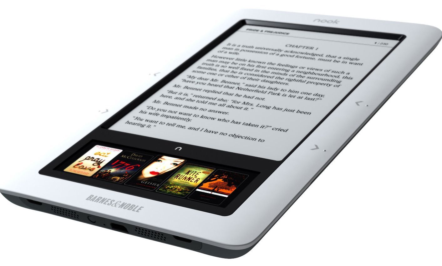
The Nook, with its small colour screen strip beneath the e-ink, was peculiar. It was a bold, innovative design choice. It was also a solution in search of a problem, and ultimately it failed to impact Amazon’s lead.
A year later, I graduated to my first Kindle: the beloved Kindle Keyboard.
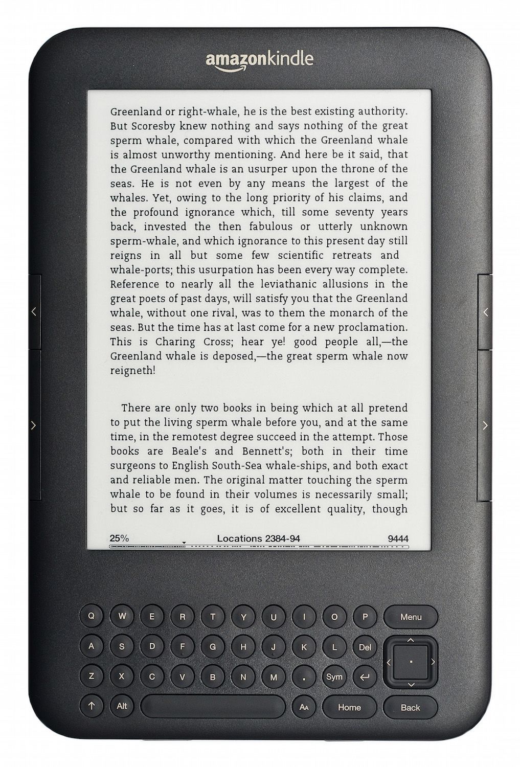
With its hardware page turn buttons and comfortable design, it was one of the most popular models in the Kindle lineage and remains one of my most treasured technological relics.
Unexpectedly, I won a Kindle Paperwhite from my mobile provider a few years after that, and it has rarely left my side.
The Paperwhite is an exceptionally designed product; comfortable, light, and reliable. It lasts forever on a charge, its then-innovative front lighting technology was exciting, and by then the Amazon ecosystem had evolved into a finely tuned machine.
I had reached e-reading nirvana.
The trouble is that technology keeps evolving, and while the e-reading space does so more slowly than other markets, it does make progress. Just like I inadvertently ignored Instapaper’s strengths for the longest time, I felt myself making the same mistake with e-readers.
Kindle shares its market with several competitors, the most notable of which remains Kobo. Here in Canada, Kobo actually claims the majority market share, so I knew that anything I wrote would have to discuss both options.
Thanks to the kindness of Kobo—with their HQ just a few minutes away from me—and Amazon, I was able to outfit myself with the latest and greatest in e-reading technology and really put them to the test.
Note: this comparison was written primarily between the Kindle Paperwhite 2 and Kobo Aura H2O, but I’ve since had an opportunity to review the Kindle Voyage as well, and comment on how it and the more recent Paperwhite 3 fit into the e-reading landscape.
Physical Considerations
We handle books differently than tablets and other digital devices. We’re more used to holding them above us as we read in bed, more likely to toss them unceremoniously into a bag, and less careful in general with them.
Some of these differences translate to e-reader usage, which is why their physical design is an important part of the experience.
Size
For many years, the accepted standard for e-reader screen size was 6 inches. This is large enough to provide the equivalent reading space as most paperback books while retaining portability.
The Kindle Paperwhite (both my original and the Paperwhite 2) maintain this screen size, as does the new Voyage. Kobo has been more willing to experiment, offering a range of options between the tiny Kobo Mini and larger Aura HD and Aura H2O.
Whether or not bigger screens will become standard like they have on smartphones, one thing is certain: the difference is not subtle.
The Kobo Aura H2O’s screen is only about an inch bigger than the Kindle’s, but it feels expansive and luxurious. Even though I tend to set the margins to maintain a comfortable column width, the impression is of a less crowded interface.
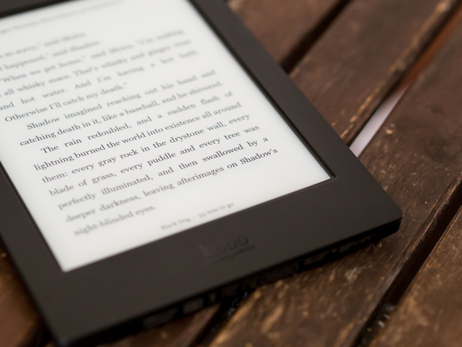
The problem is that this increase in screen size leads to an increase in the overall bulk of the device. Unlike many tablets, e-readers maintain a large bezel around their screens. Bezels are aesthetically unsightly, but they’re very practical for devices where you’re passively holding more than actively interacting.
For the Kobo, this results in a device not much smaller than my iPad Mini. It’s not as tall, but it’s almost as wide, and thicker too. You can see the approximate size differences in this stack:

Of course, given the materials and internals it remains way lighter, but the added bulk isn’t negligible.
This goes back to the difference in usage patterns. Tablets get picked up and put down a lot, or propped up using their case, or docked in front of us. Books, and by extension e-readers, tend to be held up in front of or above us, sometimes for hours at a time.
Despite the perceptual benefits of the larger screen, I can’t help but feel that the Kobo’s size is just a bit exaggerated, its weight just a bit heavier than I’d prefer. It feels like one of those large-type book variants—justifiable, but somehow not as natural to hold.
I realize this sounds biased by my familiarity with 6-inch screens, but I deliberately spent the majority of the review period using nothing but the Kobo, as that was the device I was less accustomed to. I became acclimatized to the point where the Paperwhite felt small, but whenever I picked the Kindle back up there was a sense of relief.
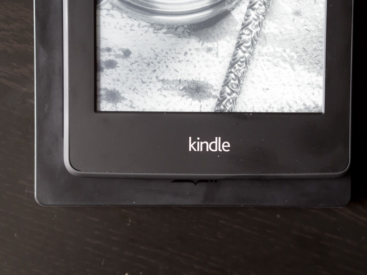
From a pure sizing perspective, I prefer the trade-off of a smaller screen for a lighter, more comfortable size.
Lighting
Since Amazon first introduced their front-lit Kindle Paperwhite, the industry has been quick to adopt the technology. The Paperwhite 2 and Aura H2O both represent a refined version of the initial technology.
Placing the Paperwhite 2 beside my old Paperwhite, the difference between the lighting is clear. At equivalent brightness settings, the new screen’s light distribution is noticeably more even, and I find the colour temperature to be less chilly. The blue-ish tint of the original Paperwhite is replaced by a soothing bone-like white.
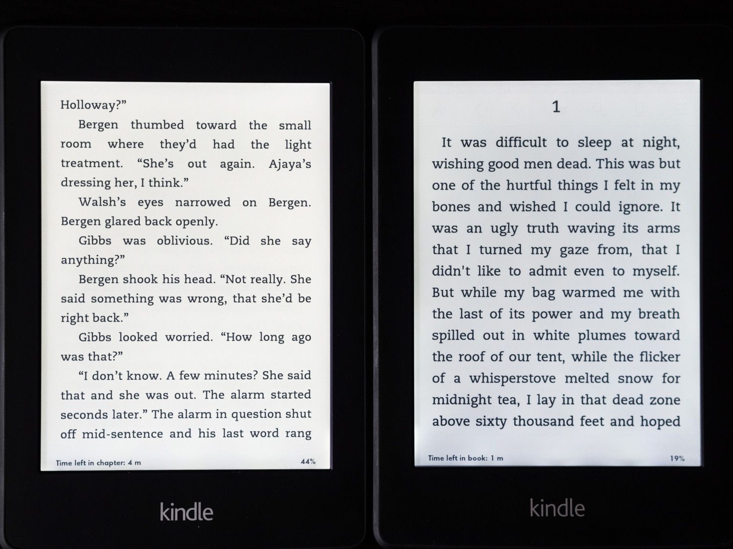 The Paperwhite 2 is on the left in this comparison, with the original beside it.
The Paperwhite 2’s screen is great, but the H2O’s screen lighting is better. At least on my unit, the light distribution is flawless. The only downside is that it too looks slightly blue compared to the Paperwhite 2.
The comparison becomes more complicated when you introduce the Kindle Voyage into the mix, because the Voyage’s screen, while still 6″, has a higher display density (300ppi vs 265ppi), and more even lighting than its predecessors. The same is also true of the third generation Kindle Paperwhite, which shares the 300ppi screen of the Voyage.
For more on that particular comparison, I refer you back to my Kindle Voyage review.
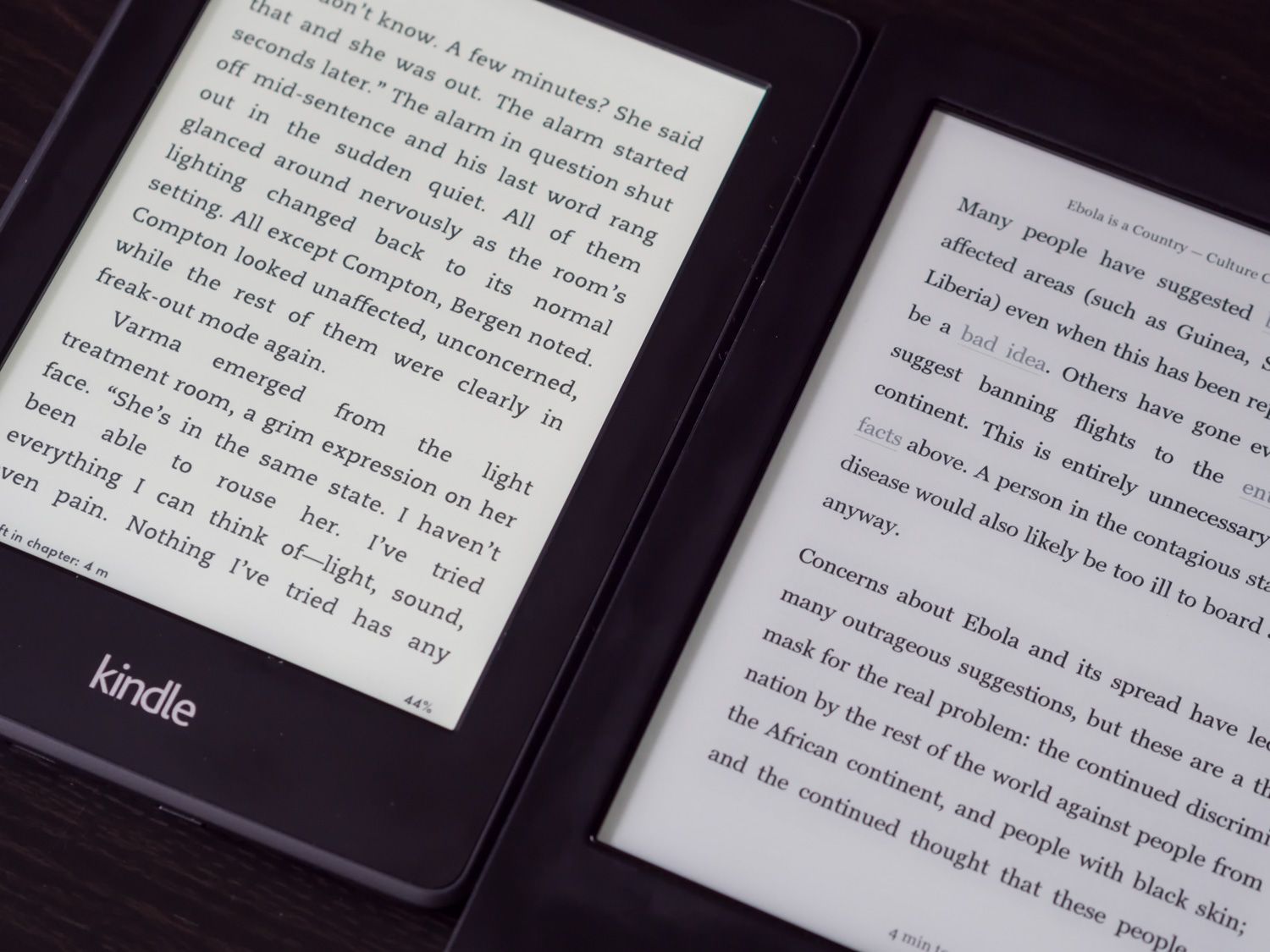
Strictly between these two—the best available e-readers in Canada—the Aura H2O has the better screen.
Materials & Interaction
Both readers use a very comfortable soft-touch material in their construction, resulting in a rubbery, secure grip for long reading sessions.
The Paperwhite’s front bezels are a slightly glossier material than its back, which makes it a bit of a fingerprint magnet. The Aura H2O is similar but retains a more matte finish.
Kobo’s rear case design features some of the angular accents that characterize Amazon’s Fire tablets, but they’re shallow enough that they don’t impact ergonomics in any meaningful way.
They do frame the “Kobo” etching on the back very handsomely though.
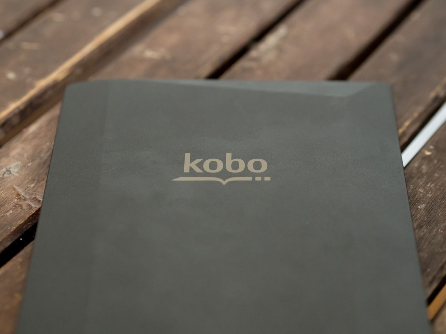
Speaking of etchings, the only way to distinguish the original Paperwhite from the new is to flip them over—the latter says, “Amazon” on the back instead of “Kindle”. If you’re paying attention, you’ll also notice that the Amazon etching has slightly glossy lettering instead of the matte ones on the original.
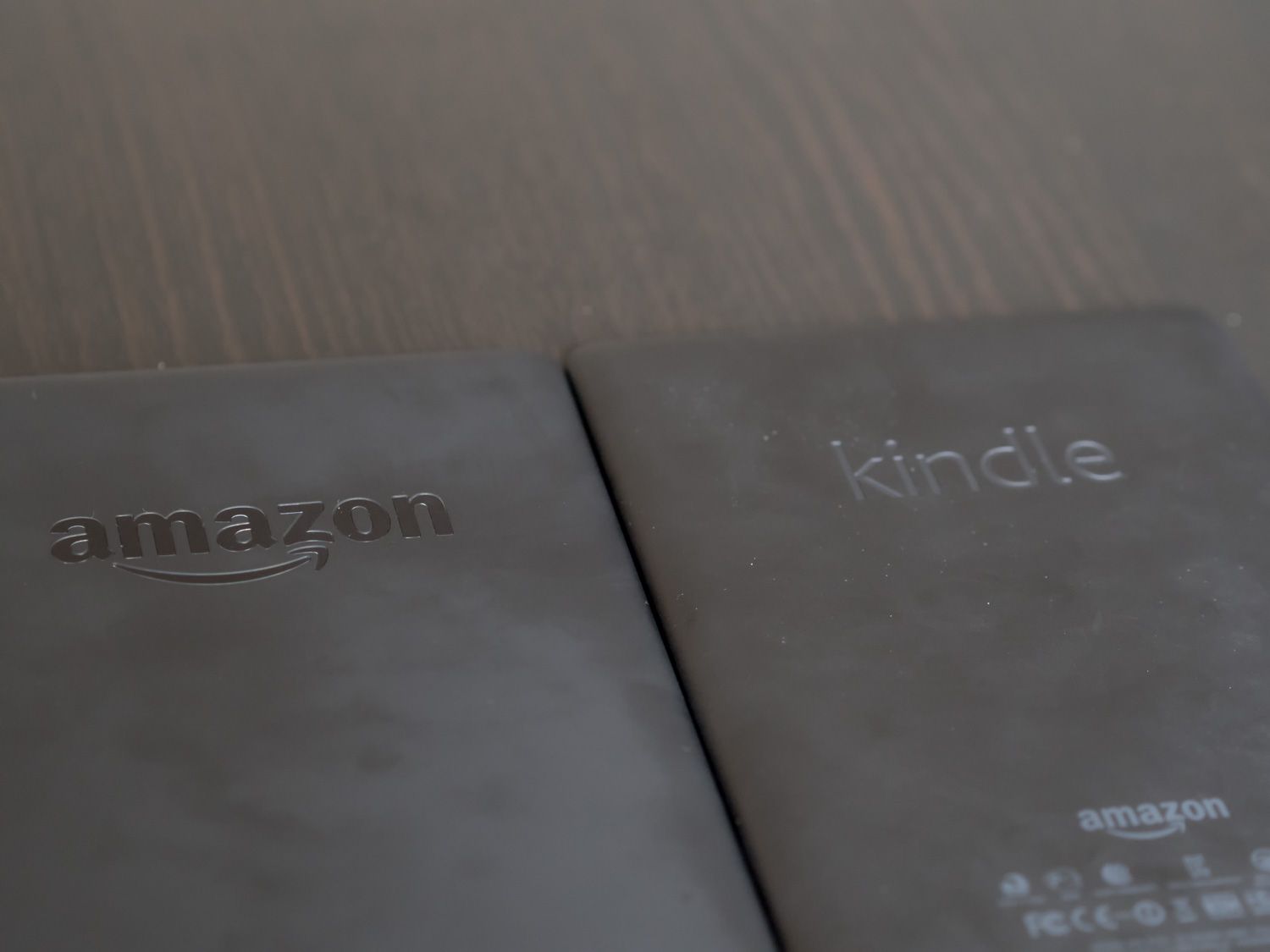
Both Paperwhites share an otherwise subdued and unremarkable design, which doesn’t bother me in the slightest: function over form.
The Voyage introduces more of that angular design language, but I haven’t seen or held one in person so I can’t comment on how that affects the reading experience.
Waterproofing
The Kobo has another trick up its sleeve. The H2O name alludes to the device’s ability to shrug off moisture. Even total submersion in a pool won’t faze this Kobo.
It simply pops up a helpful dialogue indicating that it’s sensed the presence of water on the screen, and life goes on. If you were so inclined, you could theoretically read underwater with it—it can hold its breath longer than you can.
This is undoubtedly cool, but I find myself questioning its practical value. There really aren’t that many contexts in which an e-reader is at risk of drowning in your average lifestyle. Trips to the beach/pool are one, and reading in the bath is another.
As someone who has encountered both situations on several occasions, all I can say is that so far I have not felt that my Kindle was at risk.
That being said, perhaps others will find this invaluable. Indeed, some obviously do, as there are entire services devoted to waterproofing Kindles.
If waterproofing isn’t important to you, but you want a Kobo, the Kobo Aura HD provides almost the same device without this additional perk and at a more competitive price point. Just keep in mind that the HD uses the older e-Ink Pearl technology, whereas the H2O uses e-Ink’s newer Carta screen (like the Kindle Paperwhite 3, Voyage, and Oasis).
Ports & Buttons
The standard MicroUSB port on both devices means charging shouldn’t be a problem, but the Kobo’s waterproofing requires that it hide its port beneath a flap.
This flap is very snug, and the force required to pop it open didn’t feel benign. Unlike the Kindles though, the Kobo hides an entirely different port as well: a MicroSD slot.
It allows for the internal 4GB of memory to be expanded, though this is only useful if you have a gigantic library of PDFs and books that you must have on your device at all times.
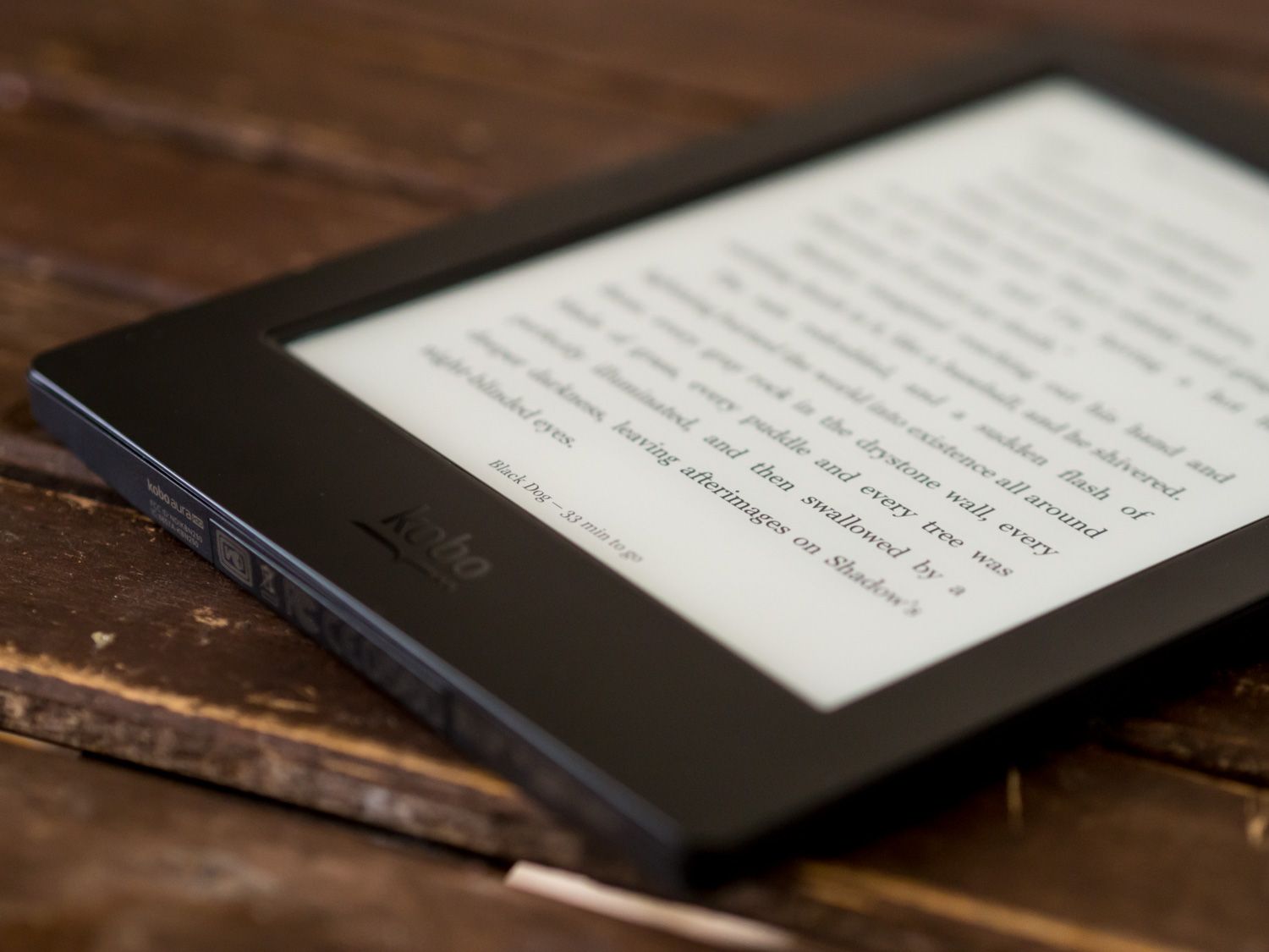
For those of us that keep only a handful of things on our e-readers at any given time, even 4GB is overkill, let alone more.
It doesn’t hurt to have it, but this isn’t a feature that would sway my decision one way or another.
To me, the most noticeable physical difference between the two devices was the location of the power button. On the Kindles, it’s at the bottom, beside the charging port. The Kobo places it on the top edge, off to the right like a tablet or smartphone.
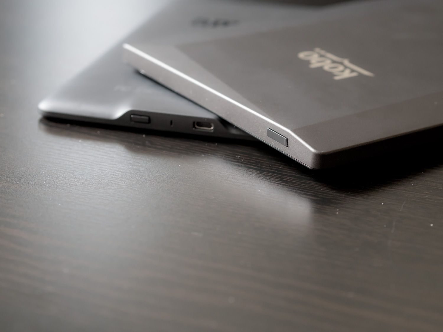
If you put your e-reader in a case with a magnetic flap, then this is not going to matter to you, but if you like to keep them uncovered for maximum lightness, you will probably agree with me that the Kobo’s placement makes a lot more sense.
While reading, it’s natural to hold the e-reader primarily by the larger bottom bezel, or even rest it against your body if you’re lying down.
If the power button happens to be on that bottom edge, like the Kindle’s is, then you’ll probably find yourself inadvertently putting your book to sleep more often than you’d like. There’s a reason that Kindle cases tend to provide a lot of buffer space along that bottom edge.
For the Voyage, Amazon finally changed this and put the power button on the back of the device.
Reading Digital Books
More than most devices these days, e-readers are focused. You can’t multi-task, they don’t make noise, and you can only use them for one thing: reading.
As a consequence, we tend to be very critical of how well they perform their one task, which is why I want to break my assessment down into the key aspects that define an e-reading experience:
- Typography, layout, and book display
- Ecosystem and Book Management
- Extensibility, Sharing, and Additional Features
Let’s dig in.
Typography, Layout, and Book Display
Typography is the architecture of the written word.
Studies repeatedly demonstrate that the choice of typeface has a powerful impact on how content is perceived and interpreted. It goes without saying then that getting this aspect right is of monumental importance for an e-reader.
The Kobo Aura H2O exceeded my expectations here. Trounced them, really. When it comes to typographic fidelity, there’s simply no contest.
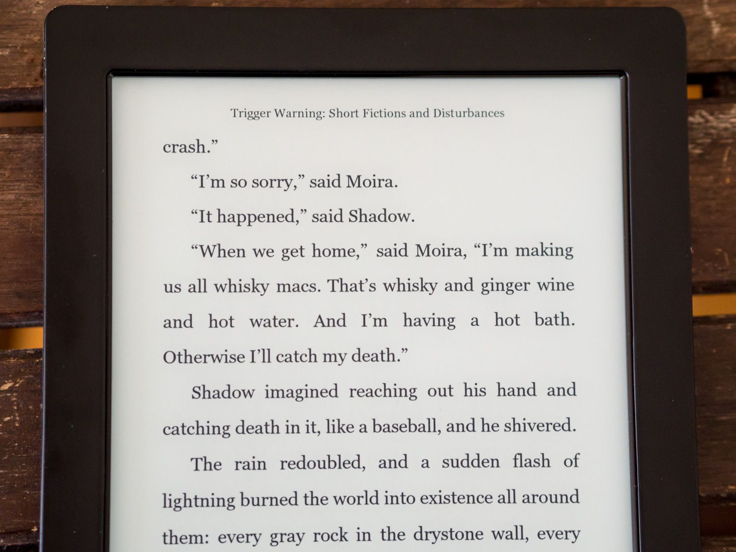
While the Kobo’s screen offers it a modest advantage in terms of pixel density (265dpi vs. 212 on the Kindle Paperwhites), that’s not what makes the H2O better at displaying type. It’s the type engine itself.
Kobo offers ten different fonts, 24 sizing options, and the TypeGenius function for customizing the sharpness and weighting of those fonts to render exactly the way you want them to. You can also use custom fonts natively on Kobo e-readers.
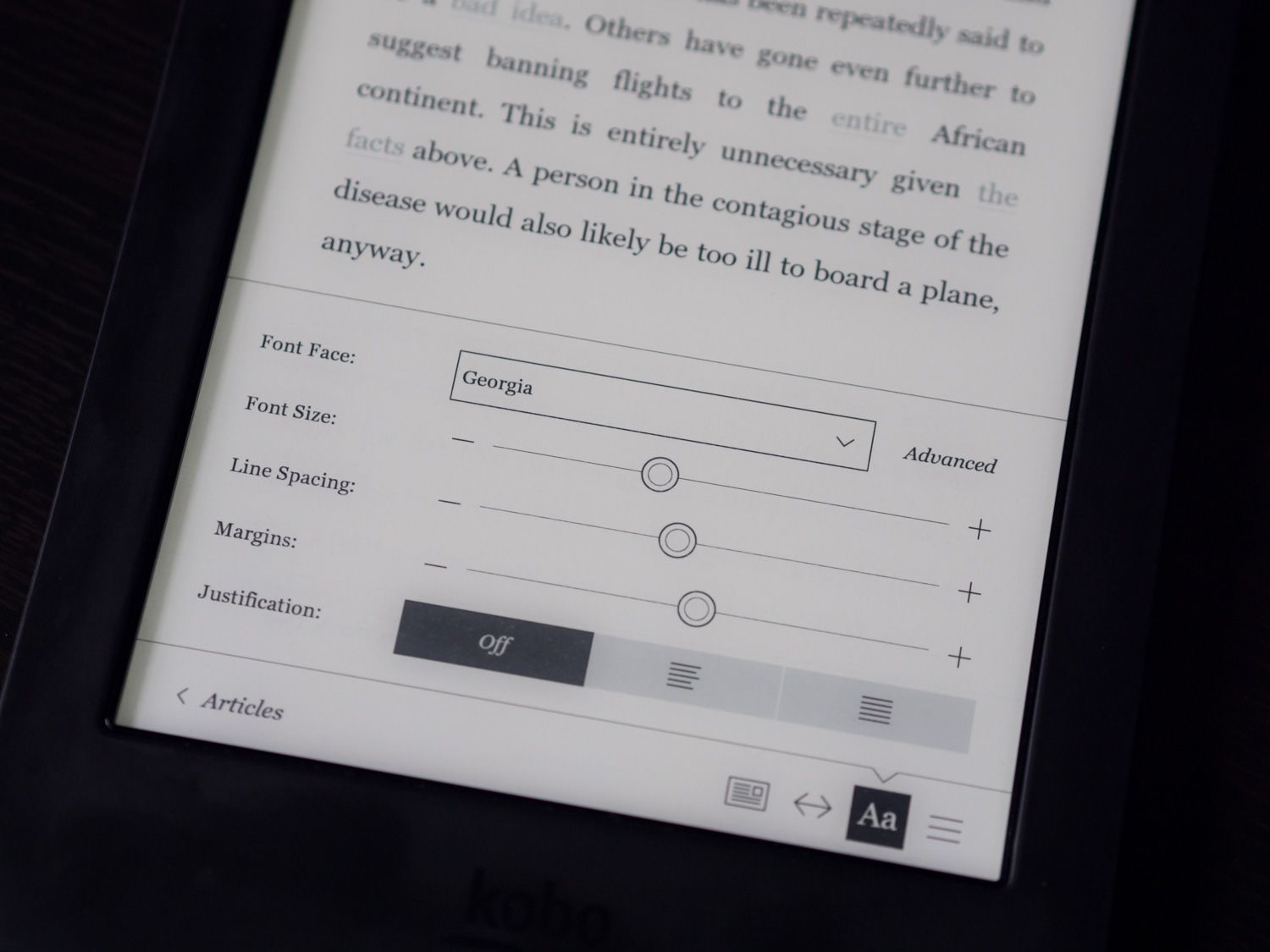
Besides font choices, you can also make granular adjustments to line height and margin width, each controlled by a dedicated slider. A rarely mentioned tweak that you can make is to adjust the target areas for page turns. On a Kindle, these areas aren’t user adjustable.
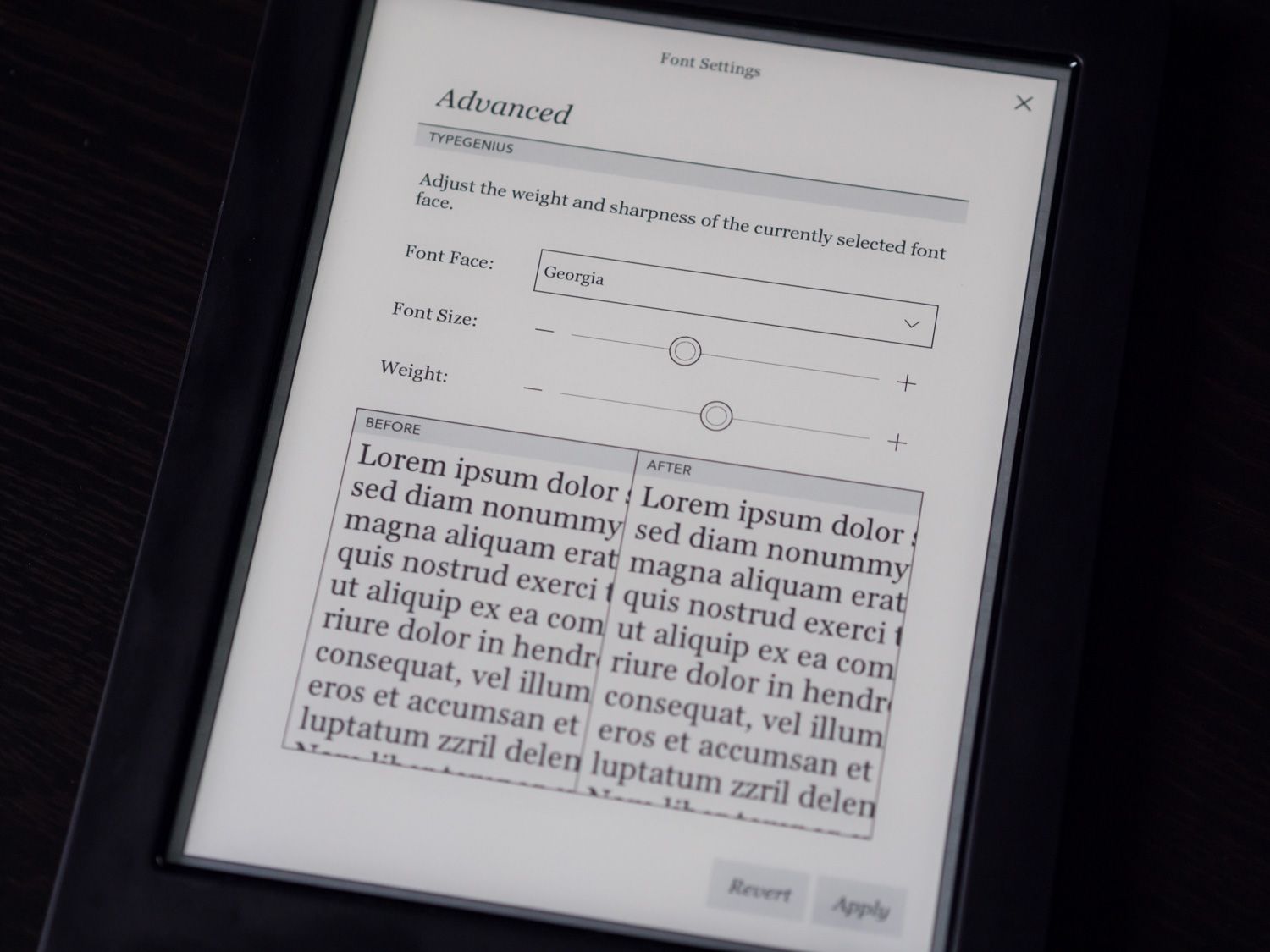
The result is a highly customizable reading experience that caters to those who want to tinker with type until everything looks perfect.
A long-standing bugbear of the Kindle software is its aging type engine, which hasn’t seen much of an update in years. There aren’t many fonts to choose from, for one thing, and the fonts you do get as options are of questionable suitability for the role of book type. I mean, who reads novels in Futura?
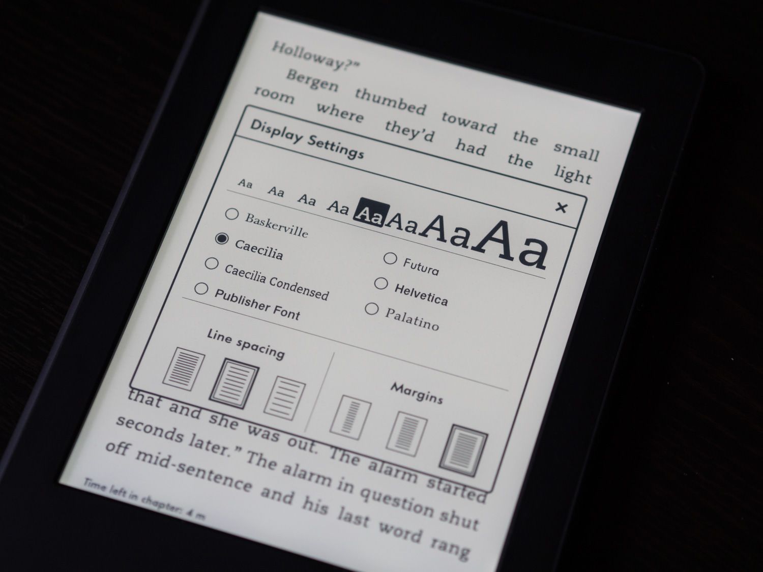
I confess that I don’t switch fonts much on my e-readers. I sometimes check out the publisher font, but more often than not I flip back to the venerable slab serif, Caecilia. It’s eminently readable on e-ink displays and is neutral enough to present the written word without comment or bias.
Their new typeface, Bookerly, is similarly appealing.
But the problem with Kindle typography isn’t font choice—to me, five well-chosen fonts will always be preferable to 15 mediocre choices.
Justified
The problem is justification. In typography parlance, full justification is the arrangement of text so that both margins are aligned to the edge of the page, with no ragged edges. On the web (including this blog), we’re used to left-aligned text. This is when the right edge of a paragraph has a varying width as longer words that don’t fit in the column width are simply shifted down to the next line.
In print, justified text is customary and is achieved by subtly adjusting the spacing between words and letters to ensure that each line fits perfectly from edge to edge.
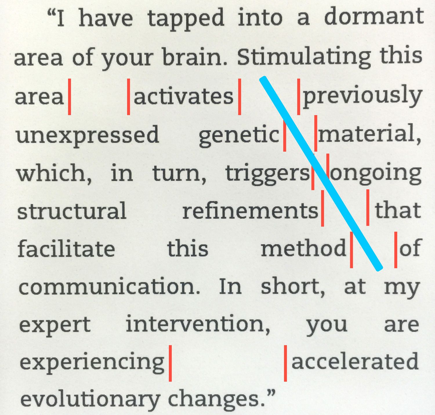
Achieving clean justification is difficult, because the stretching and compressing of spaces leads to an optical effect often referred to as “rivers”, which gives paragraphs an ugly, gap-toothed appearance.
Good type engines minimize this effect with smarter spacing choices, which is part of what makes Kobo’s text look so good. Not only that, but Kobo provides two options for avoiding the problem entirely: left justifying text like we do on the web or hyphenating words.
Amazon has fallen behind severely in this area, and it’s not acceptable. I would be fine with them not offering additional justification choices if their type engine did a terrific job with the rendering.
But it doesn’t. An example of Kindle text rendering circa 2015, before the updates:
As John Gruber put it:
Good typographic layout is hard, no argument, but that’s the only thing an e-reader is meant to do. Typographic layout and font rendering are the Kindle’s equivalents to audio fidelity from an iPod—there’s no excuse for it to be less than good, and it ought to be downright excellent.
And that was written three years ago! Amazon still has not seen fit to address the issue.
C.G.P. Grey is equally unforgiving, pointing out that the result of Amazon’s obstinance results in ongoing display issues that are “comically, insultingly bad for a product with the sole purpose of displaying text.”
I couldn’t agree more, sadly.
But let’s take a step back for a moment. The issues I’ve just described are only going to be bothersome to a small subset of the Kindle’s audience, and as vocal as that contingent may be, it’s still a drop in the ocean.
To the average consumer, typographical nitpicks aren’t even on the radar, let alone important factors in their decision of which e-reader to buy.
One could argue that Amazon has made a tactical decision, opting to focus on a more holistic view of the digital reading experience rather than focusing in on the minutiae of type.
We’ll test this argument now by zooming out and looking at the ecosystems behind these two e-reading options.
Ecosystem and Book Management
Whenever you buy technology these days, it’s important to realize that you buy into an ecosystem too. This is true even for e-reading.
Unlike Amazon, Kobo has maintained a tenuous friendship with brick-and-mortar stores, offering their devices for sale in several major retail chains (like Indigo/Chapters here in Canada) as well as allowing customers to purchase Kobo ebooks via those retailers’ online stores.
While this strategy certainly helps them gain market share by making their product visible to shoppers browsing those stores (it’s what helped them capture the majority here in Canada), I don’t see much benefit for readers.
The Tortoise and the Hare
Setting that aside, the raw purchase experience remains very similar between the two ecosystems. Books can be purchased either directly on the e-reader or via the web store, and books can be previewed and delivered instantly to your device. Kobo’s web store actually allows you to preview the book immediately in a pop-up window, something that Amazon’s listings don’t allow.
I say “ delivered instantly”, but that’s only true for the Kindle. Saving a preview to your library on the Kobo store doesn’t push the update to your Kobo e-reader, so you’re stuck having to refresh manually. On the Amazon site, you click to send the preview to your Kindle and—I kid you not—it begins downloading instantly.
I timed this just for fun and wasn’t even able to count a full second between clicking “Send to Kindle” and having the preview appear on the Paperwhite. It’s uncanny and feels like magic.
This would be a stupid complaint, a textbook first-world problem, if the two devices performed their synchronization routines at comparable speeds. But they don’t.
On the Paperwhite, a general sync takes an average of 3-5 seconds. I initiated a sync at the same time on the Aura H2O, and my timer is currently passing 3 minutes and thirty seconds. It’s still working on it.
What exactly differs between the two processes to cause such a huge discrepancy is beyond me, but the difference is night and day. The Kindle feels perpetually in tune with what’s going on, while the Kobo performs its synchronization with the kind of hesitant plodding that’s endearing in an elderly relative but infuriating on a $200 flagship gadget.
I should mention that these lightning fast Kindle sync speeds are present whether you’re connected via WiFi or Amazon’s global 3G network. That 3G option is unique to Kindles and is potentially a huge selling point since all Kobo readers are WiFi only.
To me, it’s much more valuable than waterproofing. Here in North America we’re used to pretty consistent WiFi coverage, and if you prepare for every trip by preloading a ton of books then it’s not an issue. But if you happen to be somewhere exotic and want to buy a book, only Amazon has you covered.
Purchasing and Reviews
Book availability varies by region, so it’s not worth comparing numbers. Suffice it to say that both Kobo and Amazon offer gigantic amounts of ebooks, and you’re very unlikely to find an ebook you want that’s unavailable in either marketplace.
What we can compare is the quality of the general purchasing experience, and here again Amazon comes out ahead for me. Their recommendation engine, while sometimes overzealous, is extremely valuable. It has gifted me with some of my favourite literary discoveries, including the immensely talented Ted Chiang, whose book of short stories was among my favourite reads of last year. I would never have discovered his work if not for Amazon.
Kobo’s recommendations are less personal, more shallow. They’re fine, but they don’t feel individualized or aware, and it rubs off on the general purchasing experience. The search results can also be somewhat puzzling, with multiple copies of what seems to be the same book appearing as different entries.
One aspect that Kobo will probably never bring to parity is the review ecosystem. Amazon’s reviews are legendary. For any given product, there will often be a host of user and professional reviews, easily accessible even on the Kindle, to help you decide whether or not you want to read the book in question.
Kobo’s book listings feel like barren wastelands by comparison. If reviews are important to you, you’ll often have to resort to checking them on the Amazon listing page before returning to Kobo to purchase.
When it’s time to make a purchase, the key factor tends to be price. By and large, the two marketplaces offer competitive prices that don’t differ wildly, but whether it’s my taste in books or an objective advantage, I almost always found Amazon’s pricing more favourable. And not by a small margin.
As a recent example, I wanted to buy What If, a book by Randall Munroe of XKCD fame.
When I went to purchase it, I opted to look on both devices to see which had the more favourable deal. The list price for the book is about $30, and Kobo was selling it for $25.99. I thought this was great until I checked at Amazon and found it for $6.99.
The fairness of Amazon’s pricing is hotly debated, and it’s a topic that I find compelling as a writer. But as a reader the conclusion is simpler: Amazon’s prices are better, and the process of finding and buying books is quicker and more seamless.
By the way, that Kobo sync? Just finished. Seventeen minutes later.
Compatibility and the Magic of Calibre
It’s not all bad for Kobo though. One extremely important advantage that Kobo e-readers have is compatibility with open book formats.
Kindles can only natively open Amazon AZW3/AZW, PDF, TXT, and unprotected MOBI files—the popular EPUB format being a notable absence. Conversely, all Kobo e-readers will open EPUB, PDF, MOBI, TXT, HTML, CBZ/CBR (comic formats), and DRM-protected content from public libraries via Adobe Digital Editions.
If you only buy your books from the respective company’s marketplaces (like most consumers will) then this is actually not that meaningful. You’ll only ever be encountering books in the device’s native formats, so compatibility is not a concern.
If, on the other hand, you want to manually manage a library of ebooks spanning multiple sources and formats, then Amazon’s stingy compatibility becomes more of an issue.
…At least until you discover Calibre. Calibre is a hideous but extremely powerful piece of software that facilitates the management of ebooks.
It includes powerful tools for converting between ebook formats, and it handles it all invisibly. You can simply connect your Kindle to your computer and send a bunch of EPUB books to it—Calibre will automatically convert them into a compatible format for you before transferring.
Calibre is a power user’s tool, great for Kobo fans as well, and it’s a must for anyone who wants to manage their library without worrying about formats or cloud storage.
Essentially, Calibre obviates the need to worry about what formats your e-reader of choice is natively compatible with, so you can focus your attention on other criteria when making your choice.
That being said, I found that sending Amazon books to the Kobo via Calibre required some extra work, with a separate plugin required to enable chapter reading times and other standard functionality.
Not the end of the world, but another small hiccup in the experience of being a Kobo user.
Extensibility, Sharing, and Additional Features
Amazon’s efforts to prioritize the big picture over display details have paid off in terms of its ecosystem, but there’s more to the story. Despite the promise of being focused, e-readers are not truly as uni-functional as I made them seem.
The difference is that their additional features are almost always enhancements designed to augment the reading experience, not distract from it.
Well Defined
For instance, there’s the built-in dictionary. This is an obvious feature that both devices share, but if we dig deeper we see more evidence of differing design philosophies.
On both devices, tapping and holding a word pops up the dictionary definition. On a Kindle, the window also has a tab for Wikipedia as well as one for X-Ray, which we’ll get to shortly.
In Kobo’s case, the definition and an option to share (to Facebook of all places) are all you get. This is the bare minimum, and I consider it a missed opportunity.
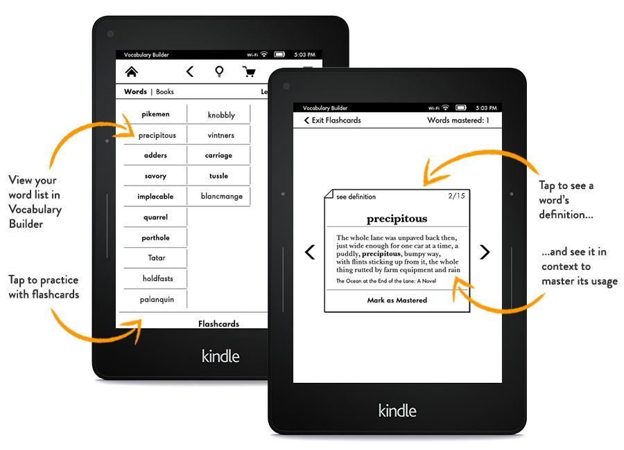
Amazon did not stop there—its Vocabulary Builder is a superb applet that runs on new Kindles that collects all the words you’ve looked up and provides a flashcard system for helping you truly learn the definition.
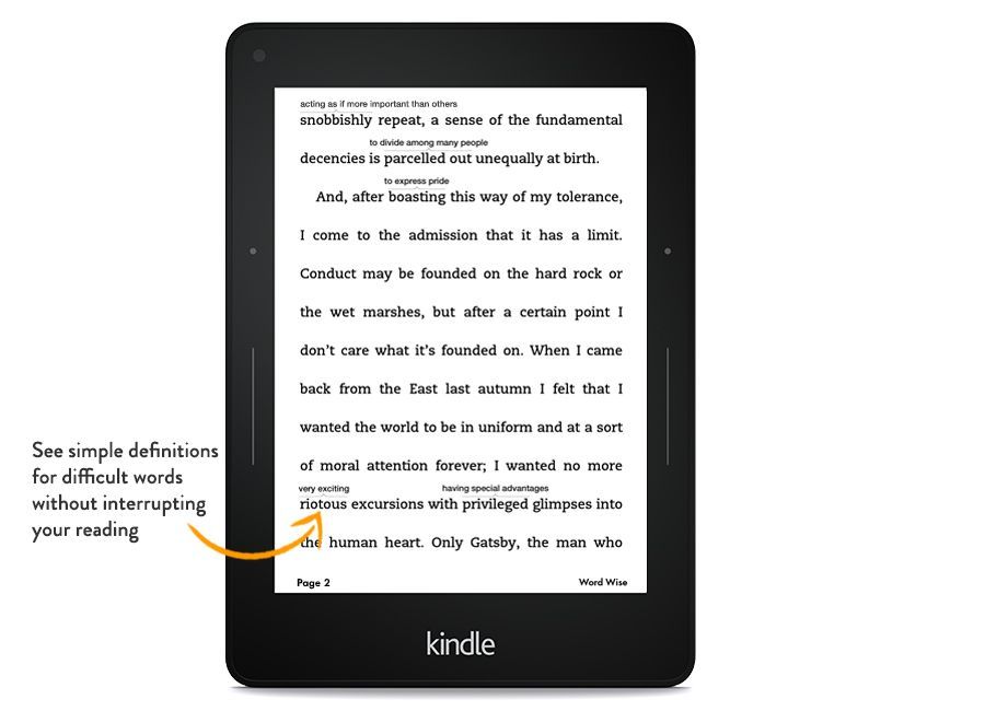
On top of that, there’s a feature called Word Wise that provides short definitions right in the body of the book, floating over difficult words. The number of hints is also adjustable, so you can tailor it to your reading level.
These two features work hand-in-hand with Amazon’s Kindle FreeTime, which allows parents or teachers to set up profiles for kids that grant access to certain books and track reading progress, vocabulary improvements, and more. Kids earn badges too, which is a clever bit of gamification.
Also worth mentioning, something of particular interest to readers in different languages, is that Kindles have a robust translation engine built in that can quickly display large passages of text in your native language. This capability, powered by Bing Translator, can even automatically detect languages so you can quickly look up a short French passage in your English book, for example.
Kobo, sadly, has no equivalent to any of this functionality.
Beyond the Book vs. X-Ray
What Kobo e-readers do have is something called Beyond the Book, which provides extended info for highlighted text in supported books, including related web articles, related books, and related authors.
Effectively, any passage becomes the centre in a spiderweb of information for you to explore. This might be an appreciated feature for some, but it feels out of place to me on an e-reader. To understand what I mean, consider Amazon’s equivalent to Beyond the Book: X-Ray.
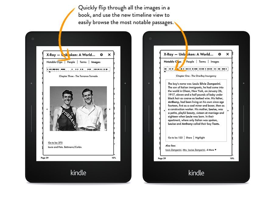
I mentioned X-Ray earlier as an additional tab that appears when you highlight a word to get its definition. For supported books, X-Ray is like a built-in Spark Notes. Highlighting a character name will surface a bio and all appearances of that character in the book. Similarly, you can access a timeline view from the menu bar button to scan through key passages and remind yourself of what’s going on if you’ve been away from the book for a while.
When you look at these competing features, Beyond the Book and X-Ray, it seems clear that the latter was designed to improve the reading experience explicitly, whereas the former serves as a distraction from it, sending you away to other articles, other books, other places than the current read.
Not only that, but there’s a discrepancy between the prevalence of the two. You can expect to find X-Ray enabled in many modern books you buy for your Kindle, but Beyond the Book is relatively uncommon, even for current bestsellers.
Extraneous Features
This difference in philosophy applies to other enhancements as well. Kobo has a built-in achievement system, a Reading Stats area, and games (sudoku, chess, solitaire, etc.)
The former are very neat, especially the reading stats, but the latter is another example of something I just find strange to include on an e-reader.
Both devices also feature an integrated web browser, and it’s about as awkward to operate as you’d expect. Personally, I could do without this, but I’ve come to realize that some find it extremely useful, especially on the Kindle where reading articles is a bit of a hassle.
Kobo’s Secret Weapon
Which brings me to Kobo’s coup de grâce: Pocket integration. If I had to pick a single feature as my biggest argument in Kobo’s favour, this would be it.
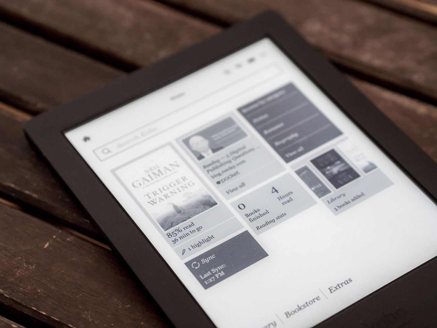
If you use Pocket to collect things to read later, you’ll be delighted to discover that all Kobo e-readers have a native integration with the service. Once you log in, Pocket articles will be another category on your homepage and you can read, favourite, and archive these articles right from your Kobo—the changes are synced to your Pocket account, just as you’d expect.
I can’t overstate how amazing this is. Many people save articles to Pocket thinking they’ll read them later, but reading long articles is like reading a book…very difficult on a device that has other apps, notifications, etc.
What I’ve found is that after a day of staring at backlit screens, I want to catch up on my Pocket reads on an e-reader, not a tablet. And now I can do so seamlessly. I’ve powered through my Pocket queue this way because it’s much easier to truly focus on articles and digest their contents.
The only problem with this feature is that it doesn’t always work. Some articles, for reasons I haven’t been able to discern, simply refuse to display. I get as far as opening to their cover page, but as soon as I try to swipe to the next page I get the pop-up telling me I’ve finished.
This happens more frequently that I would like, for at least 1/3rd of the articles I add to Pocket. The strangest part is that the articles display the usual cover image and reading estimate in the list, they just don’t open properly. And I’ve seen multiple instances where even two parallel articles from the same publication display the issue: one works perfectly, the other doesn’t. Re-downloading, even re-booting are ineffective.
It’s a peculiar annoyance, and one that I assume a firmware update will be able to fix.
As a Kindle user, I’ve been stuck with various workarounds for sending articles to my device. There’s an email address for files, and you can get Instapaper/Readability to send articles to it as well (provided you whitelist them on the Amazon site—another step). There’s also a Chrome/Firefox extension that sends articles to your Kindle in one click, and that’s been my solution of choice.
Unfortunately, I use Safari as my main browser, so my process for getting articles onto my Kindle is as follows:
- Find article, save it to Instapaper
- Instapaper sends articles to Kindle (automatically or manually)
- Read articles on Kindle
On the H2O, I’ve been able to cut that down to two steps:
- Find article, save it to Pocket
- Read
For someone like me who reads a lot of articles, this is a transformative improvement and the single most tempting aspect of the Kobo.
Sharing
The pendulum of preference swings more widely than I expected between these two.
For every feature like Pocket integration that has me lusting after a Kobo, I remember something like highlights and annotations, and suddenly my loyalty to Amazon is reinvigorated.
Here’s the thing: Kobo’s highlight system is stunted. On my Kindle, I’m used to liberally highlighting interesting, beautiful, or otherwise memorable phrases and having them safely tucked away in a centrally accessible database that I can draw from whenever I want to. Not only that, but it can be interesting to see what others have highlighted via the Popular Highlights option.
On the H2O, I was happy to see that highlighting was present and accounted for, but as soon as I started using it I realized the problem: they’re stuck on the device. I didn’t think this was possible, but an email to my Kobo contact confirmed that the annotation system is indeed locked to the device itself.
This is precisely the sort of limitation that I was glad to be rid of with ebooks, so to have to contend with it again is terrible. If I highlight a passage on the Kobo, that passage can only be seen on the device and can’t be exported in any useful fashion.
Compared to the Kindle’s easily accessible plain text version and instant availability on the Kindle website, this seems like a bewildering oversight.
In fact, the only legitimate way to get a highlight off the Kobo is to share it to Facebook. I don’t want to do that. The only social network I want to interact with while reading is the one designed for it: GoodReads.
Guess who integrates with GoodReads? Amazon.
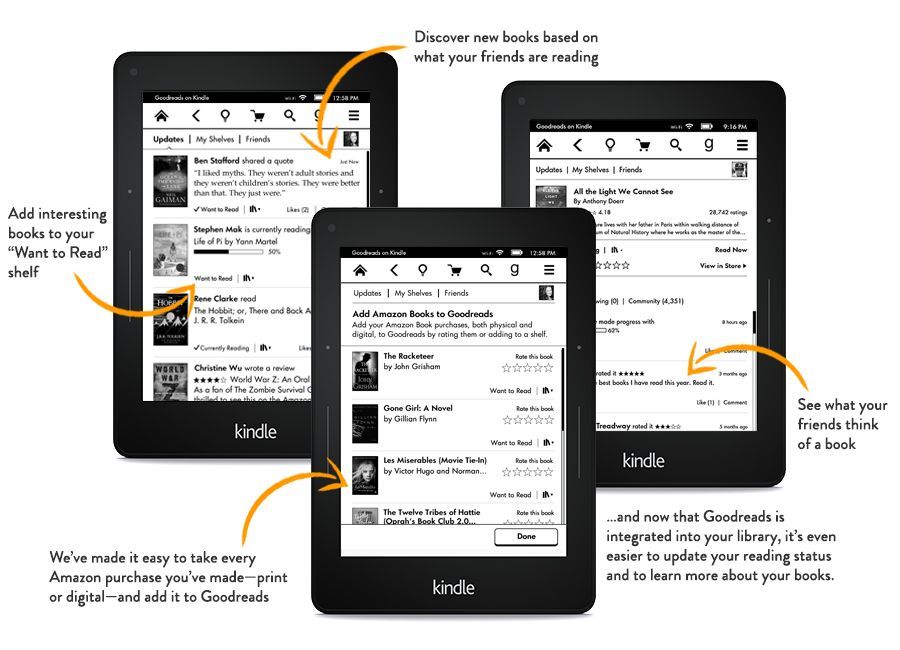
Speaking of sharing, Amazon is keen to provide multiple ways of sharing your books legitimately. For one thing, they have the Kindle Lending Library, which is a perk of your Amazon Prime membership that allows you to freely borrow more than 800,000 books.
There’s also an easy way to loan your purchases to others, whether or not they have a Kindle. This is exciting for friends, but it gets even more fun with the power of the internet: a popular subreddit exists where people can request books they want to read and have kind citizens loan it to them. It’s brilliant, serving as a sort of turbo library.
Furthermore, Kindles recently gained the ability to link Amazon accounts, allowing family members to share purchases.
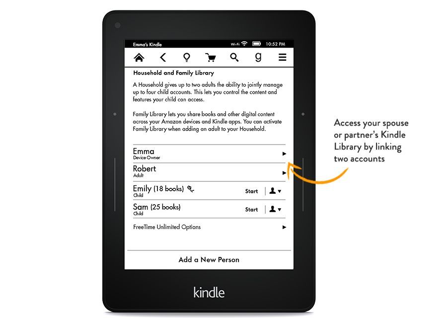
Kobo hasn’t enabled any lending, loaning, or borrowing functionality. This might change soon though, as the parent company, Ratuken, recently announced its acquisition of OverDrive, the established firm that powers book lending in the United States. Ratuken’s purchase represents “phase 2” of its ebook business plans.
Phase 1 was purchasing Kobo.
Showdown
We’ve now explored nearly every facet of how these two devices compare. We’ve looked at their ability to display and manipulate text, their ecosystems, and their various enhancements to the reading experience.
Even so, there are several aspects I didn’t discuss, like battery life (both great), their ability to handle PDFs (both crap), the particulars of the web browsers, jailbreaking, the covers and assorted accessories, and more—if these aspects interest you then please ask about them.
As I was working on this comparison, I found myself surprised at how much my opinion fluctuated. I expected the conclusion to be fairly self-evident, easy to pin down.
The truth is that which one you choose will come down to how you prioritize your criteria for e-reading. Neither is perfect. But one may be more suitable for your needs.
For example, I find the Kindle’s type display frustratingly primitive. Kobo’s type engine is light years ahead, and when you pair that with the H2O’s utterly magnificent screen, the combination is very compelling.
On the other hand, I adore the highlighting functionality of the Kindle, as well as its various subtle enhancements to the reading experience, which I feel are more in line with my desire to stay focused.
Kobo’s additional features feel distracting, and that’s exactly what I’m trying to avoid when I pick up an e-reader.
Then again, Kobo has that superb Pocket integration and lots of charming details. One of my favourites is that it shows you the current book/article cover on the screen while it’s sleeping (compared to Amazon’s generic screensaver image, or ads if you haven’t paid to remove them).
In my head, this back and forth debate raged on for a while, but in the end I concluded that the overall experience of owning a Kindle was preferable given my criteria and experience.
So which should you buy?
Which You Should Buy
After hundreds of hours of testing, here are my recommendations.
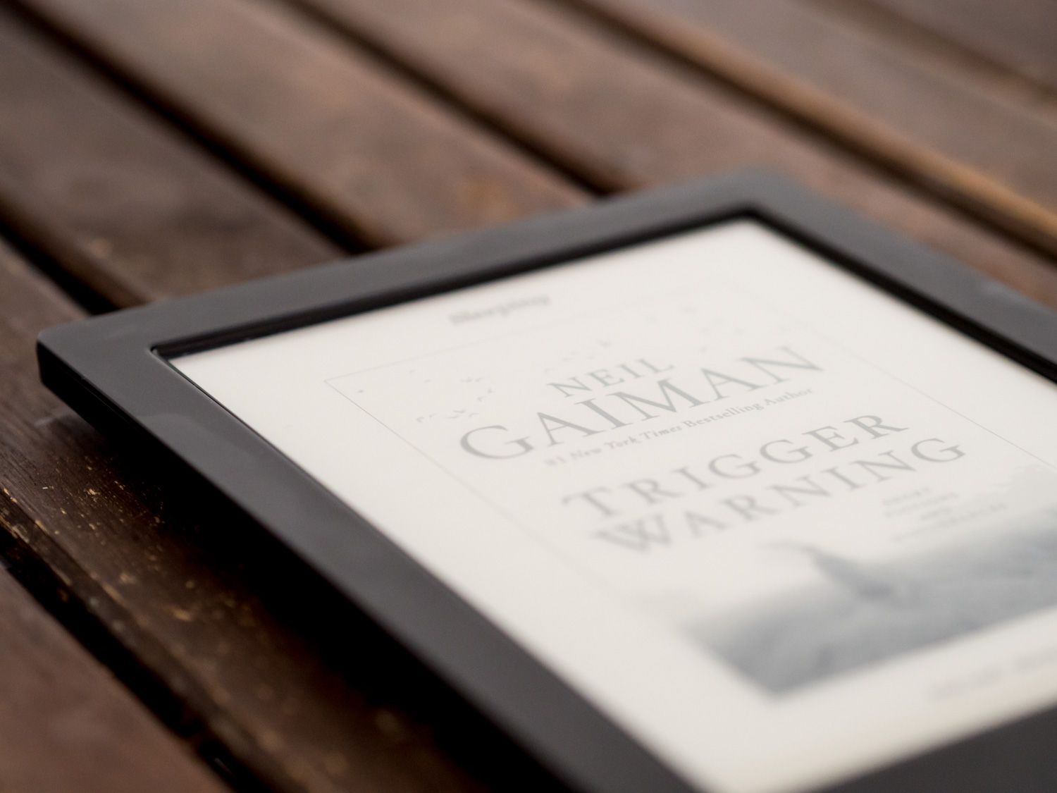
Kobo Aura H2O
Kobo’s flagship, waterproof e-reader is the one for you if:
- You want a larger screen than the 6″ industry standard
- You care about typographic fidelity and customization
- You are an avid Pocket user
- You frequently read in wet conditions or are clumsy with your devices
- You want the best back-lit display available in Canada
- You can put up with slow syncing
- You’re willing to pay more—the H2O retails for $180
- You don’t mind the limited highlighting functionality
- You don’t want to borrow, lend, or otherwise share books
- You have no need for features like Vocabulary Builder, Word Wise, FreeTime, GoodReads integration, or X-Ray
The Aura H2O surprised me. It is an extraordinary piece of reading technology. It also feels like the result of a company that focused on optimizing the reading experience at the expense of everything else—its ecosystem and enhancements lag behind Amazon’s.
If that doesn’t bother you, or if you are willing to sacrifice those aspects in favour of the most customizable and beautiful display of digital type that I’ve ever seen, then you should buy the Kobo Aura H2O.
Kindle Paperwhite 2
Amazon’s e-reader for everyone, the Paperwhite 2, is the ideal choice if:
- You prefer a smaller, more comfortable e-reader
- You’re willing to forgive the sub-par typography in exchange for a stronger ecosystem
- You use highlights a lot and want to have them accessible anywhere
- You enjoy sharing, lending, and borrowing books
- You prefer enhancements that help deepen the reading experience (X-Ray, Vocabulary Builder, etc.) rather than distract from it (Kobo’s Beyond the Book) and want these features to be available for more of your books
- You need the ability to translate passages into different languages, or look things up on Wikipedia
- You want to take advantage of kid-friendly functionality like FreeTime and Word Wise.
- You rely on Amazon’s reviews to make purchasing decisions, and you like paying the lowest prices for books or having the option to read unlimited books for a monthly fee.
- You can put up with less even screen lighting
- You are okay with not being able to customize the interface or reading experience much, let alone add custom fonts and adjust font weights
Amazon has refined the Kindle into an incredibly competent, affordable device with few actual flaws. Their more holistic approach to development (and their head-start) has resulted in a product with more thoroughly developed features.
Those who can forgive the occasional text spacing issue, and who aren’t distracted by a subtly inferior screen will find—as I have—that the Kindle Paperwhite is the best overall reading experience available.
Parting Words
It’s been a long journey, but I hope I’ve done this topic justice. I consider it a resource for those who are debating an e-reader purchase, and I hope the discussion helps you discover which one best suits your needs.
You can’t go wrong either way.
One thing is clear: the passionate, engrossing surrender to words that I remember from my childhood may not be able to survive on the web, but it has found a vibrant new place to thrive on our e-readers.
digital lifestyle technology review