Amazon Kindle Voyage
Reviewing my favourite Kindle
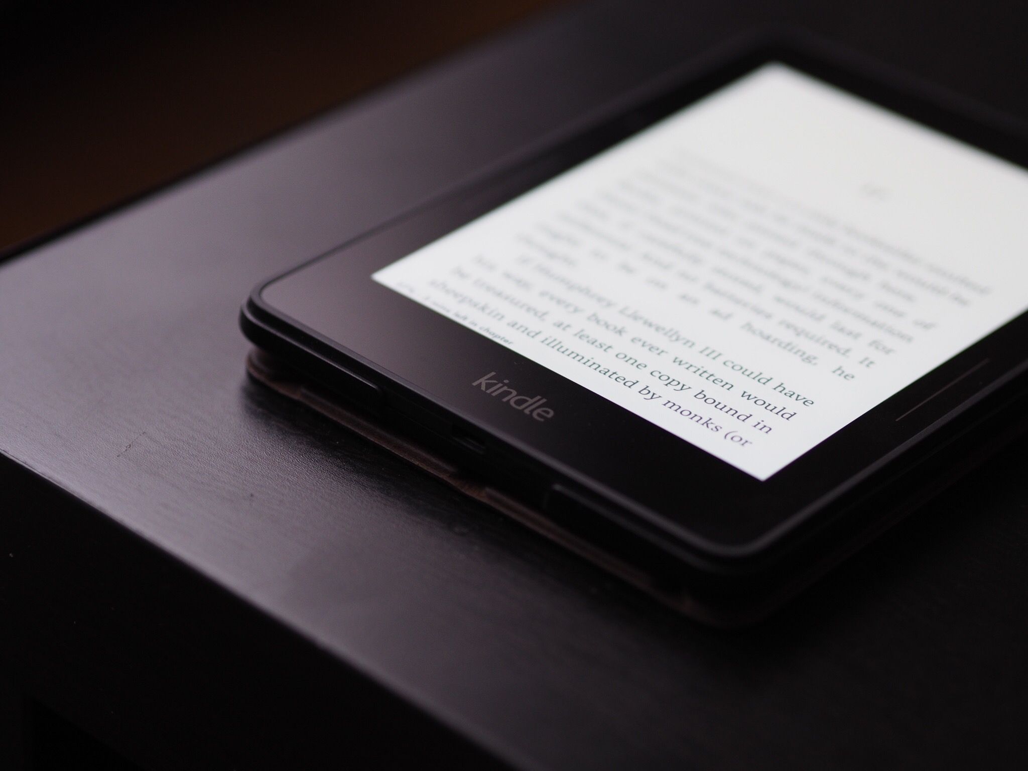
I recently reviewed two of the best e-readers on the market, the Kobo Aura H2O and the Kindle Paperwhite.
I was left left wishing I could properly evaluate the current landscape of e-readers, and today I finally can. You see, a wild Marius appeared (a different Marius) and offered to lend me his Voyage so that I could finally have a chance to put the device through its paces.
Design & Build
Two things struck me immediately: the design of the Amazon case, and the build quality of the device itself. In each instance, I had the exact opposite reaction to I was expecting.
Let’s start with the build quality: I was expecting it to feel as expensive as it is, but…it doesn’t. The Voyage adopts the more angular design language of Amazon’s Fire tablets, but the result isn’t so much stylish as garish.
From the front, all is well; the smooth transition from bezel to screen helps the display seem a bit more spacious even though it’s the exact same size as the Paperwhite’s. The discrete button markings help lend a sense of elegance, but their efforts are somewhat foiled by the return to a more distracting Kindle logo on the chin.
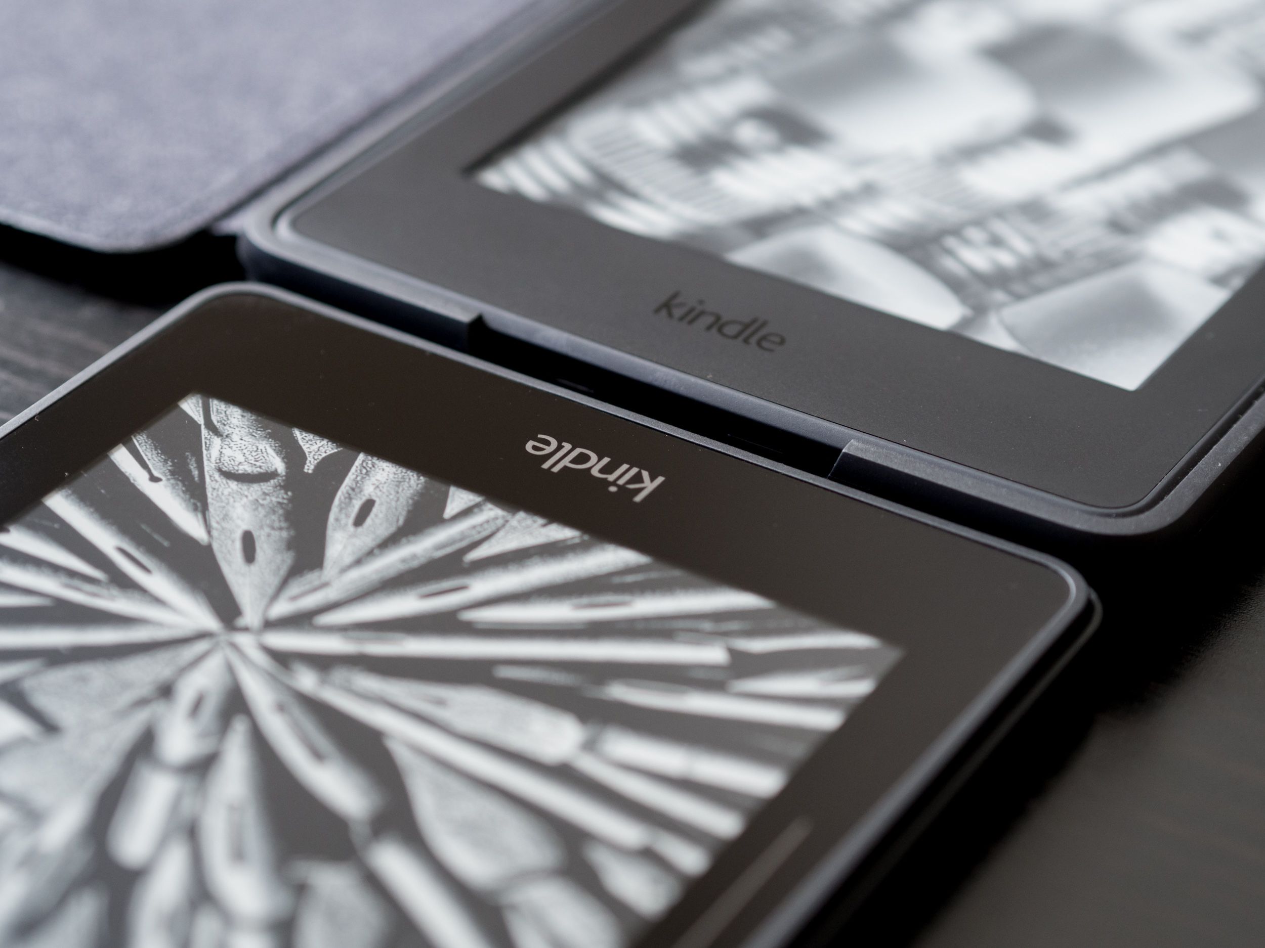
Put beside the subtle indented logo on the latest Kindle Paperwhite, the Voyage’s shiny branding seems ostentatious. I can forgive this though, because it’s a small detail and the front panel does feel like a significant step forward for the product line. Having that seamless glass panel really makes a difference. The real problem I have with the design is evident when you turn the thing around.
Instead of maintaining the soft, almost rubbery material of the Paperwhite, the Voyage back panels have a harder, smoother finish that feels cheaper to the touch. Also, thanks to the angular design language, this plastic is assembled like a set of irregular tangram tiles that feel slippery when compared to the comfortable texture of the Paperwhite.
What’s worse, the topmost panel is a terrible glossy chunk that looks like the IR blaster on old remote controls. Why, Amazon?
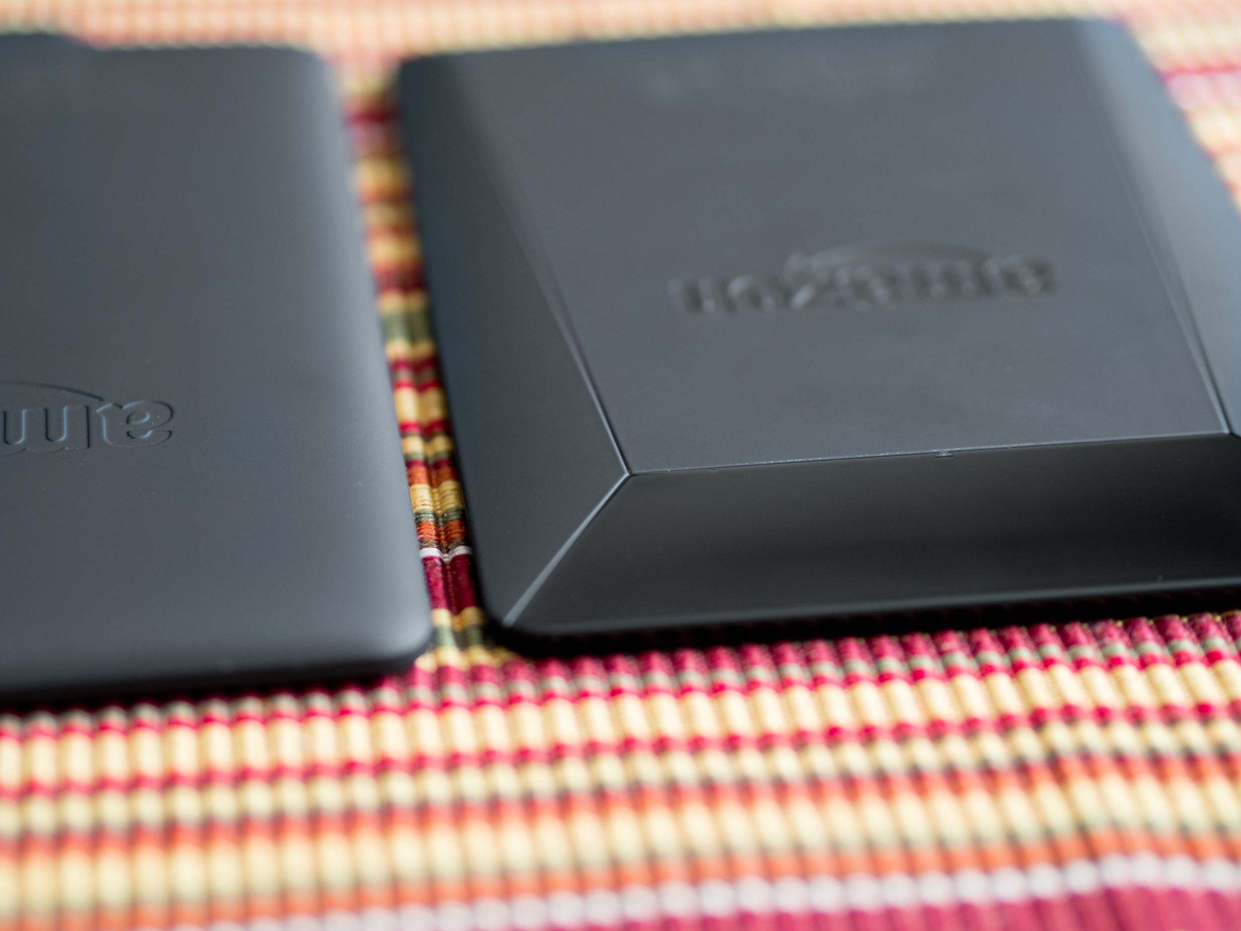
On the other hand, the reduced weight and thickness makes the Voyage supremely comfortable to hold and operate for long periods of time. The difference between Voyage and Paperwhite 3 straddles the line between noticeable and meaningful, and it’s difficult to say definitively which side it falls on.
The Paperwhite is hardly a bulky device, but if you spend a lot of time holding it, the slightly reduced weight of the Voyage may well be significant to you.
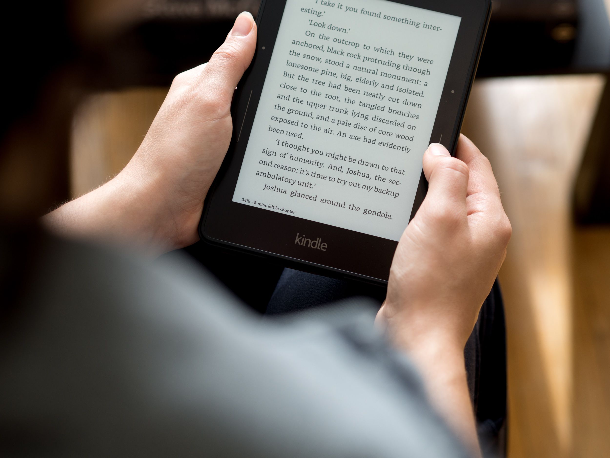
For me, it was. I tend to spend hours holding my Kindle, so over the course of that much interaction, even minute differences in physical attributes can have a great cummulative effect. Overall I definitely prefer the dimensions of the Voyage, but I also can’t say that going back to my Paperwhite is a big downgrade.
 The Voyage (right) is thinner and sleeker, but also more angular than the Paperwhite.
I appreciate that the power button moved to a less vulnerable spot too. It’s now on the back where I’m less likely to accidentally trigger it, but it’s accessible enough that I don’t have to reach for it when I need it. In this sense, it’s a better placement than the Kobo Aura H2O, which has it on the top edge.
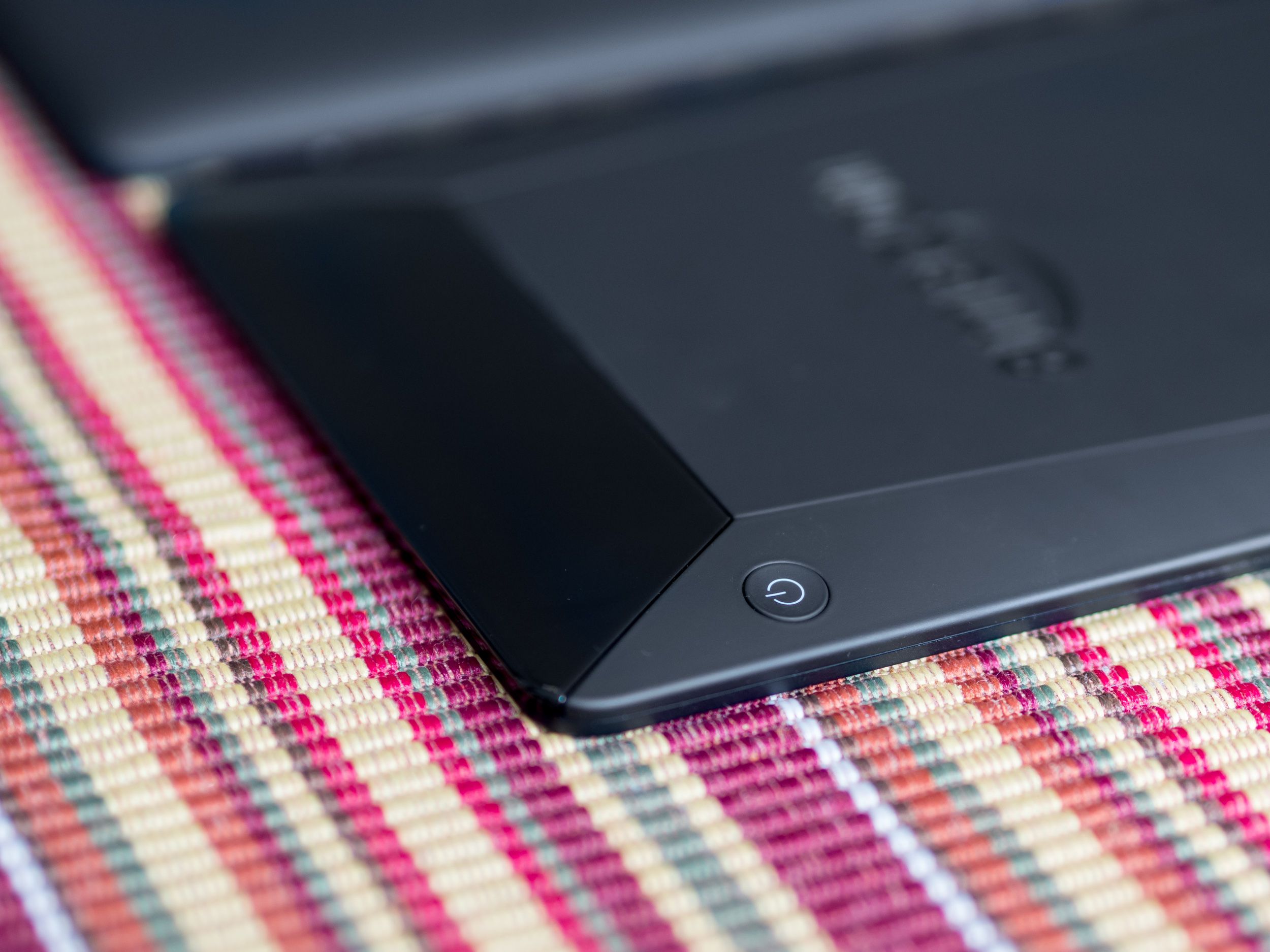
In the end, my reservations about the appearance and tactility of the back are mostly offset by the beauty of the front, and I quickly forgot about the ugly back thanks to the official Amazon case.
Above the Fold
When I first saw the “Origami” cover, I was skeptical and, frankly, a bit confused. It’s an aggressively bold design, and it’s difficult to grasp how exactly it works until you’ve had an opportunity to hold and use it.
Now that I have, I’m surprised by how great it is. I expected an awkward, different-for-the-sake-of-being-different type of thing, but it turns out to be a brilliant and innovative re-thinking of a simple problem.
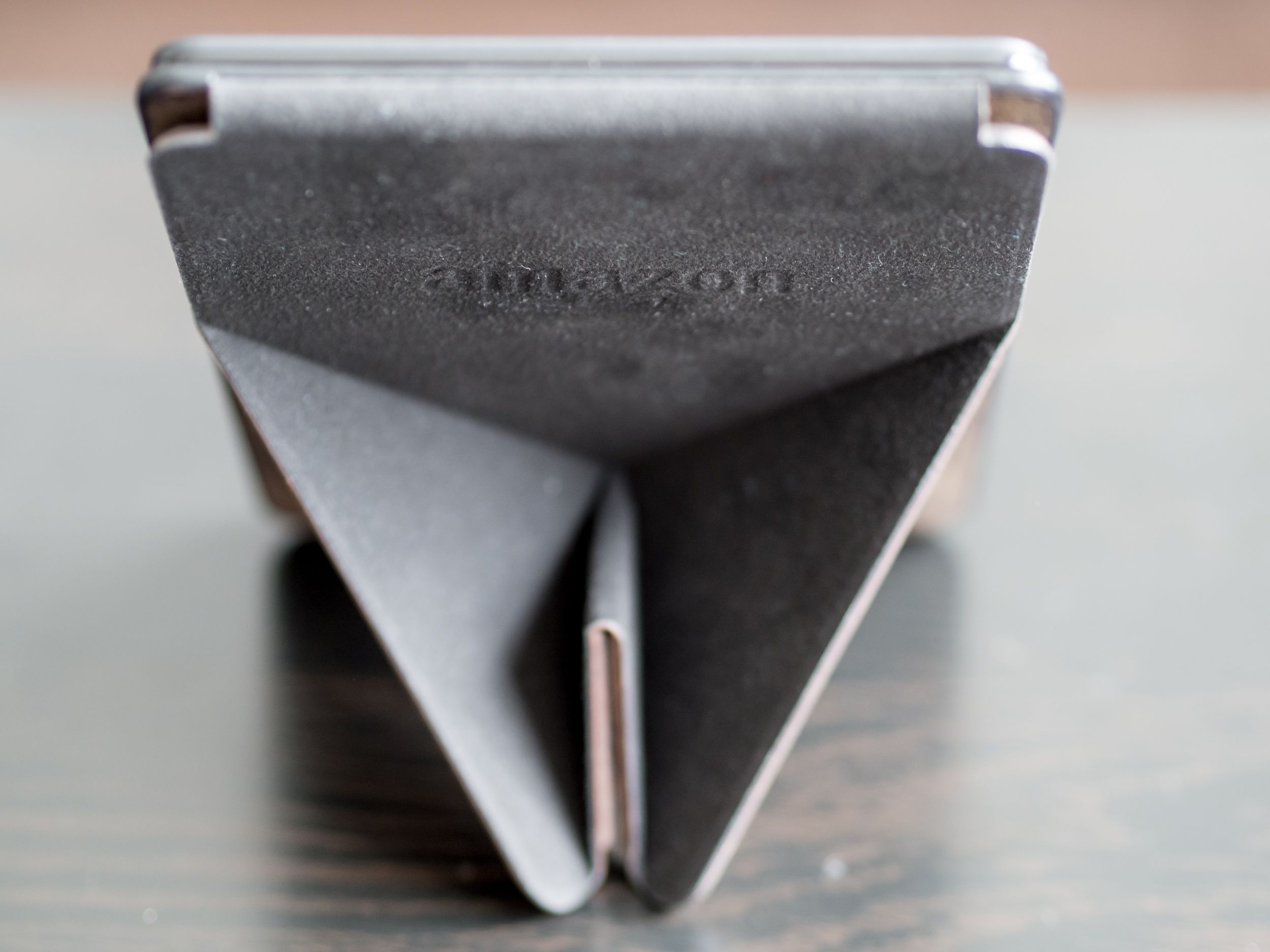
The cover opens vertically, like a reporter’s notepad, instead of the familiar book-like cover of the Paperwhite. Its folding panels allow it to form a stand that holds the Voyage up like a picture frame. For those of us who like to rest Kindles on their sides while reading in bed, this is even better than trying to make a tent out of the Paperwhite case because it works equally well on either side.
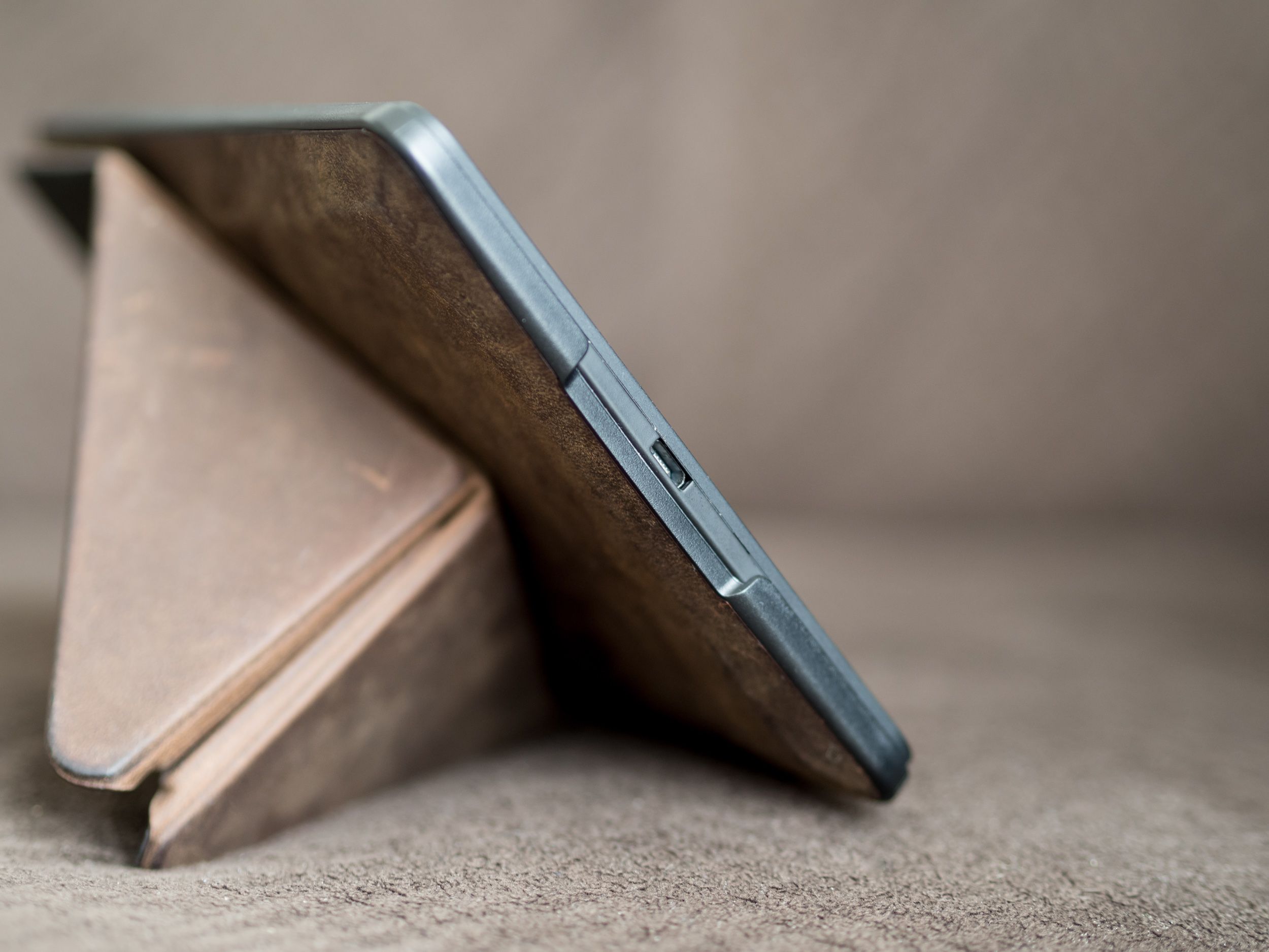
Perhaps my favourite feature of the cover is how easy it is to get the Voyage itself in and out. Instead of pulling and fighting the frames like a sturdy smartphone case, the Voyage simply slots into the Origami cover from the top, with strong magnets holding it firmly in place. Removing it is as simple as flipping open the cover and gently pushing the Voyage up and out.
It’s brilliant, simple, and very satisfying.
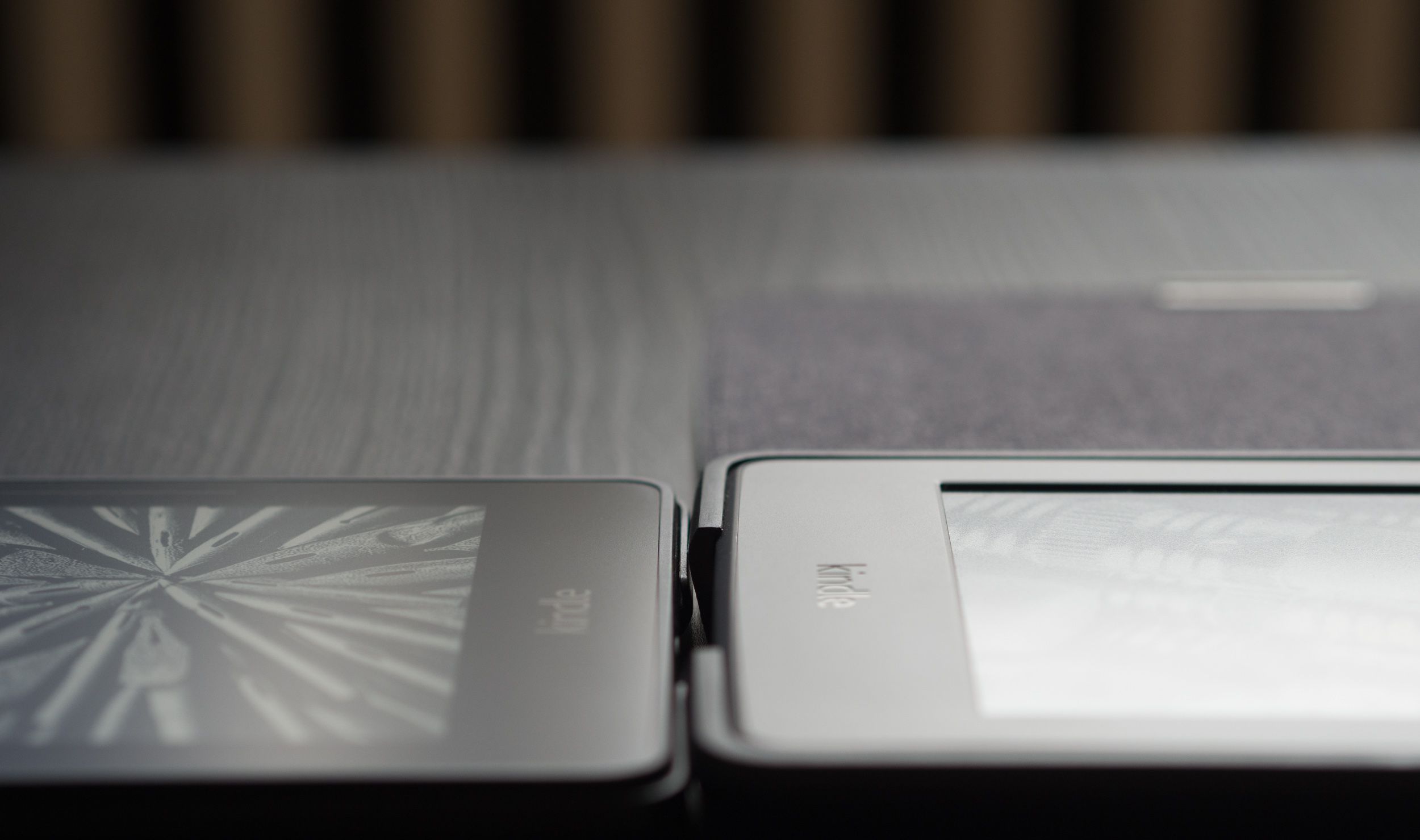 A side effect of this mechanism is that the case doesn’t add as much bulk around the edges of the device, which gives the whole setup a more refined look than the chunky rubber corners of the Paperwhite cover (right).
I was using the leather version of the Origami cover, and its subtle patina lent the ensemble a much more luxurious feel than the Voyage alone can muster.
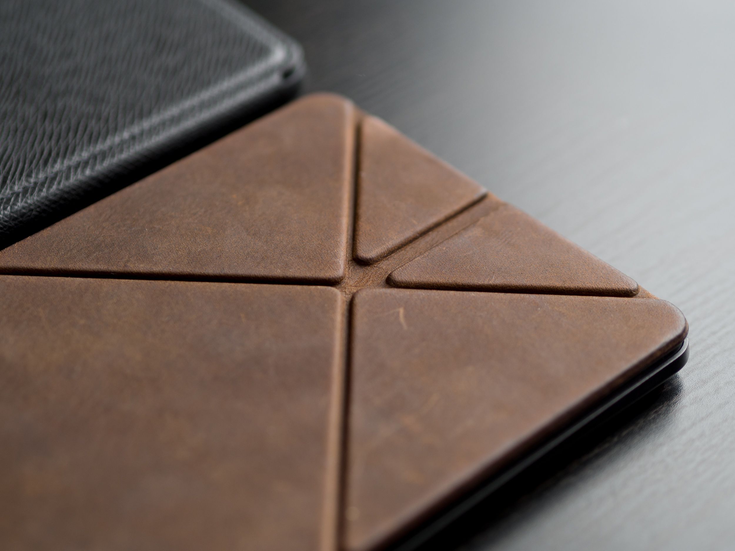
I consider the cover a must-have.
Turning the Page
Setting aside the physical differences, the Voyage and third generation Paperwhite are more alike than different when it comes to actual reading. As for the Kobo side of things, everything I’ve already written on the subject still holds true.
More specifically, the Voyage and Paperwhite now run the same version of the Kindle software, meaning both have access to the advanced typesetting features and Bookerly font (for compatible books). Simiarly, both screens are high-resolution 300ppi panels. But they’re not quite identical—the Voyage has an ambient light sensor that automatically adjusts display brightness, while the Paperwhite does not.
This is a small convenience, not a major differentiating factor, which is how I would characterize a lot of the differences between the Kindle Voyage and its mainstream Paperwhite cousin.
The main difference in reading experience involves the controversial page turn buttons. As other reviews will be quick to point out, they’re not real buttons because they don’t move when you press them. They offer a gentle buzz of haptic feedback, more like Apple’s Force Touch concept than the old Kindle Keyboard buttons.
In the end, they provide the same functionality, and I wasn’t at all bothered by the lack of travel. To be honest, I often caught myself swiping the screen instead of using the buttons. After so many years of touchscreen familiarity, it took me some time to get used to having dedicated page turn buttons again, and I’m still not sure that I really missed them.
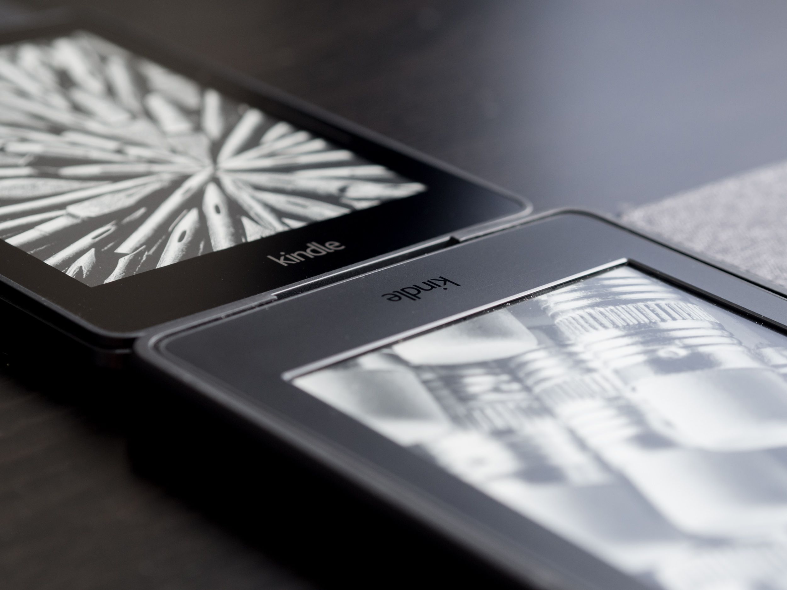
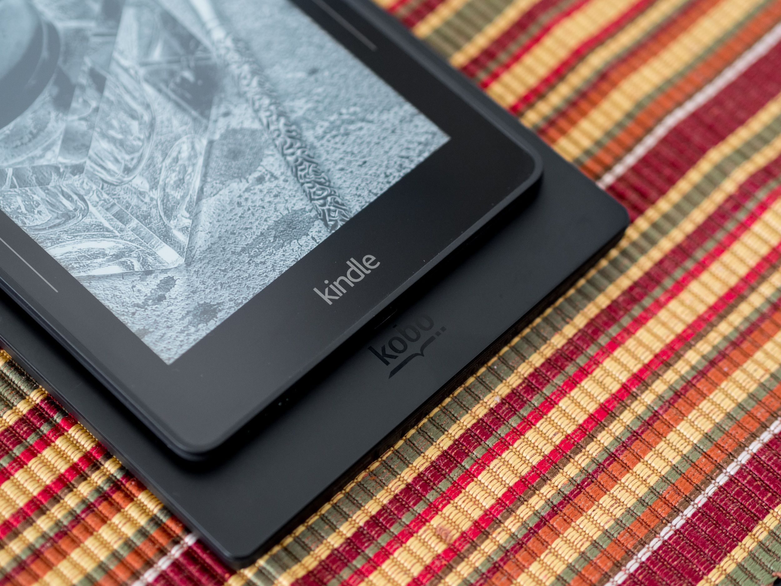
When I reviewed the Kobo Aura H2O, I made sure to praise how expansive and large the screen felt, even though I prefer the more compact size myself. The Voyage’s lack of inset screen and slightly reduced bezel width combine to produce a very similar effect to the Kobo, without actually making the device or its screen any larger.
It’s the best of both worlds. In fact, the Kobo looks almost comically large by comparison.
Meaningful Improvements
I could spend time showing you side-by-side comparisons between the screens of the Paperwhite and Voyage, but I won’t—I’ll do just one, because that’s all it takes.
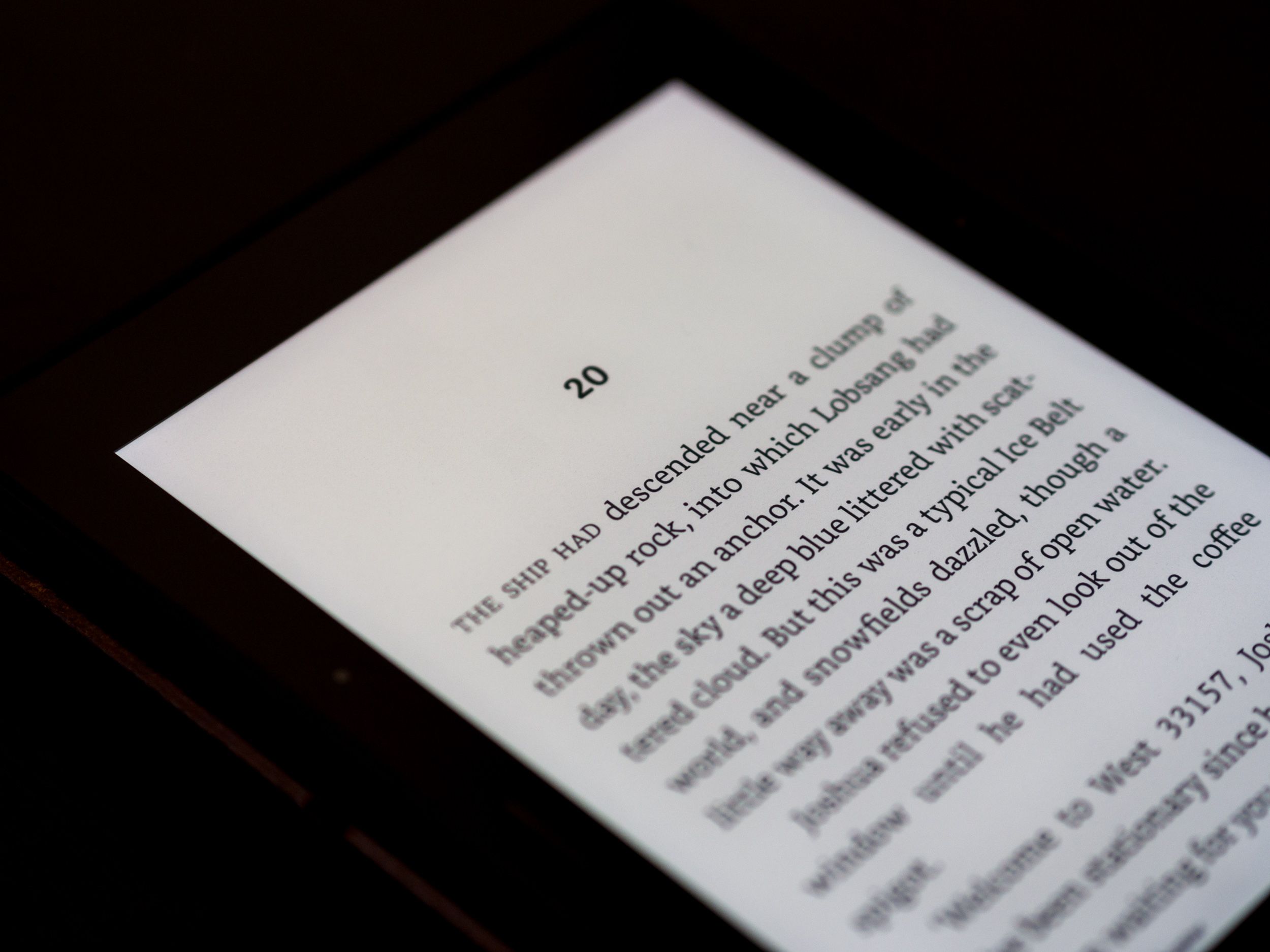 Here’s the Voyage.
 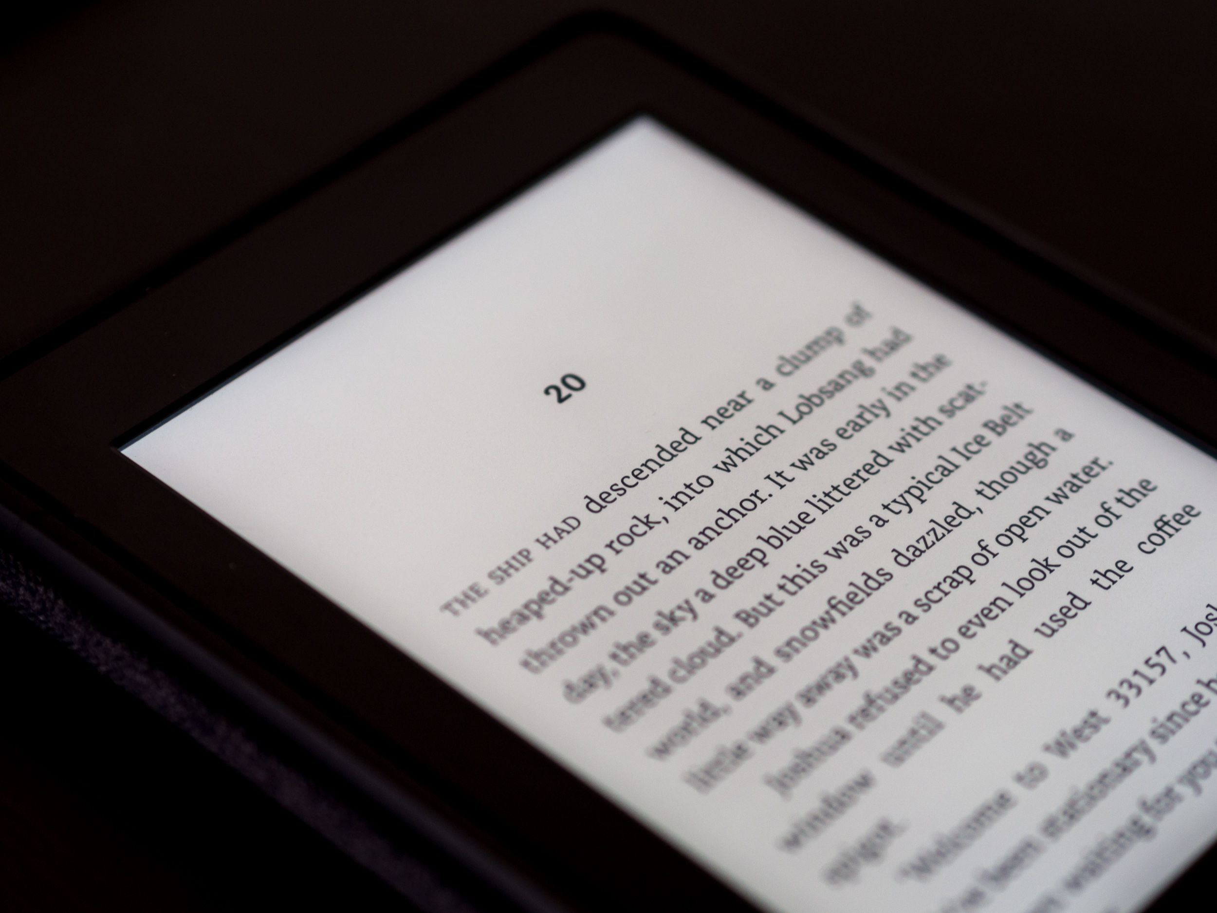 And the Paperwhite.
As you can see, we’re not dealing with major improvements here.
The differences in colour tint, lighting evenness, and brightness are so subtle as to be absolutely imperceptible unless you’re looking at the devices side by side and paying attention. At this stage in the Kindle family’s history, an awkward one by any measure, the top two offerings simply aren’t sufficiently different to merit the price gap between them.
When the Paperwhite still had a lower resolution screen, it all made some sense. Now, we’re in a transitional phase where the pricing doesn’t accurately reflect the value.
That’s fine, it won’t last much longer. But it leaves me speculating as to how Amazon intends to improve the next Voyage in a way that will allow it to truly earn its place in the line-up and justify its premium cost.
Beyond what I’ve already proposed, I want to leave you with a vision of a possible future integration.
Medium
One of the things I love most about the Kobo is its Pocket integration. Being able to seamlessly sync my read-it-later service with the device that’s designed for reading is brilliant.
At the time, I wondered if Instapaper would make for a natural rebuttal from Amazon. After all, Instapaper features a similar highlighting system, is more focused on reading than sharing, and already has a digest system that works with Kindles.
More recently, a thought occurred to me: what’s the one service that’s not only successful, but is also more specifically focused on the written word than either Pocket or Instapaper?
It was obvious: Medium.
What if Amazon brokered a deal to allow Medium users to seamlessly access their bookmarked articles on their Kindle? What if the Letters functionality of Medium Publications could be tapped to send new articles directly to your Kindle instead of your inbox?
Medium may not be the best choice for everyone as a publishing platform, but it’s certainly demonstrated that it has tremendous potential as a universal reading platform. Combine the world’s most promising reading platform with the world’s dominant e-reading device and the potential seems vast.
Food for thought.
The Voyage
Amazon has come a long way in designing its e-readers. Having used nearly all of them, I have come to appreciate the patient refinement of details, even if it’s sometimes meant waiting a long time for seemingly-obvious things (better typography, anyone?)
When you look at the problems more critically, you realize that some of them are bigger than they seem. E-book typography isn’t really solved by more typesetting options in the interface. Having deep type options like the Kobo devices allows you to feel like you’re solving the problem, but ultimately it’s just a bandaid hiding the wound.
What’s broken is the underlying formats and the design decisions that make it so difficult for publishers to offer anything approaching a consistent, typographically intact look across multiple devices. To fix that, we’d need a new format, not arbitrary support of ePub, which is just another facet of the same broken system.
I don’t know how Amazon intends to tackle these sorts of problems. Indeed, I’m not even sure they can. What I am sure of is that they’re aware of them, and they’re opting for a long-term vision that may take time to come to fruition.
Part of that long-term vision includes building the hardware that will support the software side of things, and the Voyage is clearly the first step in that process. Having refined the basic e-reader to near perfection in the Paperwhite, Amazon is now left with the challenge of preparing for the next chapter.
In the meantime, the first generation Voyage may not be worth it for all but the most die-hard e-reading fanatics. It doesn’t do enough to differentiate itself as far as the actual core reading experience, and a few missteps in the material design leave something to be desired.
It’s a fantastic e-reader, don’t get me wrong—the best, as far as I’m concerned—but it’s the best by such a narrow margin that it’s not worth spending the extra $80 right now. That $80 is better spent on some great books you can read just as well on the Paperwhite, or a basic Kindle for a friend or family member.
I love the Kindle Voyage, but I don’t recommend it yet. Today, it isn’t hasn’t yet fulfilled its promise, hasn’t risen to its true potential. But tomorrow? Tomorrow is a new day, and the Kindle Voyage of tomorrow is an exciting thing to imagine.
review technology digital lifestyle