 Marius Masalar
Things vs Todoist in Early 2020
Comparing my favourite task managers at the beginning of a new year.
It always comes down to a choice between these two productivity powerhouses for me.
Over time, I’ve mostly settled on using Things, but as I tend to do once or twice per year, I switched back to using Todoist for a few weeks to see how things have changed and improved over the past few months.
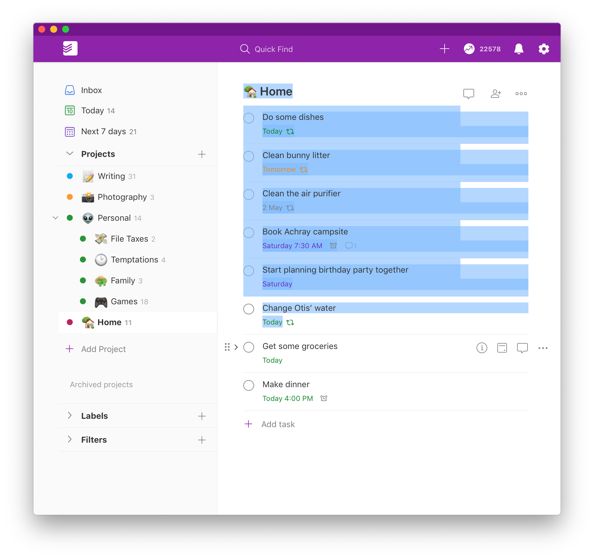
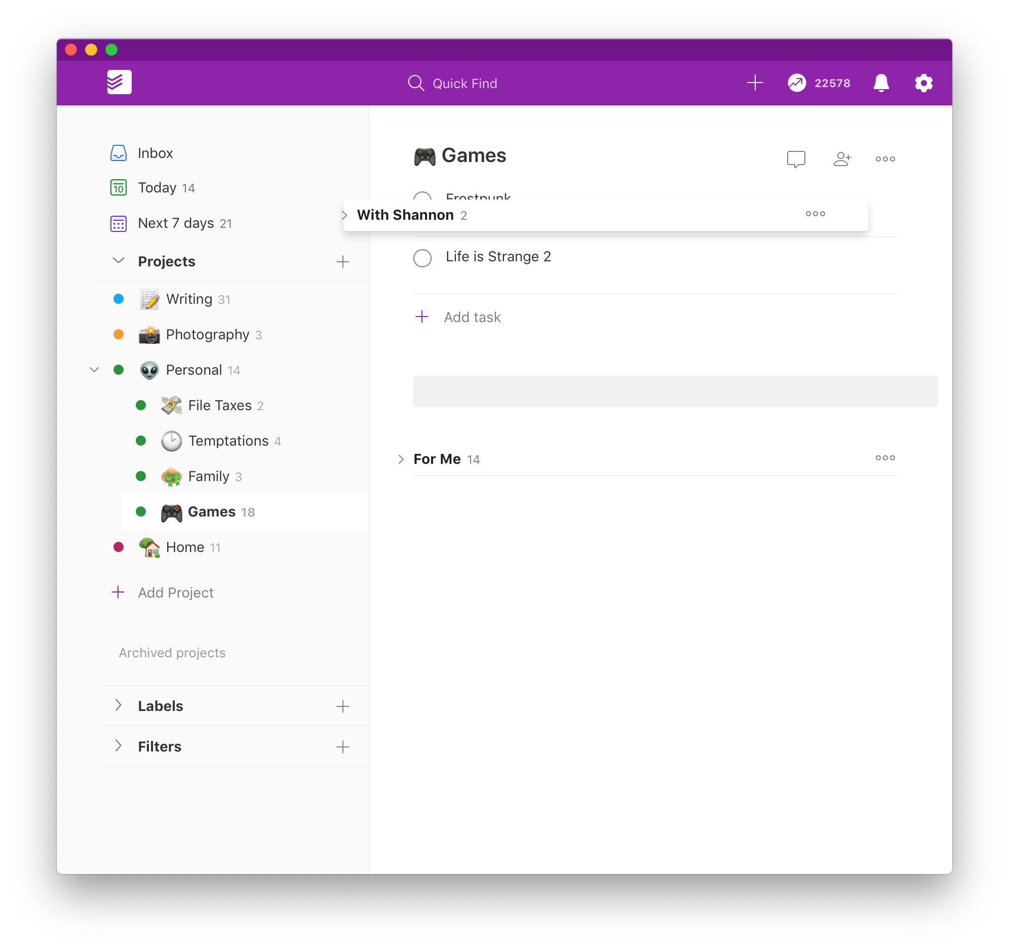
Doist (the company that makes Todoist and Twist) recently unveiled one of the largest updates to Todoist in recent memory, a broad overhaul they called Todoist Foundations. It brought many useful refinements, including proper sections, a familiar drag-and-drop quick add button on iOS and Android, a new task detail view, and revised iconography throughout.
Things, meanwhile, has also been steadily improving, with important quality of life additions like the overhauled Quick Find and the incredible Type Travel feature making its way to iPadOS.
So how do they compare nowadays? I thought I’d offer a set of strengths and shortcomings for each one, a highlight reel of sorts that you can use to determine which one is a better fit for your needs.
Todoist: Strengths
To my mind, the defining feature of Todoist is the natural language task input.
More than ever, that capability sets Todoist apart from the competition for speed of capture. Many task management apps want you to use the Inbox to capture tasks in a very rough form, returning later to properly schedule and file them into the appropriate list.
This workflow has never worked for me because I almost always know exactly where and when each task is for when I enter it. As a result, I want to quickly enter a new task and organize it in the same step, removing the need to subsequently sort through a messy inbox. Even setting aside the time burden, the simple mental ease that this provides is hard to overstate—nothing I’ve tried makes capturing tasks feel as effortless and joyful as Todoist.
That being said, relying on natural language means that you end up having to remember some syntax tricks for more complex scenarios.
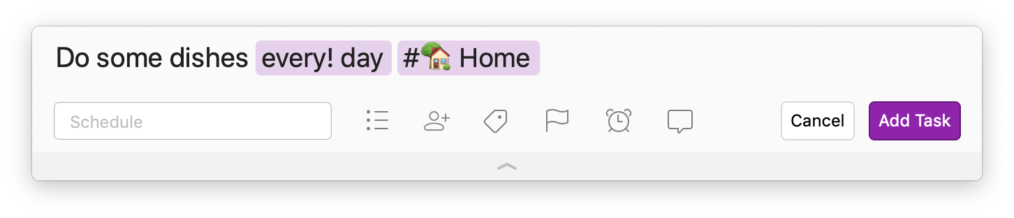
Discovering the ‘every!’ Command
For example, it was only recently that I learned about the every! command, which allows you to create tasks that repeat on a schedule but only after the previous instance has been completed. In the past, when I had repeating tasks, they would repeat whether or not I had completed the previous instance. In many cases, this resulted in a string of nonsensical duplicates.
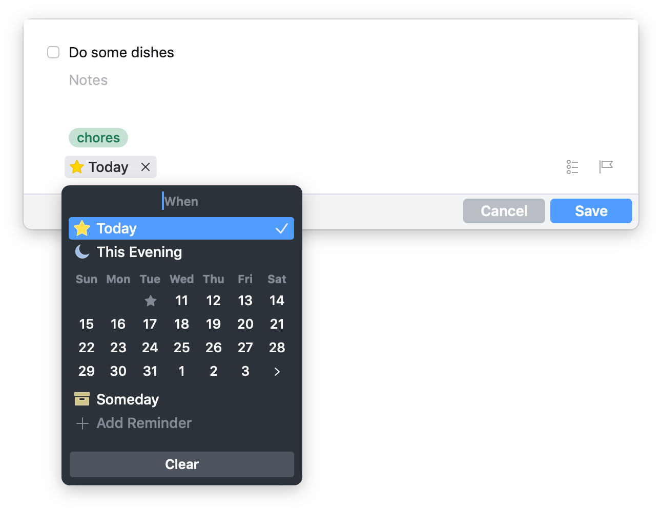
The reason it happens is that I was typing in something like wash some dishes every day. This natural language syntax does indeed create a repeating task, but it repeats daily with no regard for the completion of its predecessor. In Things, when you’re in the dedicated repeat settings for a task, you can choose whether or not you want the repeat to depend on the completion of the current instance, and I thought this wasn’t possible in Todoist until I discovered this syntax trick.
If you use every! instead of every, then Todoist establishes that completion dependency and you get tasks that repeat on schedule only when you’ve completed the current instance.
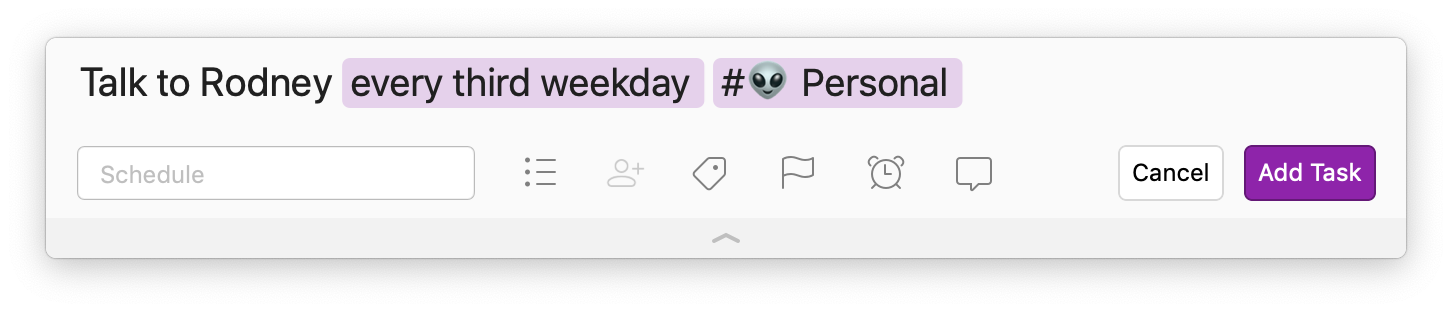
More Sophisticated Scheduling
Speaking of scheduling, Todoist’s understanding of dates and repeating tasks is more sophisticated than Things’. For example, I have a repeating task that I only want to appear every third weekday. In Things, tasks can repeat weekly or daily, but there’s no awareness of weekends, so it’s impossible for me to set up this particular repeat pattern. Even something simpler, like repeating every other weekday, I would have to set up manually in the repeat settings for the task.
In Todoist, I can simply enter a task using every three weekdays and Todoist handles it perfectly.
Other People
Things remains unaware of other people, offering no ability to share or collaborate in a useful way.
As an individual task management system, that’s fine, but it means that many Things users—myself included—are stuck employing a different app for lists or tasks that need to be shared with a spouse, friend, or teammate.
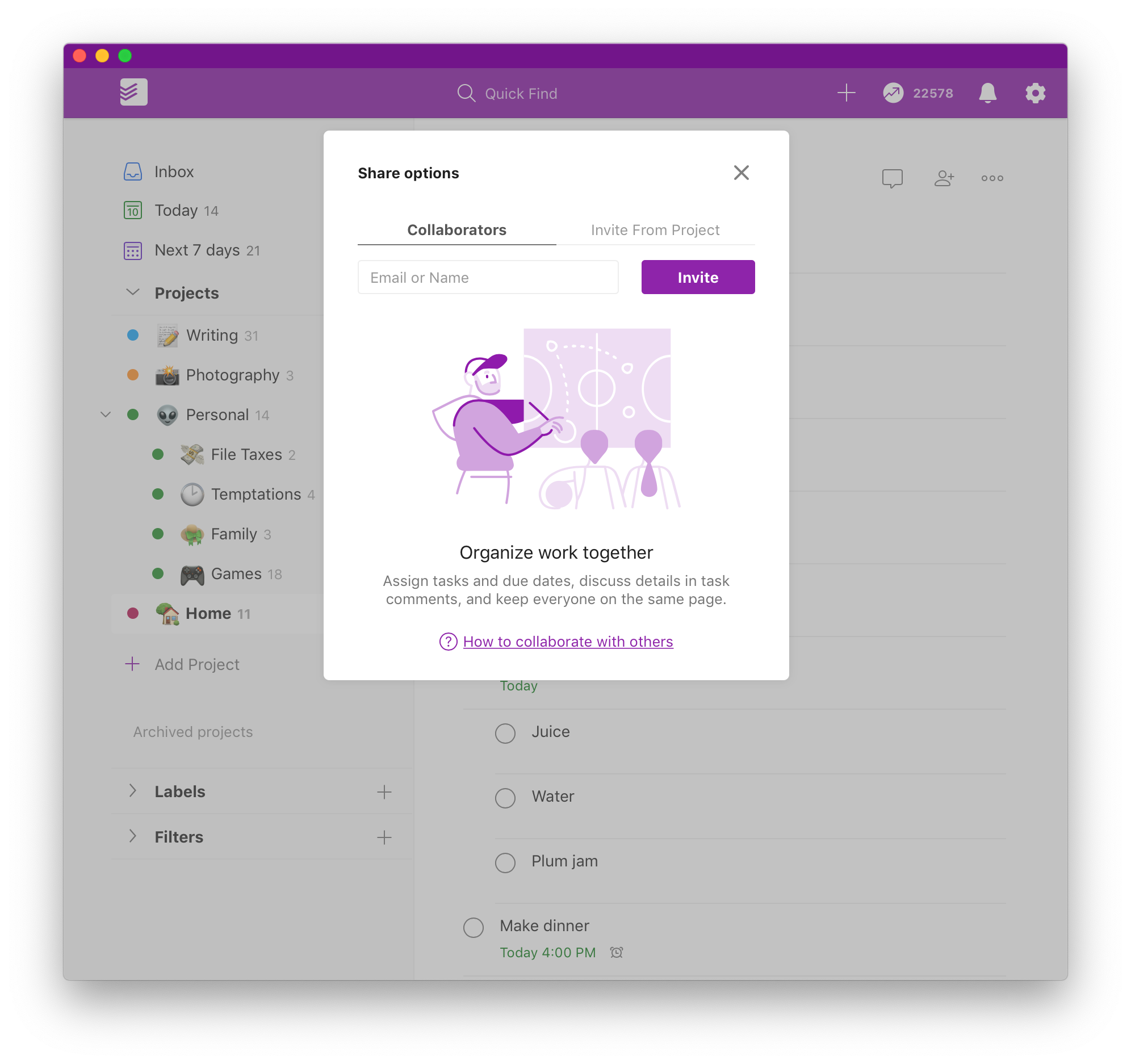
Todoist, on the other hand, was built for collaboration. Projects can be shared, and every project, task, and subtask gets its own dedicated comment thread for easy discussion. Similarly, you can generate a calendar subscription link for any project, allowing you to view your tasks (or allow collaborators to view them) in your calendar system of choice. If you use Google Calendar, there’s also a potent two-way sync available.
Other Platforms
Todoist is available on every mobile and desktop platform on the market, including the web.
Things is only available for Apple platforms, with no web view and no apparent plans to expand to others.
Todoist: Shortcomings
For all its compelling advantages, Todoist still has a lot of rough edges that bother me.
Moving Tasks is a Pain
Moving tasks is a pain, especially on desktop/web. The drag target feels small and volatile, so I often end up accidentally bulk highlighting tasks. What’s worse, you can’t bulk move tasks within a list. This seems like a niche problem, but I ran into it many times after the Foundations update because I suddenly had “real” sections I could use and wanted to move existing tasks into newly created sections.
I initially thought you could use the normal “Move to Project” bulk task moving system to accomplish this, but it remains unaware of sections. As it turns out, the only way to move a group of tasks into a new section is…one at a time. Using that small, easy-to-miss drag target to grab each task and pull it down under its destination section. I had to do this nearly forty times for one of my lists and it was painful.
Sections Kind of Suck
Sections, meanwhile, can’t be moved above the list of loose tasks either. I always want to see sections before loose tasks (similar to how I prefer to have folders on top in the Finder, even with alphabetical sorting), but there’s no way to accomplish this in Todoist. Sections are always at the bottom of the project, under your loose tasks.
For some reason, it’s not only the movement feature that’s unaware of Sections: they’re invisible to Quick Find as well. You cannot currently search for a section to quickly navigate to it. The whole sections system feels half-baked at best, and I hope to see them improve it.
Rigid, Spartan Design
Todoist doesn’t allow you to resize the sidebar, or hide unused sections (I never use Labels or Filters).
That’s not so bad, but there are many small design touches that make Todoist feel distinctly less helpful and informative than their equivalents in Things. For example, while projects can be nested, there’s no immediate visualization of progress like there is for projects in Things with their little pie-chart progress indicator. I miss that bit of glanceable status info.
Moreover, Things includes a list of the day’s calendar events on the Today page, an affordance I find significantly more useful than showing my tasks in my calendar (something I never want).
Todoist also lacks the ability to usefully divide a day depending on context. Omnifocus has the most power here, but even Things’ simple daytime/evening division within the Today view keeps my task list from feeling cluttered. Todoist has no way of creating this sort of contextual division. The best you can do is use priorities or manual ordering to put tasks into a more approachable sequence.
I’m personally not too bothered by this, but my wife (who has been a devoted Todoist user for years) says she finds herself avoiding opening the app sometimes because it feels like there are too many things on her list that she’s unable to do anything about until later in the day and it makes her feel anxious and unproductive.
I find information density a little off in Todoist as well; I wish that task rows weren’t so tall. They span to two rows as soon as you make use of scheduling, comments, or repeats, and it makes the list feel taller and more bloated than I’d like. Ideally, I would love for all of that metadata to be displayed inline with the task title to keep things lean, but if it must span to two rows then I’d prefer to have the spacing tightened up to allow more tasks to be visible at a time without having to resort to a change in text size.
Unfortunately, some of these things are likely consequences of Todoist’s web-based nature. The fluidity and polish of an app like Things are difficult to scale to a service that spans so many more platforms.
Due Dates Only
While Todoist’s understanding of schedules and repeats is unmatched, it lacks one critical feature: the ability to distinguish between start dates and due dates.
I often want to start work on a project many days before it’s due, so in Things I can set both a start date and a due date. The former is when the task shows up in my Today view, but I also remain aware of when it actually needs to be completed by and can manage my time accordingly.
In Todoist, tasks can only have a single date assigned to them. Tasks show up in your Today view on that date, and if they happen to be due later then there’s no way to indicate that unless you put the date in as a simple text comment or include it in the task title, both of which are clunky workarounds.
I honestly expected this to be a headline feature of Todoist Foundations as it’s been one of the most pervasive feature requests for years now, but somehow it continues to remain unaddressed.
Maybe next year?
Things: Strengths
Things’ more limited scope allows it to transcend many of its competitors in terms of polish, fluidity, and general usability.
Incredible Design
There are very few apps, across any category or platform, that can rival Things for user experience and design. It is unbelievably solid, thoughtful, and humane in a way that I hope inspires other developers.
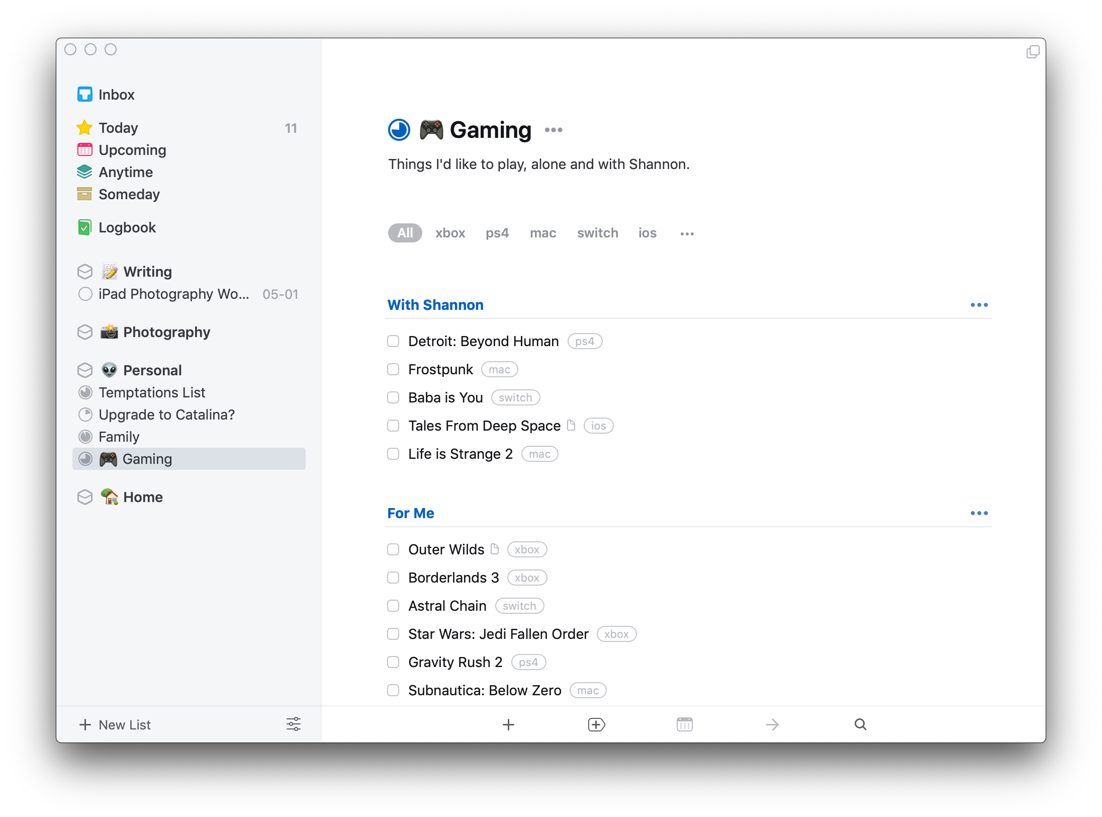
Seemingly-simple details like the ability to see your calendar entries in the Today view, the ability to cancel (not just delete) a task, the presence of progress indicators on Project lists, or the availability of an Evening separation for your day’s tasks are all examples of this deep understanding of how people manage tasks.
All of the subtle animations and a clear sense of visual hierarchy come together to form a brilliantly cohesive experience that makes task management seem effortless, light, and unthreatening.
Keyboard Navigation
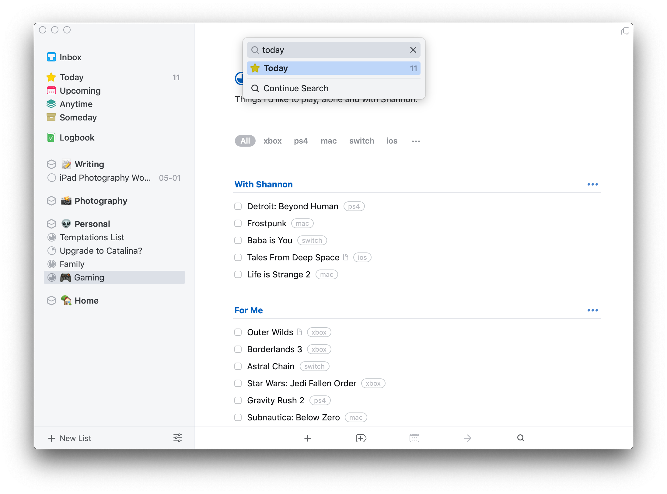
Navigating around Things feels like a superpower thanks to Type Travel and the associated Quick Find features.
It’s such an unfamiliar concept that it took me some time to get used to, but now I wish every app worked this way. In Things, to get around you can simply…start typing. Want to get to your Today view? Just start typing today—from anywhere in the app—and you’ll see the Quick Find menu appear and autocomplete your destination.
This works for Projects, Areas, preset lists like Upcoming and Anytime, as well as individual tasks, headings, and hidden utility lists like Deadlines, Repeating, and Tomorrow.
Best of all, this works on iPadOS with a connected keyboard as well. Between Type Travel and keyboard shortcuts, you can accomplish almost anything in Things without clicking or tapping.
The Logbook
Things and Todoist both take pretty good care of your completed tasks, but Things has a dedicated Logbook section for them that I find appealing in principle, even if I don’t look at it that often.
Todoist is a bit more granular in that it has an “activity log” that not only shows completed tasks, but also captures changes you’ve made, things you’ve removed, and other such details. This is fine, but it’s less accessible and feels like a troubleshooting tool more than a way to reflect on your accomplishments.
Things: Shortcomings
While I spend most of my time with Things, some aspects continue to bother me.
Cumbersome Task Entry
Given my preference for quick capture of tasks with all metadata, you can imagine that I don’t consider Things to be as quick. It isn’t terrible, but it requires a lot of tabbing around through multiple fields as compared to the simple typing in Todoist.
Furthermore, certain aspects like repeat scheduling can’t be set up at capture at all in Things—you have to create the task first, then navigate to it and access its repeat settings.
This is also one area where Todoist’s more spartan design has an advantage: the total lack of interface fluff or animations makes interaction feel quicker and more responsive, particularly on mobile devices.
I should mention that Things does, technically, have some natural language input, but it only operates in the scheduling field of task entry and lacks a few of the more sophisticated options that Todoist offers (like awareness of weekdays).
No Collaboration
My needs on this front are basic, but Things nevertheless fails to provide any ability to share a list with someone else.
I’m not a big user of email integrations and all those neat things that Todoist can do, I just want to be able to have a shared grocery list with my wife or collaborate on travel planning. Todoist makes this sort of thing effortless, and you can use as many or as few of its collaboration features as you need.
Todoist also has the advantage of allowing file and link attachments, which I find very helpful.
Things is focused entirely on personal productivity, and it seems to think that everyone’s tasks exist in a protected silo where other humans don’t matter or contribute to your day. It’s not the end of the world to have to use Reminders or another simple app for those shared lists, but it feels like unnecessary app clutter.
It’s an unfortunate limitation, particularly because I believe the team would have a unique approach to solving this problem if they ever decided to tackle it.
No Equivalent to Filters
Todoist’s Filters operate like smart searches, and since you can assign filters as Favourites, you can effectively set up custom contexts in your sidebar.
I don’t personally have a use for this, but I’ve heard from fellow Things users who have a higher task volume that they’d like the ability to create and keep those views more accessible without having to perform searches every time they want to see their tasks organized that way.
Lack of Web Access
The burden of supporting multiple platforms with a native app on each is heavy, so I understand why the Things team hasn’t been eager to take that on.
That being said, the lack of a web interface for Things impacts its usefulness for people who don’t have access to Apple devices at work (or at all, obviously). They can, of course, bring their iPhone or iPad with them and use it in tandem, but having your task manager available in some fashion on a work machine would be more streamlined.
A web view would immediately open Things up to other platforms including Windows, Linux, and ChromeOS, and a well-made web app should also operate well in a mobile browser, allowing Android users to partake.
It’s still a lot of work, but with their sync infrastructure in place, I feel like it’s a natural next step that would allow them to expand their reach and more easily justify a switch to sustainable subscription pricing.
Things vs Todoist in 2020
As always, I’m torn.
When you have two contenders that are so capable, the decision comes down to which set of shortcomings most directly impacts your productivity.
Things is beautiful, thoughtful, and focused, but I wish I could add tasks as effortlessly as I can in Todoist, collaborate with others, attach files and links to tasks, and access it from any device I happen to be testing or using.
Todoist is fast, powerful, and ambitious, but it lacks polish and is missing quality of life features like start/due dates, glanceable information cues, and more robust support for sections and navigation that make Things feel so delightful to use.
There’s also the question of cost; Todoist is a subscription ($36/y, though there’s also a free tier) whereas Things is a one-time purchase on each platform (you’ll spend $80 getting it on macOS, iOS, and iPadOS).
For now, I’m still using Todoist and enjoying the sense of speed and flexibility that it offers.
While you can easily go down a rabbit hole and obsess over your choice of app instead of actually getting things done, I do think it’s valuable to re-evaluate your choices every so often. That way, you can be sure the choice you’ve made is still the best one and isn’t just an old habit that’s holding you back.