 Marius Masalar
GoodTask vs. Clear
Here we go again.
When I first started blogging, one of the subjects I tackled was the rivalry between to-do apps Things and Wunderlist. I struggled to figure out which of them was best suited to my needs, and which offered the best balance between capability and simplicity.
As it turns out, it wasn’t them—it was me. That entire system of task management isn’t aligned with how I think of productivity. Nevertheless, I like to keep my finger on the pulse of productivity software, and I do still use Reminders for the basic task management scenarios where it is superior to a Bullet Journal.
In the hopes of finding a replacement for Reminders, I recently took some time away from my usual system to try out a few new task management contenders: GoodTask, and Clear.
Foundations
To be fair, Clear was actually released way back in 2012, where it held the #1 paid app spot worldwide, but I hadn’t given it a fair chance way back then. At the time, I found it simply too lean…too many missing features to justify a transition, despite its killer aesthetic and delightful interaction animations.
In any event, my first priority was evaluating the core functionality of the apps. Both have iOS and Mac apps available, and both boast about seamless cross-platform sync, so the playing field would appear to be level.
The reality was unexpectedly complicated. Clear provides its own sync via iCloud, and consequently it works and feels very seamless.
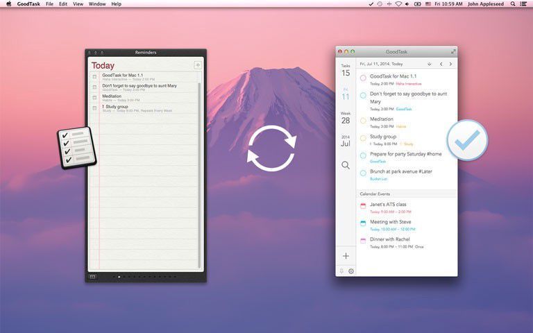
GoodTask takes a different approach—one that I expected to produce superior results—by building its entire architecture on top of the standard Reminders app and its data. GoodTask isn’t another app you have to migrate your data to, it’s simply a more functional and aesthetically pleasing way of interacting with your existing Reminders data.
In other words, you can use it interchangeably with Reminders on iOS and/or OS X.
Sync Performance
To my mind, the fact that GoodTask is simply a “layer” on top of Reminders should have resulted in sync that was just as fast and reliable as Clear’s, if not more so.
For whatever reason, this was not my experience. In fact, I often encountered significant lag between marking a task as complete on my phone and that state being recognized by the Mac app.
Moreover, I encountered several instances where marking a task as complete on one device simply didn’t translate to the other at all—even half a day later!
When using the Reminders app, sync is noticeably quicker, and invariably accurate, so something about how GoodTask is syncing leaves much to be desired.
Clear is to be commended not only for being quick to sync, but also for being 100% accurate during my usage. Regardless of what device I was using it from, or how quickly I switched to another, Clear kept up.
Features & Functionality
GoodTask is an extension of Reminders, so everything you can do in Reminders can be accomplished in GoodTask as well.
This includes:
- Creating tasks and organizing them into lists
- Adding reminders for tasks, both time and location based
- Creating repeating tasks with custom schedule
- Sharing lists with other people
To me, those represent a bare minimum of functionality without which I cannot manage my tasks the way I naturally want to in these kinds of apps.
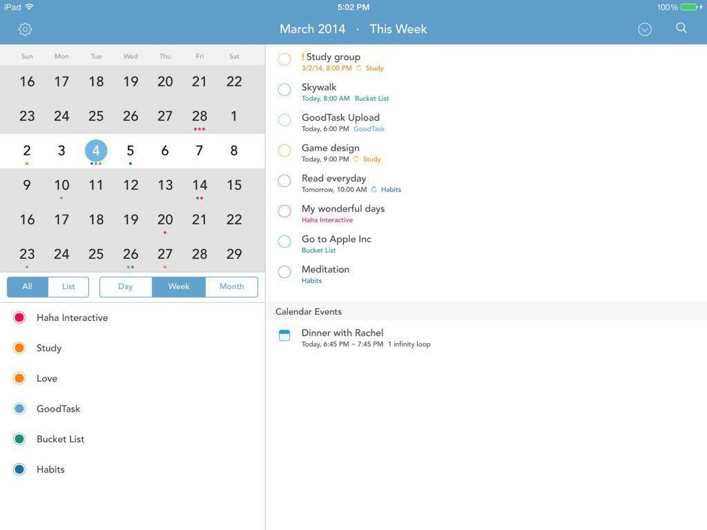
Beyond the basics, GoodTask ropes in limited Calendar integration, and a custom URL scheme for integrating with apps like Launch Center Pro.
The calendar integration is functionally superficial in that you cannot add, remove, or modify calendar events, but visually it provides a great deal of satisfaction to be able to see both your calendar events and tasks in a single app.
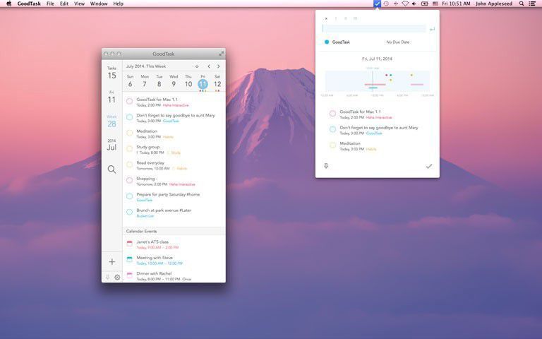
On either platform, GoodTask displays this info in either a Day, Week, or Month view, and there’s also a holistic Tasks view that contains everything, albeit not very usefully—more on that later.
While I’m okay with the lack of editing/creation capabilities for the calendar events in the time-based views, I do wish that there was a way to at least open the Calendar app from GoodTask. As an overview, seeing those calendar events is terrific since it means I don’t have to keep two apps open, but clicking an event in GoodTask is a dead end: there’s no link to the event in your calendar app, or a link to Maps for finding the location.
Clear eschews almost every feature that Realmac Software considered extraneous to the process of managing tasks (for better or worse), which means that beyond creating tasks and lists, you cannot do much.
Task reminders, for example, were added recently but can only be configured to trigger at a specific time, not a place. Recurring tasks of any sort are also absent. Sharing is entirely impossible, meaning that having a communal grocery list with your significant other/roommate/family/etc. is one task that cannot be accomplished with this app.
To me, those omissions make Clear functionally limited in a way that impacts my usage in very tangible ways—a shared grocery list is one of my most used lists, for instance, and I often set reminders for myself while I’m out to trigger when I get home.
More Reminders Benefits: Siri and Web Access
In other words, GoodTask easily bests Clear for sheer functionality, and one potentially-overlooked benefit of being integrated with the native Reminders is that GoodTask can therefore take advantage of Siri.
For many people, speaking to your phone is still a strange experience, but having been trained by my time with the Moto X, I find myself doing it all the time, and mostly in the context of adding tasks.
“Add bread to my grocery list” is a good example. I can say this to Siri while I’m out, while I’m distracted…anywhere. She dutifully finds my list called Groceries and adds bread to it.
Since GoodTask is built upon Reminders, I can see that task the next time I open the app. No such luck with Clear. The closest we can come to that experience using Clear is opening the app, swiping to add a new task, and then using dictation instead of typing. Either way, it takes a lot more steps.
For situations when you find yourself restricted to a browser, GoodTask users can fall back on the native Reminders web app. Clear users, as you can imagine, are stuck.
Design
Since aesthetics are leading marketing points for both apps, I want to take some time to talk about design not only in terms of aesthetics but also in terms of usability.
GoodTask, Bad Design
In the case of GoodTask, the interface is visually pleasing and consistent on both platforms, so using the app on either feels like a seamless experience. The desktop app also has a menu gremlin that allows new tasks to be added without bringing the main window up.
As previously mentioned, the GoodTask interface is always divided into several views: Day, Week, Month, and Tasks. These views are attractive, but form has come at the expense of function.
The process of creating a new task, for example, is not as streamlined as the native Reminders. The app does not allow you to click within a list to add a new item (or tap on iOS), so you’re stuck using the keyboard shortcut or clicking the + button on the interface.
Thankfully, on iOS you can use the wonderful pull gesture to quickly add a new task in any of the views, which is great.
Since you can’t open a specific list to view only its contents, you also can’t quickly add a task to a specific list without selecting it from a dropdown menu (unless you’ve set the list in question to be your default).
For example, within the Tasks view, all lists and all their tasks are shown by default, and while you can collapse certain lists, you still can’t directly add a new task to whichever list you’re looking at. Getting an overview of all your lists can also be a chore, since lists with many items will take up the majority of the interface.
In my case, it means that by default I can only see 3 of my 9 lists in the Tasks view until I start collapsing some of the longer ones. GoodTask also doesn’t remember which lists you’ve collapsed when you restart it, so the problem is compounded.
All of this awkwardness belies either a disproportionate level of attention directed at aesthetics over design, or simply a difference of usage paradigms between GoodTask’s designers and myself. Either seems perfectly plausible to me, and it’s entirely possible that others will find the UX issues I’m having irrelevant.
I Can See Clearly
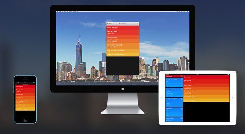
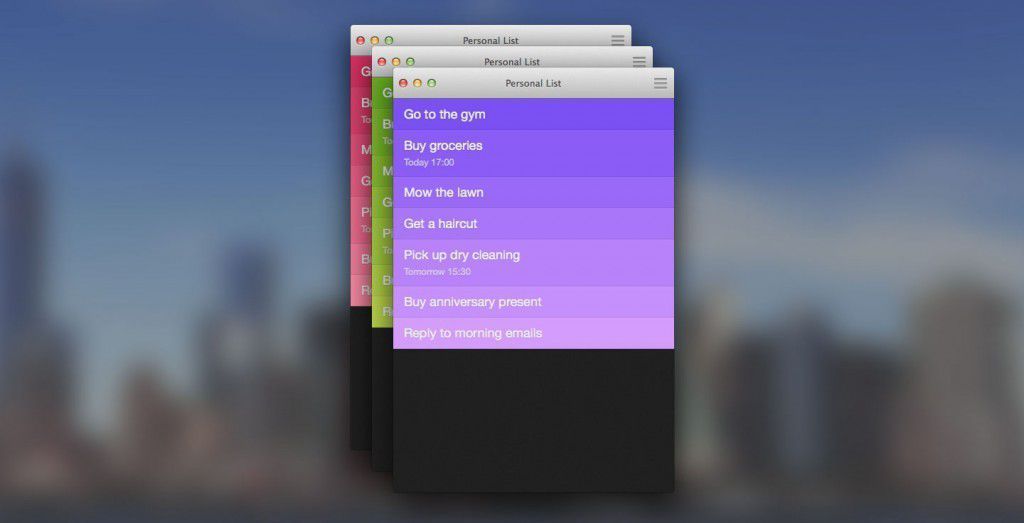
Even more so than GoodTask, Clear is designed around its aesthetic. The colourful, flat look was ahead of its time and has remained utterly at home from iOS 6, through 7, and now into 8.
Assigning colours to lists is more meaningful when those colours are as immersively implemented as in Clear, and the addition of free unlockable colour schemes and IAP sound packs (freely included in the Mac app) make for a clever and respectable way to monetize the free app.
What really stands out, however, is how well thought out the actual user experience is in Clear. Adding tasks in the iOS version uses the same pulldown gesture as GoodTask, but Clear has the advantage of having pioneered it in this context, not to mention the fact that the folding paper aesthetic is intrinsically more tactile.
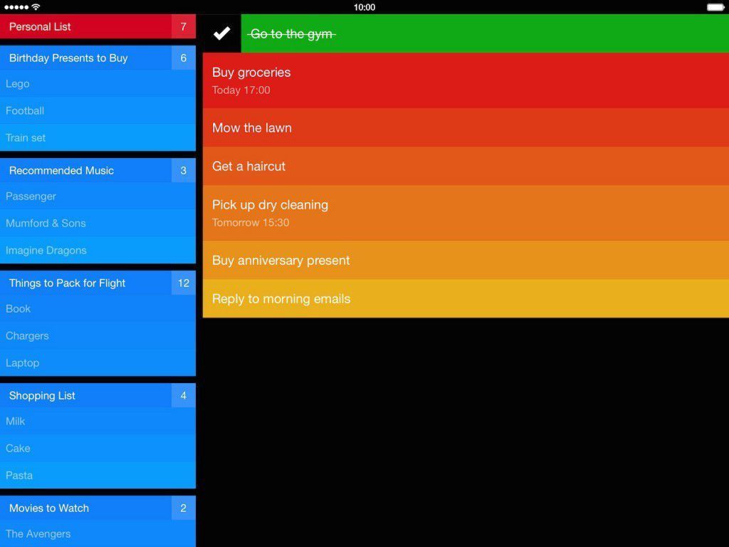
Not only that, but adding tasks in general is more streamlined. New tasks can be added at the top of lists with the pulldown gesture, or between any existing items by pulling them apart with two fingers—a terrifically satisfying gesture.
Completing a task is a swipe from left to right, and deleting it is the opposite. The same gestures also work when dealing with entire lists.
Navigation is also gesture based, with a pinch performing a “zoom” out to the list level, where you can see your individual lists and jump into or rename one. Pinching again takes you to the menu.
The real miracle is how much of this sense of delightful tactility is maintained in the Mac version, which uses the same gestures for trackpads and also supports clicking around and using keyboard shortcuts. New tasks are created simply by typing (or left clicking), and hovering your mouse between existing tasks lets you interject a new one just like on mobile devices. Even the sounds are there, with some very satisfying scrolling clicks.
The only significant downside to Clear’s design is that it too lacks the same ease of access to other lists that the native Reminders app provides. On iOS, Reminders allows you to simply tap the header to get into/out of any list, and on OS X or the web view the sidebar ensures that all your lists are always handy.
Clear actually manages to offer the same ease on iPad, but not on iPhone (where a sidebar wouldn’t fit). More baffling is the OS X implementation, which is one window by default but can be split into multiple windows…I feel like a sidebar is an easier solution than having multiple Clear windows floating around.
I also wish that each list could have its own distinct theme, but I assume that it’s deliberately not possible for reasons of visual continuity between lists.
Showdown
It’s been an odd comparison, I grant you, since Clear is designed to be a no-frills task management environment that prioritizes speed and charming interaction over raw features, while GoodTask is a compelling extension of Reminders that tries to tie in calendar events alongside tasks.
Ultimately, neither is going to sway me from my Bullet Journal approach to staying productive: I’ve become too used to tracking accomplishments, tasks, ideas, and events in the same environment (OneNote) on a daily basis to be able to revert to what now feels like an archaic system of lists.
Nevertheless, for situations where this format still works—like my shared grocery list example from before, and for capturing all those reminders that Siri enters for me while I’m out and about—I was hoping to discover a replacement for the native Reminders.
GoodTask, while beautiful and ambitious, fails to live up to my most basic expectation: being a better user experience than the native Reminders it builds upon. By definition, something that attempts to improve upon Apple’s work should be easier, more beautiful, and more engaging to use. Sadly, to me it was only more beautiful, and that alone is not going to get me to switch.
Clear, on the other hand, exceeded my expectations. In fact, it’s close to perfection—frustratingly so! I’m shaking my fist at Realmac.
It is truly endearing to interact with, effortless to use, and reliable.
Clear lacks only three things that would make me switch to it immediately for my remaining task management needs:
- The ability to create recurring tasks. I use Reminders to help keep me on track for developing good habits, and I don’t want to have to create an identical task every day/week/month because that’s unnecessary work.
- The ability to take dictation directly from Siri. Whether this comes in the form of Reminders integration, or as a result of new APIs available with iOS 8, it is crucial for my usage.
- The ability to share lists with other users. Groceries, gift ideas…whatever the case, it needs to be possible.
I give these suggestions with the understanding that Clear’s main goal was to remove fluff, but my argument is that these three features represent a gigantic spectrum of use cases that are severely impeded or made impossible by their absence.
None of these suggestions are news to Realmac, of course, and in fact their own answer to the question of “Does Clear work with the Reminders app on iOS/OS X?” is an enticing “not at this time” rather than “no”, so I’m optimistic.
Conclusion
While I may not have discovered a replacement for Reminders, I did ultimately enjoy my experience with both GoodTask and Clear.
GoodTask lacks the polish and focus of Clear, but it’s built on solid ground and has a lot of potential to become terrific as the developers continue to work on it. They are very responsive to bug reports and suggestions, so I am confident that we can expect quick improvements.
Clear is unique and remarkable, but for my uses, Realmac have thrown the baby out with the bathwater in trying to pare it down to the essentials. The missing features are maddeningly relevant to the exact ways I would use it, and so despite my earnest desire to switch, for now…I simply can’t.
review productivity technology