Surface 3 vs. Surface Pro 3
On the day of its arrival, I had just handed my life’s work to a kind gentleman at the post office.
I always make an effort to use and review everything that crosses my desk as thoroughly as possible as a matter of principle. This time around, it was also a matter of necessity.
It was a Monday, and the weekend before, I booted my desktop machine and received that chilling system notification that informs you a hard-drive is about to fail. Naturally, I have a good backup system in place, but I still felt that sinking sensation in the pit of my stomach as I switched over to the boot drive’s clone just in time to see the original evaporate.
When I returned from sending the deceased drive back to the manufacturer for a replacement, I was wondering how I was going to get any serious work done with a computer that’s running its operating system off an external drive (which is painfully slow and incapable of any intensive tasks).
Then I got the email informing me that my Surface Pro 3 review unit would arrive that afternoon.
Serendipity to the rescue!
Third Time’s a Charm
When I set out to review the latest generation of Surfaces, I faced a different challenge than in previous years, largely because Microsoft opted to do away with Windows RT for this generation.
Not only that, but they brought the Surface Pro’s best feature—pen support—to the normal Surface 3 as well. As a result, the gap between the two narrowed significantly, making it a more difficult choice than ever for consumers.
What sets them apart now is form factor, raw performance, and a few key optimizations that suit each model’s strengths.
The only way to offer a useful perspective was to spend time with both, so that’s exactly what I did. I spent several weeks rocking the Surface Pro 3 (i5 with 128GB of storage and 4GB of RAM) and then immediately switched to the Surface 3 (64GB of storage and 4GB of RAM).
Instead of wasting words re-writing spec sheets, I want to focus on the core differences and similarities between these machines so that you can make an informed choice about which one is a better fit for your needs.
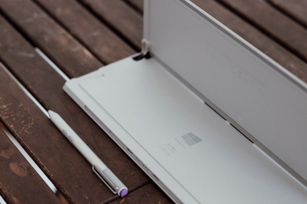
Putting the Pro in Progress
I’ve owned or reviewed every model of the Surface line-up with the exception of the Surface Pro 2. I liked the concept from the beginning, but the execution always left something to be desired.
It’s gratifying to see that even Apple has come around to the promise of a productive tablet. They’re approaching it from a different perspective, and it remains to be seen how successful they’ll be, but the core concept is the same.
It makes Microsoft look prescient and ambitious—words that I’m increasingly comfortable ascribing to the company. I’ve said it before: this is not your parents’ Microsoft we’re dealing with today.
While the concept was strong before, what sets this generation apart from its predecessors is refinement.

Design
For the first time in the family’s history, Microsoft has truly embraced the “Pro” identity, switching to a more spacious 12” screen size housed in a wider, flatter design for their flagship.
The new 3:2 aspect ratio makes it distinctly better suited for common work-oriented tasks (versus the media-optimized widescreen 16:9 aspect ratio of the other Surfaces). Viewing web pages, multi-tasking between several applications, editing documents, and taking notes with the pen is simply more comfortable on the Pro 3 screen.
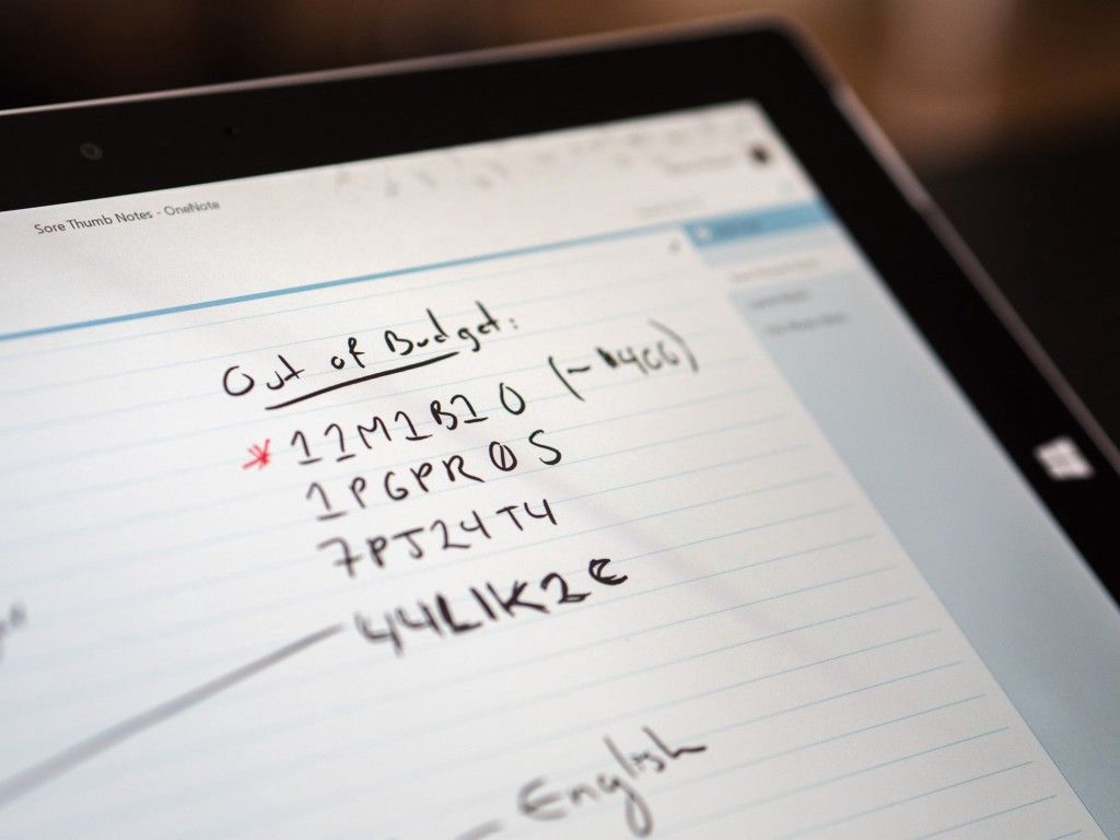
The Surface 3, on the other hand, retains the size of its predecessors, which I always found to be an excellent compromise between the cramped workspace of a tablet and the unwieldiness of a laptop.
The material and physical quality of the devices hasn’t changed; the magnesium bodies feel sturdy and their airbrushed, angular look gives them a distinctly modern identity.
On the Surface Pro 3, the famous kickstand has finally been freed from having fixed positions. You can now adjust it to any angle you like, and I appreciated this especially while using it on my lap, on a bus, and in other situations where a normal seating setup isn’t possible.
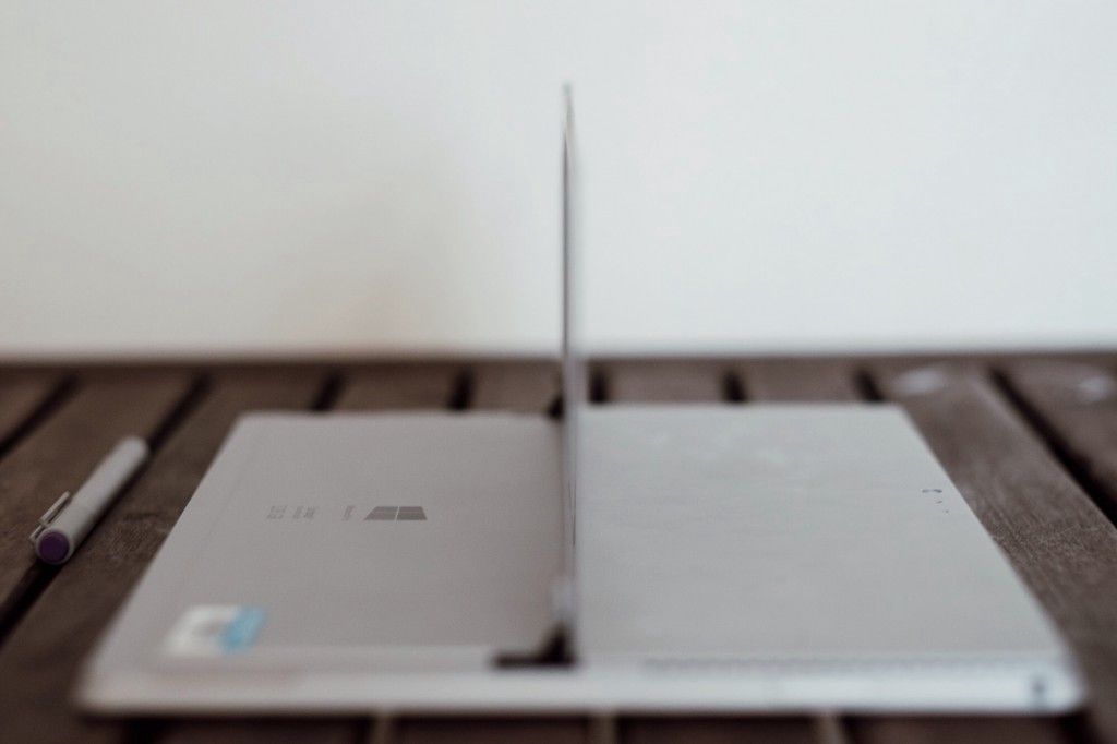
The Surface 3 has three (well, four…sort of) kickstand positions, and I definitely missed the extra leeway after experiencing the infinite angles of its big brother.
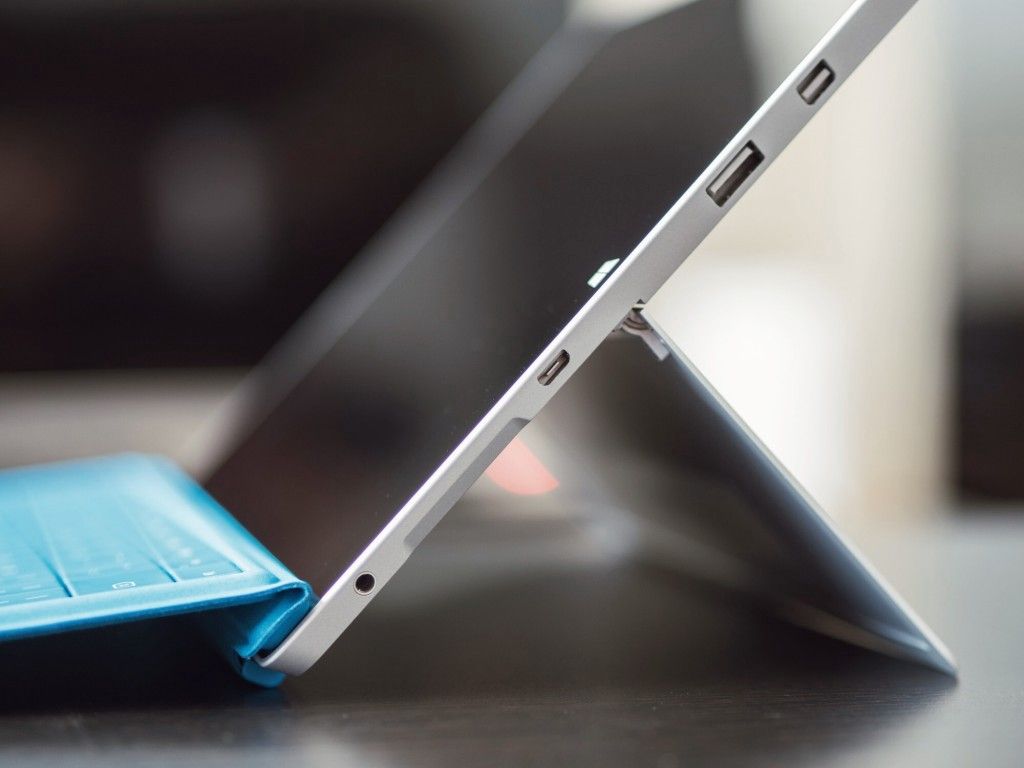
Both models are light enough to be considered portable, though this depends on your perspective. I’m comparing them to the laptops whose functionality they replace rather than the tablets whose form factor they aim to match.
I will say that the Surface Pro 3 seems to have crossed the threshold where my brain considers it a “laptop” as far as size, rather than a tablet. It’s just a bit too big to read things on casually, and just a bit too heavy to carry around the house with me.
Ports and Connectivity
An interesting difference between the two Surfaces is the way that they charge.
The Surface Pro 3 has retained a proprietary charging mechanism (which I find flimsier than before), but the Surface 3 has switched over to a standard MicroUSB port for charging.
This is a brilliant move on Microsoft’s part because it means most people will be able to charge their Surface, their phone, and their e-reader with the same cable. I just wish they had brought over the extra USB port on the Surface Pro’s charging brick to the standard model.
The other key connectivity difference is the availability of LTE on the Surface 3. While both models are meant to be taken on the go, Microsoft seems to be acknowledging that the Pro is just a bit too big for frequent travellers. It’s fine to take to work and back, but business users who are constantly on the go will probably appreciate the smaller form factor in conjunction with the ability to stay connected on the road.
This is especially true when you consider that the performance of the Surface 3 will almost always meet their needs.

Performance
By closing the operating system gap between models, Microsoft has effectively isolated its Pro line to a narrower audience. Many will lust after it, but it’s no longer the case that a Surface Pro 3 will be required for people to have a good experience with a Surface.
The Surface 3 now runs full Windows, so owners have access to the full ecosystem. More importantly, the Surface 3 has enough computing power to handle the vast majority of average needs.
For business users, the entire educational market, most casual home users, and almost everyone who doesn’t have specialized requirements, the Surface 3 is now the de-facto choice for mobile computing.
Web browsing, media consumption, document creation, multi-tasking, research, note-taking, basic coding, and even light gaming are well within the performance envelope of the Surface 3, especially when configured with 4GB of RAM. Moreover, the exceptional battery life and fan-less design means that the Surface 3 is actually better for many of these tasks than its more powerful sibling.
Configured anywhere above the baseline model, the Surface Pro 3 offers enough horsepower to tackle most computing requirements without breaking a sweat: mobile music production, running VMs and compilers for software development, photo editing, video editing, basic gaming, etc. are all tasks I successfully accomplished on the review unit.
As with any laptop that isn’t an unwieldy behemoth, the performance isn’t going to rival your desktop machine, but it’s more than capable of offering solid performance on the move or docked at a desk.
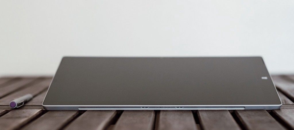
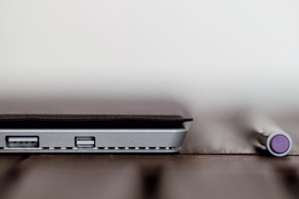
For you desk users, it’s worth noting that the Pro 3’s Mini DisplayPort is now capable of outputting 4K video, so if you wanted more screen real estate, you’ve definitely got it.
Whether or not you need that extra computing power is the most important question to ask yourself, and chances are if you can’t come up with a specific reason for needing it, you’re better off with the Surface 3.
Pen
When it comes to the Surface line, the pen is perhaps their most recognizable feature.
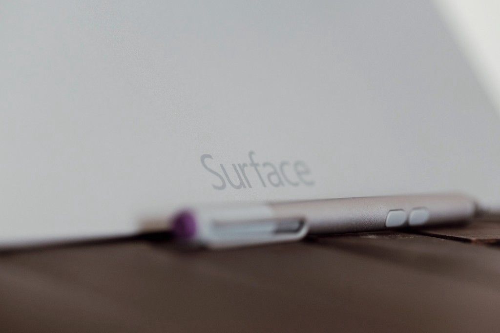
Much has been written about the fact that the Surface 3 and Surface Pro 3 use a different pen technology than their predecessors (Ntrig vs. Wacom). Now that several months have elapsed and the driver situation has stabilized, the reality is that the difference between the two systems is essentially invisible to the end user.
As someone who is not an artist, my main use of the pen is for note-taking, for which I care more about accuracy and latency than having thousands of levels of pressure sensitivity. In this respect, I noticed an improvement in the pen on both the Surface 3 and Pro 3.
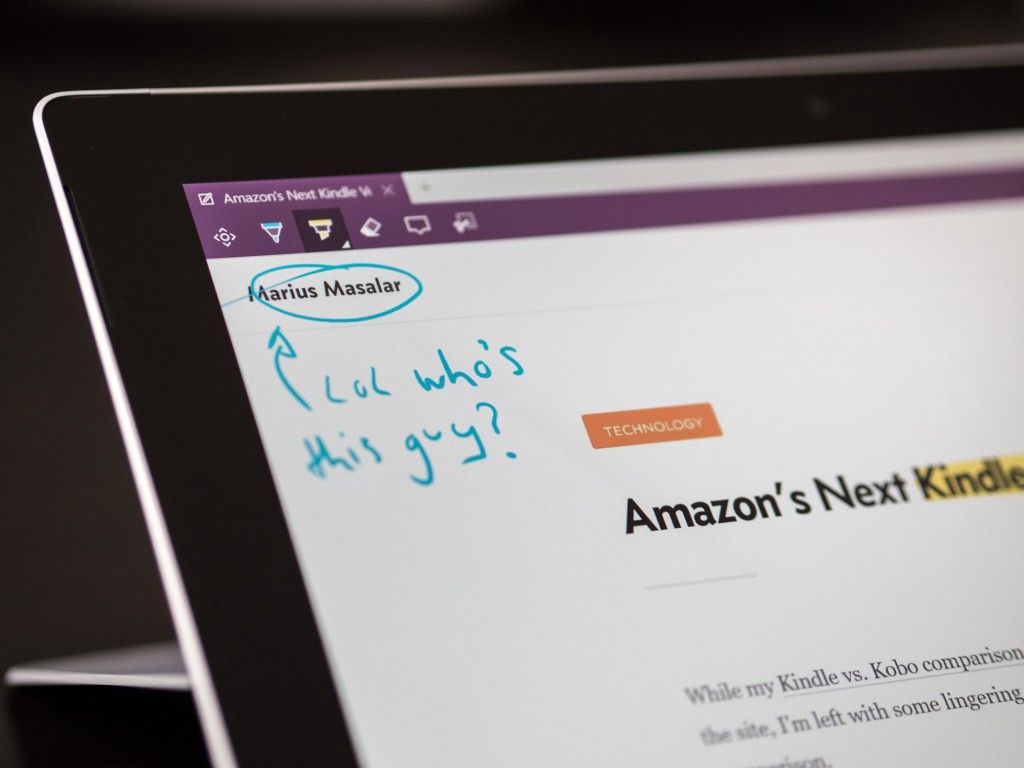
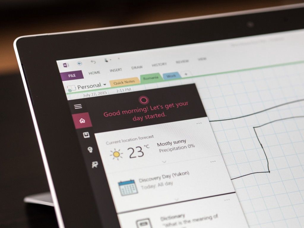
The pen is even more useful now that Windows 10’s Edge browser has page annotations built in. This was a surprisingly useful feature, and one that I now wish would make its way into the browsers I use regularly. It’s simple enough to be accessible to anyone, but robust enough to provide actual value, and the high OneNote integration makes annotated web pages easy to manipulate and share.
Overall, the pen experience is still by far the best I’ve ever experienced on a digital device, and I applaud Microsoft’s ongoing research into making pen input feel as natural and convincing as the real thing.
While using a pen on glass remains different than using a pen on paper, I no longer consider it to be worse.
Keyboards & Cameras
With new Surfaces come new Surface Type covers.
These interesting accessories complete the Surface package; indeed you never see one shown without a colourful cover attached.
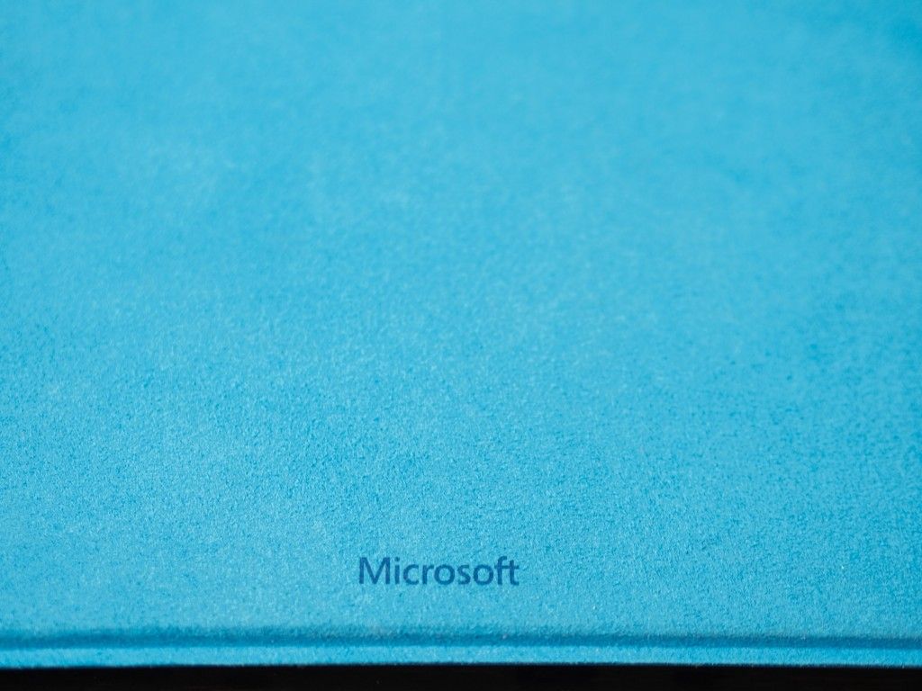
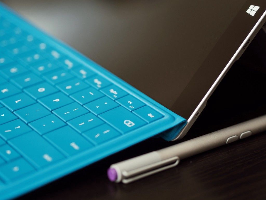
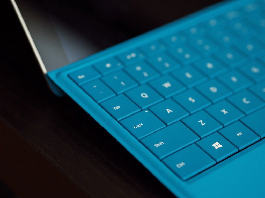
This generation has been tweaked in a few crucial ways: there’s a larger trackpad area, the mounting magnets can now lift the keyboard to a more comfortable angle, the keys are backlit, and the key size and travel has been ever so slightly adjusted.
Taken together, these updates result in a more comfortable typing experience. For the first time, I felt like I was typing on a real keyboard that just happened to be a felt-lined tablet cover as well. It was quite comfortable once I got used to it, and I didn’t feel slower or less accurate than on a standard keyboard.
For the sake of completeness, I should also mention that the cameras have been updated on the Surface 3 and Pro 3. The Pro now has 5MP front and rear facing cameras, and the normal 3 has a 3.5MP front-facing camera and an 8MP rear shooter. These are clearly designed for video conferencing though; please don’t run around taking photos with them.
Battery
If you’re wondering about battery life, I’ll say only this: the Surface 3 made it through the day consistently and predictably, without any nasty surprises. It’s no iPad, but the Surface 3 achieves the baseline for necessary battery performance in a modern device: it lasts long enough that I don’t worry about it.
The Surface Pro 3 wasn’t quite the same, although it’s still a tremendous upgrade from the first generation Pros, which had abysmal battery life. The Pro 3 can generally be relied upon to make it through the day, but because of its more powerful computing architecture, the drain tended to be faster. Doing anything that taxes the processor for an extended period of time (rendering video, for example) can really chew through battery quickly.
This is an expected trade-off though, and Microsoft has done an admirable job optimizing this over time with firmware updates.
Still, you’ll want to keep your charger handy for the Pro 3, whereas you can safely forget it at home with the 3.
Choosing a Surface
Microsoft’s targeting has become increasingly clear.
Basically, almost everyone should pick the Surface 3. Students, business users, family members, writers, casual internet browsers…for all these people, the Surface 3 offers the best bang for your buck in the computing world. More capable than a Chromebook, with a more familiar computing experience than an iPad, the Surface 3 is a laptop, tablet, and notebook.
It is the best computing device that Microsoft has ever released, and it’s the fulfillment of the promise they made when the first Surface was unveiled.
You can get cheaper machines, and you can get more powerful machines, but the unique balance of size, power, form factor, and input flexibility of the Surface 3 is unbeatable.
If (and only if) you’re the kind of user who would normally buy a powerful laptop, you should probably buy a Surface Pro instead. It offers the same calibre of performance, but its more flexible form factor gives it a wider range of capabilities.
The Pro 3 sacrifices some portability in favour of more screen real estate and the horsepower to do more demanding things with it. Digital artists, media professionals, architects, software engineers, and other power users will be well served by the Pro 3’s balance of attributes.
Docked and attached to external monitors at a desk, it becomes the nerve centre of an office workspace, but pull it out of the dock and all that power comes with you on the train ride home, or on a flight to your next presentation, or to the cottage for the weekend.
It’s the ultimate untethered workstation; overkill for most people, but potentially game-changing for its target audience.
Conclusions
When my hard-drive replacement was installed and my studio machine was up and running again, I found myself much less inclined to use the Surface Pro 3.
Because of the unique assortment of computing tasks I do, the Surface Pro 3 was never going to be more than a stop-gap for me—but I knew that going in.
It’s too bulky for me to want to take it everywhere, and it’s not powerful enough to do my music work on (no mobile machine is, so it’s not the fault of the Surface just a consequence of the kind of work I do).
Ultimately, the Surface Pro 3 just doesn’t fit my needs.
The Surface 3, on the other hand, never left my side. It’s just capable enough to handle the majority of tasks I needed it for, and the difference in size is enough to make it a comfortable daily carry.
Writing articles, researching, browsing, and even writing music (notation in Sibelius, not using a sequencer or any demanding samples/synths) was no problem at all. The latter was actually a better experience on the Surface than the studio machine because of the pen input. That same pen input made taking meeting notes in OneNote a terrific experience.
As a companion to my full computing setup, or a standalone machine for everything non-intensive, the Surface 3 struck the perfect balance of features for my needs. In fact, if I’d been given the option, I would have opted to keep the Surface 3, not the Pro.
Your computing needs will dictate which Surface is right for you, but you can make it easier by answering the following questions for yourself:
- Do you regularly do computationally intensive tasks (video rendering, large photo manipulation, music production, compiling large codebases) on the go?
- Does a 12” screen versus a 10.8” screen make a difference for your usage?
- Do you prefer more horsepower and less battery life or less power but no fans and comfortable all-day battery life?
- Do you need LTE connectivity?
- Are you looking to spend more or less than $1,000?
Whatever you decide, you’re buying into a family of forward-thinking, capable devices.
The Surface 3 and Surface Pro 3 are a significant leap forward in almost every way, and it’s the first time that I consider Microsoft’s promise of replacing a laptop for most people to be truly fulfilled.
review technology productivity