iPhone 6s
It’s too soon for me to draw any serious conclusions, but I’ve been spending some time with an iPhone 6S and wanted to share a few initial impressions.
For the sake of context, it’s worth mentioning that my daily driver is an iPhone 6 Plus, and I have never been happier with a phone than I am with this one, despite the fact that it took me some time to get used to the size.
I’ve always been curious about the standard size though, so this year I wanted to spend some time with the 6S rather than simply upgrading to the 6S Plus directly.
Shot On iPhone 6S
I’m going to start with the most important change: the camera.
All photos in this review that aren’t of the phone itself were shot this weekend on an iPhone 6S with no special technique, no tripod, and no post-processing whatsoever. These are all literally taken straight from the Photos app and resized for the web.

Photography is a major passion of mine, and I love being able to carry some incredible pieces of imaging technology with me. Like many people, I’ve taken a lot of photos with my iPhone, but I always reach for my camera when I can.
This isn’t likely to change, but the iPhone 6S camera has taken a significant leap forward, to the point where any interest I had in buying a Sony RX100 or similar compact point-and-shoot has evaporated.

While I wish the megapixel count had climbed to a more comfortable 16MP, the new 12MP sensor provides a healthy boost to image detail while retaining the phone’s ability to capture images with the sort of instant, reliable responsiveness that keeps iPhones at the forefront of the most popular camera charts.
Photos are detailed, colours are accurate, and dynamic range is broader than ever (even with HDR mode turned off).

Moving Pictures
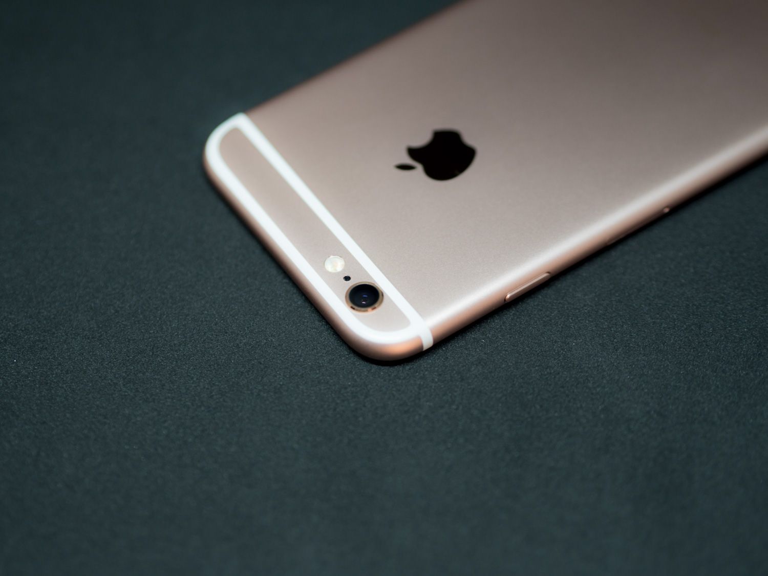
I’m still testing the imaging capabilities overall, but one aspect that immediately jumped out at me is how important optical image stabilization really is.
Going back to a normal 6 after using the 6 Plus has made me realize just how much of a difference it makes. It allows for sharper photos in all conditions with less deliberate shooting technique, and of course produces much better low light shots.
I consider the OIS alone to be enough of a reason for people to get the Plus instead of the normal 6S.
Speaking of pictures and movement, I have to say that I’m surprised by Live Photos (or as my family calls them “those Harry Potter photos”). I initially dismissed them as a gimmick, but Apple has once again proven that they’re masterful at taking an existing concept and refining it to the point of perfection.
Live Photos make me smile. Scrolling through my photos and seeing that brief hint of motion, being able to press (or hold on a device without 3D Touch) and see the scene come to life is delightful. Often what we want to capture about a scene is not the momentary arrangement of objects and people, but the nuances of how they’re interacting with each other.
The latter is impossible with a still photo, and I say this as someone who adores photography as a medium. At best, we can hint at those nuances, giving our imagination and memory the handholds it needs to fill in the blanks for us.

A video, of course, captures everything, and much of the criticism of Live Photos centres around the fact that they’re essentially short videos. But video is fundamentally a different medium. A video demands more attention, more involvement. It carries more information, has different priorities.
A video’s priority is to capture a sequence of events, a complete timeline of action. A photo captures a single moment, allowing our imagination to extrapolate the broader context.
Live Photos bridge the gap between the two. They’re more photo than video to me because the priority is still on capturing a moment—the execution just allows for that moment to be captured more completely.
Most of our improvements to camera technology have been about capturing moments with more accuracy, more dynamic range, more detail. Live Photos are Apple’s attempt to improve an entirely different dimension: time.
All of this to say that I think Apple’s clout has the potential to finally make this concept a widespread evolution of imaging. The demand is certainly there (just look at previous iterations of the concept, or entire platforms like Vine).
They don’t necessarily do things first, but Apple definitely tends to do things best and I look forward to seeing what the world at large makes of Live Photos once they get easier to share everywhere.
3D Touch
Adding new dimensions to familiar concepts seems to be the theme of this year’s iPhone refresh.
The feature that’s been getting the most attention is unsurprisingly 3D Touch, which is an evolution of the Force Touch concept we first saw on the Apple Watch. Essentially, it adds depth to interaction with your screen, giving meaning to touch pressure.
In practise, this is implemented as a sort of “right-click” that offers more or less dynamic shortcut options depending on the individual app. Where Live Photos turned out to be more interesting than I expected, 3D Touch has so far been a bit underwhelming.
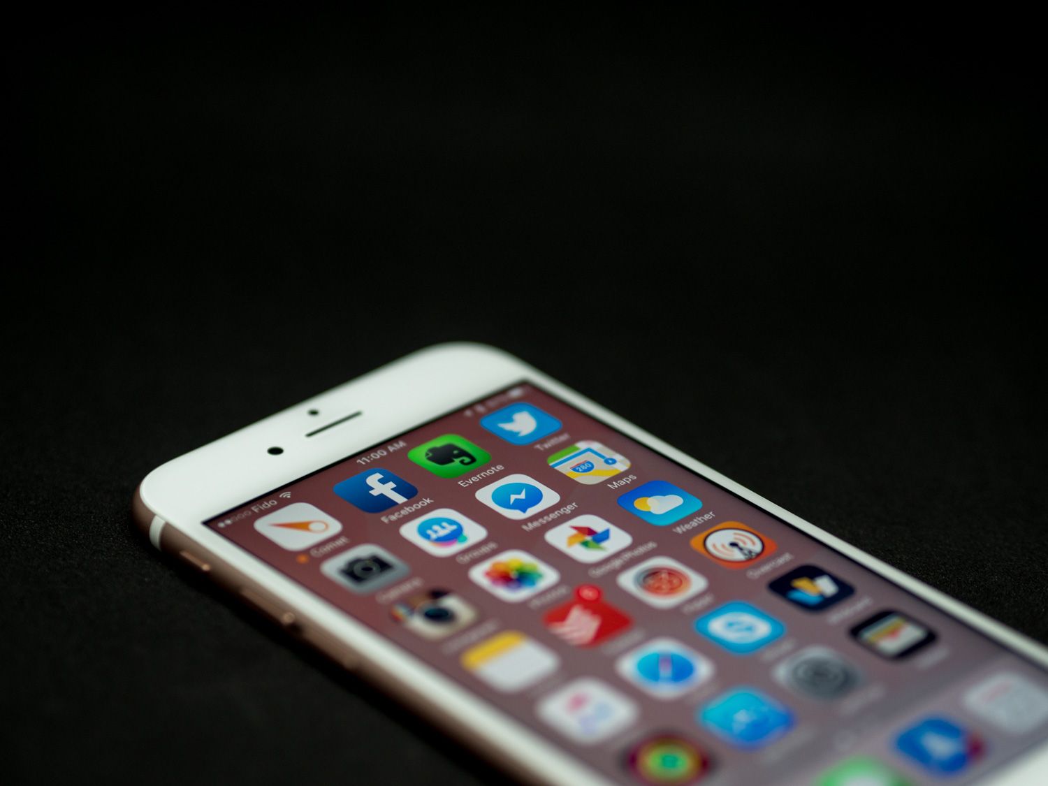
This isn’t because I don’t think the concept has potential, but I do think that it’s just that: potential. For now, it feels like a paradigm that hasn’t been sufficiently explored, so until more third-party developers throw their weight behind it, I wouldn’t consider it a crucial decision-making factor.
The one component of 3D Touch that I did find compelling is Peek and Pop. They’re silly names, but the implementation is perfect. The ability to quickly preview links, dates, and conversations without leaving an app is terrific.
I can’t wait for it to come to iPad as well, where this kind of streamlining further reinforces iOS 9’s push toward a more productive tablet experience.
More Grip, Less Slip
On the topic of touch, it isn’t just the front of the phone that’s been improved.
I used to be all about screen protectors and cases, but in recent months I’ve been going commando with my iPhone. This began as an experiment, but ended up being a preferable experience.
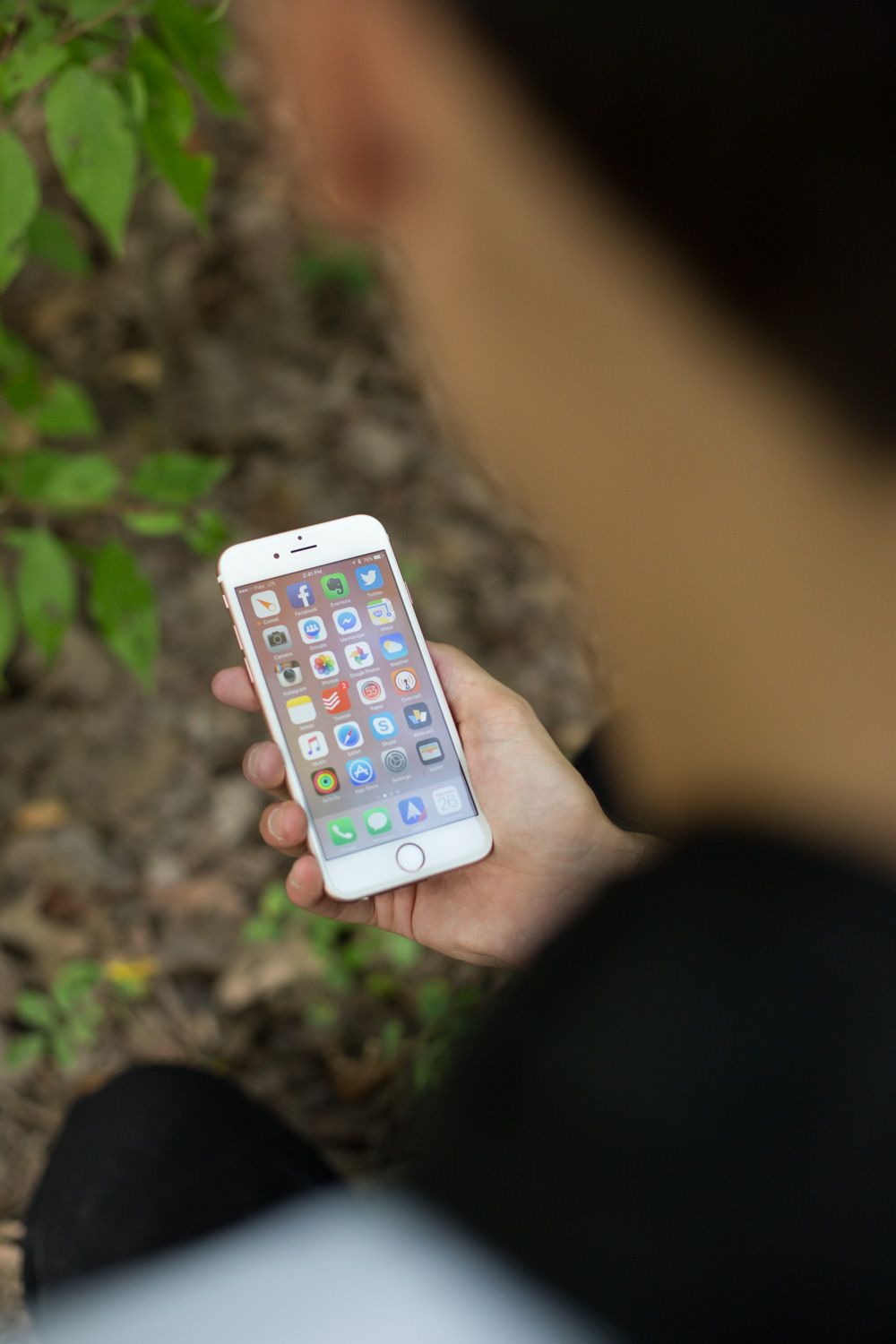
The iPhone 6/6 Plus are slippery. The rounded edges and slick metallic surfaces are beautiful, but they do make using your iPhone feel like tapping and sliding on the world’s most expensive bar of soap. I don’t drop my phones, so it’s a risk I’m willing to take in exchange for a better aesthetic experience, but make no mistake: you have to hold them carefully.
The 6S has a new generation of screen glass (still made by Corning, of Gorilla Glass fame), but it also replaces the body material with Series 7000 aluminium, which is alloyed with zinc to provide extra durability. An unexpected side-effect of this is that the surface is less slippery.
It’s not a night-and-day difference, but it’s noticeable when you’re holding both generations in your hand, and the iPhone 6S offers enough grippiness that I no longer feel as wary when holding it without a case.
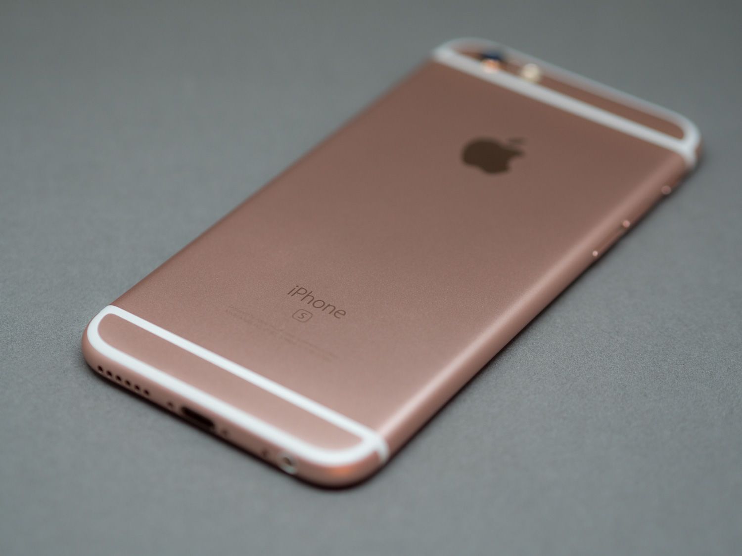
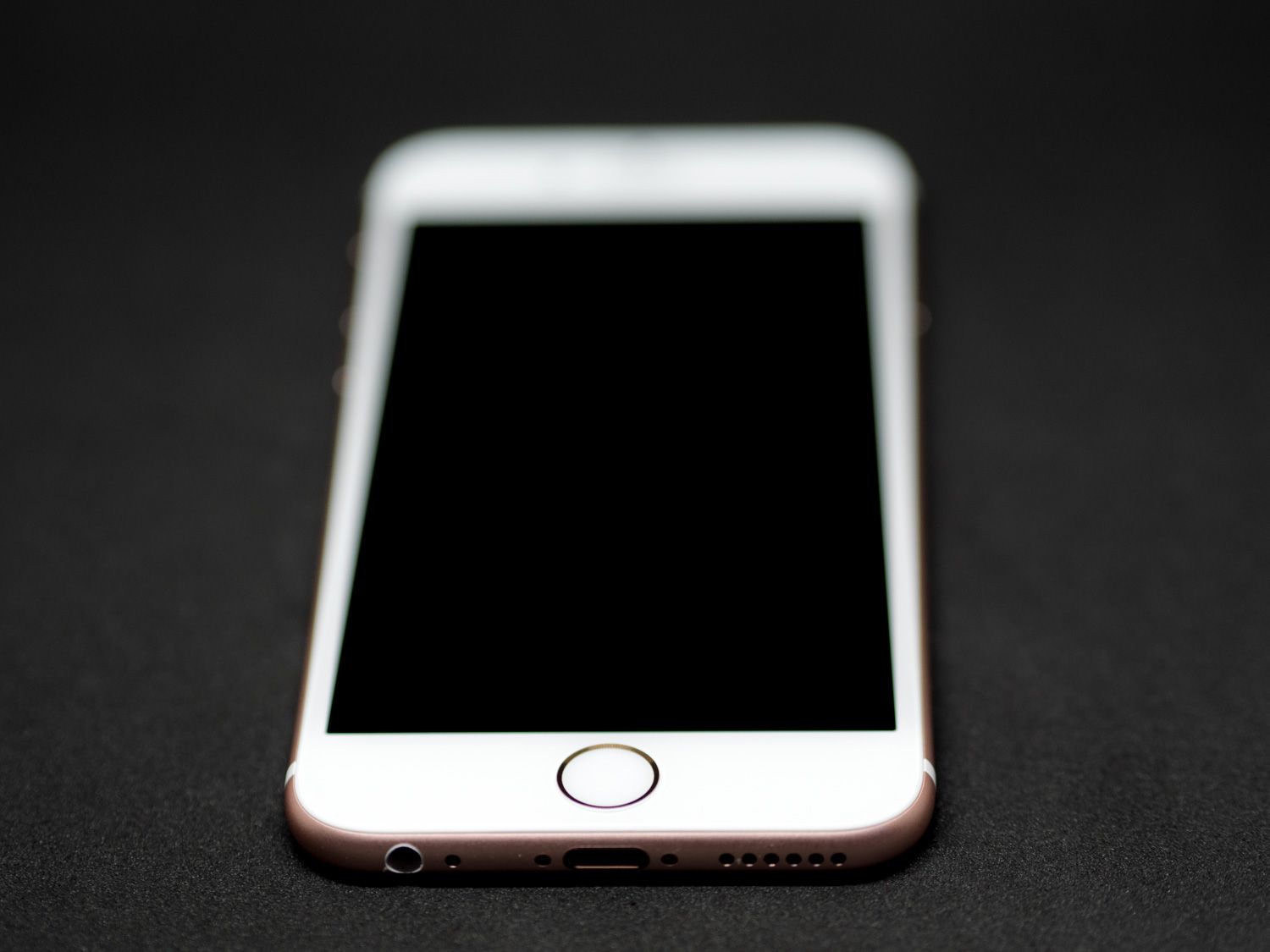
Going case-less will be especially tempting for those who opted for a rose gold iPhone, like my mum. It’s her iPhone 6S that I was using this weekend while waiting to upgrade my own 6 Plus, and I’m glad because I probably wouldn’t have given the rose gold a chance otherwise.
I’ve read a lot of reports of it being pink, but having seen it in person I’m willing to concede that it really is more rose gold than pink. In most lighting, it’s a beautiful colour. What I didn’t like (and what ultimately led to my mum switching to a space grey model) is the front: I don’t like the white front.
Not only does it ruin the illusion of a big immersive screen, but it has a more plastick-y look that always struck me as less premium. It’s a matter of preference, of course, but I wish Apple had offered the choice of having a unique colour and a black face this year—rose gold plus black would look extremely stylish.
Oh well, maybe next time.
Speed Demon
That the iPhone 6S is fast comes as no surprise. The benchmarks are ridiculous, but what most people care about isn’t benchmark battles. So here’s a real-world example of what they mean: on my iPhone 6 Plus, even running iOS 9.1, there are stutters in the interface while multitasking and in certain other interactions like opening Spotlight.
It reminds me of the iPad 3, where the hardware was just a bit too underpowered to offer a seamless experience at the required screen resolution. Optimization has helped alleviate this, but it’s still a problem.
The 6S does not stutter. It does not pause, drop frames, or hesitate at all. Apps open quicker, resume instantly, and are held in RAM longer. I don’t know if this is also the case with the 6S Plus, but I have to assume so given the specs and reports from other reviewers—I look forward to drawing my own conclusions when I upgrade.
I can actually forgive the occasional hiccup on my 6 Plus, but what I find most difficult to return to is the comparatively glacial speed of Touch ID. Without a doubt, Touch ID was the most noticeable improvement to convenience in recent memory, especially once third party apps got access to it.
With Touch ID 2, this convenience is accelerated to the speed of thought. I sincerely don’t know what my lock screen picture is on the 6S because I’ve never seen it.
I set up Touch ID during the initial phone set up, and the unlocking process is so quick that I go from screen off to home screen without the intervening glimpse at the lock screen.
I can’t speak to the improvements in accuracy since I always found Touch ID to be on point during the initial few months—it’s only after that time that I started having to re-do the set up or continually wipe the sensor to improve reliability. Time will tell whether or not the long-term accuracy is improved, but in the short term, Touch ID now handles dampness better than before, which is a welcome improvement.
The Deal-Breaker
The last thing I want to talk about is the reason why this weekend convinced me I can’t live with a normal 6S: battery life.
Unfortunately, once you’ve experienced the battery life of a 6 Plus, it’s very difficult to accept anything less. I can give up the extra screen real estate, I might even be willing to sacrifice OIS (that’s a lie), but the freedom from battery anxiety is one of the tech world’s most sublime joys, and I don’t think I could ever go back to inferior longevity.
Don’t get me wrong, the iPhone 6S is a sturdy performer, offering the traditional definition of full-day battery life even with heavy usage of Maps, the camera, and social media apps. Compared to competing flagships like the Nexus 6 it feels great. But…after a busy day, it always dropped below 20% before I went to bed, which is something I haven’t had happen since I got my iPhone 6 Plus.
It’s not a subtle difference either; for interest’s sake I looked at my battery stats the last time I charged my 6 Plus, and I had gotten 15 hours of usage and 50 hours of standby time with the battery at 4%. That was without engaging Low Power mode, and with WiFi, LTE, Bluetooth (connected to my Apple Watch), and Background Refresh all turned on.
Once you’ve experienced battery life like that, anything less seems barbaric.
Initial Conclusions
While I won’t be choosing a 6S (I’ll be upgrading to a 6S Plus instead), I did enjoy my time with it. It’s more comfortable to hold, easier to get in and out of pockets, and the improvements make it feel like a more responsive, capable phone.
Over time, the subtleties of its performance and design will become more apparent, and the developer community will put the new technologies to good use. Only then will I feel comfortable drawing more definitive conclusions about this generation of iPhone.
In the meantime, based on my preliminary experiences, I feel comfortable saying that the iPhone 6S brings enough exciting improvements to the table to be a worthy upgrade, especially for those on pre-6 devices.
It needn’t be an immediate upgrade, but anyone jumping on the bandwagon—early or late—will be happy they did so.