iPad Pro
Reviewing my new personal computer
For the record, I lasted two months.
I returned my first iPad Pro not long after I got it, thinking I couldn’t justify keeping it when the Air 2 was capable of doing everything I needed it to.
Since selling my laptop last year, I’ve been doing a lot of work on my Air 2, so surely I could continue to do so, right? Well. Here we are, two months later, with me typing from my new iPad Pro.
Absence makes the heart grow fonder, but it also helped me understand what exactly makes the iPad Pro such a compelling device.
As a result, rather than reading an early-adopter review from someone who thought it was cool but ultimately not a meaningful improvement, you get to read this later review from the same guy after he realized he was wrong.
Hardware
I picked up a WiFi-only iPad Pro with 128GB of storage. It’s Space Grey.
To me, it seemed like the only viable option. 32GB is half of what I had on my Air 2, and I was always pushing up against the limit so it was going to be double or nothing. As for connectivity, tethering has always worked perfectly whenever I’ve needed it, and more often than not I don’t thanks to the widespread WiFi coverage in Toronto.
The first time around, I bought the Smart Cover with it and called it a day, but it just so happened the Apple Store had two Smart Keyboards in stock when I was there. Figuring I could return & exchange it if I didn’t like it, I picked one up. To complete the picture, I also managed to get my hands on an Apple Pencil.
Before I talk about the accessories or my workflow, I want to quickly address some things about the iPad Pro itself.
Size Matters
It’s too big to be used the way you use your current iPad.
Other reviews will tell you it’s still portable (of course it is) and can still be carried in one hand (sure, why not) but those individual examples don’t change the fact that the iPad Pro no longer offers the effortless ergonomics that its smaller siblings do. Anyone who tells you otherwise is probably lying to cover lingering doubts about whether they actually like the size.

Trying to hold it above your head to read your Instapaper queue at night is the beginning of a bedtime story about how noses break. It isn’t that it’s heavy, disproportionate, or imbalanced in any way, it’s just not the same kind of device.
To me, the moment it all clicked was the moment I let go of treating the iPad Pro like just another iPad.
Each time I’ve upgraded iPads in the past, they’ve either gotten lighter and smaller, or just more powerful. For the first time, this upgrade is larger and heavier too. It demands you adjust your usage patterns to accommodate it, but it’s an effort worth making.
Size buys you a few crucial things: contextual awareness, multitasking effectiveness, and content comfort. These are all facets of the same gem, but taken together they make a strong argument in favour of the iPad Pro for those who are looking to take their tablet seriously.
They’re also a clear indicator that if a tablet is just a tablet to you, then the iPad Pro is not the right choice.
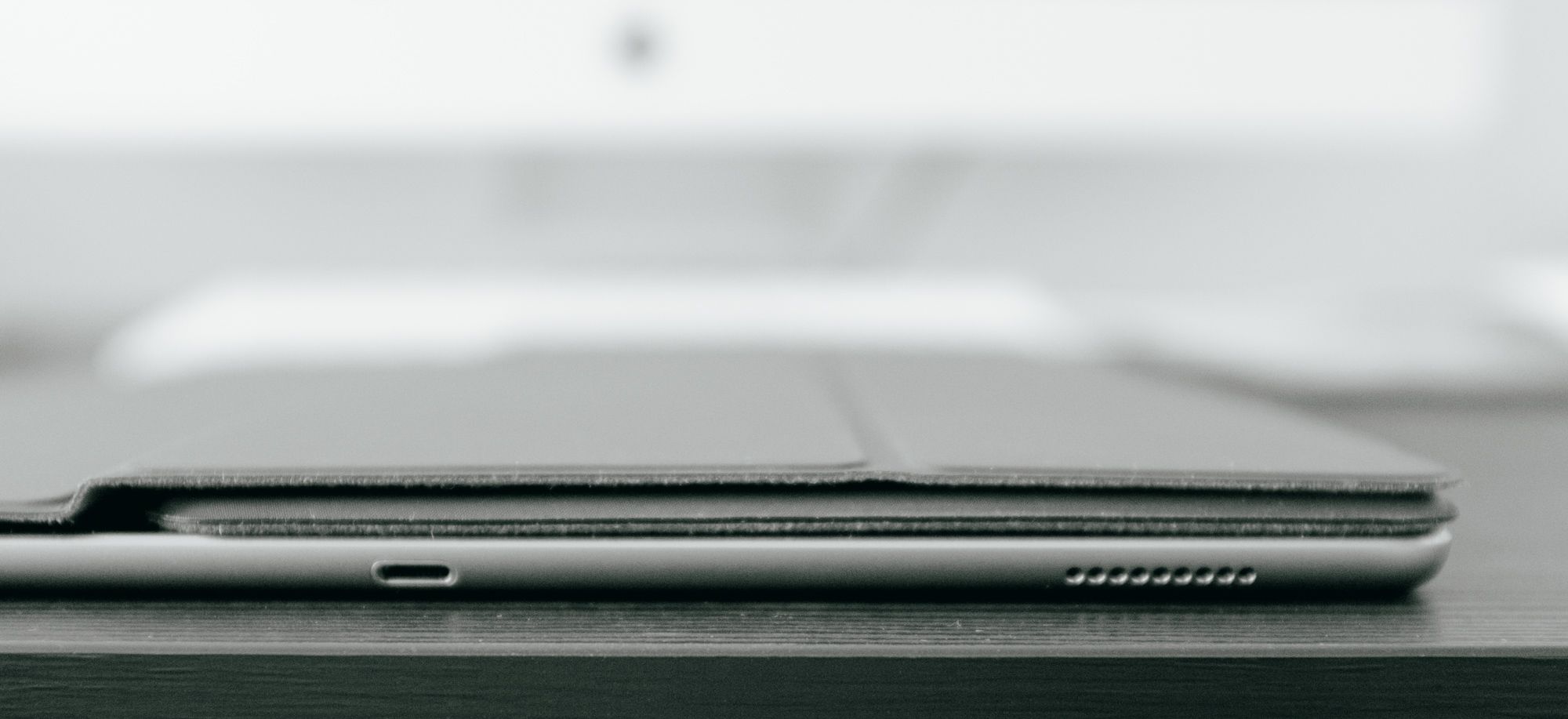
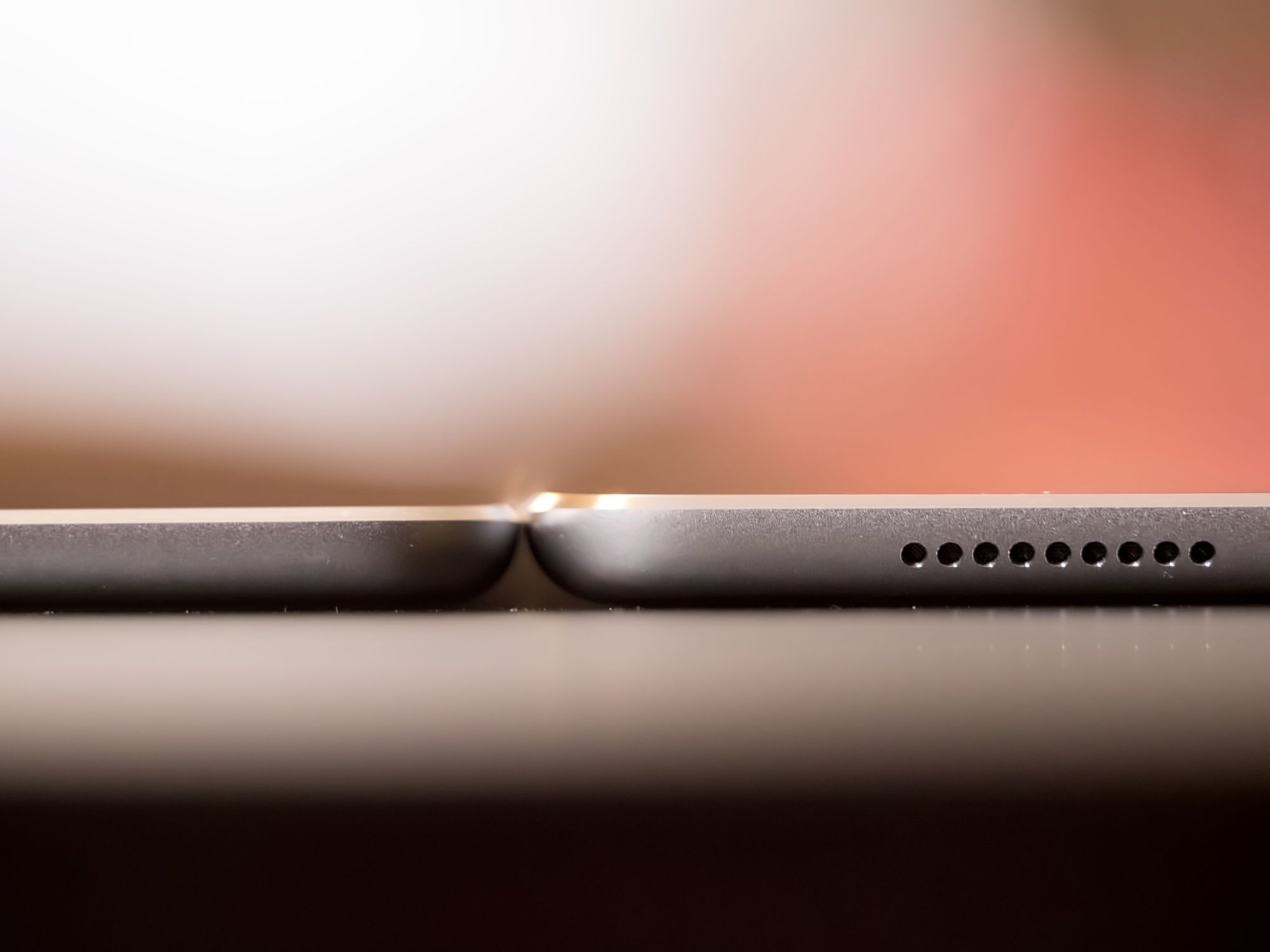 The difference is subtle, but the iPad Pro (right) is a bit thicker than its predecessor (iPad Air 2, on the left).
Would You Look at That
Besides the obvious size advantage, one thing the iPad Pro screen has going for it is a tremendous contrast ratio.
Despite not using OLED technology (where the black pixels are off), this panel produces deep blacks and is capable of stretching to a higher maximum brightness than its predecessors. Coupled with the familiar accuracy and stability of the colour rendition, it makes the iPad Pro an exceptional triage and editing point for digital photos.
This is one of my favourite uses of the device, and once Apple bolsters RAW file handling and developers close the software gap, I can easily see it becoming a better tool for photographers than a laptop out in the field, especially with the Pencil in tow.
This need for improvement leads me to a crucial topic: iOS.
iOS for Work
Apple’s greatest hurdle in evolving iOS won’t be making great hardware, it won’t be getting software developers to step up their game, and it won’t even be the creation of a healthier pricing ecosystem for apps.
It will be outgrowing the pervasive notion that you can’t do real work on an iPad, that iOS is only good for consumption, and that touch-centric operating systems don’t offer the precision required for certain workflows.
This is understandable, to an extent, because the iPad represents a shift in how we interact with our computers. Look at the landscape objectively and a mouse begins to look like a strangely abstracted means of manipulating your digital world. It’s the rotary dialler on an old phone.
In With the New, In With the Old
The direct, tactile immediacy of touch, voice, and pen input is a natural evolution, but like any evolution it will be met with resistance by decades of muscle memory and workflows built on the foundations of its predecessor.
The worst part is the defensive attitude that’s emerging, as if this transition must somehow happen immediately and destructively. These new input methods will have to earn their place, just as the mouse and GUIs did when keyboards and command lines were king. Just as it should be.
But it’s important to allow for the possibility that one day they might supplant what we know and trust, and that they might deserve to do so. That they might, in other words, be better. Perhaps not in the form they take today, but in the form they will take in the long run.
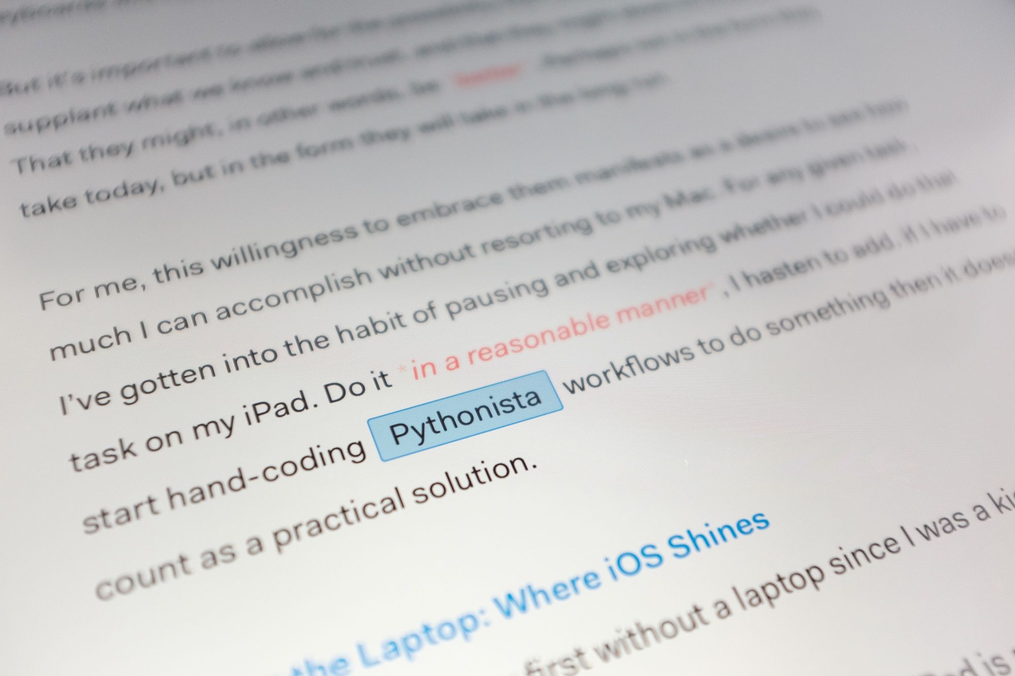
For me, this willingness to embrace them manifests as a desire to see how much I can accomplish without resorting to my Mac. For any given task, I’ve gotten into the habit of pausing and exploring whether I could do that task on my iPad. Do it in a reasonable manner, I hasten to add. if I have to start hand-coding Pythonista workflows to do something then it doesn’t count as a practical solution.
Ditching the Laptop: Where iOS Shines
This past year was my first without a laptop since I was a kid.
For most of what I used my laptop to do, the iPad is not just a workable replacement, it’s actually a better experience. Handling email, preparing and annotating documents (including spreadsheets, GANTT charts, forms, etc.), taking meeting notes, doing client presentations, managing my web servers, developing sites, blogging, photo editing, and more are tasks I now prefer to do on my iPad.
All things I was doing on my iPad Air 2, mind you.
The difference between working on my Pro versus the Air is not the ability to do these things, but my willingness to. The Pro is optimized for multitasking and doing things that take advantage of the screen real estate, so working on a spreadsheet is suddenly not a claustrophobic nightmare but a perfectly comfortable experience.
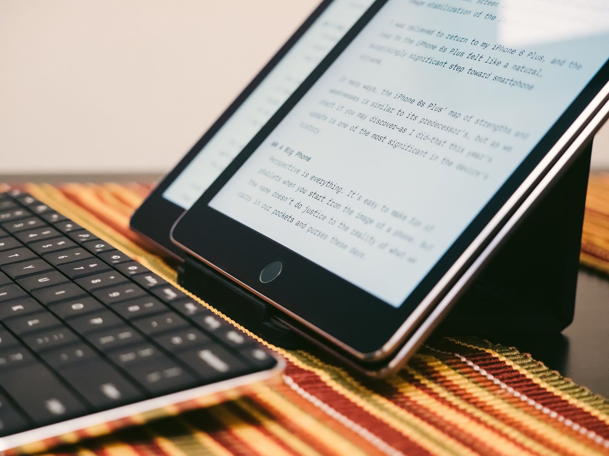
As much as I’m used to having a ton of windows open, the reality is that I’m only ever actively addressing one or two apps at a time. Sometimes I jump between pairs of apps, but I’m never actively engaged with 4 apps at the same time.
Even when I am bouncing back and forth between multiple apps, those apps open and resume much faster on iOS than they do on OS X. I can go from idea to execution in moments on my iPad. No waiting for anything to boot, no protracted login process, nothing—pure efficiency.
For that reason, iOS’ model of Split Screen or full-screen operation makes a lot of sense to me, and in fact does wonders for my productivity. I notice it especially in the context of writing, where I can work for hours in Ulysses without getting distracted like I tend to on my computer.
And I do mean for hours. The battery life I’m getting on this iPad Pro is outstanding, and I love that I can confidently pick it up in the morning, use it literally all day, and not have to worry about running out of juice before bed.
My iPad Pro is my work machine, my reading and video watching companion, and even a great platform for some casual gaming interludes. It’s hard to overstate how wonderful it is to finally have a computing experience this seamless.
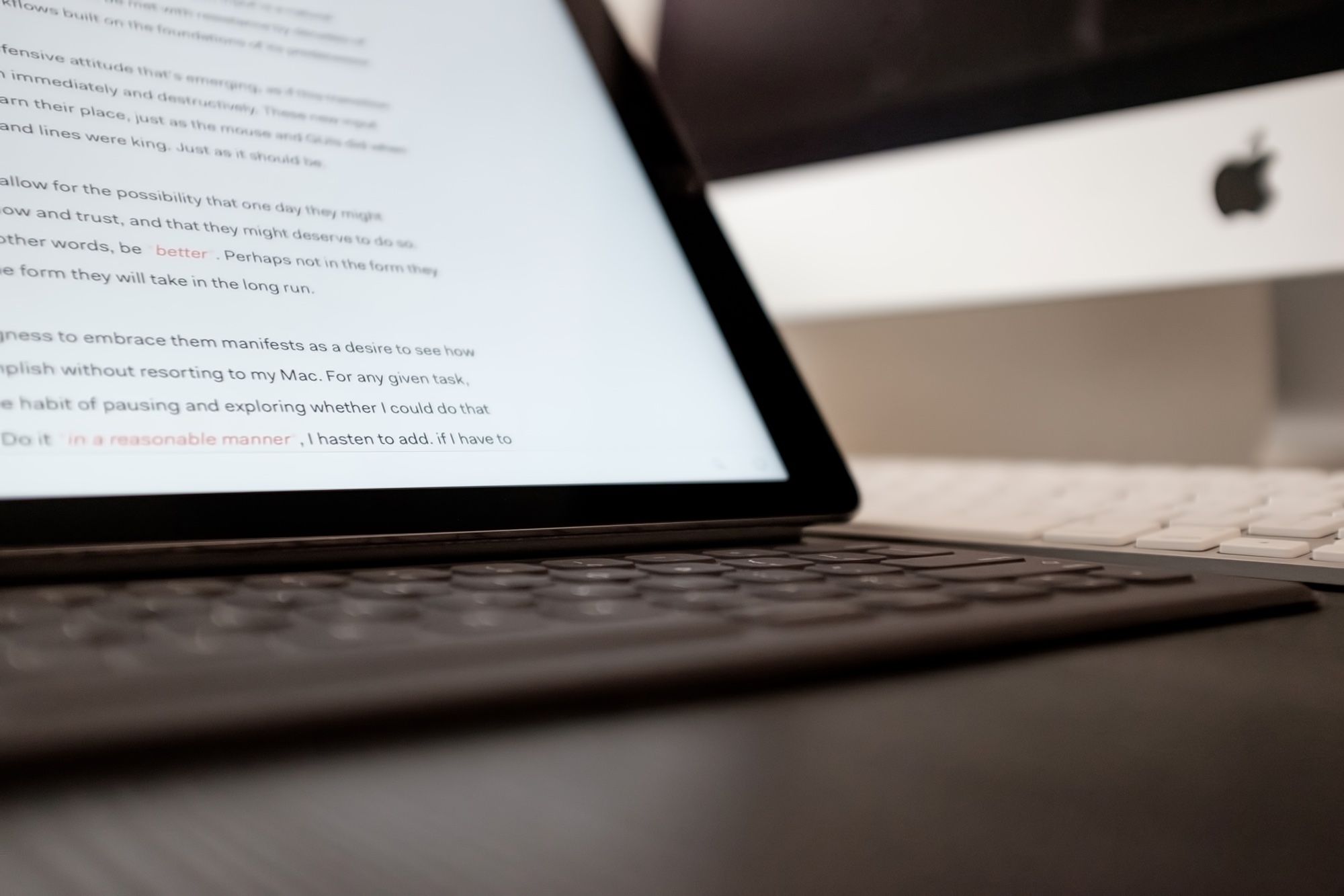
Keeping the Mac: Where iOS Falters
In all this celebration of iOS’ strengths, I don’t want to give the impression that it doesn’t have issues or limitations that bother me. I still have a Mac, and it’s mostly because there are things that simply cannot be accomplished on iOS yet.
Notable examples tend to involve any sort of professional audio work. Doing my game/film music work? Totally impossible on an iPad thanks to the gigantic sample libraries and multi-core heavy processing demands of my Logic templates. I do sometimes use the iPad as an instrument or control surface, but it’s not ready to handle more.
Podcasting? Not yet practical with the lack of detailed audio routing capabilities, although we’re getting tantalizingly close on this front.
Outside the audio realm we have things like serious video editing, engineering applications, app development (not just coding but actual running and testing of apps), and other similar niche workflows.
One limitation I think is almost inevitable for Apple to tackle is the current lack of RAW support in iOS. It’s a tricky problem, since new camera models require updates for support, but they’re used to doing it for OS X. That being said, until RAW editing is possible, the iPad will only ever be a companion in a professional photographer’s workflow.
What’s interesting to me is how many of these limitations are simply software ones. There’s no hardware impediment to having XCode on the iPad Pro. There’s no hardware limitation preventing better audio routing, or RAW support for photos.
There are also smaller, more common frustrations. For instance, if you’ve ever tried to perform bulk file operations in iOS, you’ll know the current Document Provider system isn’t up to the task.
It’s low hanging fruit like this that I hope Apple will tackle in iOS 10. Given the recent 9.3 update and its somewhat surprising wealth of features (for a humble point release), I think it’s safe to assume Apple is hoping to take iOS to the next level this summer.
There will continue to be a wide gap between what can be accomplished on iOS versus OS X, but that gap will continue to narrow, and each step brings that many more workflows into iOS’ comfort zone.
In the meantime, accepting the limitations of iOS and learning how your workflow can (or can’t) work around them is key. As Ben Brooks recently pointed out:
Like Macs in 2004, iOS either just works, or it flat out won’t work for that task. Either you can do it pretty easily, or not at all.
The Accessories
How do Apple’s first-party accessories fit into this picture? After a couple of months of use (less for the Pencil, which is still difficult to get your hands on), I admit I’m delighted.
Smart Keyboard
When I first bought the iPad Pro, I opted for the standard Smart Cover largely because I was concerned that the extra bulk it adds to the overall package is not worth it.
After I stopped thinking of the iPad Pro as the same kind of device as my Air 2, I changed my mind on this front. The truth is that the difference in bulk between iPad Pro + Smart Cover and iPad Pro + Smart Keyboard is negligible. Not only that, but it turns out having a keyboard around while navigating iOS is really handy.
The ability to quickly ⌘ + Tab between apps, or return to the home screen without reaching up to the screen or home button is glorious. I also love that there’s a shortcut for Spotlight (the same one as on OS X, naturally) and this has become my preferred method of opening apps.
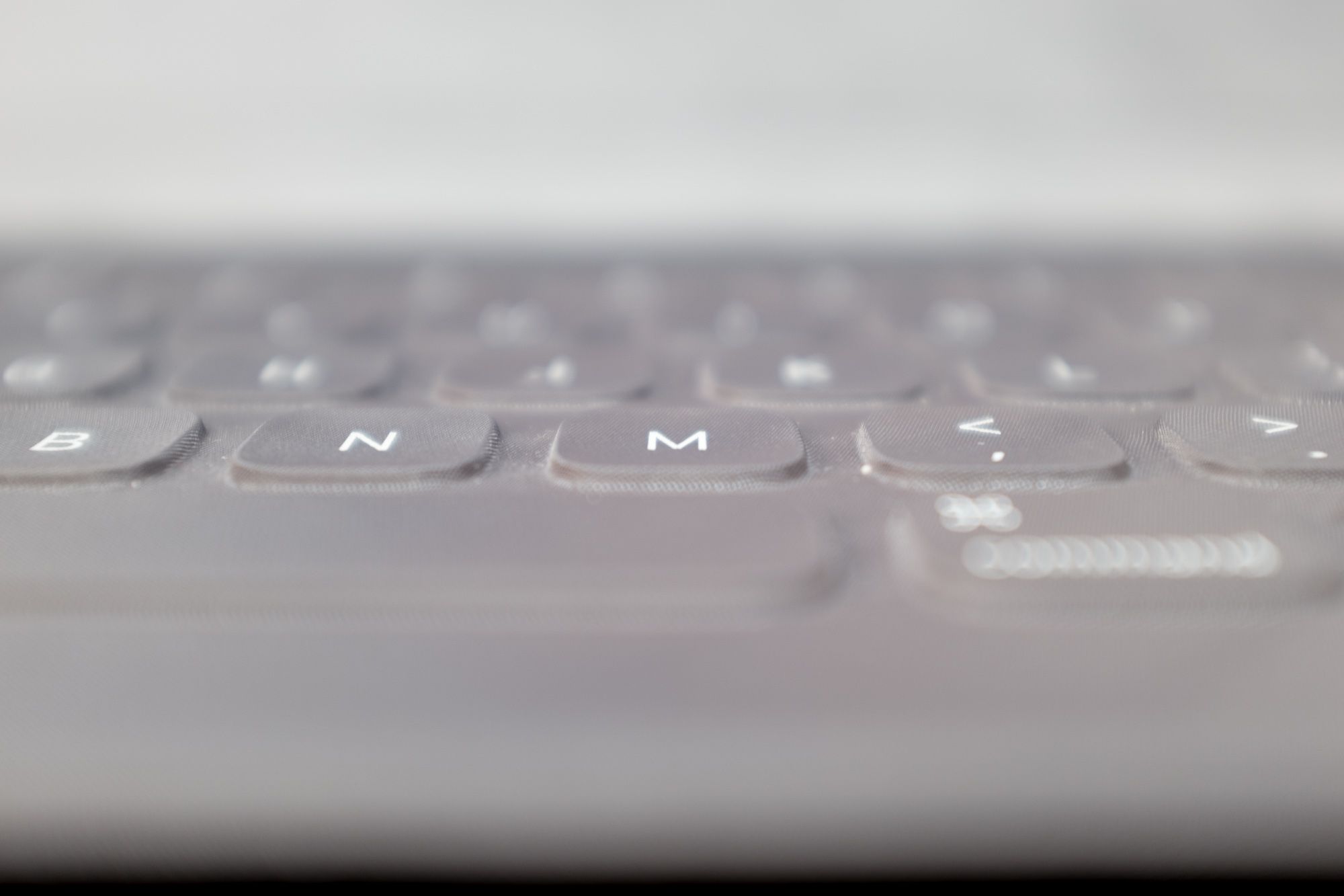
The keyboard itself is surprisingly comfortable to type on, and among my favourite aspects is its stealthy typing sound. I often have my iPad with me in meetings, and it’s in these sorts of settings that I appreciate the ninja swishes of the Smart Keyboard. It makes most laptop keyboards sound like the chattering teeth of a hypothermic mountain troll by comparison.
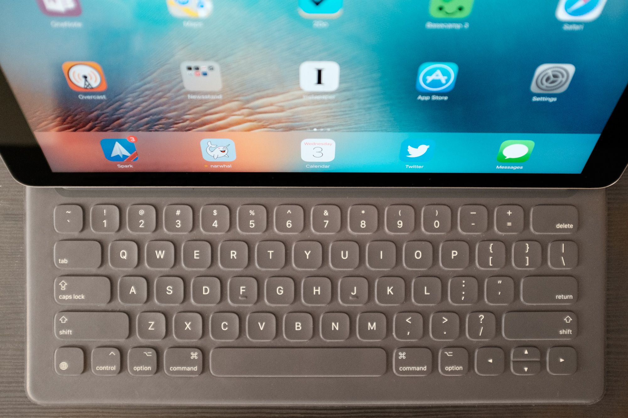
The key travel is relatively shallow, but it covers that distance with a satisfying tactility. Somehow, it doesn’t lead to fatigue after hours of typing. I even got used to the oddly-proportioned arrow keys.
An unexpected benefit of the Smart Keyboard’s fabric construction is that it doesn’t seem to get as dirty with finger grease. It’s also much easier to clean since there’s nowhere for dust and grime to get stuck.
As a case, the Smart Keyboard is just as effective as the Smart Cover, but the additional panels make it a bit confusing to arrange into a video viewing setup. You have to rest the keyboard on the back of the iPad with the keys facing outward in a non-intuitive manner. That said, it’s sturdy once you figure it out.
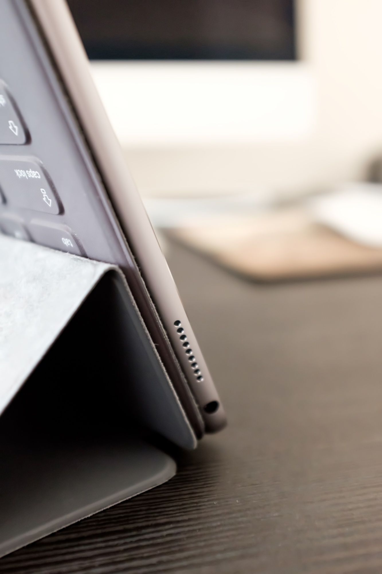
Propping it up in keyboard mode turns out to be really easy once you stop worrying about how to do it. I just unfold the panels and aim the connector port to the right place and everything else just falls into place.
My biggest complaint about the Smart Keyboard is the discrepancy in magnet strength between the one that holds the case on and the one that attaches to the Smart Connector port. At least on my unit, the latter is quite a bit stronger, so if I try to pull the iPad out of typing mode at anything other than the perfect angle, I end up detaching the Smart Keyboard entirely rather than just disconnecting the keyboard.

Why Not Logitech?
One thing I expected to be more bothered by is the lack of a function key row, something I had gotten used to on the Logitech keyboard case I used to use with my iPad Air 2. The native shortcuts replace some of these keys, and the only ones I truly miss are the volume control keys. Maybe iOS 10 will bring some new shortcuts like ⌘ + ↑ / ↓ for volume?
Logitech brought this row to its iPad Pro CREATE keyboard case as well, along with backlit keys and protection for both the back and front. The problem is they also changed the design language from the elegance of their old cases to something with all the aesthetic appeal of a toolbox. Not only is it significantly bulkier, but it’s also inexcusably ugly. I wouldn’t put it on my iPad if they paid me the $200.
Apple Pencil
Now that the Pencil has entered the equation, the argument about lack of precision in iOS becomes significantly harder to defend.
Having spent a lot of time with Microsoft’s Surface tablets throughout their lineage, I went into the experience with high expectations. I’m not an artist, but I do enjoy the potential for free-form diagramming and sketching during the creative process.
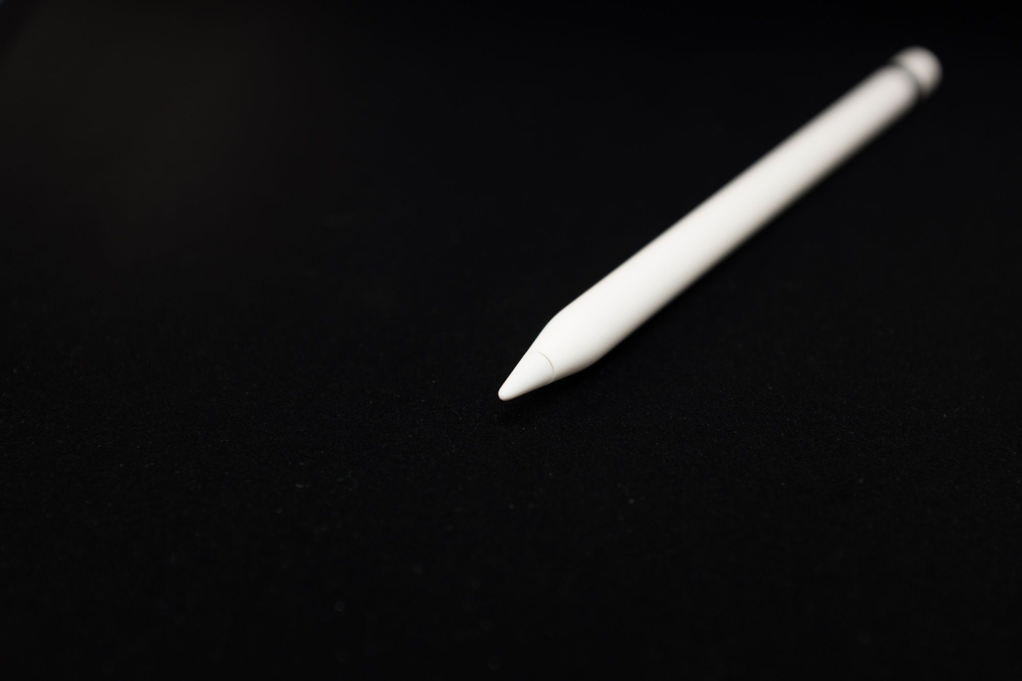
The Apple Pencil exceeded my expectations.
Its precision is remarkable, and working with it in optimized apps is so good that I can’t help but smile. OneNote comes to life, the Notes app reveals itself as an invaluable idea sketchpad, Adobe Comp is suddenly an indispensable part of my design process, and Paper transforms into a presentation powerhouse for illustrating concepts in a visual manner.
Last week, during a meeting with a new client, I was able to clip her existing website homepage into OneNote and annotate it as we discussed room for improvement. I crossed things out, showed some alternative colour options, and sketched out potential alternative layouts for her as we talked. All on my iPad Pro.
The sheer fluidity of the experience was as amazing to me as it was to her, and I’m pretty sure she went straight from the meeting to the Apple Store.
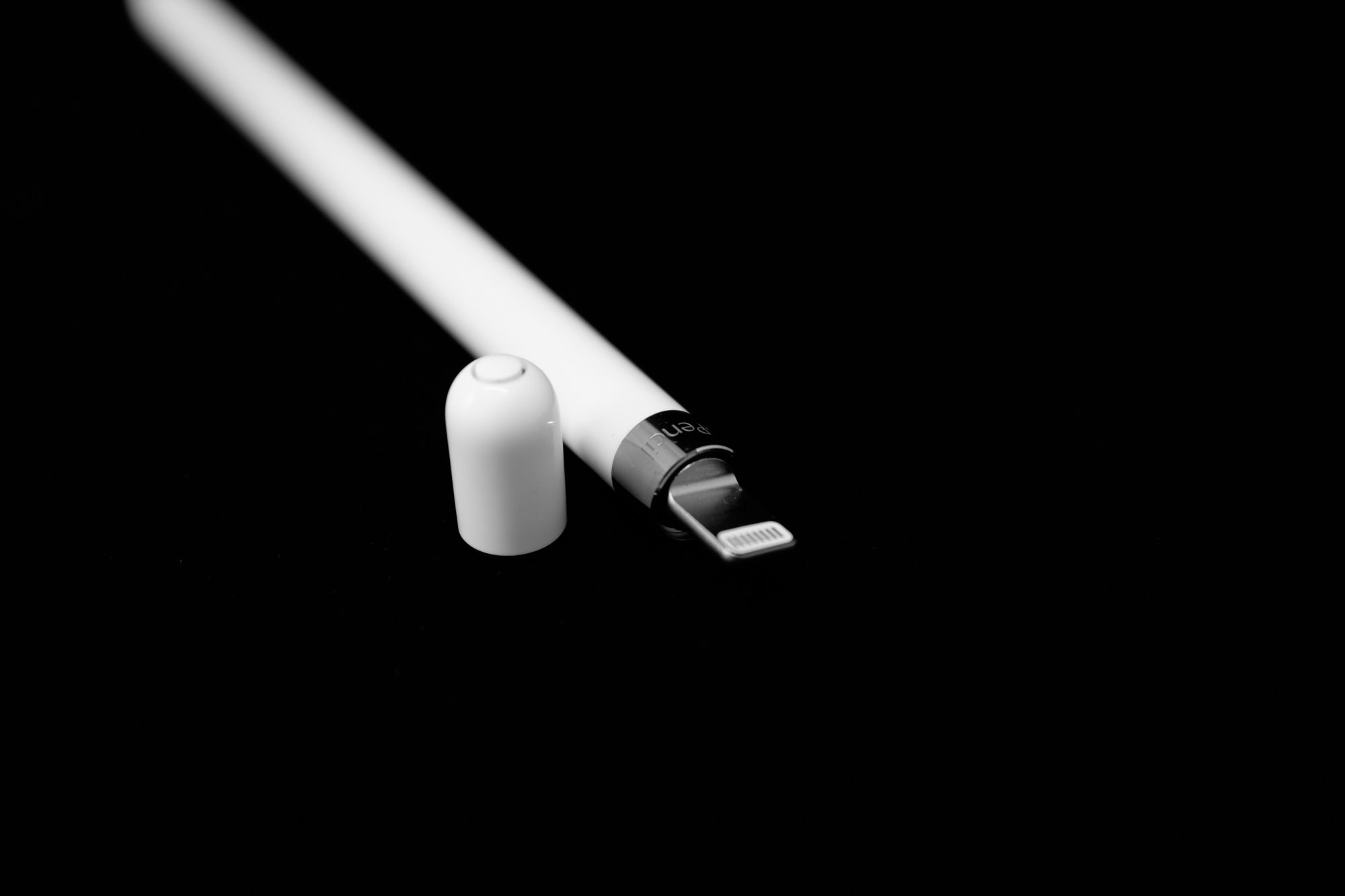
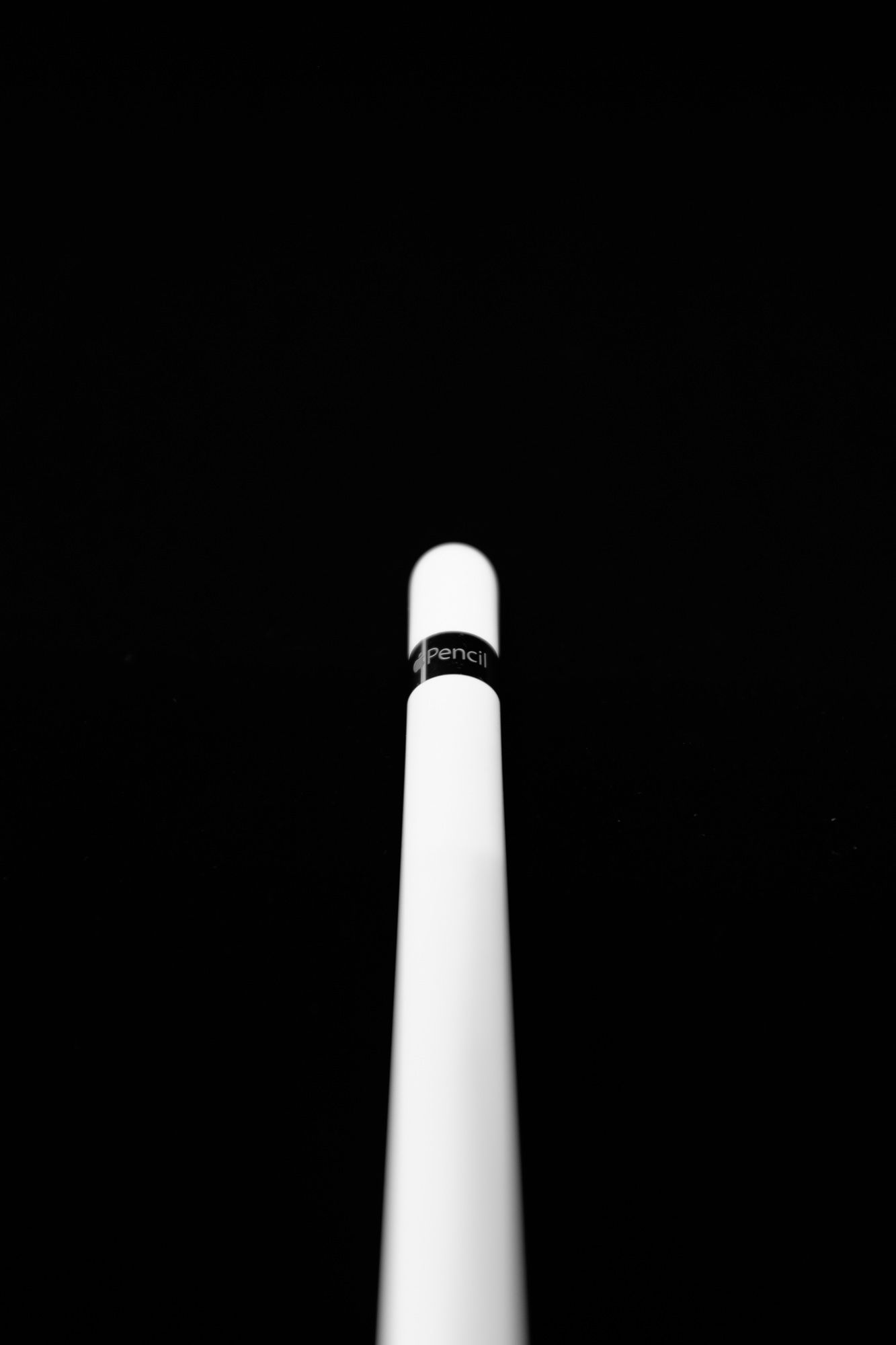
Physically, the Pencil is extremely comfortable to hold. I was concerned by the reviews discussing its slippery surface, but in practice I found this to be a non-issue. I can always add a pen grip if I find my fingers getting sweaty. The weight, length, and balance of the Pencil is where it really shines. For my large hands, it seems to be an ideal fit, and it’s great to be working with a stylus that doesn’t feel like a crayon.
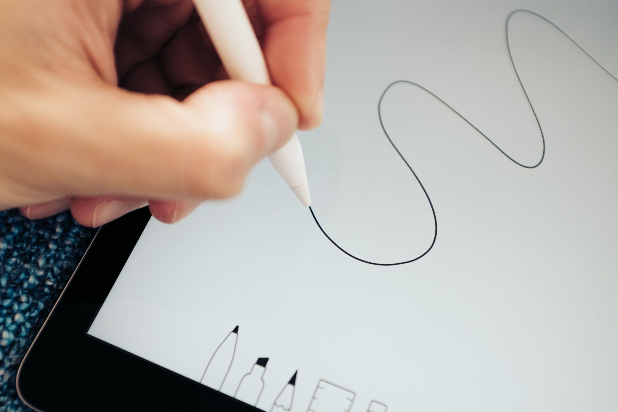
Along the same lines, normal writing is finally possible with the Pencil. If you’ve used any other iPad stylus, you probably know what I mean when I say it was often necessary to write larger than you would on paper, or more slowly. This is no longer the case at all, and in conjunction with the near-flawless palm rejection it feels like a true leap forward in digital inking.
The fact that Apple’s first foray into making a modern stylus is either on par with or better than Microsoft’s fourth attempt with the Surface Pro 4 pen is encouraging. There’s clearly a lot of time and energy being spent refining this experience, and it will continue to improve as app developers become more acquainted with its intricacies.
I also hope Apple will explore the possibility of different tip textures, like Microsoft has, because that’s one area where digital penmanship is still clearly behind: the simple feeling of pen scratching on paper.
My Favourite Computing Experience
When I see people on Reddit asking how they can find use for an iPad, I am genuinely confused. How can you not?
Somehow, almost invisibly, iOS has gone from that fun companion ecosystem I spend some of my spare time into something much more. It has become a crucial part of my life and work; a seamless, trustworthy, elegant, and focused environment.
The iPad Pro is the first device that truly embodies iOS at its best. A simple boost in horsepower, more speakers, a larger and better screen…separately these are iterative improvements to the platform. But taken together, they establish the iPad Pro as its own device, one that paves the way for a future where iOS can be a primary operating system, not a secondary one.
Some of us are closer to that future than others, but I think we can all agree it’s one worth imagining.
review technology productivity