Todoist vs. 2Do
I put my favourite pair of task management apps to the test to see which comes out on top in this in-depth comparative review

My personal productivity system has been remarkably stable over the past two years. I did a lot of switching between apps in the past, eventually settling for a year on my own digital version of the Bullet Journal system.
I enjoyed it for three main reasons:
- A focus on things I’d done instead of things I had left to do, resulting in a sense of accomplishment instead of dread when looking at my tasks
- As a byproduct, I ended up with a growing journal of what I’d done without requiring actual journaling (which I suck at)
- The flexibility to add tasks, ideas, notes, and other miscellany into the same bucket rather than scattering them across different apps/services
Unfortunately, it had one critical flaw: Bullet Journal (even a digital version) sucks at planning for future work.
Carrying over unfinished tasks to new dates, scheduling tasks for distant dates, and offering a customizable overview of what’s coming up are things that Bullet Journal just isn’t good at. The workarounds that exist (yes, I tried them) just feel awkward and tedious.
If I’m being honest, Bullet Journal has more than one flaw (collaboration is also rough) but the overall system worked really well for me for longer than any past approach to task management had, so it was with reluctance that I embarked upon yet another journey to find an alternative.
Todoist
Then I found Todoist and it’s absolutely perfect.
Phew, that was easy…article over, right?
Actually Though
Todoist does a lot of things right:
- Natural language processing for blazing fast task entry
- Karma system for keeping you accountable and for maintaining a record of what you’ve accomplished, which is like Bullet Journal but with a gamification angle
- Extremely fast apps on every platform and the web. No more waiting for OneNote to open, navigating to the right sheet, etc…
- Clean, effective visual design that keeps the focus on your tasks and removes almost every bit of chrome from the interface
- Robust sharing and task commenting system
- Markdown support!
- A web view for easy access even without your main devices
Todoist’s structure is immediately clear: Projects are the top level of organization, and they contain tasks. Tasks can have nested sub-tasks (And you can continue nesting further from there), and each task can have its own due date, comment thread, and attachments.
You can assign Labels to tasks as a tagging system to further organize them however you like, and you can use the Filters to create smart searches that help you highlight particular subsets of tasks.If you’re sharing a project with others, you can also assign tasks to them or have tasks assigned to you.
My discovery of Todoist happened a year or so ago, and I adopted it almost immediately. It won’t surprise you to learn that I try a lot of productivity software, especially in the task management space, but I typically last less than a month with each new thing.
Like my OneNote Bullet Journal before it, I lasted a full year with Todoist, which almost never happens. I took it as a good sign, and it even ended up as a temporary solution for the agency before we settled on Basecamp.
So what happened?
Well, Federico Goddamn-Trendsetting-Italian Viticci happened.
2Do
I want to take a moment to state, for the record and in defense of my hipster credentials, that I liked 2Do before it was cool. Now everyone’s doing it.
Anyway, I remember using 2Do way back in its earliest incarnation…when it still looked like this:
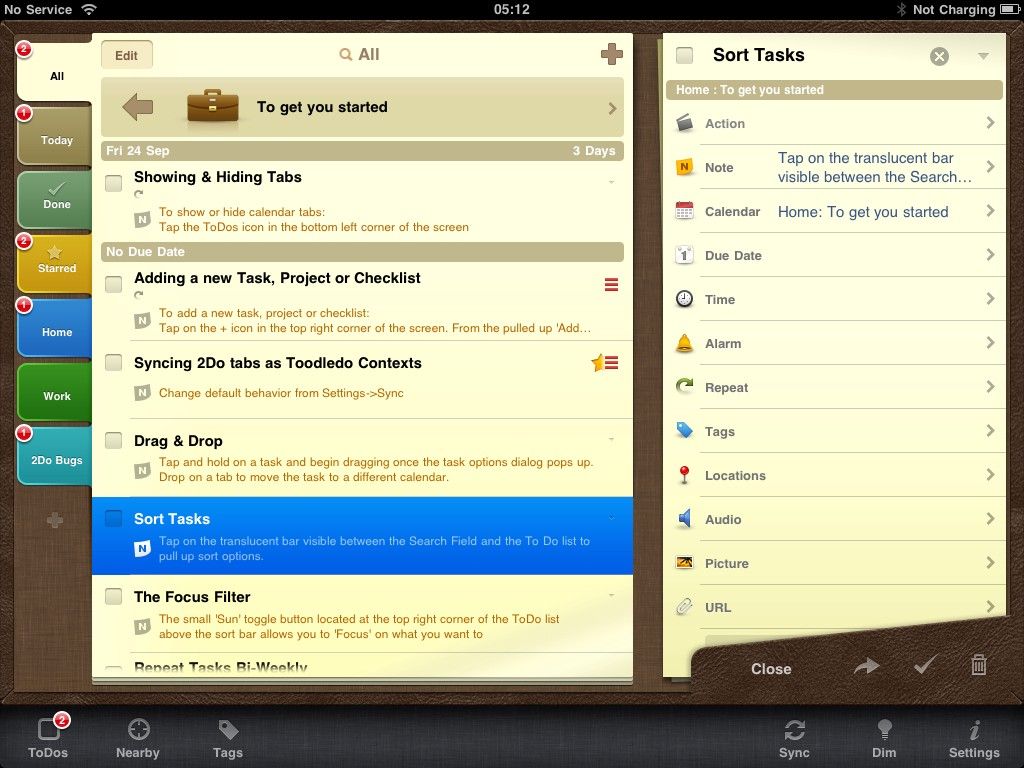
Which is funny because I’m about to tell you that a large part of the reason I switched to 2Do from Todoist earlier this year is for the interface.
You see, nowadays 2Do looks more like this:
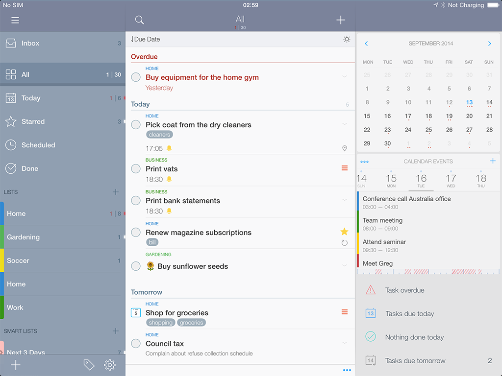
Much better, right? Especially since 2Do’s interface can be customized to show as much or as little detail as you want.
Not only does it look great, but 2Do has a number of key advantages:
- The ability to access the Quick Add system for entering new tasks on OS X even when the main app isn’t running
- Project and Checklist task types, easier sub-tasks, plus much better visual distinction of recurring tasks versus regular ones
- The ability to drill down into a Project/Checklist and quickly add subordinate items, which is a bit of a pain with Todoist
- The ability to set Start dates for tasks, not just Due dates
- Great bulk task operations
- The ability to add Actions (web links, phone numbers to call, etc.) to tasks, only some of which can be replicated in Todoist using the comments and file attachments
- A calendar module for easily navigating through tasks based on their due dates
- The ability to password/Touch ID protect your task list
2Do’s additional features mean there’s more terminology to wrap your head around than with Todoist.
In 2Do, the top level of organization is a List Group, and those contain Lists. Lists are the equivalent of Todoist Projects. This gets confusing because 2Do then offers three different types of task that can be filed into those Lists: normal tasks, Checklists, and…Projects.
Normal tasks are self-explanatory: they’re the basic unit of productivity. They can have tags assigned, notes added, actions (links and such) attached, and you can set Start and Due dates separately for them.
Checklists and Projects are both containers for normal tasks, and there’s really only one functional difference between them. Projects contain normal tasks, each of which can have its own dates, notes, etc. Checklists contain stripped-down tasks that share the due date of the Checklist itself. They can still have notes and attachments, but not independent dates.
The added task types in allow for a lot more granularity in how you organize your responsibilities.
Hold On, What About OmniFocus?
Over the years, I’ve realized that there are two kinds of people.
The first group of people “manage” their tasks only to the extent that’s required to make it possible for them to complete things.
The second group of people manage their tasks like monks manage their religion. Completing tasks is almost an unhappy occurrence for them, because the more they get done, the less they have to tag, file, order, annotate, schedule, and otherwise micromanage.
As far as I can tell, this second group are who OmniFocus works best for. I’m being snarky, but the truth is that everyone has to find the methodology that works best for them, and for some people that means a lot more power than most task management systems offer.
For those people, OmniFocus is ideal.
For me, OmniFocus—with its Contexts and Perspectives and Forecasts oh my!—is a bizarre labyrinth of fiddly bits that chase away any hope of actually accomplishing things.
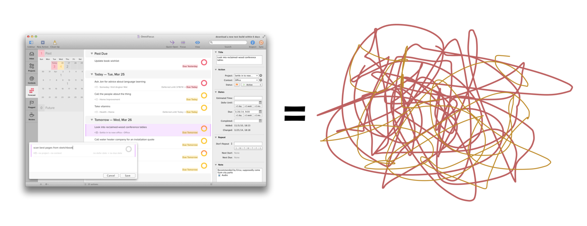
So no, I don’t use OmniFocus.
The Dilemma
Back on topic, here’s the problem: Todoist is the best. But 2Do is also the best.
And I need to pick one.
I mentioned that I switched to 2Do earlier this year, and now I’ll admit that I switched back to Todoist about a month ago. As I did my research for this article, the constant back and forth between the two over a period of several months allowed me to assemble a wishlist for each app.
While they’re both excellent, both have a few crucial limitations that frustrate me, especially since it’s generally the case that what one lacks, the other provides.
As with any details of a productivity system, my wishlists are applicable mostly to my own preferences for managing tasks, but I want to share them in the hopes that they also make sense to others and lead to improvements that benefit users of both apps.
2Do Wishlist
It doesn’t surprise me in the least that 2Do is experiencing such an influx of high profile attention. It deserves it. The fact that the whole operation is helmed by one individual is almost mind-boggling, and his kindness and responsiveness to feedback is just icing on the cake.
Nevertheless, there are some critical issues with the app in its current state that make it impossible for me to stick with for the long term.
Natural Language Processing
I want to be able to quickly enter new task details just by typing, without having to tab over to different fields or click around an interface. Here’s what it looks like in Todoist:

Nothing to do but type, with automatic parsing of keywords to assign details.
And here’s 2Do’s version of the Quick Add window:
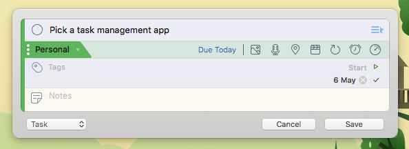
I had to click the Due field and select the date to mirror the same task details as in Todoist (the Personal project is my default, but I’d have to pick that manually too if I needed it to go elsewhere).
It’s immediately evident that Todoist’s natural language processing allows for quicker, more streamlined task entry. While you can unfold its interface to add details by clicking, I much prefer typing “today” or “on April 1st” to set due dates.
Similar syntax also exists for assigning tasks to Projects and adding Labels.
Speed
2Do isn’t slow, but compared to Todoist it often feels that way. Even ignoring the task entry advantage, Todoist feels quicker because the sync is almost instantaneous.
Unlike Todoist’s one and only native sync, 2Do has a number of syncing possibilities, all of which are slower and most of which come with some serious caveats. Not only is this confusing (just pick Dropbox unless you have a specific reason not to), but it seems unnecessarily complicated.
The reasoning behind it is rooted in security—a worthy concern—but the impact on user convenience is more significant than I’m comfortable with.
What I’d like to see is native iCloud syncing, but not the way it’s done now by piggybacking on Reminders data. I’d prefer a custom, dedicated 2Do sync engine-one that supports all the app’s features, that is fast, and that doesn’t require me to keep deleting completed tasks to prevent the database from clogging up the sync process.
Which leads me to one of my biggest pet peeves with 2Do…
Respect My Completed Tasks
Coming from my Bullet Journal system and its deep reverence for accomplishments, 2Do’s desire to constantly destroy the past is jarring.
For anyone who likes keeping a record of what they’ve accomplished, 2Do in its current state is basically unusable. Once you accumulate a few weeks worth of tasks in your Done pile, the sync slows down considerably and the app starts nagging you to delete your completed tasks.
You can copy and paste each day’s completed tasks out into Day One or something, as a sort of journaling approach, but this is an extra step that I’d rather not have to take.
Not only that, but completed tasks aren’t even searchable, so if you’re trying to find a specific task (perhaps because there’s some key information attached to it in a note), you have to go digging for it manually. And that’s assuming you haven’t already deleted it from the history because the app nagged you to!
Todoist handles past tasks with more elegance, keeping a record of everything you’ve ever done in their system. Forever. No matter how many completed tasks you accumulate, there’s zero impact to sync or app performance.
You can also search for completed tasks just as easily as for upcoming ones, with the only limitation being that you can’t actually see when you completed a given task. So if you’re searching because you want to know when you did something, your only option is to manually look through the task history to find it.
This is one area where a Bullet Journal system beats both of these options.
Todoist Wishlist
My current app of choice (again) is Todoist, which inches out a win for my needs despite the deficiencies below. In the future, I’d love to see the Todoist team tackle some of these items.
Persistent Quick Add
Unlike its competitor, the Todoist system-wide Quick Add field only shows up if you have the Todoist app running in the background. 2Do’s will pop up even if the main app isn’t running.
Not a deal-breaker, but a helpful convenience.
Better Sub-Task/Project Views
Todoist has no Checklist or Project task types (what it calls “Projects” are “Lists” in 2Do). A task is a task is a task as far as Todoist is concerned.
One of the consequences of this structure is that you’re stuck creating tasks with subtasks, and you don’t have the ability to focus in on those subtasks without seeing everything else that’s in that Project area.
Here’s an example to illustrate what I mean: let’s say I’m working on Test Project, which has a couple of sub-tasks. This project pertains to my personal life, so I want to file in that area. Here’s what it would look like in Todoist:
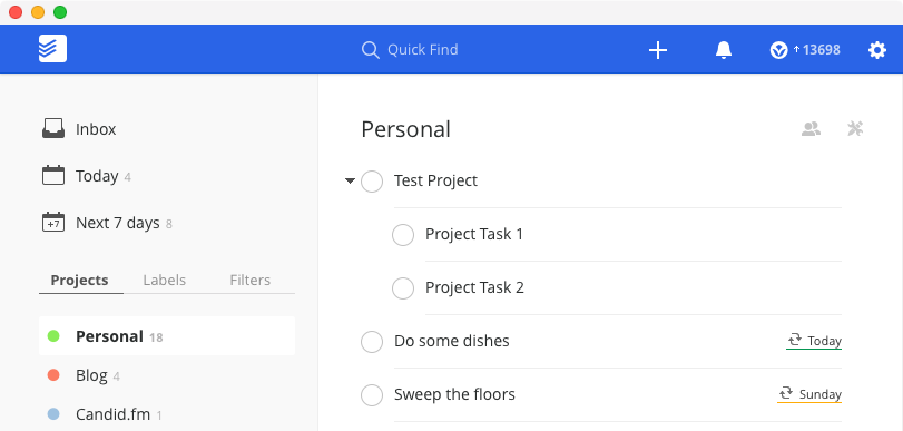
In 2Do, I can choose to view it the same way…
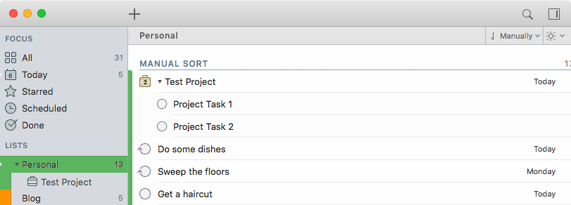
…But maybe I don’t want to see every other Personal task cluttering up my view. I want to focus on what needs to get done for Test Project, so I can zero in on just what I want to see:
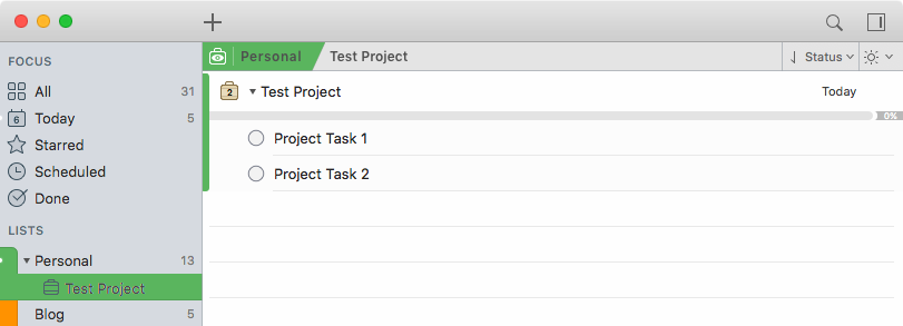
Not only is this cleaner, but there are also some helpful details like the progress bar above the list that fills up as I make my way through the project’s tasks.
The same thing also works for Checklists in 2Do.
Having said that, there’s a way to mimic this in Todoist by using the “Labels” to designate projects within each list, but then you’re using an entirely different mechanism (and you don’t get a progress bar). Also, if you have tasks with subtasks within that label group then you still don’t have a way to focus on just one at a time, so this workaround only gets you partway there.
Keyboard Shortcuts & Bulk Operations
When I was first taking notes for this article, I had a big problem with the lack of keyboard shortcuts in the iOS version of Todoist.
They’ve since put in a robust set of them, which I really appreciated, but there’s still one area that’s lacking: shortcuts for common re-scheduling operations like “Schedule for Tomorrow” and “Schedule for Today”.
On Todoist’s desktop apps, you’re stuck clicking a few times to accomplish this, whereas in 2Do you have a single-key shortcut to defer tasks, and even ones to defer to common times like “tomorrow”.
The reverse is true on iOS because Todoist has an easy swipe gesture to reschedule, whereas 2Do requires a bunch of tapping around…you see what I mean about one app providing things the other lacks.
Better Handling of Past Tasks
Todoist’s Karma system is one step forward and one step back from my Bullet Journal method.
The ability to set goals in addition to viewing what I’ve accomplished each day is a great improvement, but the inability to tell when a task was completed from the search interface is frustrating. I’d love to see that metadata presented when searching through completed tasks.
More Options for How New Tasks Are Inserted
Despite the specific omissions I noted above, Todoist has a wealth of keyboard shortcuts on the desktop.
Among them are different shortcuts for adding new tasks to the top of a list or to the bottom. This is terrific, but I wish it were possible to set one or the other behaviour as the default for contexts where those shortcuts can’t be used.
They don’t work in the Today view, for instance, and I spend 90% of my time in the app there. In this view, the only way to add tasks is using the global Quick Add or the in-app Quick Add dialog, which always adds the task to the bottom of the list.
Parallels & Power User Features
Though they’re called different things, many of the advanced features of these apps exist in a similar fashion in both:
- Todoist’s “Labels” are like 2Do’s “Tags”
- Todoist’s “Filters” are like 2Do’s “Smart Lists”
- Both let you email tasks in (though I find Todoist’s implementation way clearer and less fiddly, and it doesn’t have to be purchased separately)
- Both have excellent Watch apps, but only Todoist offers a Complication for your watch face
- Both keep automated backups of your entire database to prevent loss of data in case you accidentally delete something
- Both allow you to add some life to your lists with emoji! 🤙
Where 2Do pulls ahead is the depth of its organizational and structural flexibility. Alongside the Project and Checklist task types (which don’t exist in Todoist), 2Do also allows you to create List Groups to further segregate information. Todoist will allow you to nest tasks to your heart’s content, but it’s not really the same thing.
On the other hand, Todoist is aware of an entire dimension that 2Do can’t handle: other people! The ability to share Projects and delegate tasks is terrific. Not to mention the ability to have conversations in each task’s comment thread, attach files of any sort (and from anywhere), and link to specific tasks.
You’ll notice that users of 2Do often mention using another app as a supplement to handle things like shared grocery lists with a spouse. I don’t know about you, but I’d rather have the ability to use only one app for this stuff over extra organizational options any day.
I could go into more depth on the advanced features but frankly there are other people out there more qualified to comment on these aspects.
The truth is I don’t use them.
I want to complete my tasks, not manage them, so I try to avoid over-complicating things with too much task shuffling and other meta-work.
The Cost of Productivity
I’m always happy to pay for good software, especially if the business model clearly allows the developer to continue working on it. Both 2Do and Todoist are paid products, but they approach income in completely different ways.
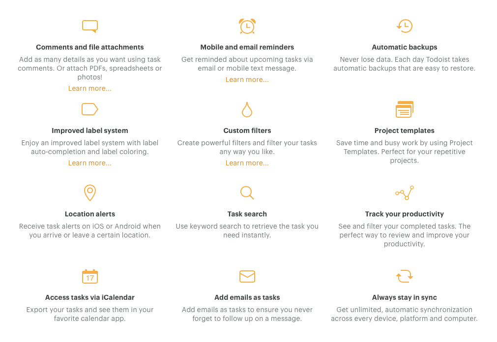
Todoist is a service, and it has a generous free tier that might end up being sufficient for people whose task management needs are basic. They get access to all the apps on every platform for free, and they benefit from the same quick syncing and basic features that make Todoist so appealing. If you want to unlock its full potential though, I highly recommend upgrading to Todoist Premium, which will set you back $30/year.
2Do has a more traditional pricing model, with fixed costs per platform that you buy the app on. Mac users will need to shell out $50 for the app, and iOS users $15. If you use the app on both platforms, like I do, then you’re looking at a one-time investment of $65.
I realize that for many people the simple fact of these apps being paid is a deal breaker, especially in such a crowded app category where tons of free alternatives exist. As is generally the case though, you get what you pay for and the quality, support, and pace of improvement for both Todoist and 2D0 is such that I’ve never felt like my money wasn’t well spent.
And yes, I did pay for both out of pocket rather than using demo or review licenses to research.
Getting Things Done
After much deliberation, I’ve settled on continuing to use Todoist for the time being.
That being said, I still have 2Do installed on my devices so I can keep an eye on the ongoing development-I don’t want to lose track of it like I did way back when it was one of the first serious task management offerings on the App Store.
In the end, both of these solutions are effective at helping me stay productive. They approach some aspects of task management differently, and one or the other might be faster at certain things, but to their great credit both manage the crucial task of helping me accomplish things, not just plan to accomplish them.
And that’s what matters.
For example, I can now cross “finish Todoist vs. 2Do article” off my list!
If you’re deciding between Todoist and 2Do, I would recommend them as follows:

Use Todoist If…
- You like clean, simple interfaces
- You demand the quickest sync performance
- You require extensive cross-platform functionality, including web access
- You prefer swipe gestures to tapping on mobile devices
- You want to take advantage of natural language processing for effortless task entry
- You don’t need an especially complex organization system for tasks and lists of tasks
- You appreciate the Karma system’s ability to motivate you
- You want to keep a record of all your completed tasks and be able to search through them
- You need to collaborate with others on projects and need the ability to easily comment, attach files, and share links to tasks
If that sounds like you, head over to Todoist.com and sign up for free. If it feels like a good fit, consider purchasing a Premium subscription to unlock its full potential.

Use 2Do If…
- You need deeper organizational capabilities and use things like Checklists, Projects, and List Groups to keep track of your tasks
- You need the ability to set start dates separately from due dates for tasks
- You’re an Apple-only person and don’t need to manage tasks on other platforms or access them from the web
- You’re concerned with owning your own data and having several sync options, including one that allows for the ability to use Siri to add tasks
- You don’t care about keeping track of completed tasks or setting productivity goals in your task management environment
- You want a lot of flexibility in customizing the density of information and the layout of panels and views
- You appreciate a bit of ornamentation to offset the baren tendencies of modern design trends
- You need to be able to secure your tasks behind a password or Touch ID
If you’re reading the above and nodding, please don’t hesitate to visit 2DoApp.com to learn more.
If you’re already convinced, go ahead and grab a copy for iOS and Mac.
review technology digital lifestyle productivity