Things 3: First Impressions
Slow and steady wins the race
My first ever digital task management system was Things. It’s been around for a decade, and I was an early adopter when it hit iOS (as one of the first 600 apps available for the platform).
I look back on my time with Things fondly. It was always the best looking, most elegantly designed app in the space, but I eventually lost confidence because of its glacial pace of development.
While other apps exploded onto the scene and raced forward with new features, new ideas, and more robust functionality, Things trundled along patiently. In an era of new frontiers, I wanted to be on the cutting edge with the cool kids. As long-time readers know, I’ve been through a lot of task management tools since then…
Was Things really slow to progress though?
Looking back, Things was among the first apps available when the iPad launched. It was among the first apps to have an Apple Watch app. Sure, the core functionality didn’t expand with the same alacrity as the competition, but the notion of a rock-solid, reliable, ubiquitous task management environment is wholly embodied in Things.
Something New
About a month ago, a friend asked me if I’d joined the new Things beta.
The name brought a smile to my face and I quickly rushed to apply. When that friend came over and showed me Things 3—the latest, gigantic update—I was blown away.
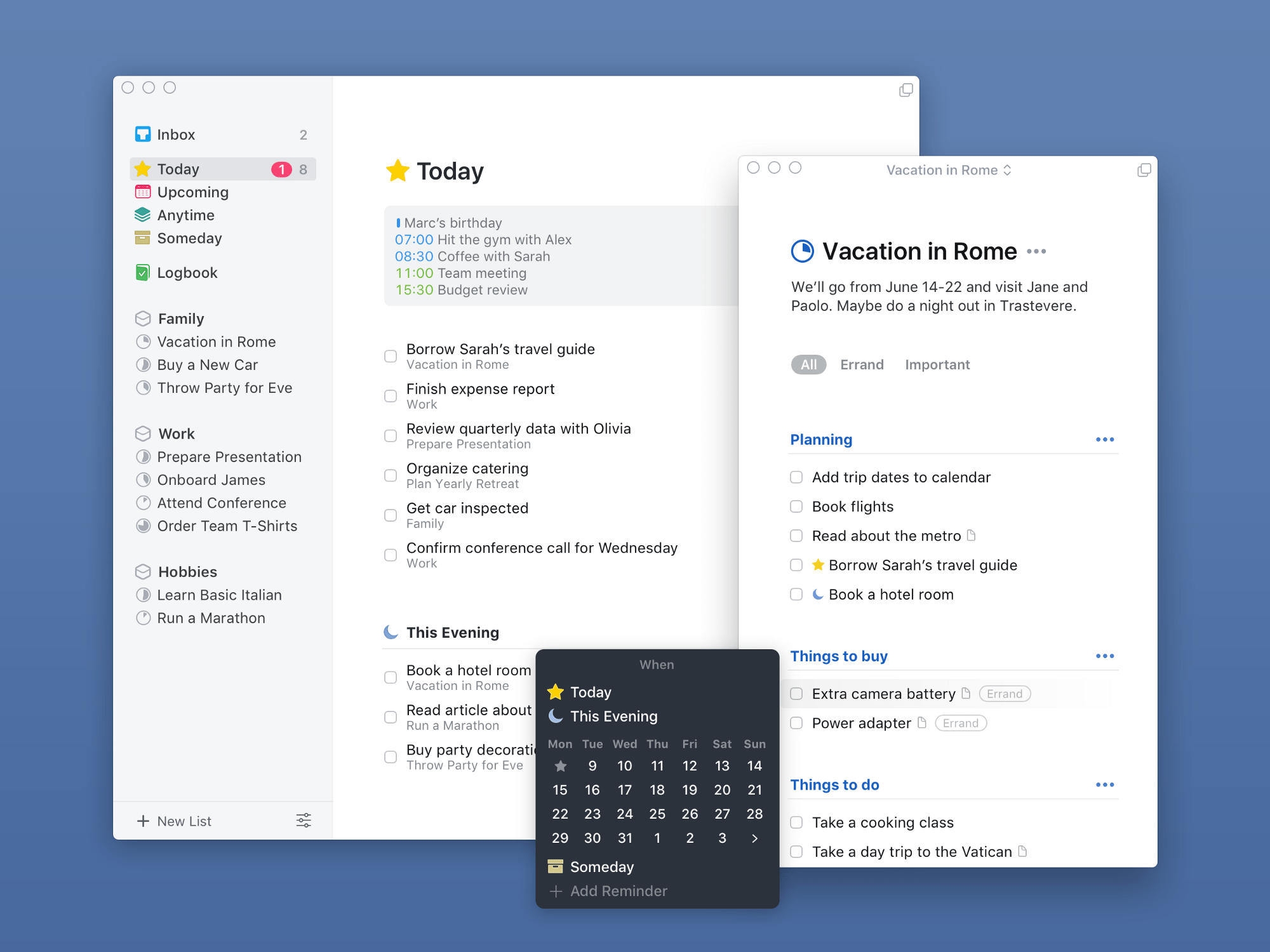
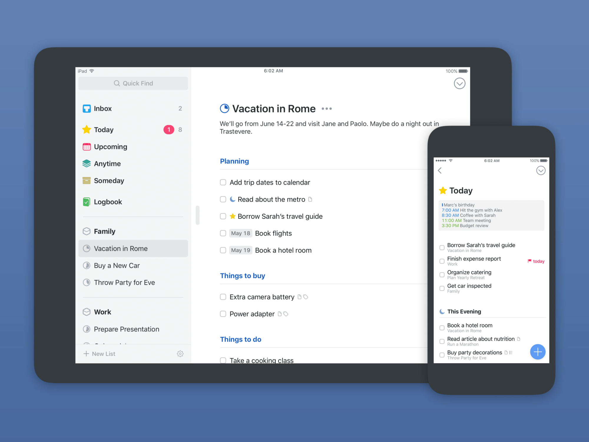
For all the innovation and rapid pacing of the modern App Store, I am almost never wowed by new apps. But I am astonished by Things 3. Setting aside functionality, this is the most beautiful Mac and iOS app that I have ever used—full stop. The level of care and aesthetic sensitivity that’s gone into every pixel is staggering, and each interface gestures invokes subtle, deeply satisfying animations.
If this doesn’t win an Apple Design Award, they may as well stop giving them out.
New Things
I’ve only been using Things 3 for a matter of days at this point, so this is nothing like a full review, but I wanted to share my initial impressions because, well, I’m impressed!
Onboarding
First impressions count, and Things 3 makes a great one.
The app introduces itself section by section, helping you quickly grasp the structure. This overcomes one of the main hurdles with productivity software, which is the feeling of being overwhelmed by options to the point of alienation.
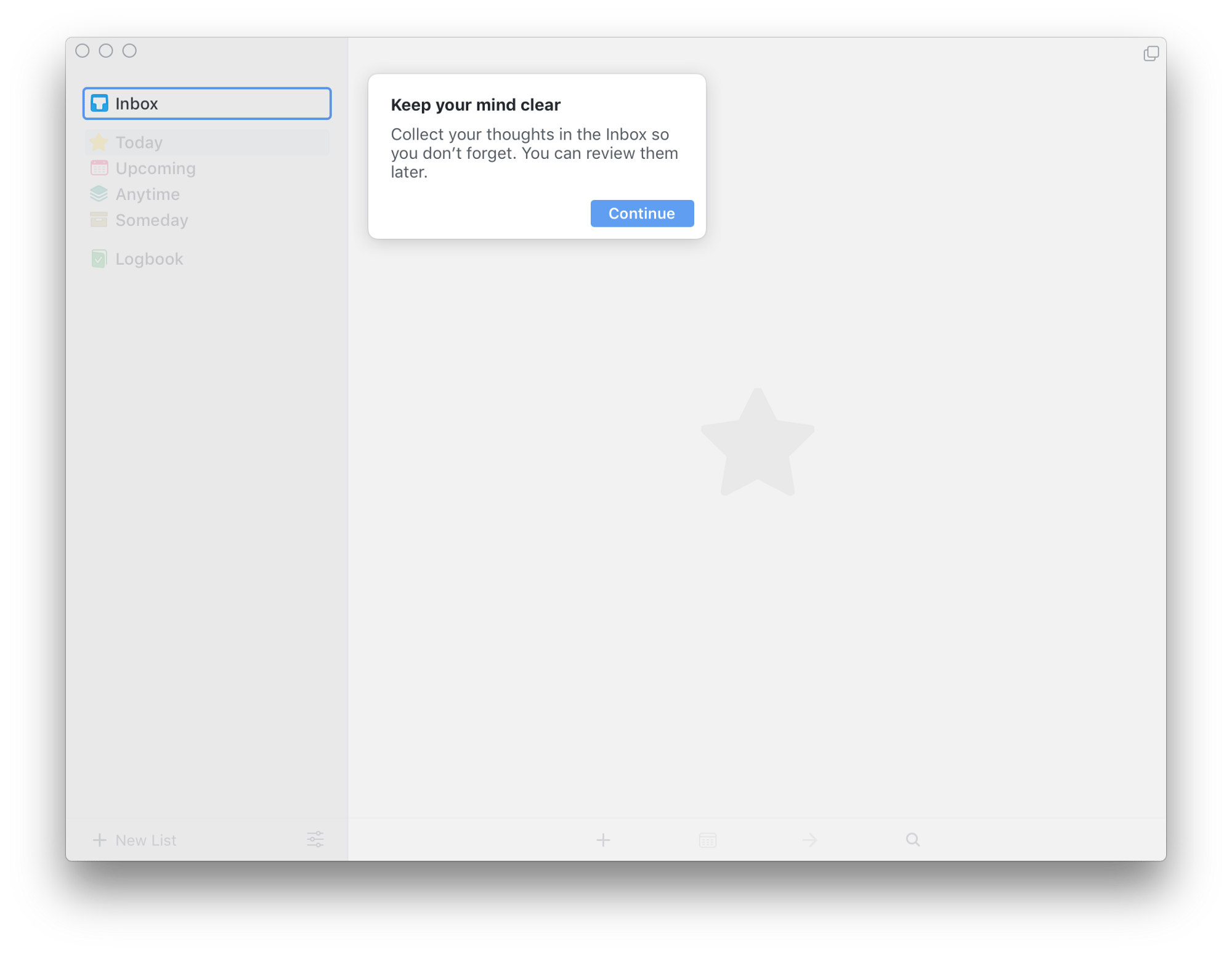
There’s also a well-thought-out introductory project that you’ll be prompted to add (specific to each device), which walks you through the various ways to add and manage your tasks.
I highly recommend keeping it on at least one of your devices.
Cross-Platform
Speaking of multiple devices, Things 3 feels the same on all of mine, with affordances for the screen size of each, and a number of clever features specific to each device.
For instance, on the Mac you can now summon multiple windows, each showing whichever view you want: Today, Upcoming, or one of your Areas/Projects.
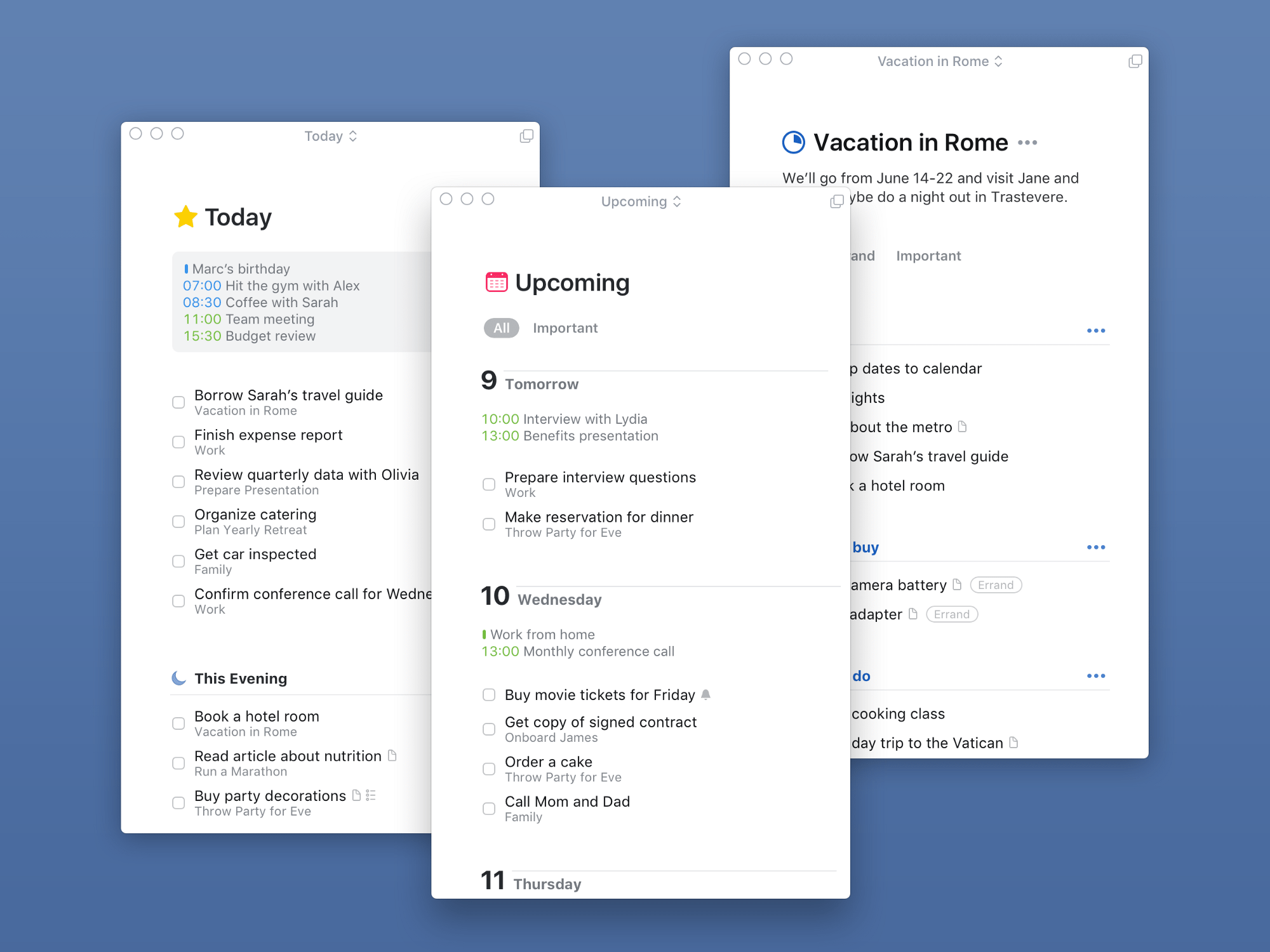
This is very handy, especially for those of us with multiple monitors who may have different things on the go in different areas of the screen and can now keep the relevant tasks right where we need them.
Calendar Items
One of the first things I noticed was the presence of my calendar items up at the top of my Today view. This is a magnificent addition as it means I no longer have to look in different places to answer the question: “what am I doing today?”
Today & Upcoming
Speaking of the Today list, that’s where I live in task management apps. The purity of Things’ approach appeals to me: I can keep the Today view open, knowing that anything I don’t complete will be seamlessly passed onto the next day (no more manually rescheduling tasks every morning).
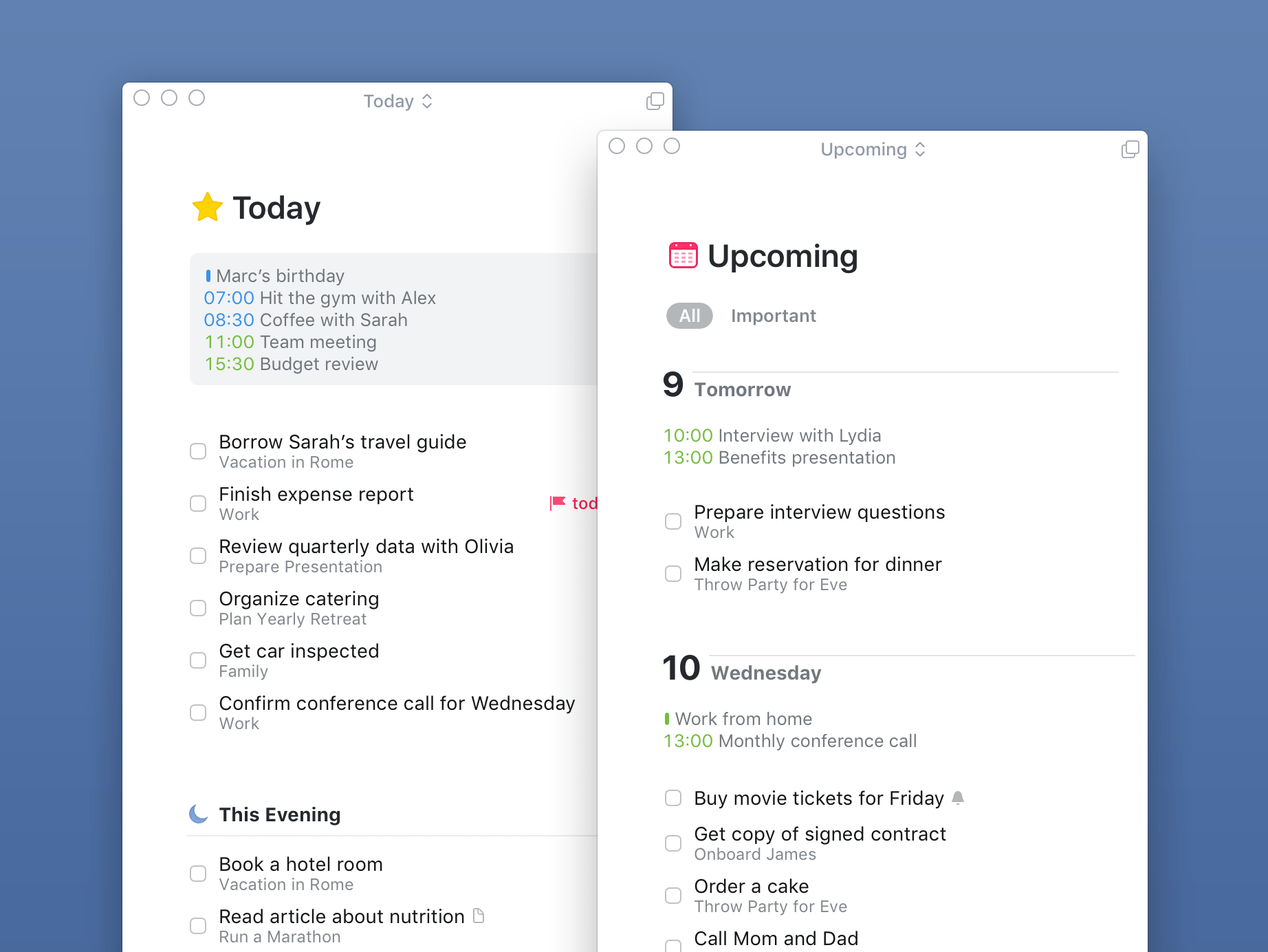
The Upcoming view lacks the granularity of custom filters or smart searches in other apps like Todoist, but I almost never use those. All I need is a glance at what’s on my plate in the next few days, and that’s exactly what Things 3 provides. Tasks can be easily dragged from one day to another, and each day has its calendar items displayed here as well for a very immediate sense of how busy I’ll be.
Today also has a new feature in Things 3: evenings. Somebody has finally recognized that there’s a distinction between “day tasks” and “evening tasks”. Whether you look at it as a hierarchy of importance or a divide between things you can do at work and things you can do at home, this is a handy way to keep your Today view less cluttered.
Anytime and Someday are two additional views that I haven’t yet found a good use for, but I probably will as I re-acclimate to Things.
Projects vs. Areas
In the sidebar, besides the main views, you can also add your own structure using Areas and Projects.
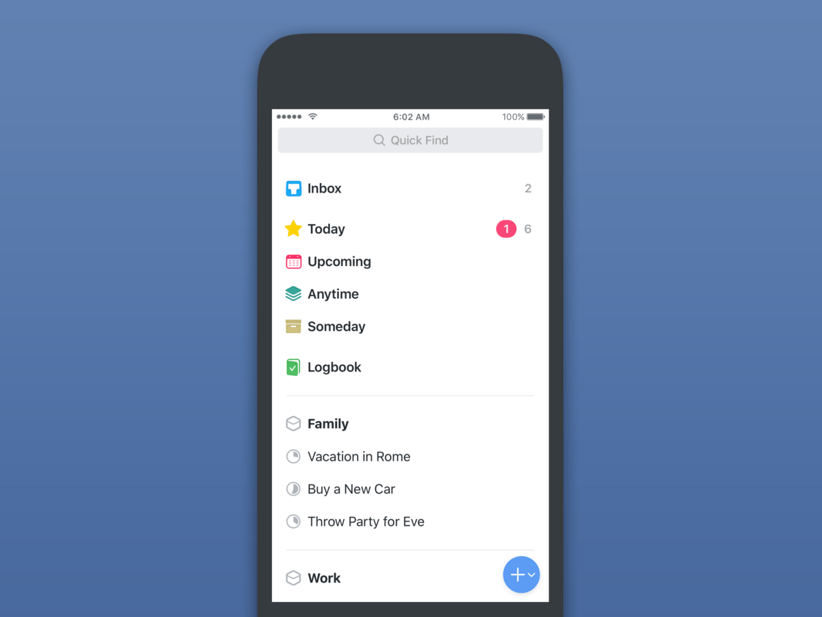
Areas (distinguished by the boxy icon beside them) are designed as broad containers for tasks pertaining to an aspect of your life. In my case, I have six set up at the moment, ranging from specifics like a “Blog” one for writing tasks, to something more general like “Long-Term” for broad resolutions.
Projects can live within Areas or float around on their own. They’re different from Areas mainly in their ability to be “completed”. You would never “complete” your home tasks, but you may well have a renovation project happening that has a concrete end point. In that case you’d most likely put a renovation Project within your home Area.
Projects have pie-chart icons beside their title, and as you check off their contained tasks, the pie fills up until you complete the entire project.
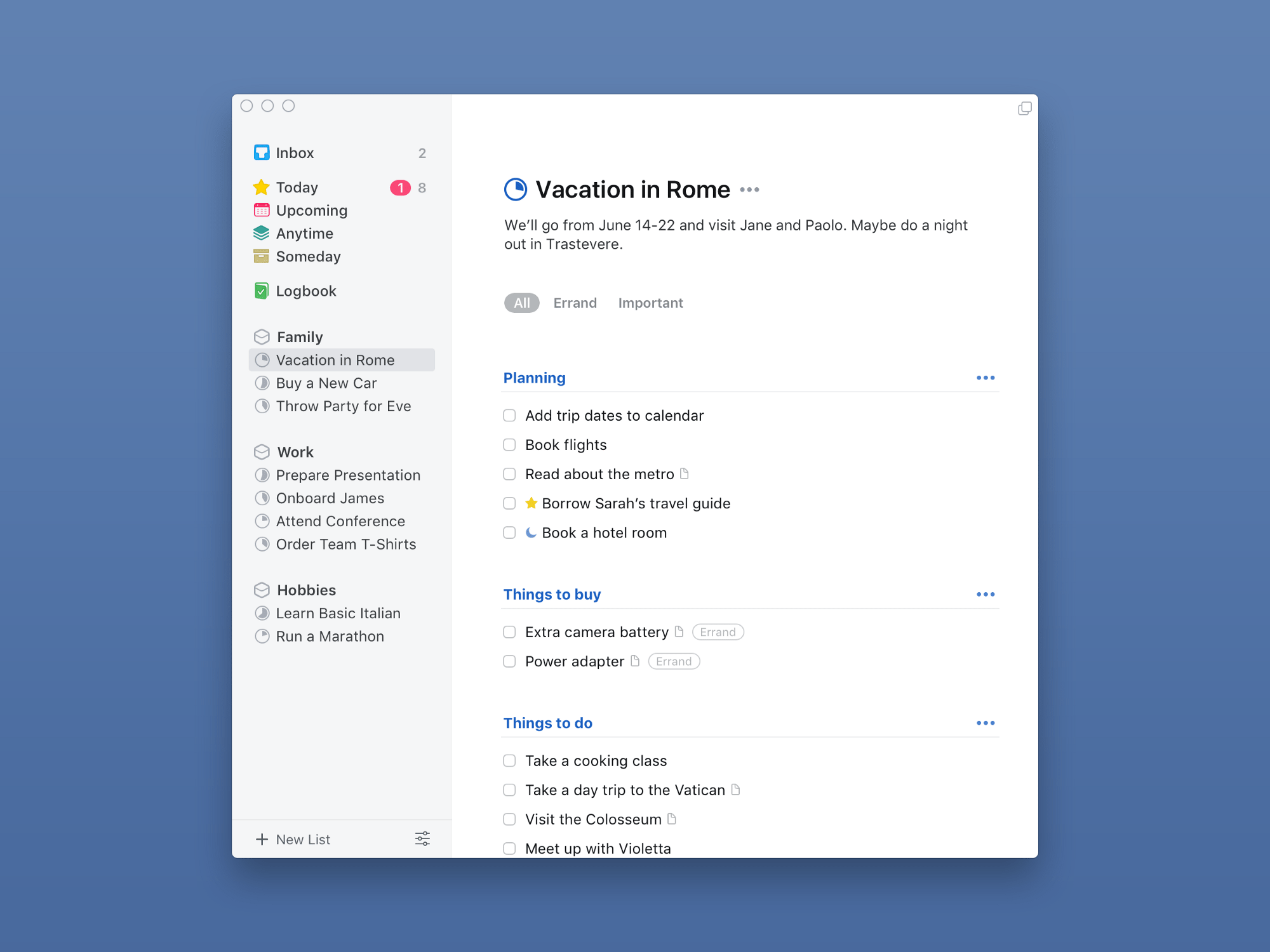
You can also add headings to further sub-divide sections within a Project. This is more of a visual affordance than anything else, but it can be very effective at keeping the structure of a project clear as the component tasks add up.
Tasks
I want to take a moment to appreciate the individual unit of productivity: the task itself.
In Things 3, tasks are wonderful to create and use. Lists of tasks look like plain text until you tap one of the tasks, at which point it will rise up out of the background as a card-like object, ready to be manipulated.
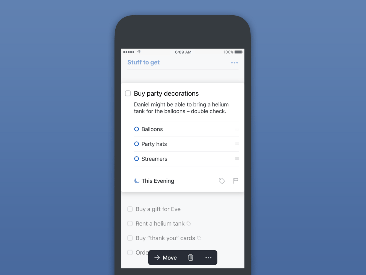
The unfolded task has a title, plus a notes area that doubles as the home for an integrated checklist—my favourite implementation of this feature so far.
Things 3 recognizes the difference between a task’s action date and its due date, so if you use that level of granularity you’ll be pleased to see it here. There’s also a new, refined date picker that makes rescheduling tasks extremely quick.
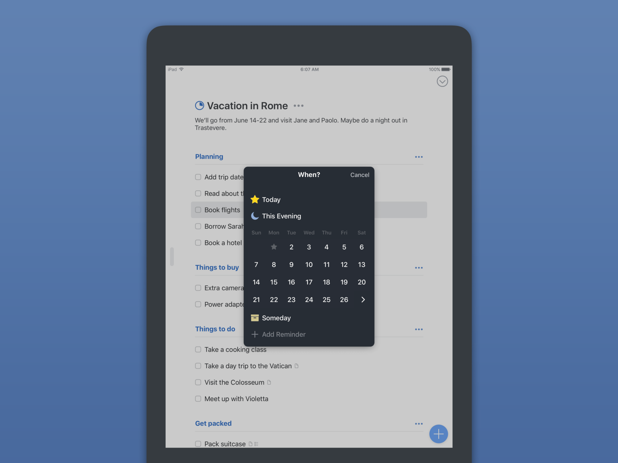
It works well via mouse or tapping, but it also feels fast via keyboard, which is how I’ve gotten used to navigating my task management environment.
There’s no natural language processing for overall task input, sadly, but NLP is present in Things within that new date picker. You can type “next Wednesday” or “June 4” and Things will quickly parse and implement your request.

You can also set reminders from this window, as you’d expect, and Things will ping you no matter which device you’re using.
Magic Plus
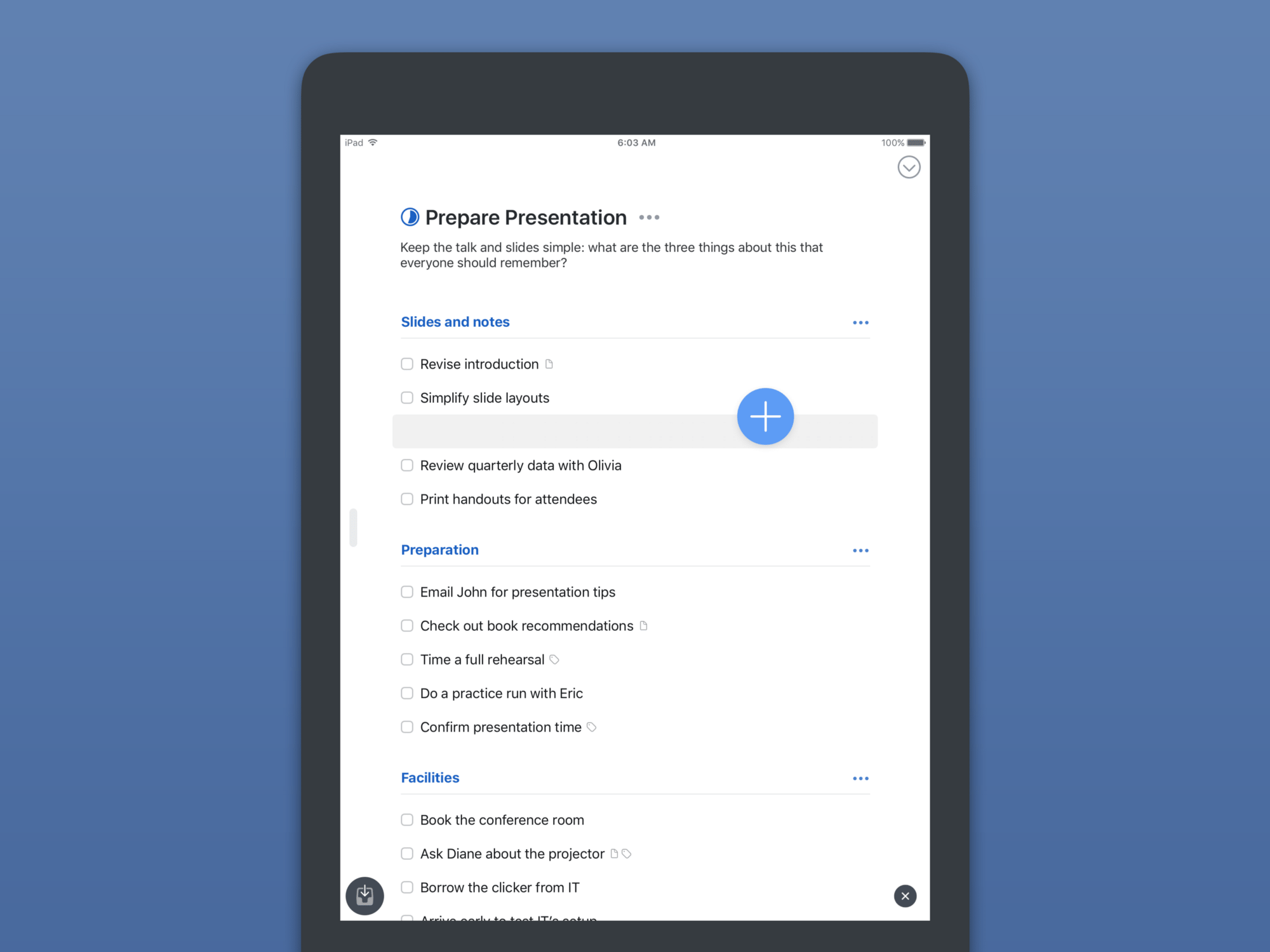
The familiar “floating action button” makes an appearance in the iOS version of Things, and it’s wonderful to use.
You can tap it to open a general entry panel, or you can tap and drag to indicate exactly where in the visible list you want the new task to be dropped.
Siri
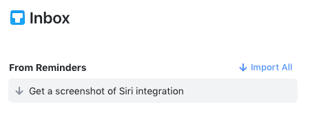
My favourite way to add random tasks is via Siri. In Things, this works via the same indirect method that other apps use: you tell Siri to remind you of something, and Things pulls that task from your default Apple Reminders list into its own Inbox.
In the Inbox, you’ll have to tap to confirm import of the task(s).
Completing and Logging
Tasks can be completed, at which point they either immediately vanish into the Logbook, or remain in place for reference.
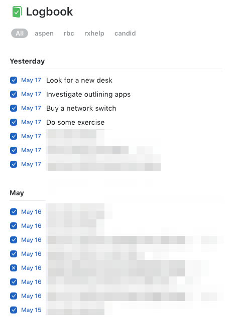
I like to keep them visible until I manually “log” them, because it lets me see not only how much work I have left for the day, but also how much I’ve already accomplished. I’ve written before about the appeal of framing task management as a series of accomplishments instead of incomplete work, and Things facilitates this.
The Logbook itself is exactly what I want: a permanent, searchable record of what I’ve done and when. An automatic work journal, essentially.
One tiny detail that I almost missed is the ability to “cancel” a task. This is a very wise way to handle tasks that were still present in your day but ended up not materializing as expected. If you simply delete tasks like that, then you lose track of how they impacted your day.
For example, I had a task set up to go pick up a package from the local UPS depot yesterday. I tried, but they didn’t have it because they decided they were going to try delivering again today. This meant the task didn’t get “completed”, nor will I need it to be rescheduled for another day. But it still took time, and by “cancelling” it instead I’m able to keep track of that.
Managing Tasks
You can select and act on multiple tasks at a time, including re-scheduling them, moving them to a new Project/Area, or completing/cancelling them.
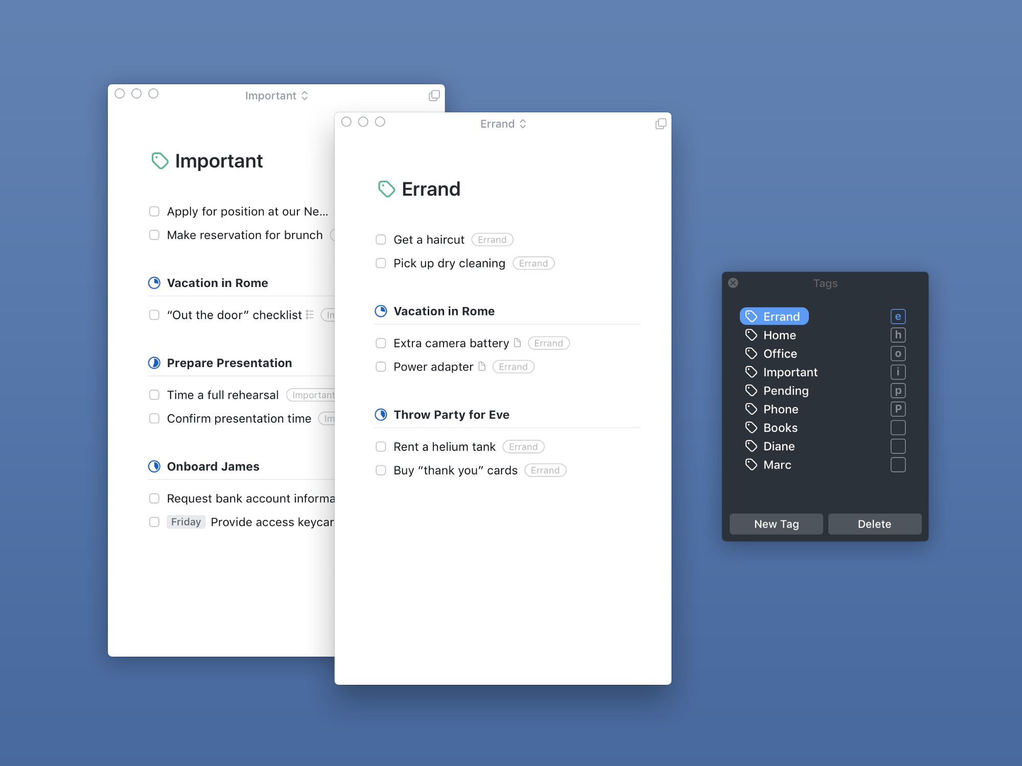
You can also make use of a solid tagging system to further organize tasks. Initially, I thought it wasn’t possible to bulk-apply tags, but it turns out you can: you just have to assign a shortcut to a tag from the tag window and then use that to tag multiple things at once.
Tags show up as a sort of tab system in lists, allowing you to quickly filter items within that list. I’ve come to appreciate this as I have an Area set up for the agency with Projects used for, well, projects! Then I use tags to indicate which client a set of tasks is for, which lets me see workload by client, across all projects.
Something Special They may not be the fastest to release new features, but when Cultured Code releases an update, it’s an event.
Things 3 was five years in the making, and it shows. More than any other app in recent memory, it re-kindles that feeling of excellence that we used to say characterized Mac and iOS as platforms. In an era of web-view based apps, the presence of a truly native, truly polished, and truly outstanding app is refreshing.
For the time being, I’m digging into Things 3 as my one and only task management system. I feel like I’ve come home and I look forward to assembling more thoughts as I spend more time with it. There are so many aspects that I didn’t even touch on.
Don’t take my word for it:
Things 3 on the Mac App Store Things 3 for iPad on the App Store Things 3 on the App Store