Pocket vs. Instapaper Revisited
Almost a year ago, I wrote about how Pocket and Instapaper have fundamentally different approaches to saving and revisiting content.
Over the past year, both products have made some significant improvements, and while they reinforce my initial conclusions, they also indicate some interesting shifts in the landscape of content saving.
Instapaper is for Reading
I’ve been happy to see Instapaper double down on their core competency: providing the best experience for those who want to explore saved content.

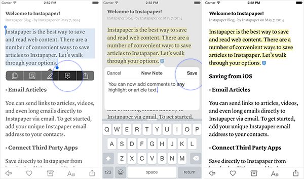
The Kindle got me used to highlighting important passages to revisit later, and Instapaper has taken this system to its logical next stage, which is providing a built-in notes system so that I can not only highlight an important passage, but also annotate it.

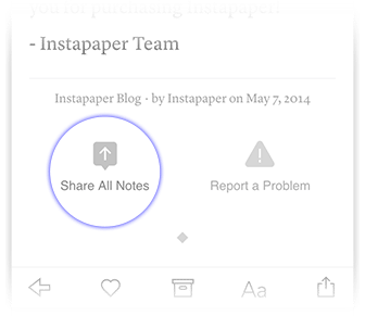
Those notes can then be shared publicly, or they can serve as a private note to self that helps me remember what my thought process was when I highlighted a passage. With iOS 9’s new Notes app, I can read through an article, taking notes all the while, and then export all my annotations for later use in an article. It’s wonderful.
One of the ways of publicly sharing a highlight is the increasingly popular “tweetshot”, which is an image of the passage that gets attached to your tweet. There’s an important accessibility concern here, but the reality is that they’re terrific for engagement and help contextualize my sharing of a link. My comment in the tweet helps, but ultimately there’s nothing like an actual passage from the text to give people a sense of whether or not they’d like to read what I’m linking to.
In the service of reading, Instapaper also introduced a Speed Reading feature that displays one word at a time at the pace of your choosing. This is proven to help you get through articles faster, and while I don’t use it, I know it’s a popular approach.
Behind the scenes, we’ve also seen improvements to sync speed, the content ranking algorithm, the mobile apps, the browser extension, and the parsing engine. The latter is a huge upgrade from last year’s experience and is now much more reliable about correctly interpreting article content, especially for multi-page setups.

Taken together, these improvements aren’t a radical rethinking of the product. They’re a collection of thoughtful refinements that improve the way people actually use Instapaper. There’s still no Mac app, there’s still no tagging, and that still doesn’t bother me.
Instapaper is for reading, for annotating, for researching, and for thinking. It remains the best choice for my usage.
Pocket is for Sharing
Recently, I’ve been spending a lot of time with the Pocket beta. This public program is a helpful way for the designers and developers to experiment with changes on a large scale without disrupting the mainstream users.
The biggest change to Pocket has been a radical re-thinking of its sharing and recommendation system. The beta recently introduced a profile system, which takes the simple stream idea of Instapaper and transforms it into a robust platform for content sharing, complete with excerpts and commentary.
It’s clean, it’s simple, and it’s well executed. I don’t like it.
Well, that’s not fair. I should say that I don’t know how I feel about it yet. To me, a read-it-later service is more about enjoying content and less about sharing it. Quite frankly I’m not sure the world needed another content sharing platform, and I certainly wasn’t craving another place to follow people.
The profile system is fundamentally a good concept, and if people enjoy it as a place to seek out my content recommendations then I’m happy to use it. But I also feel like this shifts Pocket’s focus in ways that take it further and further away from solving actual problems that I have.

What really bothers me about this update is the new recommendation system, which feels like a step backward. As much as I love the people I follow, if all I read is stuff they share, it’s easy to fall into a place where you’re just being fed a big circle-jerk of stuff that doesn’t expand your thinking, doesn’t broaden your horizon, and doesn’t reveal new subjects or ideas that might be compelling but would never emerge naturally in your particular social ecosystem.
One potential option to explore, on the content discovery front, would be to draw a line between user recommendations and recommendations that come from Pocket’s aggregated data. I have a million ways to get the former, but Pocket is uniquely positioned to offer a better look at the latter.
It’s about variety of content, and the ability of the recommendation system to surface things that I can’t or wouldn’t likely get elsewhere.Otherwise it’s just another window into the same room. I want a door to the outside.
Perhaps these changes were necessary from a business perspective. But I do think that Pocket had some other refinements I would have preferred to see first: a highlighting/annotation system, more typography options. Things focused on the experience of discovering, consuming, and remembering key aspects of content. Not just sharing it.
Middle Ground
For the past couple of months, I’ve split my time between Pocket and Instapaper in an effort to map out the concrete advantages of one over the other.
They both offer Picture-in-Picture support for video watching on the iPad, but only Instapaper offers Split View and 3D Touch support (for now). They both read articles aloud, although I find the feature equally useless on both. They both allow me to use my e-reader to enjoy longer reads, but Pocket’s Kobo integration remains leaps and bounds beyond Instapaper’s Kindle Digest system.
Ultimately, they both make it really easy to save something for later no matter what app, device, or environment I’m in, but it’s no longer the case that they’re more alike than different.
The truth is that they’re no longer comparable products. Instapaper has remained a read-it-later service, while Pocket is slowly transitioning into a social recommendation network.
For now, it’s difficult to say which is the better approach, but it makes it easier than ever to decide which approach is better suited for your needs. In my case, it makes Instapaper more appealing than ever, while Pocket slowly but surely becomes a better tool for a different use case.
productivity digital lifestyle