I Bought an Android Tablet
First impressions of the Samsung Galaxy Tab S5e

I know, I know.
It isn’t a joke though: it’s 2019 and I actually went out to the Samsung store to exchange my own money for a Galaxy Tab S5e, a freakishly thin slab that currently stands more or less alone in the Android space against Apple’s dominant iPad.
So what gives? I think it’s important to explore other ecosystems and experiences whenever I have the opportunity. As my venerable iPad Pro slowly inches toward the grave, I figured it was an ideal time to see what’s happening with Android tablets before I commit to spending a small fortune on replacing the iPad Pro.
Samsung recently announced a true iPad Pro competitor in the form of the Tab S6, which boasts a much more powerful processor, stylus, and other goodies, but in that price range the value comparison between it and the iPad Pro is less favourable to the Samsung.
Which quickly brought me to the mid-range Galaxy Tab S5e. Samsung continues to believe that they have something to offer the tablet market, and after the first couple of days with this thing, I have to say…I think they do.
What Is It?
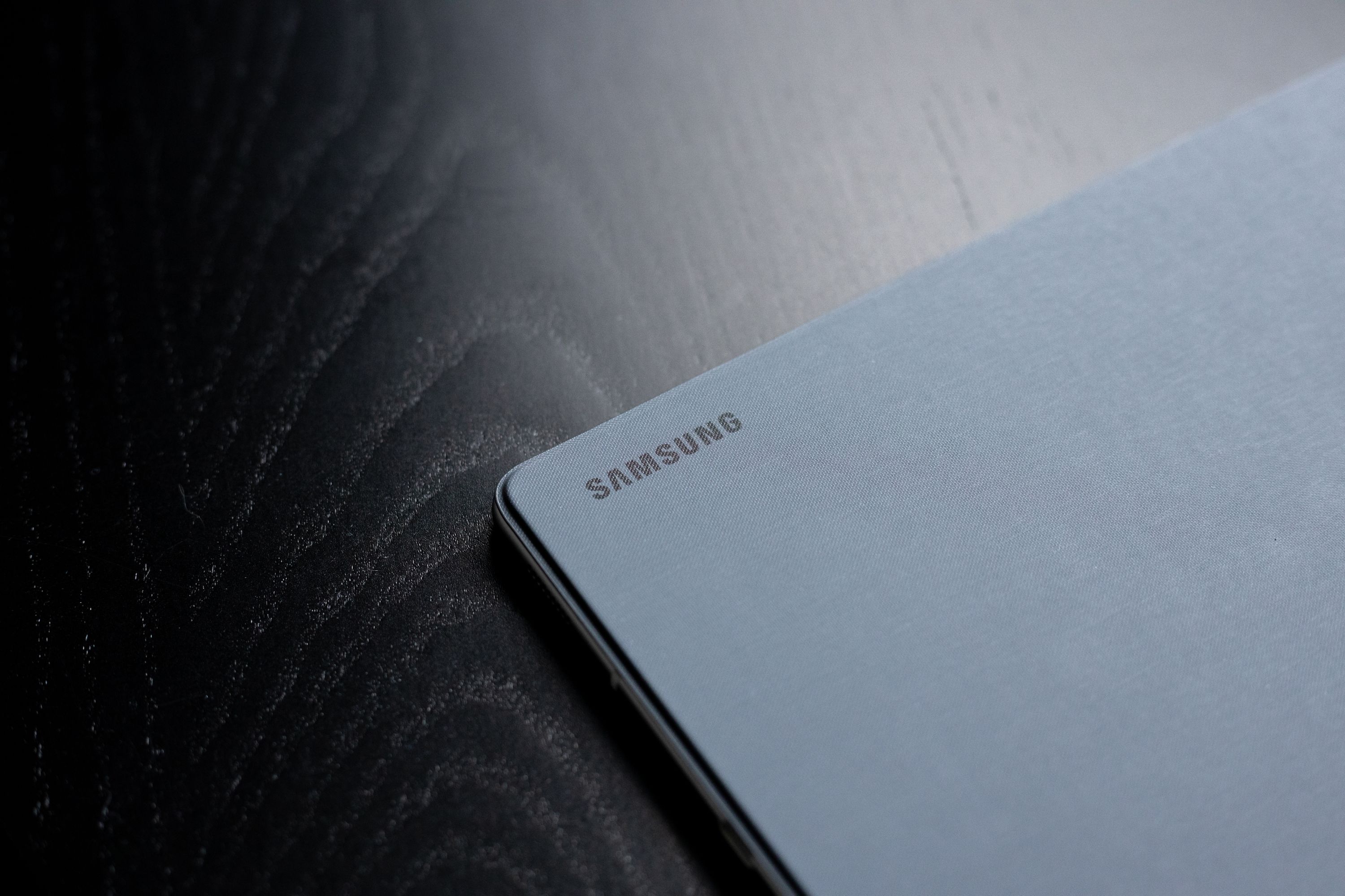
The S5e is a tablet with a 10.5” display sporting a cinematic 16:9 aspect ratio and utilizing the best of Samsung’s famous AMOLED technology. This screen is packed into a virtually bezel-less body that’s thinner and lighter than any iPad except the much-smaller iPad Mini.1
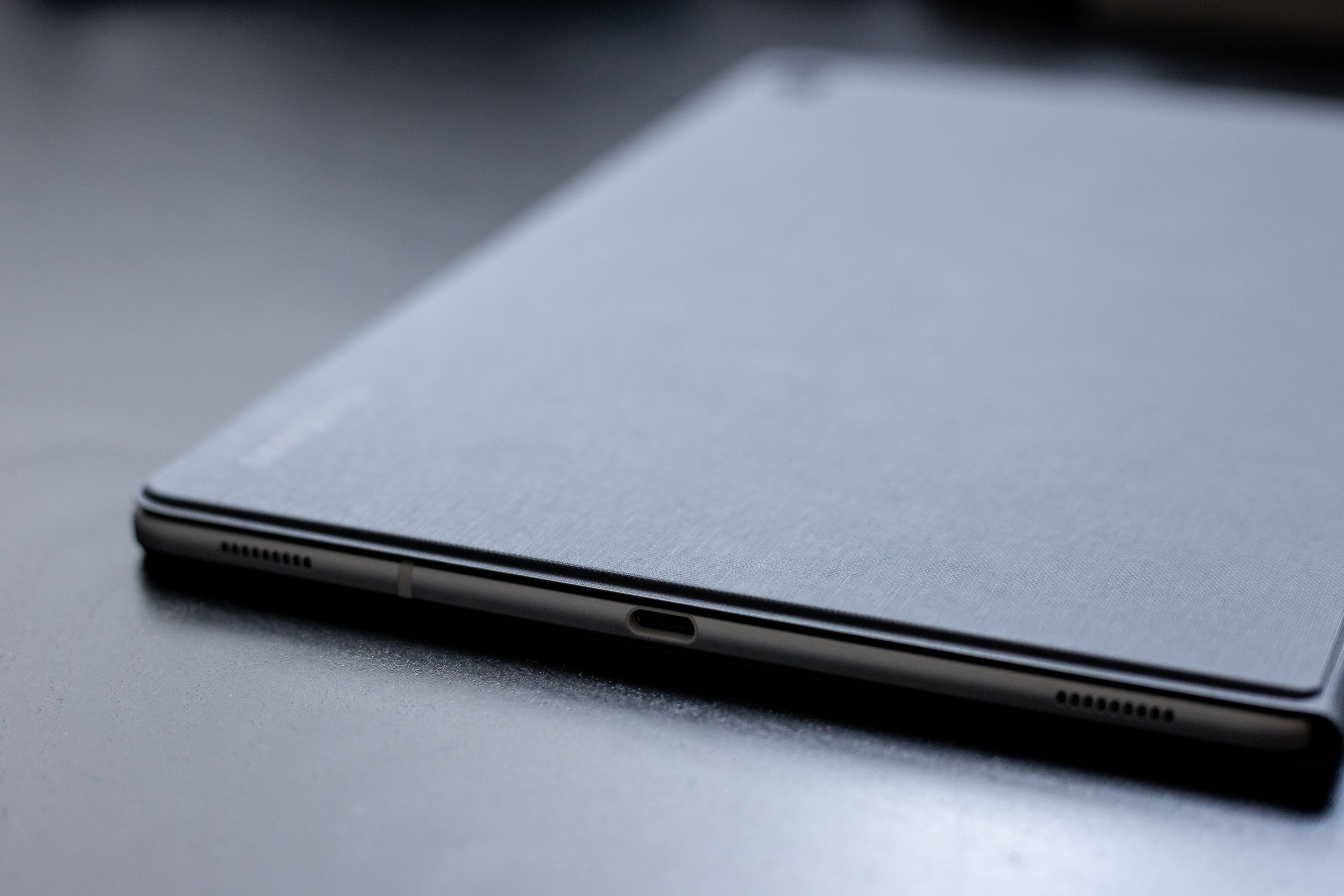
The tablet also features a quad speaker array with Dolby Atmos support, fingerprint and facial recognition biometric unlocking mechanisms, a USB-C port, Bluetooth 5.0, and expandable storage. It runs the current version of Android with Samsung’s OneUI skin.
I bought the absolute baseline model (64GB of storage) and it cost me $450 less than the equivalent iPad Pro 11” would have.
First Impressions: The Good
It’s hard to pick this thing up without being impressed by its form factor. It feels so thin and light that it seems impossible for such a thing to be real and functional.
Even with its magnetic book-style cover attached2, it’s still about the same thickness as my iPad Pro without a case, and the smaller footprint makes it immediately easier to carry, pack, and wield.
The screen is—in a word—glorious. It has a higher pixel density than the iPads, it’s nice and bright, and it looks better than the iPads do from more extreme viewing angles.
A lot of my tablet time is spent on YouTube, and this is where the 16:9 aspect ratio serves as a great advantage. I can finally watch videos without huge black bars! More importantly, the Android YouTube app allows me to view videos in their full range of resolution, unlike the iOS version that artificially limits you to 1080p even on the 4k-capable iPad Pros.
The result is the best mobile video watching experience I’ve ever had. Footage looks outstanding, the 4 speakers are loud and balanced, and between the AMOLED screen technology and the true 4k resolution, everything just looks better.
Of course, being an Android tablet, it also does everything that iPads are just now gaining the ability to do with the upcoming iOS 13 release. Things like mouse support, proper file management with external storage, direct importing of photos to Lightroom, and desktop-class browsing. And speaking of storage, the Tab S5e allows you to add up to 512GB of additional storage via MicroSD card, so I felt comfortable buying the baseline storage model knowing that I could always add more later.
Samsung has also been working on a “desktop mode” of sorts that they’re calling Dex. Available on the S5e too, Dex transforms the tablet into something very much like a laptop, with windowed apps, a desktop, external display support, and some very neat PC/Mac connectivity options. I haven’t had a chance to play with this too much yet, but it does work as advertised.
Lastly, trying the Tab S5e meant I also got to see how Google Duo compares to Apple’s FaceTime, and while this isn’t really specific to the tablet, I have to say that it was better. I made several long video calls and Duo connected faster, kept the signal steadier, looked cleaner, and kept audio/video in sync between both parties more effectively. Kudos to Google for that one, it’s good enough that I’m likely going to keep using it instead of FaceTime even on iOS devices.
First Impressions: The Bad
As much as I love the form factor, I wish it came in a 13” size—I miss the screen real estate of my iPad Pro. Particularly for web browsing and writing, where the wider 16:9 aspect ratio becomes less favourable in landscape orientation.
The Tab S5e doesn’t support Samsung’s S-Pen stylus, so there’s no drawing/writing capabilities, but if I’m honest that isn’t actually a big deal to me. I’ve used my Apple Pencil way less than I expected to, to the point where I’m not even sure if I’d buy a Pencil for the new iPad Pro.
One thing I would buy is the LTE version, and this is sadly missing from the Tab S5e, though only in certain regions. My understanding is that other countries get access to an LTE-capable variant, but in Canada it’s WiFi only.
I also have two complaints about the display. Great as it is, I wish it had a higher refresh rate like the new iPad Pros do. Something that looks so great feels like it ought to move with more fluidity. Which brings me to my second screen complaint: scrolling is a bit weird. Mostly noticeable when scrolling text, there seems to be a slight delay in the way the content refreshes across the width of the display, leading to situations where text looks like it’s slightly tilted while scrolling. It’s similar to the artifacts I notice on my iPhone X in some situations, so it might just be a consequence of OLED vs. LED display technology that’s amplified by the larger surface area of the tablet.
It feels a bit unfair to put this solely in the negatives section, but the Tab S5e experience suffers because it runs Android. Samsung’s OneUI skin is leagues better than the TouchWiz trash that preceded it, but it’s still Android, and Google has all but abandoned tablet form factors, so most apps feel poorly optimized for the size of the display.
It also just lacks the wealth and diversity of apps that iOS has. I wouldn’t have any issue replacing most things, but there are no good equivalents to some of the audio apps I use, nor to the design apps, nor to many of the games I enjoy.
Android itself has a much better notification system, much more leeway for customizing the system to match your needs, and some really obvious-but-great features like the ability to designate default apps for things. But it also continues to feel less fluid than iOS. I mostly notice it in simple things like navigating the interface: iOS is much more gestural, and the gestures feel more natural, so you get the illusion of manipulating real objects to move through a virtual space. Android has a few gestures, but everything feels more mechanical, more traditionally computer-like, which is appealing to some but has become a bit old-fashioned to me.
Plus, adopting Android means giving up on a lot of the cross-platform niceties that a mostly-Apple household takes for granted: answering iMessages from any device, AirDropping stuff back and forth, and using Continuity to seamlessly transfer tasks from place to place.

Now What?
I’m more torn about this than I expected to be. It makes very little sense for me to keep this tablet, but…I kind of want to.
For a particular use case—a stereotypical tablet use case of watching videos, managing email, playing games, browsing the web, and writing some documents—it’s outstanding. The Tab S5e offers similar or better hardware than the iPad Pro for significantly less money, which feels like tremendous value in an era of extremely expensive electronics.
I wish that Google hadn’t given up on Android tablets, but I’m glad that Samsung is continuing to push them, because I now know that if someone wants a premium hardware experience without shelling out $1,000+, I can confidently steer them toward the S5e.
technology productivity review